CP

Fall Color Palette — Amber Orchard

A warm five-color autumn scheme layering burnt orange and maple red over ochre, olive, and deep brown — every color matched to real paint you can buy.

By Jessica Williams · Color Stylist & Interior Editor

Burnt Orange
Dominant
Kompozit Pretty Parasol · 1039
#AC5D3E
LRV 17
Maple Red
Secondary
Kompozit April Love · 1061
#8B3D2F
LRV 9
Golden Ochre
Base
Kompozit Yellow Warning · 0928
#C69035
LRV 32
Dried Olive
Support
Kompozit Old School · 0410
#686945
LRV 13
Deep Walnut Brown
Accent
Kompozit Silent Sea · 0515
#2A2B2C
LRV 2
View palette in

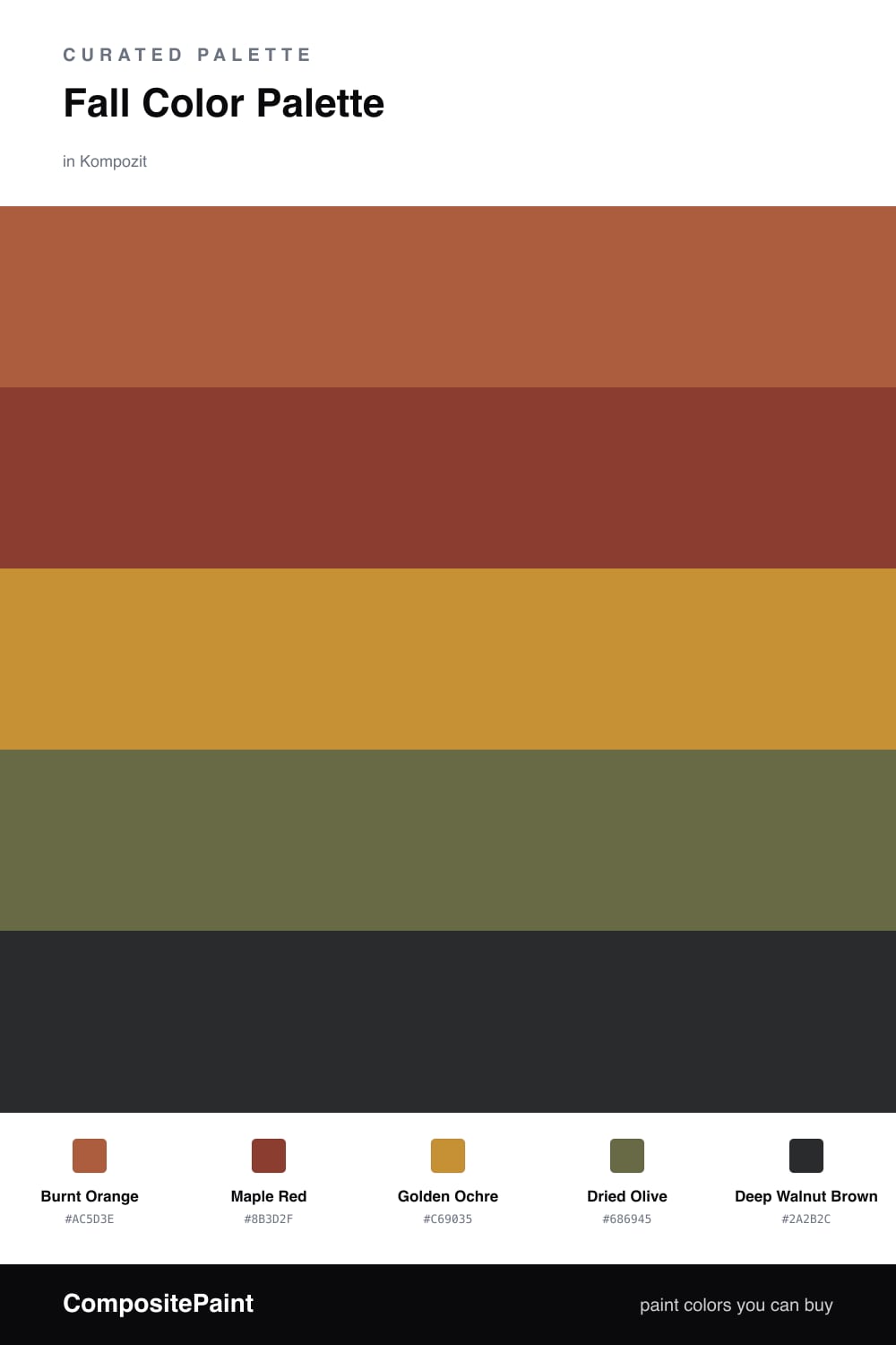
Fall is less a set of colors than a feeling of warmth pulling closer, and this scheme chases exactly that. Burnt Orange leads the way with that smoky, sun-baked glow, while Maple Red deepens the mood like leaves a week past their peak.

Underneath them, Golden Ochre spreads out as the soft, honeyed base that keeps the whole palette from going too moody, and Dried Olive slips in as the unexpected partner that makes the oranges look richer and a little more grown-up. A touch of Deep Walnut Brown anchors everything, perfect for a door or a piece of trim.

For 2026 this reads warm without feeling rustic. Keep the surfaces matte and the light low and golden, lean on the ochre for the big planes, and let the burnt orange and maple red carry the spark.

Buy These Colors

Each color matched to the closest real paint in every brand, by ΔE2000. Kompozit first; take any SKU to the store — these mix on demand.

Burnt Orange
#B25A2E · LRV 17 · Dominant
Kompozit Pretty Parasol · 1039 ΔE 3.63
Backdrop Bahaus · BD-BH ΔE 15.66
Behr Thanksgiving · M210-7 ΔE 4.05
Benjamin Moore Pilgrimage Foliage · 2175-20 ΔE 2.22
Clare Sriracha · PNT100-DP-29 ΔE 12.04
Dunn-Edwards Georgia Clay · DE5181 ΔE 4.57
Farrow & Ball Blazer · No. 212 ΔE 11.71
Magnolia Home On Bosque · JG-36 ΔE 4.88
PPG / Glidden Fragrant Cloves · 1199-7 ΔE 2.47
Sherwin-Williams Earthen Jug · SW 7703 ΔE 2.85
Valspar Ripe Peach · P045 ΔE 1.9
Maple Red
#8E3A2C · LRV 9 · Secondary
Kompozit April Love · 1061 ΔE 1.08
Backdrop Punk Rock · BD-PR ΔE 5.98
Behr Firebrick · 210D-7 ΔE 3.05
Benjamin Moore Copper Clay · 2172-10 ΔE 2.49
Clare Vintage · PNT100-DP-67 ΔE 10.34
Dunn-Edwards Deep Crimson · DEA152 ΔE 4.48
Farrow & Ball Incarnadine · No. 248 ΔE 7.17
Magnolia Home Create · JG-28 ΔE 8.62
PPG / Glidden Brick Dust · 1056-7 ΔE 5.5
Sherwin-Williams Bolero · SW 7600 ΔE 3.18
Valspar Decadent Red · 2002-5A ΔE 1.04
Golden Ochre
#C99544 · LRV 34 · Base
Kompozit Yellow Warning · 0928 ΔE 2.04
Backdrop Anita · BD-AN ΔE 16.07
Behr Solid Gold · M280-6 ΔE 1.29
Benjamin Moore Spicy Mustard · 2154-20 ΔE 1.13
Clare Good as Gold · PNT100-DP-59 ΔE 6.2
Dunn-Edwards Laredo Road · DE5369 ΔE 1.92
Farrow & Ball India Yellow · No. 66 ΔE 3.33
Magnolia Home Vintage Crown · JG-152 ΔE 10.31
PPG / Glidden Italian Saffron · 16-12 ΔE 1.16
Sherwin-Williams Golden Rule · SW 6383 ΔE 2.75
Valspar Tupelo Honey · 8002-21F ΔE 1.85
Dried Olive
#6E6B43 · LRV 14 · Support
Kompozit Old School · 0410 ΔE 2.28
Backdrop Buenos Aires · BD-BA ΔE 14.74
Behr Portsmouth Olive · HDC-CL-20 ΔE 1.02
Benjamin Moore Sage · 2143-10 ΔE 4.12
Clare Daily Greens · PNT100-DP-61 ΔE 9.24
Dunn-Edwards Spruce Woods · DE6238 ΔE 5.25
Farrow & Ball Bancha · No. 298 ΔE 2.67
Magnolia Home Landscape · JG-49 ΔE 2.29
PPG / Glidden Sphagnum Moss · 1111-7 ΔE 3.88
Sherwin-Williams Eminent Bronze · SW 6412 ΔE 6.6
Valspar Vineyard View · 8003-27F ΔE 1.72
Deep Walnut Brown
#3B2A20 · LRV 3 · Accent
Kompozit Silent Sea · 0515 ΔE 11.23
Backdrop Hocus Pocus · BD-HP ΔE 13.02
Behr Bitter Chocolate · 790B-7 ΔE 7.73
Benjamin Moore Wenge · AF-180 ΔE 4.78
Clare Blackish · PNT100-DP-54 ΔE 12.68
Dunn-Edwards Black · DEA187 ΔE 10.63
Farrow & Ball Pitch Black · No. 256 ΔE 9.84
Magnolia Home Moments · JG-150 ΔE 6.04
PPG / Glidden Black Magic · 1001-7 ΔE 11.53
Sherwin-Williams Polished Mahogany · SW 2838 ΔE 6.29
Valspar Noblesse Oblige · 8004-2G ΔE 6.72

Questions

How do I keep this many warm colors from feeling heavy?

Let the golden ochre do most of the quiet work as your base, then use burnt orange as the lead and bring in maple red and olive in smaller doses. A bit of unpainted white trim or pale oak floor gives your eye somewhere to rest so the warmth reads cozy, not closed in.

Which color should I commit the most square footage to?

Reach for burnt orange as the dominant if you want the autumn feeling up front, or flip it and let golden ochre carry the largest surfaces with burnt orange as an accent wall. Keep deep walnut brown for the small grounding moments like a door, a shelf, or trim.

Similar Palettes

Closest schemes by color — not by label.