Autumn Color Palette — Amber Harvest
A warm five-color autumn scheme built on burnt orange, maple red, and golden ochre, grounded by olive and deep brown — every color matched to real paint you can buy.
By Jessica Williams · Color Stylist & Interior Editor
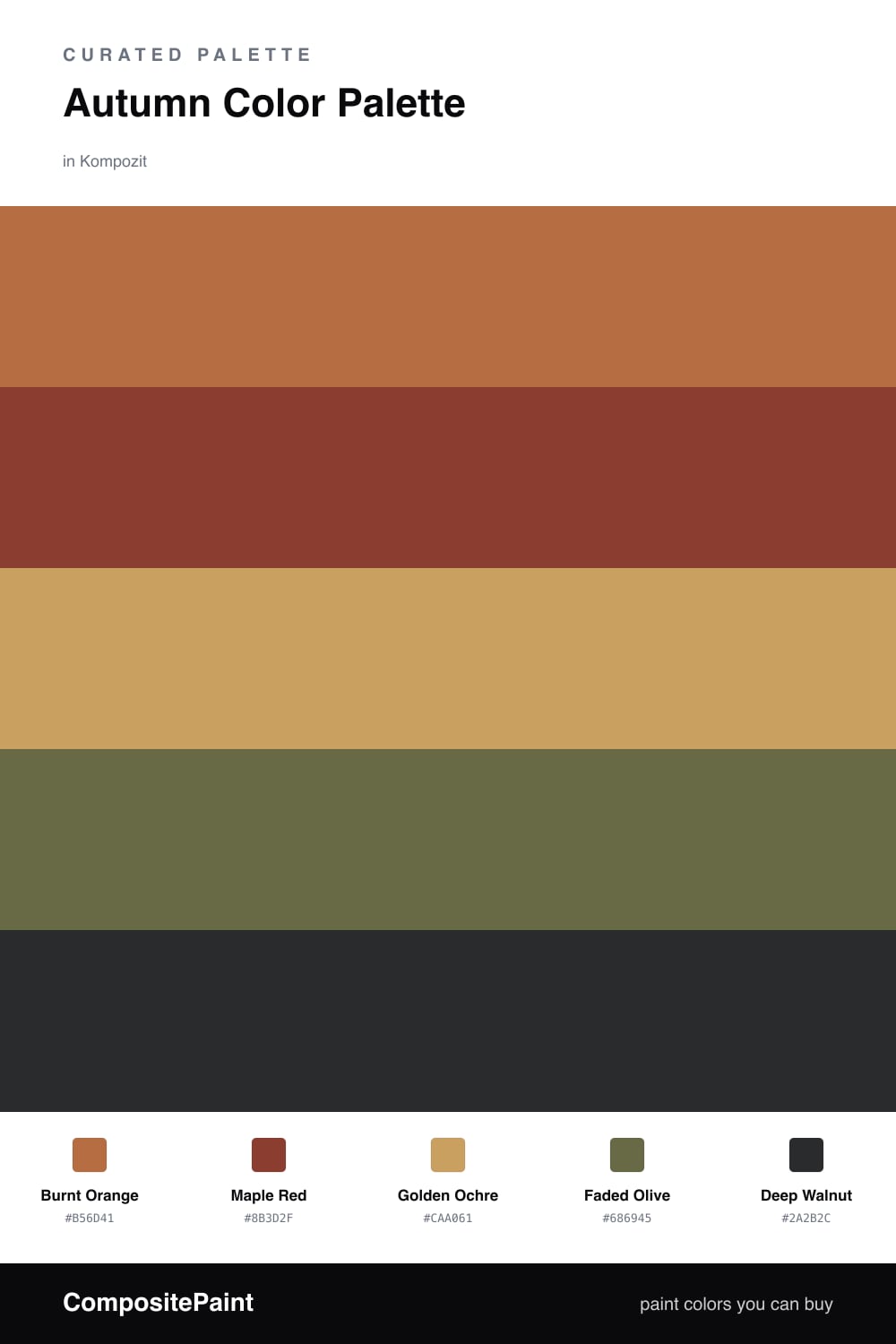
There is a moment in early fall when the light turns honey-gold and everything outside looks lit from within. This palette chases that feeling. Burnt Orange carries it as the dominant tone, warm and a little smoky, the kind of shade that glows in afternoon sun.
Maple Red deepens the story like the underside of a turning leaf, while Golden Ochre spreads underneath as a soft, sunlit base that keeps the whole scheme from feeling heavy. I love ochre right now — it reads richer and more grown-up than the mustard tones we leaned on a few years back.
To keep it from going too cozy-rustic, Faded Olive slips in as a cool, contemporary counterweight, and Deep Walnut anchors the edges. Use the olive and walnut sparingly and let the warm trio do the talking.
Buy These Colors
Each color matched to the closest real paint in every brand, by ΔE2000. Kompozit first; take any SKU to the store — these mix on demand.
Questions
They all share a warm, earthy undertone pulled straight from fall leaves, so they feel like one family rather than five separate picks. The olive cools things just enough to keep the oranges and reds from running hot.
Let burnt orange lead and use maple red as the deeper companion, roughly a 60/20 split, then bring in ochre as a soft backdrop with olive and walnut as quiet grounding touches.
Similar Palettes
Closest schemes by color — not by label.