CP

Fall Color Palette — Fall Mist

A warm five-color autumn scheme built on burnt orange, maple red, ochre, olive, and deep brown — every color matched to real paint you can buy.

By Maya Patel · Reviews Editor & Product Tester

Burnt Orange
Dominant
Kompozit Pretty Parasol · 1039
#AC5D3E
LRV 17
Maple Red
Secondary
Kompozit April Love · 1061
#8B3D2F
LRV 9
Hazy Ochre
Base
Kompozit Angel Food Cake · 0913
#D7A14F
LRV 41
Olive Grove
Support
Kompozit Gold Sparkle · 0389
#786B3D
LRV 15
Deep Cocoa Brown
Accent
Kompozit Silent Sea · 0515
#2A2B2C
LRV 2
View palette in

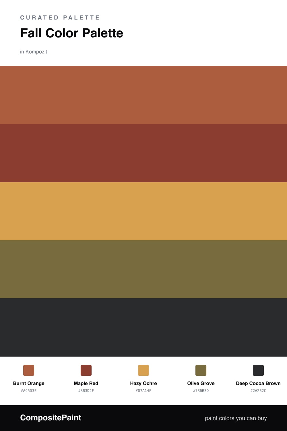
Fall Mist is autumn without the cliche. The star is a soft, dusty Burnt Orange that feels more contemporary than a classic pumpkin tone, and it sets the temperature for everything around it.

Maple Red deepens the scheme and gives it that late-October richness, while Hazy Ochre works as a warm, sunlit base that keeps the room from going dark. Olive Grove is the quiet surprise here — a muted green that makes the warm tones look intentional rather than seasonal.

For 2026, I would push the orange across the dominant surface, let the ochre breathe on adjacent walls, and save Deep Cocoa Brown for the moments that need an anchor — a door, a cabinet, a frame. Used that way, the palette stays cozy but reads modern.

Buy These Colors

Each color matched to the closest real paint in every brand, by ΔE2000. Kompozit first; take any SKU to the store — these mix on demand.

Burnt Orange
#B5612E · LRV 19 · Dominant
Kompozit Pretty Parasol · 1039 ΔE 5.61
Backdrop Buenos Aires · BD-BA ΔE 14.99
Behr Acorn Spice · S-H-280 ΔE 4.99
Benjamin Moore Gold Rush · 2166-10 ΔE 1.26
Clare Sriracha · PNT100-DP-29 ΔE 13.72
Dunn-Edwards Georgia Clay · DE5181 ΔE 5.97
Farrow & Ball Picture Gallery Red · No. 42 ΔE 12.08
Magnolia Home Work Worn Wood · JG-35 ΔE 6.3
PPG / Glidden Mincemeat · 1200-7 ΔE 2.95
Sherwin-Williams Husky Orange · SW 6636 ΔE 4.88
Valspar Fireside Chat · 8002-15G ΔE 4.13
Maple Red
#8C3A2B · LRV 9 · Secondary
Kompozit April Love · 1061 ΔE 1
Backdrop Stage Beauty · BD-SB ΔE 5.24
Behr Cinnamon Brandy · 230D-7 ΔE 4.94
Benjamin Moore Tea · 2091-10 ΔE 2.69
Clare Vintage · PNT100-DP-67 ΔE 10.36
Dunn-Edwards Deep Crimson · DEA152 ΔE 4.79
Farrow & Ball Incarnadine · No. 248 ΔE 7.64
Magnolia Home Create · JG-28 ΔE 8.84
PPG / Glidden Brick Dust · 1056-7 ΔE 5.64
Sherwin-Williams Bolero · SW 7600 ΔE 3.58
Valspar Decadent Red · 2002-5A ΔE 1.32
Hazy Ochre
#D7A24A · LRV 41 · Base
Kompozit Angel Food Cake · 0913 ΔE 1.19
Backdrop Rosita · BD-RO ΔE 22.02
Behr Solar Fusion · UL150-3 ΔE 2.65
Benjamin Moore Buttercup · 2154-30 ΔE 0.47
Clare Good as Gold · PNT100-DP-59 ΔE 6.85
Dunn-Edwards Chipmunk · DE5376 ΔE 2.06
Farrow & Ball India Yellow · No. 66 ΔE 3.63
Magnolia Home Bright Days · JG-45 ΔE 7.84
PPG / Glidden Curry Sauce · 1210-7 ΔE 3.65
Sherwin-Williams Ceremonial Gold · SW 6382 ΔE 4.09
Valspar Golden Tiger · V052-4 ΔE 2.78
Olive Grove
#6F6B3E · LRV 14 · Support
Kompozit Gold Sparkle · 0389 ΔE 3.69
Backdrop Buenos Aires · BD-BA ΔE 14.73
Behr Portsmouth Olive · HDC-CL-20 ΔE 2.1
Benjamin Moore Sage · 2143-10 ΔE 4.61
Clare Daily Greens · PNT100-DP-61 ΔE 10.22
Dunn-Edwards Dill Pickle · DE5573 ΔE 6.78
Farrow & Ball Bancha · No. 298 ΔE 3.83
Magnolia Home Landscape · JG-49 ΔE 3.24
PPG / Glidden Sphagnum Moss · 1111-7 ΔE 3.3
Sherwin-Williams Relentless Olive · SW 6425 ΔE 2.76
Valspar Vineyard View · 8003-27F ΔE 1.84
Deep Cocoa Brown
#3A2A1F · LRV 3 · Accent
Kompozit Silent Sea · 0515 ΔE 11.05
Backdrop Hocus Pocus · BD-HP ΔE 13.01
Behr Bitter Chocolate · 790B-7 ΔE 7.65
Benjamin Moore Wenge · AF-180 ΔE 5.41
Clare Blackish · PNT100-DP-54 ΔE 12.55
Dunn-Edwards Black · DEA187 ΔE 10.53
Farrow & Ball Pitch Black · No. 256 ΔE 9.72
Magnolia Home Moments · JG-150 ΔE 6.07
PPG / Glidden Black Magic · 1001-7 ΔE 11.46
Sherwin-Williams Polished Mahogany · SW 2838 ΔE 7.19
Valspar Noblesse Oblige · 8004-2G ΔE 7.32

Questions

Why do these autumn colors work together?

They all share a warm, earthy undertone, so they read like one family instead of five separate picks. The ochre acts as a soft bridge that keeps the orange and red from competing.

How do I use this scheme without it feeling heavy?

Let the burnt orange lead on the largest surface and keep the maple red and brown to smaller doses — trim, a single wall, or accents. The olive and ochre carry the in-between space and lighten the whole mood.

Similar Palettes

Closest schemes by color — not by label.