Fall Color Palette — Ember & Ochre
A warm five-color autumn scheme built on burnt orange and maple red, softened with ochre and olive and grounded in deep brown — every color matched to real paint you can buy.
By Emily Roberts · DIY Editor & First-Timer's Guide
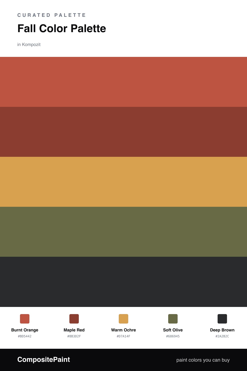
There is a reason fall colors feel so comforting on a wall — they are the shades we already love in sweaters, soup, and changing leaves. This palette leans into that warmth with a glowing Burnt Orange in the lead and a softer Maple Red right beside it for depth.
Warm Ochre is the quiet workhorse here. Think of it as a friendly, golden version of beige that keeps the bolder colors from feeling heavy. A muted Soft Olive adds a fresh, slightly modern twist, which is what gives this scheme a 2026 feel rather than a dated harvest look.
Finally, Deep Brown is your anchor. You only need a little of it — a cabinet, a frame, a stretch of trim — to make all the warmer tones pop. Start with the orange as your main color and build outward, and you really cannot go wrong.
Buy These Colors
Each color matched to the closest real paint in every brand, by ΔE2000. Kompozit first; take any SKU to the store — these mix on demand.
Questions
They all share a warm, earthy undertone, which is the secret to a scheme that feels calm instead of busy. The orange and red carry the energy, while the olive and brown settle everything down.
Let the burnt orange lead, then use maple red and ochre in medium doses. Save the deep brown for small grounding touches like a door or trim — roughly a 60/30/10 spread.
Similar Palettes
Closest schemes by color — not by label.