Autumn Color Palette — Canyon Ember
A warm five-color autumn scheme built from burnt orange, maple red, golden ochre, and deep olive-brown, with every color matched to real paint you can buy.
By David Chen · Formulation Lead & Resident Chemist
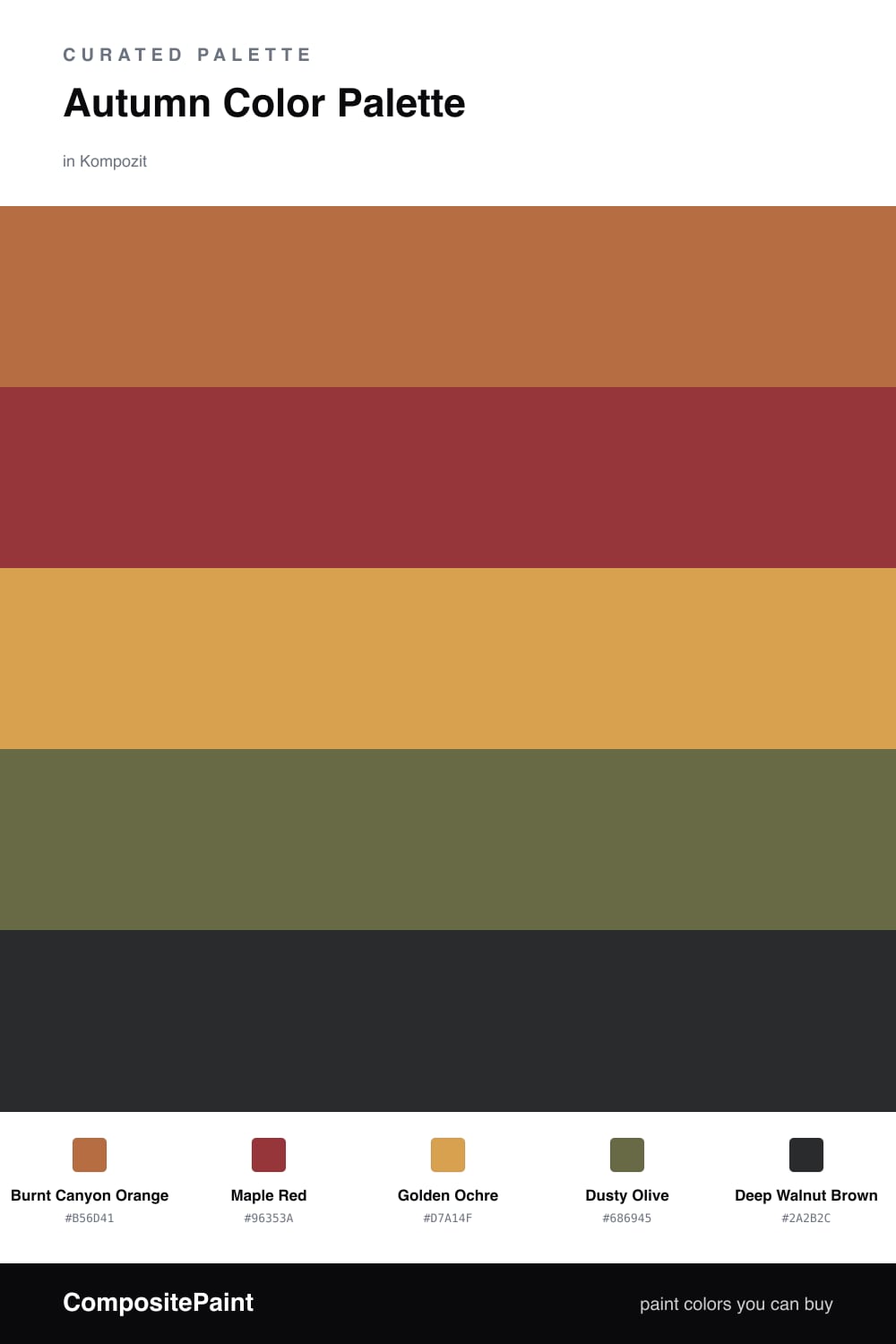
Autumn is really just the warm half of the color wheel turned up loud. This scheme starts with Burnt Canyon Orange as the lead, the kind of clay-fired tone you see on a hillside late in October, and pairs it with a smoky Maple Red that adds depth without going fully dark.
To keep it from feeling heavy, Golden Ochre does the quiet work as the base color. Think of it as the daylight in the palette, the soft glow that lets the bolder tones stand out. A muted Dusty Olive bridges the warm reds and the grounded browns, which is the trick that makes the whole thing read modern instead of rustic.
Finish with Deep Walnut Brown in the smallest amounts, on trim, a frame, or a single piece of furniture. For a 2026 feel, let the ochre take up more room than you think you should and treat the red and brown like seasoning, not the meal.
Buy These Colors
Each color matched to the closest real paint in every brand, by ΔE2000. Kompozit first; take any SKU to the store — these mix on demand.
Questions
They are all warm earth tones drawn from the same place on the color wheel, so they share an undertone and never fight. The orange and red give energy while the olive and brown calm everything down.
Lean on the Golden Ochre as your light, open color and use it across the biggest quiet surfaces. Save the maple red and walnut brown for smaller doses so the room still breathes.
Similar Palettes
Closest schemes by color — not by label.