Fall Color Palette — Harvest Hearth
A warm five-color autumn scheme of burnt orange, maple red, golden ochre, soft olive, and deep walnut brown — every color matched to real paint you can buy.
By Jessica Williams · Color Stylist & Interior Editor
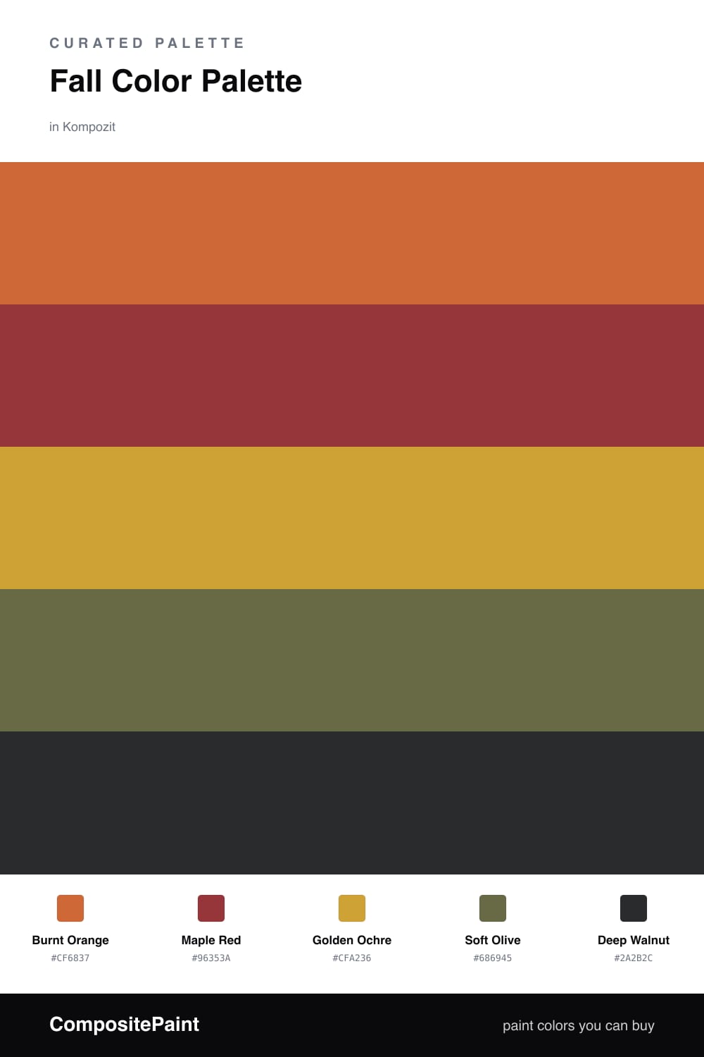
There is a moment in early fall when the light turns syrupy and everything outside glows a little. This palette bottles that feeling. Burnt Orange leads as the dominant color, warm and a touch dusty, the shade of a maple just before it lets go.
Maple Red deepens the story while Golden Ochre brings in the low afternoon sun, and a quiet Soft Olive keeps it all from turning too sweet. It is the green you see at the edge of a field that has not quite given up summer.
To ground the scheme, lean on Deep Walnut as your base on trim, a bookshelf, or a single heavy piece. The 2026 way to wear this is unfussy: big warm fields of color, matte finishes, and just enough olive and walnut to make it feel collected rather than themed.
Buy These Colors
Each color matched to the closest real paint in every brand, by ΔE2000. Kompozit first; take any SKU to the store — these mix on demand.
Questions
Lean on the Golden Ochre to lift things. It catches the light and warms everything around it, so use it on a feature wall or in soft furnishings while you let the Deep Walnut sit low, on trim or a single piece of furniture.
Burnt Orange is the dominant shade here, so give it the largest surface. Then sprinkle Maple Red and Soft Olive in smaller doses as accents, and let the walnut brown ground the whole scheme.
Similar Palettes
Closest schemes by color — not by label.