CP

Fall Color Palette — Spiced Harvest

A warm five-color autumn scheme built on burnt orange, maple red, and golden ochre, grounded by olive and deep brown — every color matched to real paint you can buy.

By Emily Roberts · DIY Editor & First-Timer's Guide

Burnt Orange
Dominant
Kompozit Best of the Bunch · 1068
#BD5442
LRV 18
Maple Red
Secondary
Kompozit Romantic Night · 1138
#96353A
LRV 9
Golden Ochre
Support
Kompozit Sin City · 0816
#CFA236
LRV 39
Olive Grove
Accent
Kompozit Old School · 0410
#686945
LRV 13
Deep Cocoa
Base
Kompozit Silent Sea · 0515
#2A2B2C
LRV 2
View palette in

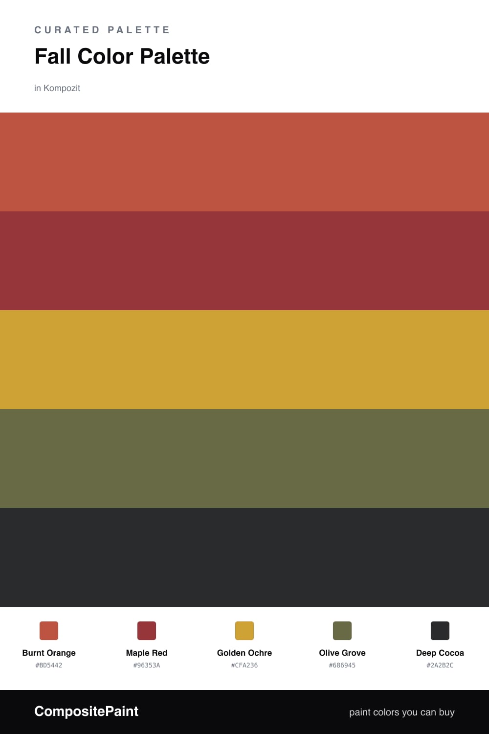
This is the palette that smells like a cinnamon candle, and I mean that as the highest compliment. Burnt Orange does the heavy lifting here, that toasty pumpkin tone you picture the second someone says fall, and Maple Red backs it up with a deeper, slightly dustier warmth, like leaves a week after they turn.

To keep it from going too one-note, Golden Ochre brings a soft mustard glow that reads modern rather than retro, and Olive Grove sneaks in a quiet green so the warm tones have something to push against. That little bit of contrast is the trick that makes the whole scheme feel current for 2026 instead of like a tin of holiday cookies.

Deep Cocoa is your anchor. Use it in the smallest doses, along edges and in grounding details, and it pulls everything together so the warmer colors get to shine. Lead with the orange, sprinkle the rest, and you have a cozy, lived-in look that still feels fresh.

Buy These Colors

Each color matched to the closest real paint in every brand, by ΔE2000. Kompozit first; take any SKU to the store — these mix on demand.

Burnt Orange
#C05D2E · LRV 19 · Dominant
Kompozit Best of the Bunch · 1068 ΔE 8.48
Backdrop Bahaus · BD-BH ΔE 17.13
Behr Jack O Lantern · M220-7 ΔE 1.91
Benjamin Moore Rust · 2175-30 ΔE 3.65
Clare Sriracha · PNT100-DP-29 ΔE 11.82
Dunn-Edwards Clay Pot · DE5174 ΔE 3.29
Farrow & Ball Charlotte's Locks · No. 268 ΔE 6.21
Magnolia Home Work Worn Wood · JG-35 ΔE 6.32
PPG / Glidden Tabasco · 1192-7 ΔE 4.31
Sherwin-Williams Husky Orange · SW 6636 ΔE 3.17
Valspar Storybook Sundown · V010-3 ΔE 3.43
Maple Red
#9A3B2C · LRV 10 · Secondary
Kompozit Romantic Night · 1138 ΔE 6.79
Backdrop Punk Rock · BD-PR ΔE 5.28
Behr Ground Nutmeg · S-H-230 ΔE 2.92
Benjamin Moore Merlot Red · 2006-10 ΔE 0.82
Clare Vintage · PNT100-DP-67 ΔE 11.7
Dunn-Edwards Deep Crimson · DEA152 ΔE 5.35
Farrow & Ball Incarnadine · No. 248 ΔE 6.65
Magnolia Home Brave And Bold · JG-32 ΔE 3.9
PPG / Glidden Autumn Ridge · 1058-7 ΔE 5.13
Sherwin-Williams Chinese Red · SW 57 ΔE 1.87
Valspar Rambutan · P044 ΔE 1.95
Golden Ochre
#D6A03C · LRV 40 · Support
Kompozit Sin City · 0816 ΔE 3.07
Backdrop Rosita · BD-RO ΔE 23.64
Behr Solar Fusion · UL150-3 ΔE 3.43
Benjamin Moore Buttercup · 2154-30 ΔE 1.97
Clare Good as Gold · PNT100-DP-59 ΔE 8.08
Dunn-Edwards Copper Cove · DE5320 ΔE 1.58
Farrow & Ball India Yellow · No. 66 ΔE 4.92
Magnolia Home Bright Days · JG-45 ΔE 8.74
PPG / Glidden Curry Sauce · 1210-7 ΔE 2.19
Sherwin-Williams Glitzy Gold · SW 6691 ΔE 2
Valspar Ripe Pear · P091 ΔE 2.76
Olive Grove
#6E6B3F · LRV 14 · Accent
Kompozit Old School · 0410 ΔE 2.94
Backdrop Buenos Aires · BD-BA ΔE 15.02
Behr Portsmouth Olive · HDC-CL-20 ΔE 1.65
Benjamin Moore Guacamole · 2144-10 ΔE 3.65
Clare Daily Greens · PNT100-DP-61 ΔE 9.83
Dunn-Edwards Dill Pickle · DE5573 ΔE 6.4
Farrow & Ball Bancha · No. 298 ΔE 3.36
Magnolia Home Landscape · JG-49 ΔE 3.17
PPG / Glidden Sphagnum Moss · 1111-7 ΔE 3.7
Sherwin-Williams Relentless Olive · SW 6425 ΔE 2.76
Valspar Vineyard View · 8003-27F ΔE 2
Deep Cocoa
#3A2A22 · LRV 3 · Base
Kompozit Silent Sea · 0515 ΔE 10.46
Backdrop Hocus Pocus · BD-HP ΔE 12.13
Behr Bitter Chocolate · 790B-7 ΔE 6.98
Benjamin Moore Wenge · AF-180 ΔE 3.73
Clare Blackish · PNT100-DP-54 ΔE 12.21
Dunn-Edwards Black · DEA187 ΔE 9.93
Farrow & Ball Pitch Black · No. 256 ΔE 9.17
Magnolia Home Moments · JG-150 ΔE 5.38
PPG / Glidden Black Magic · 1001-7 ΔE 10.9
Sherwin-Williams Raisin · SW 7630 ΔE 6.03
Valspar Noblesse Oblige · 8004-2G ΔE 5.65

Questions

Which color should I use the most of?

Lead with Burnt Orange as your main color and let Maple Red come in second. Keep Golden Ochre and Olive Grove as smaller supporting moments, and use Deep Cocoa to ground the edges so nothing feels too sweet.

Will all this warmth feel too heavy?

It will not if you give the eye a place to rest. The Olive Grove cools the palette down just enough, and a generous wall of Burnt Orange paired with plenty of natural light keeps the whole thing feeling cozy rather than dim.

Similar Palettes

Closest schemes by color — not by label.