CP

Fall Color Palette — Maple Ember Glow

A warm five-color autumn scheme of burnt orange, maple red, golden ochre, olive, and deep brown, with every color matched to real paint you can buy.

By David Chen · Formulation Lead & Resident Chemist

Burnt Orange
Dominant
Kompozit Casa De Oro · 1026
#CF6837
LRV 23
Maple Red
Secondary
Kompozit Romantic Night · 1138
#96353A
LRV 9
Golden Ochre
Base
Kompozit Sin City · 0816
#CFA236
LRV 39
Dusty Olive
Support
Kompozit Old School · 0410
#686945
LRV 13
Deep Walnut Brown
Accent
Kompozit Silent Sea · 0515
#2A2B2C
LRV 2
View palette in

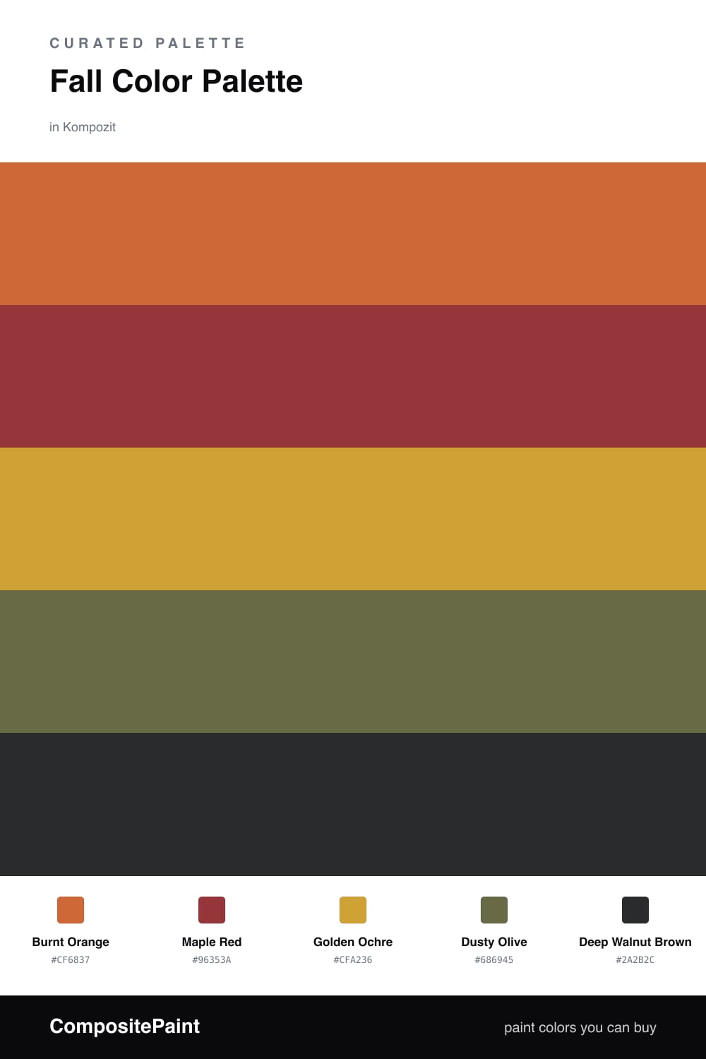
Autumn is really just one warm undertone caught at different stages of ripeness, and that is the trick that makes this palette hang together. Burnt Orange leads as the dominant glow, the color of a maple at its peak, and Maple Red deepens it a half step the way the shadowed leaves do.

Golden Ochre is your base and your light. It is soft enough to cover a large wall without shouting, and it reflects a warm, honeyed light into the room. Dusty Olive is the quiet stabilizer here, a muted green that keeps all that warmth from tipping into something too sweet, much like the way evergreens balance a hillside of fall color.

For 2026 I would lean a little less rustic and a little more refined. Let Deep Walnut Brown show up sparingly, in a door, a frame, or a single moody accent wall, so the whole scheme feels collected rather than themed.

Buy These Colors

Each color matched to the closest real paint in every brand, by ΔE2000. Kompozit first; take any SKU to the store — these mix on demand.

Burnt Orange
#C2632E · LRV 21 · Dominant
Kompozit Casa De Oro · 1026 ΔE 3.43
Backdrop Old Soul · BD-OS ΔE 26.01
Behr Chivalry Copper · 240D-6 ΔE 3.53
Benjamin Moore Fall Harvest · 2168-10 ΔE 2.47
Clare Fire Sign · PNT100-DP-74 ΔE 6.65
Dunn-Edwards Clay Pot · DE5174 ΔE 3.59
Farrow & Ball Charlotte's Locks · No. 268 ΔE 7.11
Magnolia Home Work Worn Wood · JG-35 ΔE 6.32
PPG / Glidden Sesame Crunch · 1198-7 ΔE 2.12
Sherwin-Williams Determined Orange · SW 6635 ΔE 2.26
Valspar Hot Wings · V046-5 ΔE 1.48
Maple Red
#9A3B2A · LRV 10 · Secondary
Kompozit Romantic Night · 1138 ΔE 7.43
Backdrop Punk Rock · BD-PR ΔE 5.85
Behr Ground Nutmeg · S-H-230 ΔE 2.28
Benjamin Moore Merlot Red · 2006-10 ΔE 0.9
Clare Vintage · PNT100-DP-67 ΔE 12.07
Dunn-Edwards Deep Crimson · DEA152 ΔE 5.89
Farrow & Ball Incarnadine · No. 248 ΔE 7.26
Magnolia Home Brave And Bold · JG-32 ΔE 4.27
PPG / Glidden Autumn Ridge · 1058-7 ΔE 5.75
Sherwin-Williams Chinese Red · SW 57 ΔE 2.43
Valspar Rambutan · P044 ΔE 1.98
Golden Ochre
#C9A04A · LRV 38 · Base
Kompozit Sin City · 0816 ΔE 2.98
Backdrop Carry the Two · BD-CT ΔE 16.21
Behr Ginger Jar · M300-5 ΔE 2.44
Benjamin Moore French Quarter Gold · 287 ΔE 2.73
Clare Good as Gold · PNT100-DP-59 ΔE 5.77
Dunn-Edwards Chipmunk · DE5376 ΔE 1.53
Farrow & Ball India Yellow · No. 66 ΔE 3.72
Magnolia Home Bright Days · JG-45 ΔE 6.82
PPG / Glidden Golden Field · 1107-7 ΔE 1.72
Sherwin-Williams Alchemy · SW 6395 ΔE 2.24
Valspar Excitable · V055-4 ΔE 0.99
Dusty Olive
#6E6B3E · LRV 14 · Support
Kompozit Old School · 0410 ΔE 3.13
Backdrop Buenos Aires · BD-BA ΔE 15.08
Behr Portsmouth Olive · HDC-CL-20 ΔE 1.86
Benjamin Moore Guacamole · 2144-10 ΔE 3.78
Clare Daily Greens · PNT100-DP-61 ΔE 9.98
Dunn-Edwards Dill Pickle · DE5573 ΔE 6.44
Farrow & Ball Bancha · No. 298 ΔE 3.56
Magnolia Home Landscape · JG-49 ΔE 3.4
PPG / Glidden Sphagnum Moss · 1111-7 ΔE 3.7
Sherwin-Williams Relentless Olive · SW 6425 ΔE 2.63
Valspar Vineyard View · 8003-27F ΔE 2.14
Deep Walnut Brown
#3A2A1F · LRV 3 · Accent
Kompozit Silent Sea · 0515 ΔE 11.05
Backdrop Hocus Pocus · BD-HP ΔE 13.01
Behr Bitter Chocolate · 790B-7 ΔE 7.65
Benjamin Moore Wenge · AF-180 ΔE 5.41
Clare Blackish · PNT100-DP-54 ΔE 12.55
Dunn-Edwards Black · DEA187 ΔE 10.53
Farrow & Ball Pitch Black · No. 256 ΔE 9.72
Magnolia Home Moments · JG-150 ΔE 6.07
PPG / Glidden Black Magic · 1001-7 ΔE 11.46
Sherwin-Williams Polished Mahogany · SW 2838 ΔE 7.19
Valspar Noblesse Oblige · 8004-2G ΔE 7.32

Questions

Why do these autumn colors work so well together?

They all share the same warm, earthy undertone, so they read like one family of pigment rather than five separate choices. Think of how leaves shift from green to gold to rust on a single branch, the eye already expects them side by side.

How do I keep this palette from feeling too heavy?

Give the golden ochre room to breathe and use it as your largest light surface. The orange and red carry the energy, the olive cools things down, and the deep brown is best in small grounding doses like trim or a single piece of furniture.

Similar Palettes

Closest schemes by color — not by label.