Fall Color Palette — Maple Smoke
A warm five-color autumn scheme built on burnt orange and maple red, grounded by ochre, olive, and deep brown — every color matched to real paint you can buy.
By Maya Patel · Reviews Editor & Product Tester
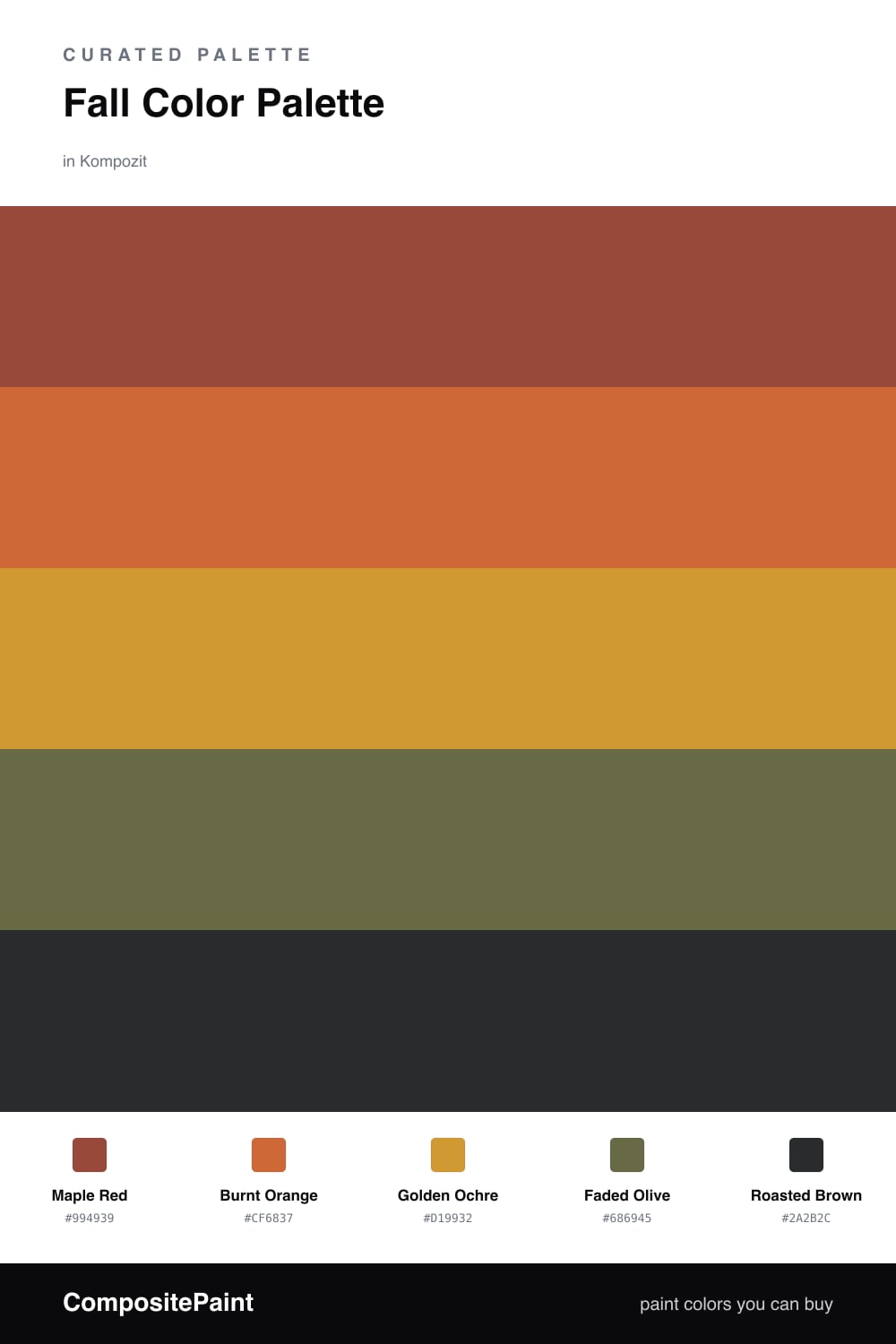
Fall palettes usually go one of two ways: too sweet and pumpkin-spicy, or so muddy they lose their glow. This one splits the difference. Maple Red leads as the dominant tone, with Burnt Orange a half-step warmer beside it, so the scheme reads like a turning tree rather than a single flat swatch.
Golden Ochre is the quiet workhorse here. It is light enough to cover big surfaces and warm enough to tie the reds and the green together, while Faded Olive adds the slightly dusty, contemporary edge that keeps the whole thing from feeling like a 1970s den.
Finish with Roasted Brown in small doses — a door, a frame, a single grounding piece. Used sparingly it gives the warmer colors something solid to push against, and that contrast is what makes the palette feel intentional instead of just seasonal.
Buy These Colors
Each color matched to the closest real paint in every brand, by ΔE2000. Kompozit first; take any SKU to the store — these mix on demand.
Questions
Lead with Golden Ochre on the largest surfaces and keep Maple Red and Roasted Brown for smaller hits. The ochre carries plenty of light, so the deeper tones read as cozy rather than heavy.
Roasted Brown. Treat it as a grounding accent on trim, a door, or one piece of furniture. A little of it sharpens the warm tones above it, but too much flattens the whole scheme.
Similar Palettes
Closest schemes by color — not by label.