Fall Leaves
A genuine burnt-pumpkin orange for a front door or one accent wall, reviewed honestly: the light that makes it glow, the light that turns it muddy, and where the color needs to stop.

Jessica has spec'd whites and neutrals for more than 300 rooms and keeps a sample wall of painted drawdowns in her studio. Every color review is checked against real reader rooms in the comments and re-tested when a formula changes. About the testing process →
- 1Burnt Cinnamon9
- 2Rookwood Terra Cotta14
- 3Fall Leaves22
- 4Caramelized35
- 5Venetian Plaster42
The Fast Verdict
Fall Leaves is Behr's straightforward answer to a real pumpkin-orange — deep and saturated, honestly orange rather than a red doing orange's job. In full sun on a front door it looks mixed specifically for autumn curb appeal; in a shaded entry or a north-facing accent wall it slides toward a flat rust-brown and loses the glow that sold it. This is a doses color, not a whole-house color, and most of the "muddy" complaints trace back to the wrong light, not a bad can.
A front door or shutters in real sun · one interior accent wall · planter boxes, a mailbox post, a small porch detail · anyone who wants an actual orange, not a red-orange bluff
You want it on more than one wall or the whole exterior · your house already has red brick, terracotta stucco or a red roof · your entry sits in permanent shade · you wanted a soft, muted autumn look instead of a saturated one
- A genuinely saturated pumpkin-orange, not a red doing orange's job
- Full sun on a front door looks custom-mixed for autumn curb appeal
- Sold across every sheen in both interior and exterior formulas — one color code covers door, trim and accents
- Deep enough (LRV 22) to hold real color instead of fading toward pastel
- Pairs cleanly with warm white bodies and near-black trim for classic contrast
- Loses its glow fast in shade or north light, reading as flat muddy rust-brown
- Too intense for more than one wall, door, or set of accents
- Fights red brick, a red roof, or terracotta stucco instead of complementing them
- Home Depot reviewers report needing real, even coats over dark or bare substrates — do not expect true one-coat coverage
What Color Is Fall Leaves, Really?
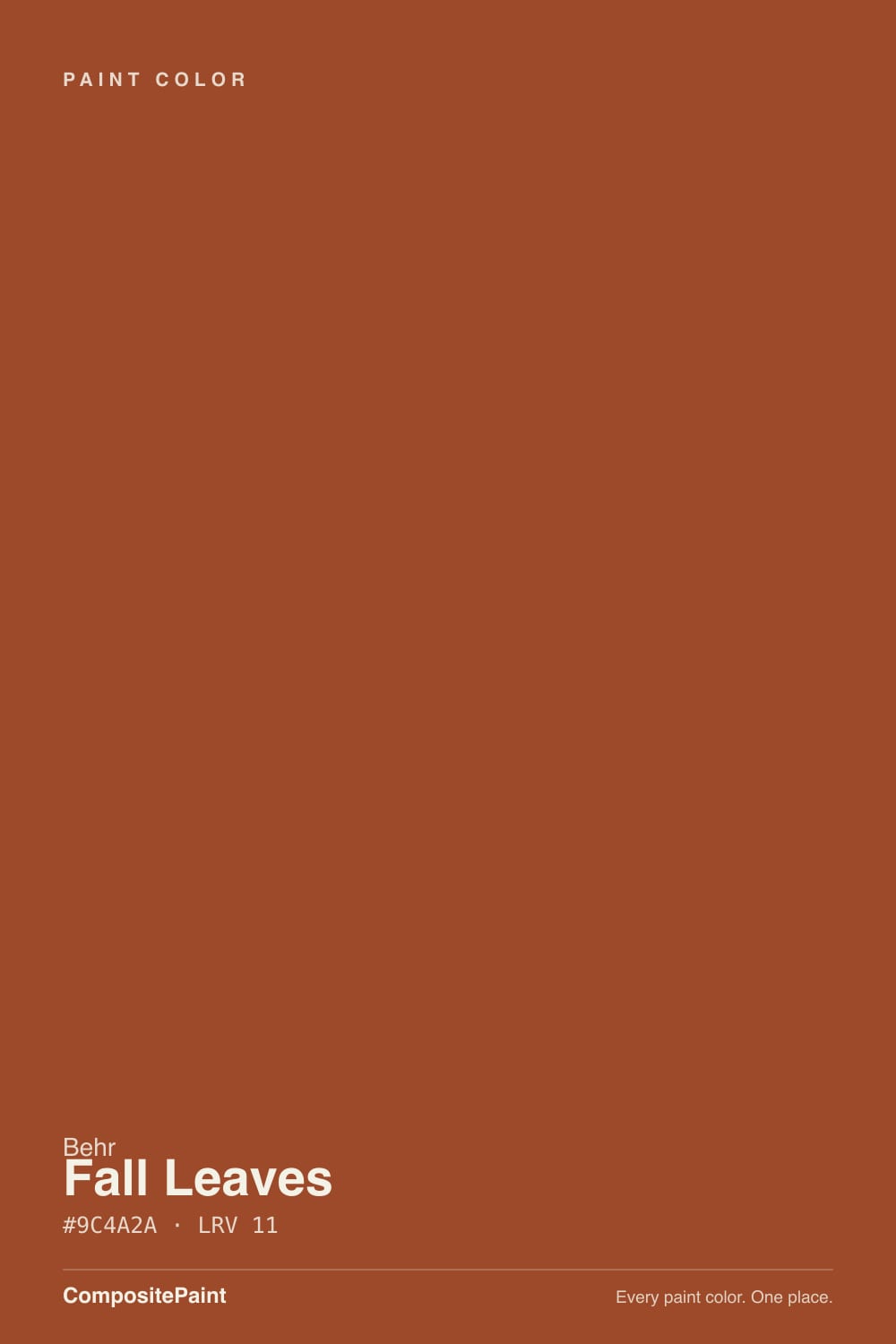
A genuine pumpkin-orange with a brown-red undertone — not a red pretending to be bold, and not a candy-orange either. Behr's own description leans on "rich, warm, earthy" and "deep, burnt orange," and that is an accurate read: the brown keeps it grounded instead of cartoonish, which is exactly why it shows up so often as a front-door color rather than a wall color. It is sold across the ordinary Behr lineup — flat, eggshell, satin, semi-gloss, interior and exterior formulas — which marks it as a workhorse deck color, not a marketing hero shade with its own campaign.
At LRV 22 it sits in genuinely deep, saturated territory, not the light "friendly orange" end of the family. Sherwin-Williams' Determined Orange lands at almost the identical LRV 22, so the two read as near-twins in depth; Behr's own Bergamot Orange (LRV 44) is roughly twice as reflective and reads as a lighter, candier orange by comparison. Fall Leaves is the deep end of the orange family — closer in weight to a rust or a burnt sienna than to a nursery-wall orange.
Undertone in one line: burnt-orange with a brown-red base, never yellow, never pink. If your sample looks flat brown with barely any orange left, that is shade or cool light doing it — not a different can.
Where It Shines
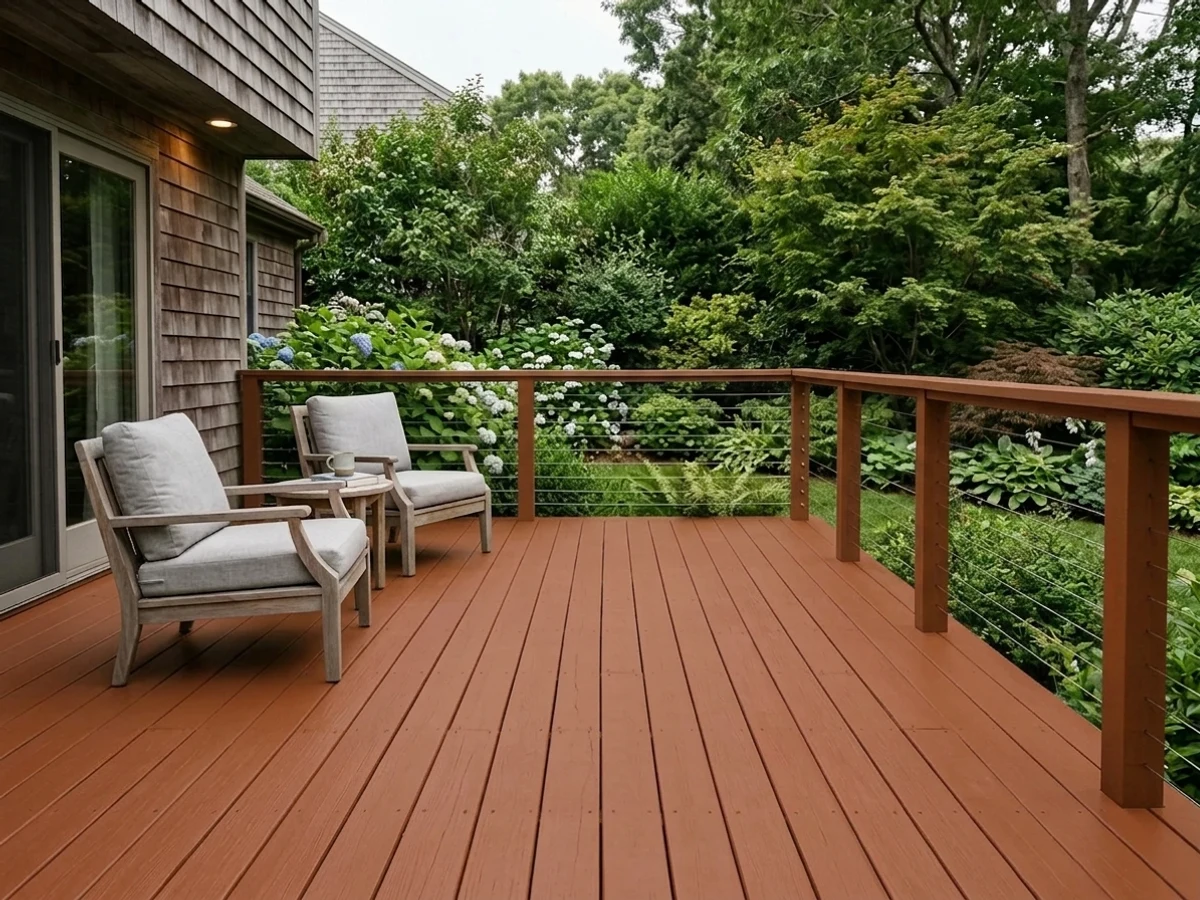
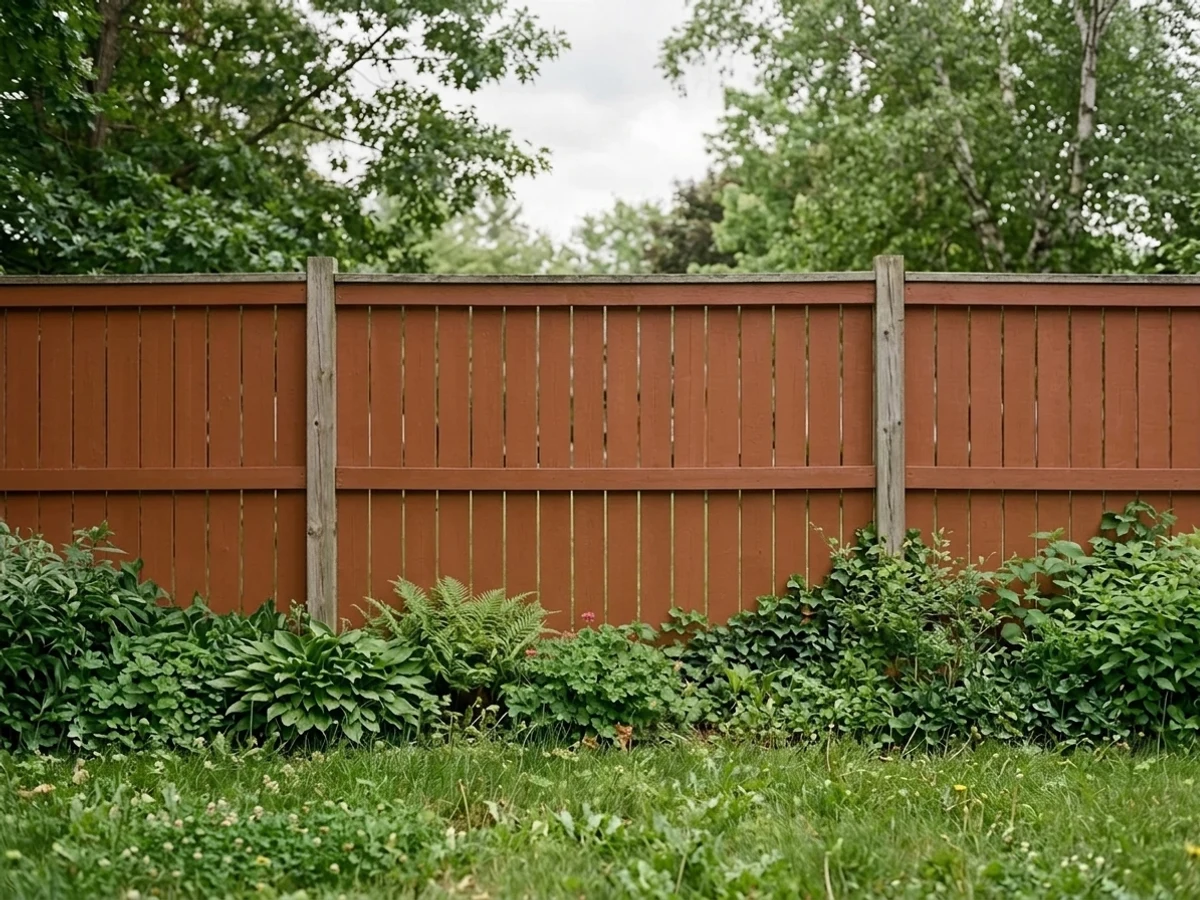
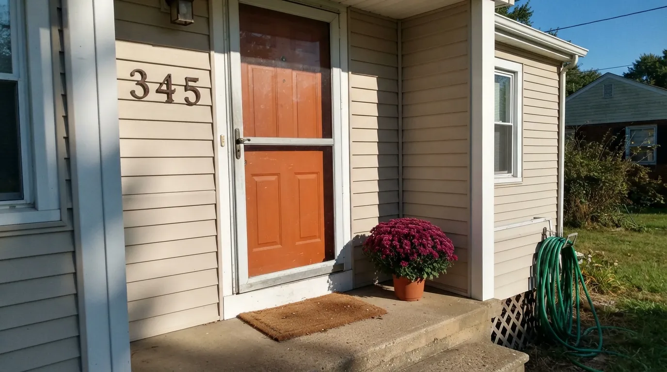
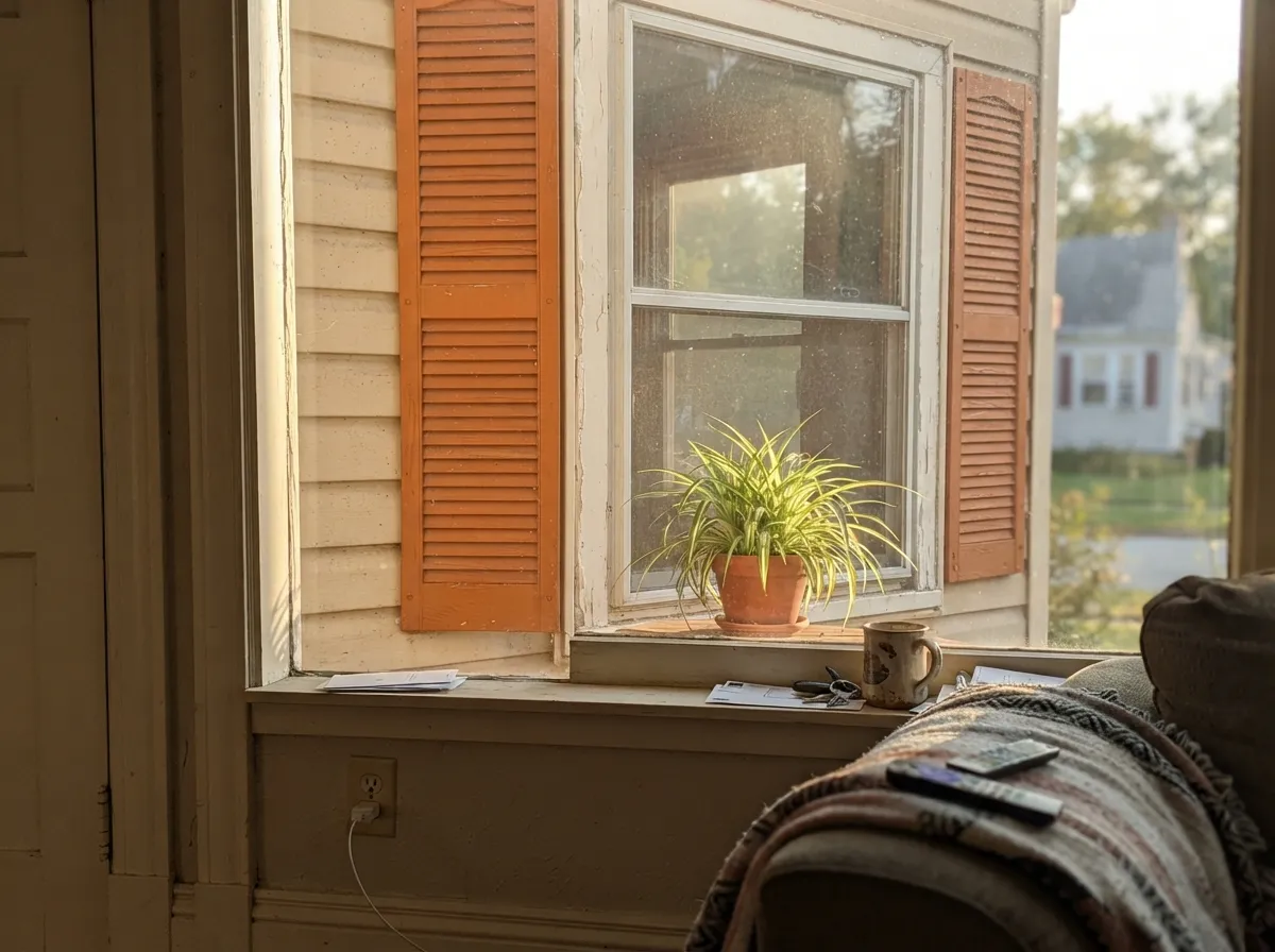
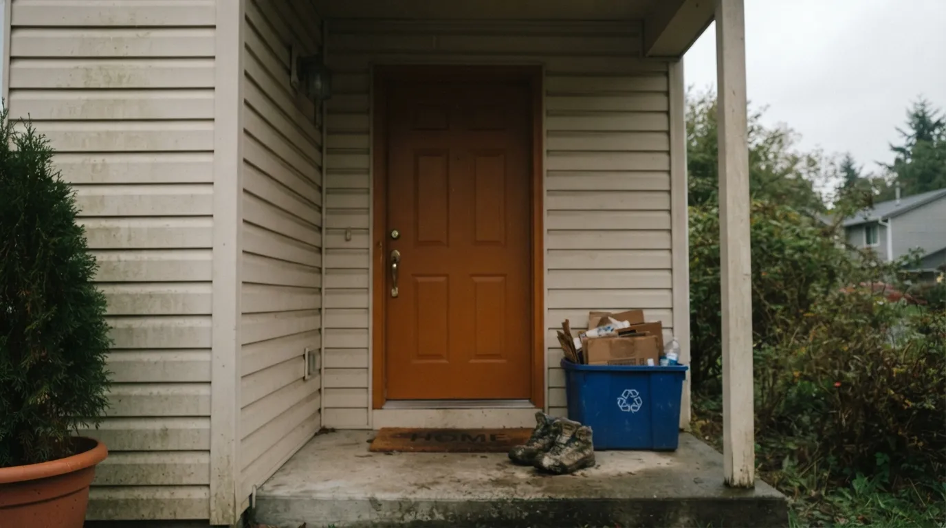
This color is built for direct sun on a small, bold surface. A front door in real daylight is its signature job — designers have been calling burnt-orange and terracotta front doors one of the entries to watch for 2026, and Fall Leaves is a textbook version of that look: warm, welcoming, and clearly intentional rather than accidental. Shutters, a mailbox post, planter boxes and other small exterior accents are its natural second home, where the saturation reads as curated instead of overwhelming.
Where It Fails
Almost every disappointed review of Fall Leaves comes from one of three predictable situations, and none of them are the paint's fault — they are the color being asked to do a job it was never built for.
This is a doses color. A whole accent wall works if the rest of the room stays quiet; a whole room or a whole house exterior in Fall Leaves reads as overwhelming, not warm. Keep it to a door, a wall, or a set of accents — never the whole envelope.
Without direct sun the orange sinks toward a flat, muddy rust-brown — the LRV 22 base color without the saturation daylight adds on top. If your entry or wall never gets real sun, this color will read as brown far more often than it reads as orange. Test a large sample in the actual light before committing.
Two warm reds fighting for attention is the most common regret from exterior use. Fall Leaves wants to be the only warm-red-orange note on the house — pair it with a neutral or gray-brown body, not another brick-red surface.
Room by Room
Semi-gloss, real sun, and a quiet body color around it. This is the use case Fall Leaves was practically built for, and the one with the most consistently good reviews.
Shutters, a mailbox post, a porch railing detail: small doses of the same saturated orange, in the same sunlight the door gets. Satin or semi-gloss for weather resistance.
At full-house scale the color stops reading as a curated accent and starts reading as a lot of orange. Use it as the accent, not the field.
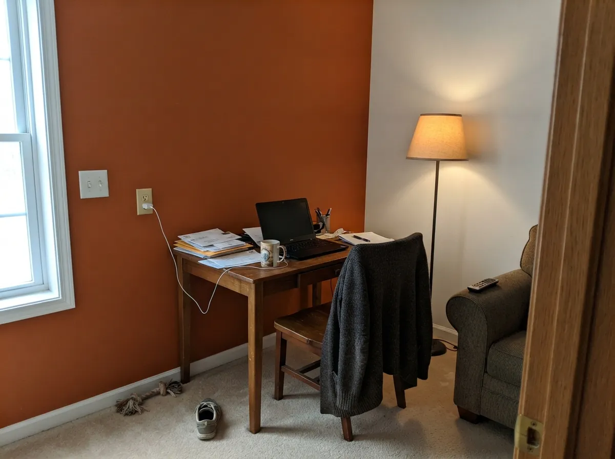
One wall in a den, office, or dining room, eggshell finish, with warm white or a quiet neutral on the other three walls. It needs real daylight or warm lamps to avoid the same muddy drift it shows outdoors in shade.
A single wall, a bench back, or the inside face of a front door works well as the color continues indoors. Full mudroom walls push toward the whole-room problem above.
There is no real track record of this color on cabinets, and its brown-orange depth is a demanding neighbor for wood tones and warm counters. A single accent detail, not a design plan, is the honest recommendation until more real kitchens prove otherwise.
Your Light Is the Risk
Direct sunlight is where the saturation shows up — a genuine glowing pumpkin-orange. This is the light the color was chosen for.
Without direct sun it sinks toward flat rust-brown and loses most of its orange energy. Sample in the actual spot before buying a gallon.
A warm flare at golden hour, flatter and more brown at midday shade. The swing is real — most owners read it as the color coming alive, not misbehaving.
A warm 2700K porch bulb keeps the door glowing amber-orange after dark; a cool white or blue-toned LED flattens it toward plain brown.
Most complaints about Fall Leaves are a light mismatch. Upload a photo of your actual room and see it on your walls — then ask for the same wall in north light or evening lamps before you buy a single sample.
Need It From Another Brand?
Any paint counter can custom-tint Behr 270D-7 directly. If you would rather stay in one brand's own deck, these are the closest stock matches, measured as ΔE2000. Under 2 is a difference you will not see on the wall.
| Brand | Closest color | ΔE | LRV | |
|---|---|---|---|---|
| Benjamin Moore | Caramel Latte2166-20 · Benjamin Moore | 3.3 | 21 | Color page → |
| Valspar | Hot WingsV046-5 · Valspar | 3.8 | 21.4 | Color page → |
| PPG / Glidden | Sesame CrunchPPG1198-7 · PPG / Glidden | 4.1 | 22 | Color page → |
| Glidden | Sesame CrunchPPG1198-7 · Glidden | 4.3 | 22 | Color page → |
| Dutch Boy | Autumn Day210-7DB · Dutch Boy | 0.2 | 22 | Color page → |
| Dunn-Edwards | Desert SpiceDE5202 · Dunn-Edwards | 3.4 | 22 | Color page → |
Similar Behr Colors
The nearest shades to Fall Leaves within Behr's own range, ranked by perceptual color distance — useful when you want the same look a touch lighter, darker, or warmer.
WCAG 2.1: AA is 4.5 : 1 for normal text, 3 : 1 for large text, AAA is 7 : 1.
Fall Leaves vs the Colors You're Also Considering
Every Fall Leaves sample board has the same rivals on it. The numbers show the real lightness gap — then it comes down to which risk you would rather live with.
Pick this for the same weight of color in the Behr deck — pick whichever brand you can actually buy locally.
Sherwin-Williams SW 6635 · LRV 22Determined OrangePick this if your painter works in Sherwin-Williams — it sits at nearly the identical depth and stays orange rather than sliding toward brown.
Pick this for the more clearly orange, less red version at almost the same depth.
Benjamin Moore 2175-30 · LRV 19RustPick this for a true rust-red — a half-step darker and redder, less orange than Fall Leaves.
Fall Leaves Coordinating Colors
The rule for coordinating with Fall Leaves: let it be the only warm, saturated note in the composition. Warm whites, quiet stucco-toned neutrals, and near-blacks all frame it well; another warm red or orange surface fights it. These are the partners that keep it looking intentional instead of loud:
Fall Leaves on Exteriors
Outside is where this color earns its keep. Designers have flagged burnt-orange and terracotta front doors as one of the entry-color trends to watch heading into 2026, and Fall Leaves is a straightforward version of that look — warm and welcoming without tipping into red. Home Depot's own reviewers rate the Marquee exterior formula around 4.2 out of 5, with the color itself drawing consistent praise; the real complaints are about coverage, not the shade.
Give it direct sun and a neutral body color and it looks deliberate. Shade drains it toward brown, and a second warm-red surface — brick, a red roof, terracotta stucco — turns the exterior into a fight between two reds instead of one confident accent. If coverage is a concern, plan on a full, even coat rather than counting on one-coat hide, especially over darker existing paint or bare wood.
Fall Leaves With Brick, Stone, and Roof Colors
This is a masonry-first decision. Gray-brown stone, tan or buff brick, and neutral stucco all sit comfortably behind a Fall Leaves door because none of them compete for the same warm-red attention. A charcoal or black composite roof is an easy, classic partner.
The one honest no is red: red brick, a red clay-tile roof, or reddish sandstone. Two saturated warm reds next to each other read as a clash rather than a coordinated scheme — pick a cooler, more muted door color instead if your house already wears red masonry.
Three Ready Palettes Built on Fall Leaves
A color is never alone on the wall. These are complete combinations in the 60-30-10 pattern, with the reason each one holds together. Every one opens in the visualizer.
A warm white body lets the door carry all the color, and near-black shutters frame it instead of competing with it — the classic curb-appeal formula for a saturated door color.
Try this palette in your roomA warm beige lets the orange read as a deliberate accent instead of a color fight, and White Dove trim keeps the edges of the bold wall crisp and intentional.
Try this palette in your roomFall Leaves and Terra Cotta Urn sit close enough in the same warm-orange family to layer without clashing, and a quiet stucco-toned body keeps the whole courtyard from turning into a color argument.
Try this palette in your roomFall Leaves FAQ
Is Fall Leaves more orange or more brown?
More orange, but a burnt, brown-based orange rather than a bright one. In real sun it reads as a genuine pumpkin-orange; in shade it leans brown. It is not a true rust-brown and it is not a candy orange — it sits deliberately between the two.
Is it too bright for a front door?
No — a front door is exactly the scale it was built for. It is far too intense for a whole exterior or a whole room, but as a single door surrounded by a neutral body, it reads as bold and welcoming rather than loud.
What trim or body color goes with a Fall Leaves front door?
A warm white or light neutral body (Alabaster, Swiss Coffee) lets the door do the talking. Near-black trim and shutters (Wrought Iron, Tricorn Black) add classic contrast. Avoid pairing it with another warm red-orange surface, like red brick.
Will it look muddy in my shaded entry?
Likely, yes. Without direct sun the color loses saturation and drifts toward flat rust-brown. Sample it in your actual entry light before buying a gallon — a north-facing or heavily shaded porch is the single biggest source of disappointed reviews.
Does it work with red brick?
Not well. Two warm reds compete instead of complementing each other. It pairs far better with gray-brown stone, warm white siding, or neutral stucco than with red or orange-toned brick.
Can I use Fall Leaves on a whole room or a whole house?
Not recommended. It is a doses color — a door, one accent wall, a set of exterior details. At full-room or full-house scale the saturation becomes overwhelming rather than warm.
Have you painted with Fall Leaves?
Rate it — one tap helps the next reader decide.
Ask a Question