CP

Autumn Color Palette — Maple Ember

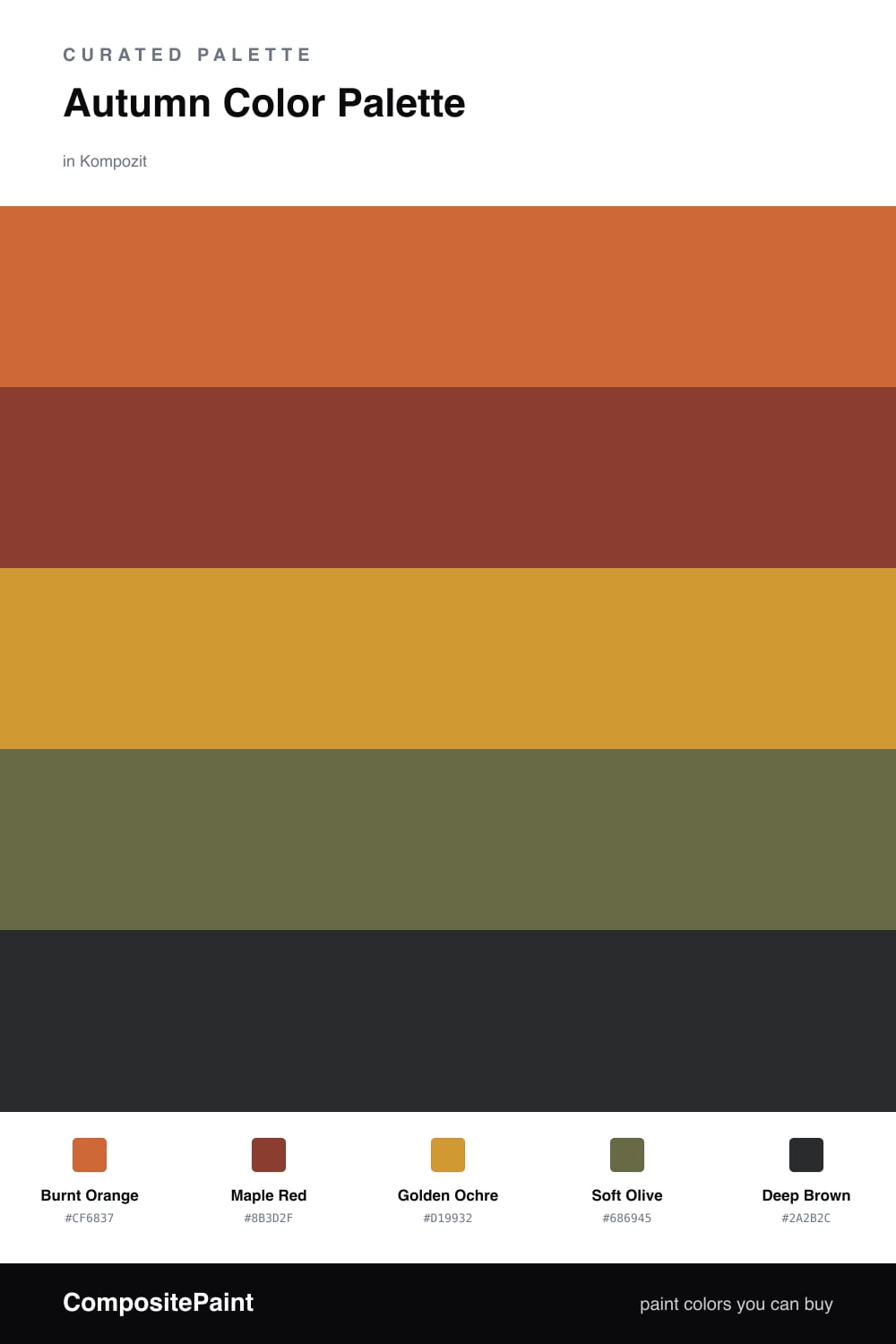
A warm five-color autumn scheme of burnt orange, maple red, golden ochre, and deep brown grounded by soft olive — every color matched to real paint you can buy.

By Emily Roberts · DIY Editor & First-Timer's Guide

Burnt Orange
Dominant
Kompozit Casa De Oro · 1026
#CF6837
LRV 23
Maple Red
Secondary
Kompozit April Love · 1061
#8B3D2F
LRV 9
Golden Ochre
Base
Kompozit Yellow Shout · 0935
#D19932
LRV 37
Soft Olive
Support
Kompozit Old School · 0410
#686945
LRV 13
Deep Brown
Accent
Kompozit Silent Sea · 0515
#2A2B2C
LRV 2
View palette in

There is something about fall that just makes you want to wrap a room in warmth, and this palette does exactly that. Burnt Orange leads the way, that toasty, glowing shade you see in turning leaves, and it sets the mood for everything else.

From there, Maple Red adds a little depth and richness, while Golden Ochre acts as a soft, sunny base that keeps the whole thing from feeling heavy. A muted Soft Olive sneaks in as the supporting player, the way a touch of green grounds a bouquet of fall leaves, and Deep Brown anchors it all like good strong coffee.

If you are nervous about going this warm, start small. Paint one feature wall in the burnt orange, keep your big surfaces in the ochre, and let the red, olive, and brown show up in pillows, throws, or a single piece of furniture. It feels fresh and grown-up for 2026 without losing that cozy, lived-in autumn feeling.

Buy These Colors

Each color matched to the closest real paint in every brand, by ΔE2000. Kompozit first; take any SKU to the store — these mix on demand.

Burnt Orange
#C4622D · LRV 21 · Dominant
Kompozit Casa De Oro · 1026 ΔE 3.15
Backdrop Old Soul · BD-OS ΔE 26.49
Behr Chivalry Copper · 240D-6 ΔE 3.37
Benjamin Moore Fall Harvest · 2168-10 ΔE 2.24
Clare Fire Sign · PNT100-DP-74 ΔE 6.5
Dunn-Edwards Clay Pot · DE5174 ΔE 3.48
Farrow & Ball Charlotte's Locks · No. 268 ΔE 6.7
Magnolia Home Work Worn Wood · JG-35 ΔE 6.53
PPG / Glidden Sesame Crunch · 1198-7 ΔE 2.48
Sherwin-Williams Determined Orange · SW 6635 ΔE 2.13
Valspar Hot Wings · V046-5 ΔE 1.68
Maple Red
#8E3B2E · LRV 9 · Secondary
Kompozit April Love · 1061 ΔE 0.9
Backdrop Punk Rock · BD-PR ΔE 5.81
Behr Firebrick · 210D-7 ΔE 2.64
Benjamin Moore Copper Clay · 2172-10 ΔE 2.39
Clare Vintage · PNT100-DP-67 ΔE 9.93
Dunn-Edwards Deep Crimson · DEA152 ΔE 3.99
Farrow & Ball Incarnadine · No. 248 ΔE 6.75
Magnolia Home Create · JG-28 ΔE 8.23
PPG / Glidden Brick Dust · 1056-7 ΔE 5.04
Sherwin-Williams Bolero · SW 7600 ΔE 2.79
Valspar Decadent Red · 2002-5A ΔE 0.57
Golden Ochre
#C99A3F · LRV 36 · Base
Kompozit Yellow Shout · 0935 ΔE 2.46
Backdrop Carry the Two · BD-CT ΔE 17.14
Behr Solid Gold · M280-6 ΔE 1.99
Benjamin Moore Fields of Gold · 203 ΔE 0.42
Clare Good as Gold · PNT100-DP-59 ΔE 6.63
Dunn-Edwards Gingerbread House · DE5334 ΔE 2.99
Farrow & Ball India Yellow · No. 66 ΔE 3.89
Magnolia Home Bright Days · JG-45 ΔE 8.89
PPG / Glidden Mayan Treasure · 1208-6 ΔE 2.67
Sherwin-Williams Crispy Gold · SW 6699 ΔE 2.12
Valspar Golden Avocado · 3008-5A ΔE 2.22
Soft Olive
#6E6A3E · LRV 14 · Support
Kompozit Old School · 0410 ΔE 3.13
Backdrop Buenos Aires · BD-BA ΔE 14.6
Behr Portsmouth Olive · HDC-CL-20 ΔE 1.86
Benjamin Moore Guacamole · 2144-10 ΔE 3.82
Clare Daily Greens · PNT100-DP-61 ΔE 10.26
Dunn-Edwards Spruce Woods · DE6238 ΔE 6.2
Farrow & Ball Bancha · No. 298 ΔE 3.61
Magnolia Home Landscape · JG-49 ΔE 3.08
PPG / Glidden Sphagnum Moss · 1111-7 ΔE 3.3
Sherwin-Williams Eminent Bronze · SW 6412 ΔE 6.29
Valspar Vineyard View · 8003-27F ΔE 1.7
Deep Brown
#3A2A1E · LRV 3 · Accent
Kompozit Silent Sea · 0515 ΔE 11.27
Backdrop Hocus Pocus · BD-HP ΔE 13.32
Behr Bitter Chocolate · 790B-7 ΔE 7.92
Benjamin Moore Bucktrout Brown · CW-180 ΔE 6.5
Clare Blackish · PNT100-DP-54 ΔE 12.69
Dunn-Edwards Black · DEA187 ΔE 10.76
Farrow & Ball Pitch Black · No. 256 ΔE 9.94
Magnolia Home Moments · JG-150 ΔE 6.36
PPG / Glidden Black Magic · 1001-7 ΔE 11.67
Sherwin-Williams Polished Mahogany · SW 2838 ΔE 7.61
Valspar Noblesse Oblige · 8004-2G ΔE 7.87

Questions

Why do these autumn colors work together?

They all share the same warm, earthy undertone, so they feel like one family instead of five separate shades. That shared warmth is exactly what makes a room feel like a cozy fall afternoon.

How do I use these colors without it feeling too much?

Let burnt orange lead and keep maple red and deep brown as smaller accents — think one bold wall, then bring the others in through pillows, art, or trim.

Similar Palettes

Closest schemes by color — not by label.