Fall Color Palette — Maple Smoke
A warm five-color autumn scheme of burnt orange, maple red, ochre, olive, and deep brown, with every color matched to real paint you can buy.
By David Chen · Formulation Lead & Resident Chemist
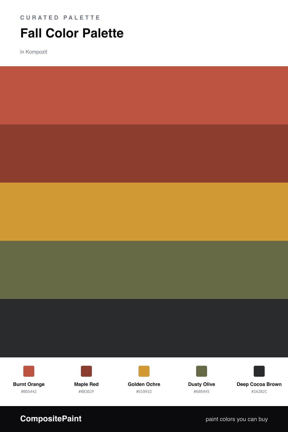
Think of a maple tree mid-October and you already have this palette in your head. Burnt Orange leads the way as the dominant color, the same glowing tone you see when low sun hits a turning leaf, and Maple Red deepens it with a touch of rust so the warmth never reads as too sweet.
Golden Ochre is the honey in the middle, a soft yellow-brown that lets the brighter tones breathe, while Dusty Olive acts as the cool, grounded bridge — the green of leaves that have not quite let go yet. It keeps the scheme from going one-note.
For 2026 the move is to skip the heavy stain look and let these colors feel a little chalky and matte. Save Deep Cocoa Brown for the smallest jobs, an inside door or a single shelf, so it anchors the room without dragging it dark.
Buy These Colors
Each color matched to the closest real paint in every brand, by ΔE2000. Kompozit first; take any SKU to the store — these mix on demand.
Questions
Pull the lightest shade out as your wall color and use the rest as smaller hits. Golden Ochre on the walls, Burnt Orange and Maple Red in textiles or a single painted piece, and Deep Cocoa Brown only where you want weight will keep the whole thing warm but airy.
Lead with Burnt Orange as your dominant note, then let Maple Red and Golden Ochre support it. Dusty Olive is the quiet bridge that cools things just enough, and Deep Cocoa Brown is the anchor you use last and least.
Similar Palettes
Closest schemes by color — not by label.