Autumn Color Palette — Moss & Maple
A warm five-color autumn scheme built on olive moss, burnt orange, and maple red, grounded by ochre and deep brown — every color matched to real paint you can buy.
By Maya Patel · Reviews Editor & Product Tester
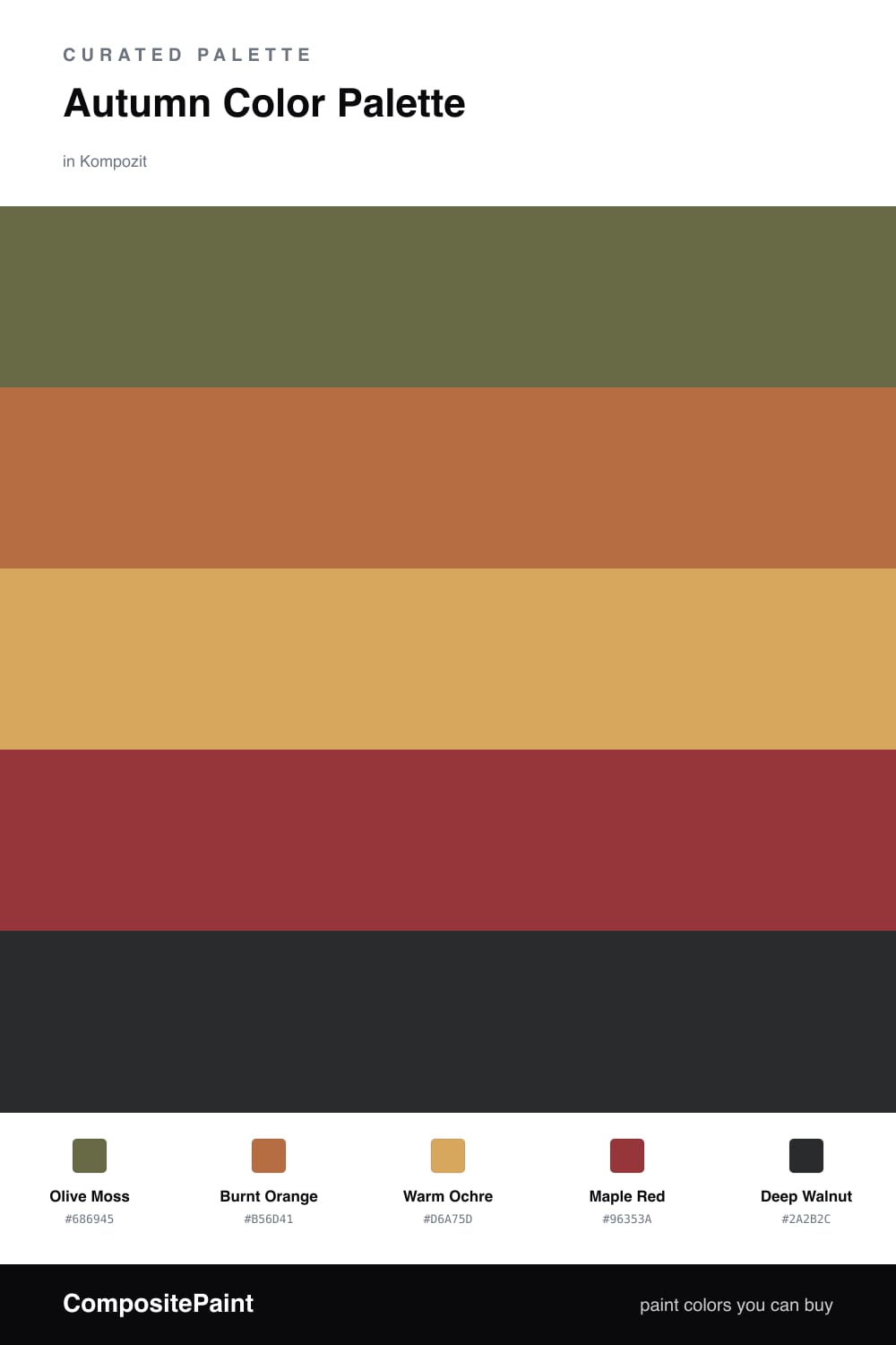
This is the autumn palette I keep coming back to, because it does not lean on the obvious pumpkin-and-rust route. The star here is Olive Moss, a muted green-gold that feels current in 2026 without trying too hard. It carries the whole scheme and reads almost neutral in daylight.
Against that quiet base, Burnt Orange and Maple Red do the talking. They are warm and saturated, but a little goes a long way, so I treat them as the spark rather than the field. Warm Ochre sits in the middle and softens the jump between the moss and the reds, which keeps the look cozy instead of loud.
Deep Walnut is the finishing move. One dark, earthy note on trim, a door, or a single piece of furniture gives the eye somewhere to rest and makes every other color look richer. The whole thing feels like a forest floor in October, which is exactly the point.
Buy These Colors
Each color matched to the closest real paint in every brand, by ΔE2000. Kompozit first; take any SKU to the store — these mix on demand.
Questions
They all share a warm, earthy undertone, so they read as one family instead of competing. The olive moss cools things down just enough to keep the oranges and reds from feeling heavy.
Let the olive moss lead on the largest surface, use ochre as the soft middle, and keep maple red and burnt orange for smaller doses. Deep walnut is your grounding note on trim or a single piece.
Similar Palettes
Closest schemes by color — not by label.