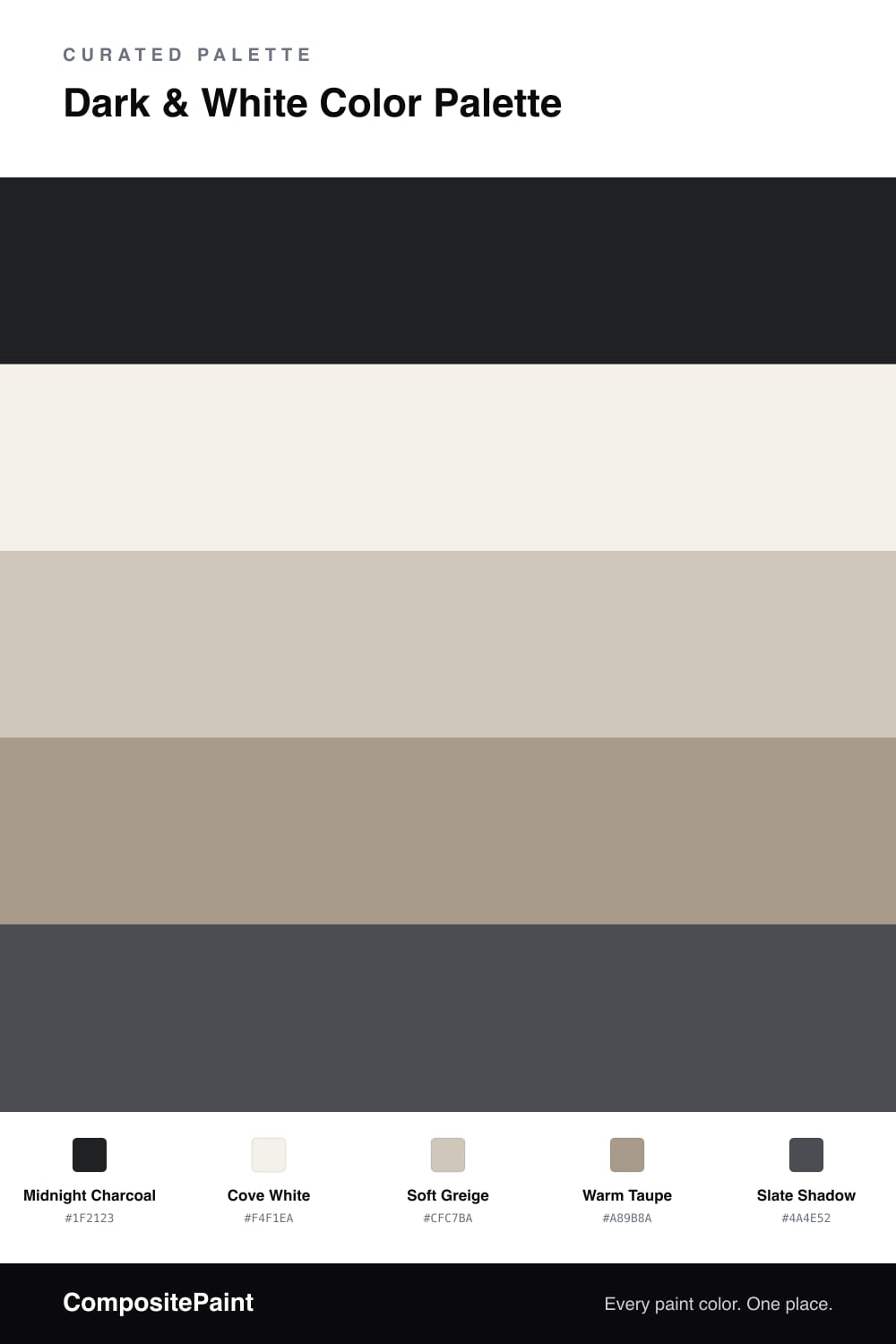
Dark & White Color Palette — Midnight Cove
A calm four-color scheme pairing a near-black charcoal with a soft warm white, steadied by gentle greige neutrals — every color matched to real paint you can buy.
By Emily Roberts · DIY Editor & First-Timer's Guide
Dark and white is one of those pairings that always looks pulled-together, and in 2026 the warm, lived-in version is winning. This scheme leans on a near-black Midnight Charcoal as the anchor and a soft Cove White that has a little warmth in it, so the contrast feels calm instead of stark.
The middle is where it gets comfortable. Soft Greige and Warm Taupe sit between the two extremes and keep everything from looking too black-and-white, while Slate Shadow adds a quiet step between the deepest dark and the neutrals. Think of these three as the breathing room that makes the bold contrast easy to live with.
If you are nervous about the dark, start small. Paint the trim, a single accent wall, or a piece of built-in cabinetry in Midnight Charcoal, keep your big surfaces in Cove White, and let the greige and taupe carry the rest. It is a low-risk way to get that high-end, contemporary look.
Buy These Colors
Each color matched to the closest real paint in every brand, by ΔE2000. Tap a swatch for its full guide or + to save it — take any SKU to the store, they mix on demand.
Questions
They give you the strongest contrast you can get, so the room feels crisp and intentional. The trick is to soften both ends — a warm white instead of stark white, and a near-black instead of true black — so the pairing reads cozy rather than harsh.
Let white lead and use the charcoal in smaller doses, maybe one wall, the trim, or the cabinets. A rough 70/30 split keeps the dark feeling like a grounding anchor instead of taking over the whole space.
Similar Palettes
Closest schemes by color — not by label.