Charcoal Entryway Palette — Iron Charcoal & Warm Walnut
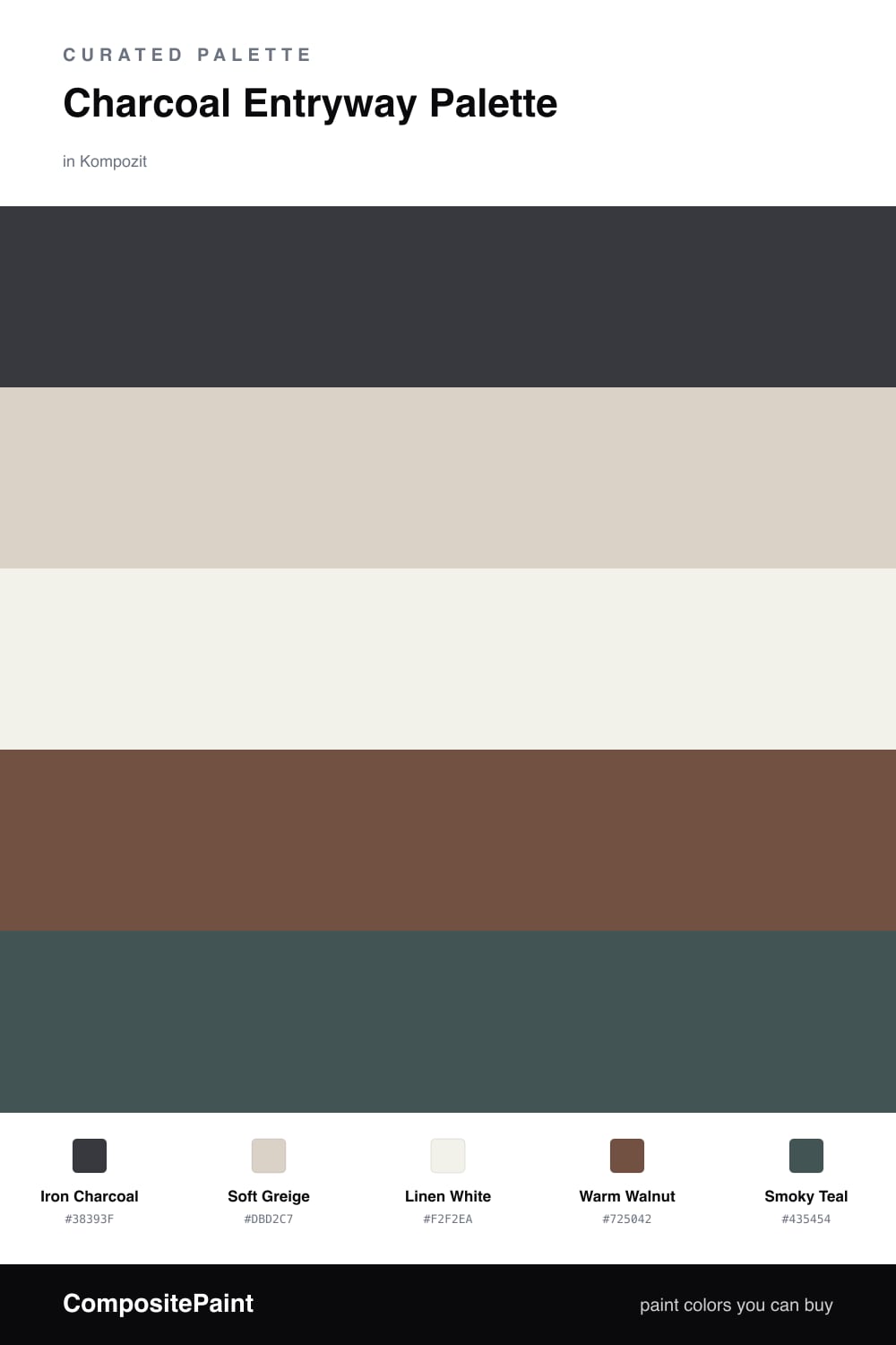
A grounded five-color entryway scheme led by deep iron charcoal with a soft greige backdrop, crisp white trim, warm walnut wood, and a smoky teal accent — every color matched to real paint you can buy.
By Emily Roberts · DIY Editor & First-Timer's Guide
An entryway is the first thing you and your guests see, so it should feel like a quiet handshake. Iron Charcoal on the walls does exactly that — it is deep and steady without going jet black, which keeps the room from feeling heavy in a small space.
To keep things bright, I lean on Soft Greige for the trim and ceiling and Linen White for a bench or built-in cubbies. That light frame is what lets the charcoal feel dramatic instead of gloomy. Warm Walnut wood tones, on the floor or a console, add the cozy warmth that stops any gray scheme from feeling cold.
For 2026 I love one confident wink of color, and Smoky Teal is it. Save it for the front door or a few small touches. A 60/20/20 mix — charcoal leading, the lights supporting, and just a sliver of teal — gives you an entry that looks pulled-together and current.
Buy These Colors
Each color matched to the closest real paint in every brand, by ΔE2000. Kompozit first; take any SKU to the store — these mix on demand.
Questions
Not when you balance it. The charcoal lands on the walls, but the trim, ceiling, and a built-in bench stay light, so the space reads cozy and welcoming instead of like a cave.
Keep the smoky teal small and intentional — a front door, a console drawer, or a runner. One pop of teal makes the charcoal feel chosen rather than safe.
Similar Palettes
Closest schemes by color — not by label.