Navy Powder Room Palette — Naval Navy & Warm Walnut
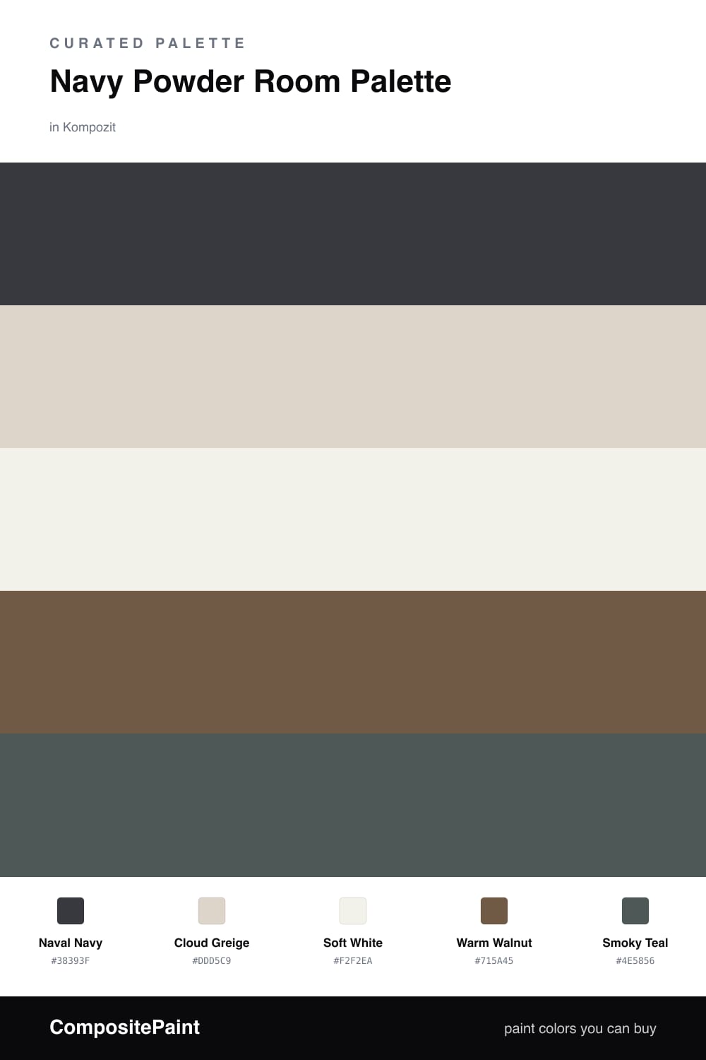
A moody five-color powder room scheme led by deep naval navy, softened with greige and crisp white, warmed by walnut and finished with a smoky teal accent — every color matched to real paint you can buy.
By Emily Roberts · DIY Editor & First-Timer's Guide
A powder room is the one space where you can be brave, because you are only in it for a minute. That is exactly why Naval Navy works so well here — a deep, saturated blue on the walls turns a tiny room into a little jewel box instead of an afterthought.
To keep it from feeling like a cave, I lift the ceiling and trim with a soft Cloud Greige and bring in Soft White on the vanity. Those two lighter tones give your eye somewhere to rest and make the navy feel intentional rather than heavy.
The warmth is what makes it cozy and current. A Warm Walnut floor or floating shelf adds a natural, lived-in note, and a touch of Smoky Teal — on a framed mirror or a painted door — ties the blues together. Lead with the navy, keep the whites doing the quiet work, and let the walnut and teal be the small, special details.
Buy These Colors
Each color matched to the closest real paint in every brand, by ΔE2000. Kompozit first; take any SKU to the store — these mix on demand.
Questions
It feels cozier, not cramped. A powder room is tiny anyway, so leaning into a deep navy actually plays to its strength — it reads like a jewel box. Keep the ceiling and trim light to bounce what little daylight you have, and add a big mirror to open it up.
Go with an eggshell or satin finish. It wipes clean near the sink, holds up to splashes, and gives the navy a soft glow without the glare you would get from a high-gloss wall.
Similar Palettes
Closest schemes by color — not by label.