Lemon Twist
Sherwin-Williams' true lemon yellow, reviewed honestly: the doors and nooks where it earns its keep, the rooms where it turns into a highlighter, and what to pick instead.

Jessica has spec'd whites and neutrals for more than 300 rooms and keeps a sample wall of painted drawdowns in her studio. Every color review is checked against real reader rooms in the comments and re-tested when a formula changes. About the testing process →
- 1Honey Tea52
- 2Jackfruit62
- 3Lemon Twist72
- 4Lemon Chiffon79
- 5Frittata86
The Fast Verdict
Lemon Twist is the yellow people picture when they say yellow: clear, saturated, faintly green-edged citrus with no cream and no gold in it. That honesty is both the appeal and the whole problem. On a pantry door, a set of playroom cubbies or a mudroom locker bank it is genuinely great — cheerful without being cartoonish, and strong enough that the color still reads from across the room. Wrap a small room in it and the same saturation turns the walls into a highlighter and casts yellow on everything, including faces. Buy it for one surface, not for a room.
Pantry doors and interior doors · playroom feature walls, cubbies and built-ins · mudroom lockers and laundry cabinets · breakfast nooks with real daylight · a front door that needs to be seen
You actually want the soft butter-yellow look · the room is a bedroom or nursery · the room is small and gets hard afternoon sun · you are painting over white and refuse to prime · your kitchen counters and floors are cool gray
- An honest, clear lemon yellow — no cream, no gold, no muddiness
- Strong enough to read from across the room on a small surface
- Makes cheap utility rooms (laundry, mudroom) genuinely fun
- Pairs cleanly with navy, bronze and muted sage without going primary-school
- Reversible commitment: one door costs a quart and an afternoon
- Overwhelming on four walls, especially in small or sun-hard rooms
- Bounces yellow onto ceilings, trim and skin tones
- Poor hiding — needs a tinted primer or three-plus coats
- Not the soft butter-yellow look most 2026 photos are selling
What Color Is Lemon Twist, Really?
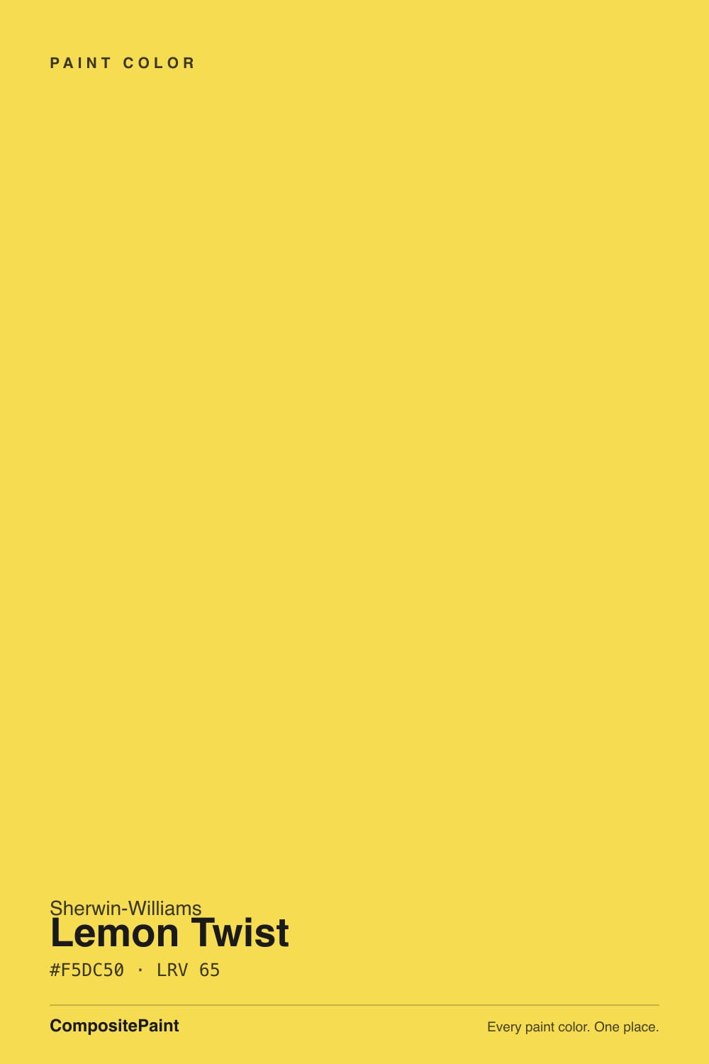
A saturated, clear lemon yellow with a faint green edge — the citrus side of yellow, not the custard side. There is no cream in it and no gold: the pigments read as fresh-cut lemon rind rather than butter or honey, and that green hair is what keeps it from going sickly-sweet in daylight. Sherwin-Williams puts it on the same strip as Fun Yellow (SW 6908, LRV 78), which is the same idea diluted; Lemon Twist is the step where the color stops being a tint and starts being a statement.
At LRV 72 it reflects a fair amount of light, but lightness is not what decides how this color behaves — chroma is. Saturated colors bounce their own hue onto every surface near them, so a full room of Lemon Twist tints the ceiling, the trim, the floor and the people standing in it. That is why the same paint that looks joyful on a single pantry door can feel exhausting on four walls of a nine-by-ten room. Compare it to Lemon Chiffon (SW 6686, LRV 79), the wall-safe yellow in the same deck: the LRV gap is real, but the saturation gap is bigger and matters more.
Undertone in one line: yellow with a hair of green — never orange, never brown. If your sample looks acid or lime-ish, that is cool north daylight or a 4000K LED pulling the green forward. If it looks golden and almost mustard, that is a 2700K bulb or low west sun. Both are the same paint reporting on your light.
Where It Shines
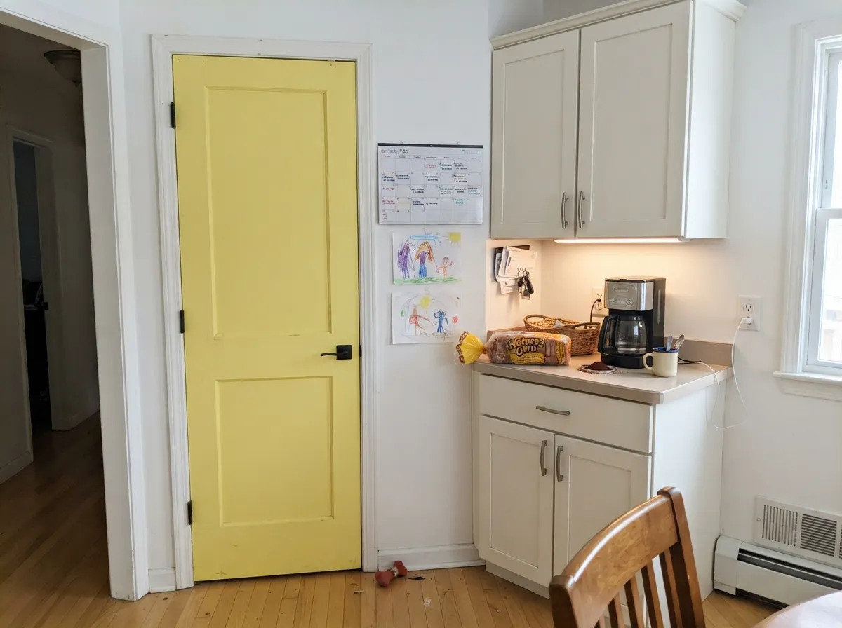
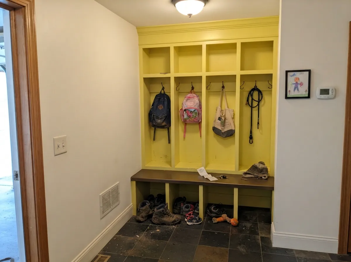
This color is built for doses. On a pantry door under warm white cabinets, on a bank of playroom cubbies, on laundry uppers or a mudroom locker wall, it does the one thing pale yellows cannot: it stays yellow from across the room instead of fading into off-white. Give it a warm white to sit against, one grounding dark like navy or bronze, and the result reads deliberate and slightly vintage rather than childish. Breakfast nooks are its other natural home — morning east light hits a citrus yellow the way it was meant to be hit.
Where It Fails
Nearly every bad Lemon Twist story comes from one of three situations, and all three are visible before you open the can. None of them mean the paint is bad — they mean the surface, the expectation, or the prep was wrong.
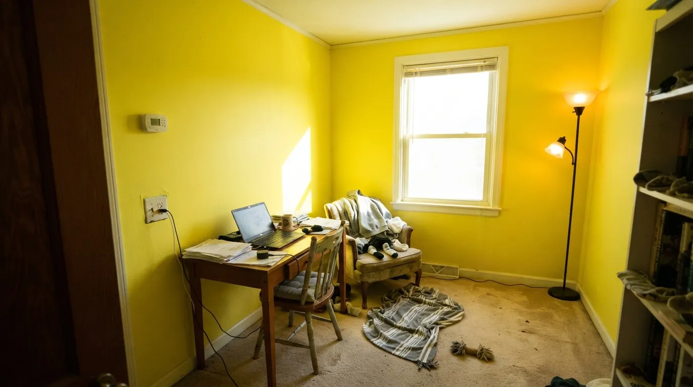
Saturation multiplies with square footage. One wall of Lemon Twist is cheerful; four walls of it in a small room with afternoon sun is a highlighter — the ceiling picks up a yellow cast, white trim looks dirty by comparison, and everyone in the room looks slightly jaundiced in photos. The fix is dosage, not a different sheen: one wall, the lower half, or the millwork only.
This is the number-one mismatch right now. The yellow moment everyone is seeing online is the soft, creamy end — Behr Butter Yellow (ICC-90, LRV 86) is pale enough to pass for a white, and BM Fresh Air (211, LRV 85) is barely a tint. Lemon Twist is several steps past both: real chroma, real citrus. If you liked the soft photos, this can will shock you on the wall.
Yellow pigments are among the most transparent in the box, which is why painters call bright yellow a poor hider. Rolled straight over white or over an old dark color it streaks, flashes at the laps, and can need three or four coats to look even. Have the store tint your primer toward the finish color and you will be done in two — this is the single most common regret that has nothing to do with the color itself.
Room by Room
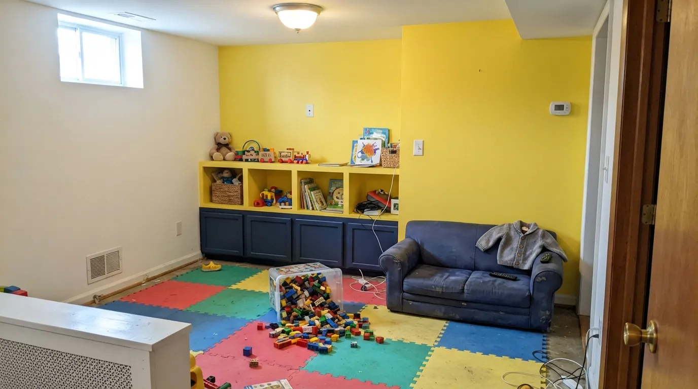
One feature wall behind the toy storage, or the cubbies and built-ins painted while the walls stay a warm white. It is high-energy on purpose, which is exactly what a play space wants and exactly what a sleep space does not. Use a scrubbable eggshell on the wall and satin on anything hands touch.
A single Lemon Twist pantry door in a warm-white kitchen is one of the best small moves in the whole deck: cheap, reversible, and it makes the room look designed. A full kitchen of lemon cabinets is a different bet, and a losing one over cool gray counters. Satin urethane-fortified cabinet enamel either way.
These rooms are usually windowless, usually boring, and nobody lingers in them long enough for the color to wear thin. Lockers, bench fronts and laundry uppers in Lemon Twist under a white ceiling turn a utility space into the happiest room in the house.
One nook wall, a built-in banquette, or the inside of a hutch. East light in the morning is the color's best hour. Do not carry it through an open-plan dining room into the living room — at that scale the bounce starts negotiating with every other color on the floor.
Saturated yellow is a stimulating color and sleep rooms are the one place that works against you. Designers consistently steer nurseries toward pale, muted yellows for this reason. If someone in the house wants yellow to sleep in, use Fun Yellow or Lemon Chiffon on the walls and save Lemon Twist for the closet door or a dresser.
A lemon front door on a white, gray or navy house is a genuinely good look and one of the safest ways to own this color. The caveat is chemistry: bright yellows lean on organic pigments that fade faster in direct UV than earth tones do. Use a top-tier exterior enamel, and expect a south-facing door to need a refresh sooner than a shaded one.
Your Light Is the Risk
The one color where cool daylight helps: it tempers the heat and keeps the lemon crisp and clean instead of hot.
Direct south or west sun on a full wall makes it glare and throw yellow across the whole room. Sample there first.
Bright citrus at breakfast, warmer and more golden by late afternoon. A wide swing — see both before you commit.
2700K lamps push it toward mustard-gold; 4000K LEDs pull the green forward and it can read acid. Pick the bulb deliberately.
Most complaints about Lemon Twist are a light mismatch. Upload a photo of your actual room and see it on your walls — then ask for the same wall in north light or evening lamps before you buy a single sample.
Need It From Another Brand?
Any paint counter can custom-tint Sherwin-Williams SW 6909 directly. If you would rather stay in one brand's own deck, these are the closest stock matches, measured as ΔE2000. Under 2 is a difference you will not see on the wall.
| Brand | Closest color | ΔE | LRV | |
|---|---|---|---|---|
| Behr | Buzz-inP300-6 · Behr | 0.9 | 71 | Color page → |
| Benjamin Moore | Amarillo320 · Benjamin Moore | 1.0 | 72 | Color page → |
| Valspar | Backlit LemonV017-2 · Valspar | 0.7 | 73.5 | Color page → |
| PPG / Glidden | MariposaPPG17-17 · PPG / Glidden | 1.5 | 70 | Color page → |
| Glidden | MariposaPPG17-17 · Glidden | 1.4 | 70 | Color page → |
| Dutch Boy | Summer's Sun118-5DB · Dutch Boy | 0.0 | 72 | Color page → |
Similar Sherwin-Williams Colors
The nearest shades to Lemon Twist within Sherwin-Williams's own range, ranked by perceptual color distance — useful when you want the same look a touch lighter, darker, or warmer.
WCAG 2.1: AA is 4.5 : 1 for normal text, 3 : 1 for large text, AAA is 7 : 1.
Lemon Twist vs the Colors You're Also Considering
Every Lemon Twist sample board has the same rivals on it. The numbers show the real lightness gap — then it comes down to which risk you would rather live with.
Pick this when Lemon Chiffon disappears into your white trim and you want a yellow that still reads yellow.
Sherwin-Williams SW 6686 · LRV 79Lemon ChiffonPick this if you want yellow you can actually put on the walls of a room — it is the wall-safe version of this idea.
Pick this for the full-strength version on a door, a cabinet run or one feature wall.
Sherwin-Williams SW 6908 · LRV 78Fun YellowPick this for the same citrus character diluted one step — the version that survives four walls of a kid's room.
Lemon Twist Coordinating Colors
The rule for coordinating with a saturated yellow is simple: one loud color per room. Give Lemon Twist a warm white to sit against and one grounding dark to hold the bottom of the room, and skip every other bright. Muted greens are the exception worth knowing — they sit beside yellow on the wheel, so they read as company rather than competition. These are the partners that keep working:
Where Lemon Twist Sits in the Butter-Yellow Moment
Yellow came back through the soft door. The version filling 2025 and 2026 kitchen features is butter: creamy, low-chroma, closer to a warm neutral than to a color. Behr's Butter Yellow (ICC-90, LRV 86) is pale enough to pass for a white, and Sherwin-Williams keeps pointing at Lemon Chiffon (SW 6686, LRV 79) for cabinetry and pantry doors. Trend commentary this year has started calling brighter lemon the next step after butter, but the paint decks are still selling the muted end.
That leaves Lemon Twist in an interesting spot. It is not a trend color — it has sat in the deck being a plain, honest lemon the whole time — and its advantage over the fashionable yellows is visibility. On a small surface, a butter yellow simply reads as off-white from six feet away; you paid for a color and got a cream. Lemon Twist does not have that problem. Use the soft yellows when you want a whole room to glow, and use this one when you want a single door, locker bank or shelf interior to be unmistakably yellow.
Lemon Twist With Wood Tones, Floors and Metals
Honey oak is the interesting case. Most fashionable colors fight golden oak; this one agrees with it, because they share the same yellow root. The risk is the opposite of a clash — the two can merge into a single wash of gold that reads unmistakably late-1990s. The fix is separation, not avoidance: keep Lemon Twist off the walls in a honey-oak room and put it on painted millwork, a door or built-ins, so there is white between the two yellows.
Walnut, espresso and painted black cabinetry are the easy wins — dark and warm gives the yellow an edge to snap against. Pale white oak and natural jute are fine. The floor to sample against carefully is cool gray LVP or gray-washed wood: gray drains the warmth out of the room and the yellow starts looking like the only thing with a pulse, which can read cheap rather than cheerful.
Metals are forgiving. Unlacquered brass and antique bronze go warm and vintage with it, matte black gives the crisp modern read, and even chrome is fine because a color this strong is not relying on the hardware for temperature. The one thing to keep away is polished gold hardware directly on a Lemon Twist door — the two golds argue at close range.
Three Ready Palettes Built on Lemon Twist
A color is never alone on the wall. These are complete combinations in the 60-30-10 pattern, with the reason each one holds together. Every one opens in the visualizer.
White on the big surfaces keeps the yellow bounce under control, so the color stays a happy accent instead of a light source. Naval at floor level gives the eye somewhere to rest and stops the room from reading like primary-color daycare.
Try this palette in your roomYellow and muted green sit next to each other on the wheel, so the pairing feels like a garden rather than a clash; Alabaster's softness keeps the lemon from turning acid the way a stark bright white would. The whole scheme costs one quart of yellow.
Try this palette in your roomA warm white wall keeps a windowless room from feeling clinical, the yellow does the cheering, and the bronze base takes the boot scuffs where a pale color would show every mark. Three colors, one small room, no risk of the yellow escaping into the rest of the house.
Try this palette in your roomLemon Twist FAQ
Is Lemon Twist too bright for walls?
For four walls of a small room, usually yes. For one wall, a nook, or the lower half of a playroom, no. The number that matters is not the LRV 72 but the saturation: strong yellow bounces its own color onto the ceiling, the trim and everyone in the room, and that effect grows with every wall you add. Sample it big, on the wall you actually mean to paint, and live with it for two days.
What white goes with Lemon Twist?
A warm white, not a stark one. Pure White (SW 7005, LRV 84) and Westhighland White (SW 7566, LRV 80) both hold their own next to it without going blue by comparison. A very bright cool white makes the yellow read acid and makes the white read gray — the same mistake people make pairing bright trim with a soft cream.
Is Lemon Twist good for a playroom?
It is one of the best colors in the deck for a playroom, as long as you dose it. Put it on a feature wall behind the storage, on the cubbies, or on the built-ins, and keep the other walls a warm white. Skip it in a room that doubles as a bedroom — saturated yellow is stimulating, which is a feature at 4pm and a problem at 8pm. Use a scrubbable eggshell on walls and satin on anything sticky hands reach.
How many coats does Lemon Twist need?
Two, if you prime properly — three or four if you do not. Bright yellows use transparent pigments and are famously poor hiders, so ask the store to tint your primer toward the color. Rolling it straight over white is the usual reason people complain about streaks and patchy laps.
What is the difference between Lemon Twist and Lemon Chiffon?
Strength. Lemon Chiffon (SW 6686, LRV 79) is a pale, softened yellow made for walls; Lemon Twist is the saturated citrus version made for a surface, not a room. If you want a whole yellow room, use Chiffon. If you want a yellow that is still obviously yellow on a single door across a bright kitchen, use Twist.
Does Lemon Twist work on a front door?
Yes — it is one of the best uses for it, especially against a white, gray or navy house with black or bronze hardware. The one honest caveat is fade: bright yellows depend on organic pigments that hold up less well under direct UV than earth tones, so use a premium exterior door enamel and expect a full-sun south-facing door to want a refresh before a shaded one does.
Have you painted with Lemon Twist?
Rate it — one tap helps the next reader decide.
Ask a Question