Fun Yellow
The playroom yellow that actually reads yellow, reviewed honestly: where it glows, the light that turns it banana, and what to pick instead.

Jessica has spec'd whites and neutrals for more than 300 rooms and keeps a sample wall of painted drawdowns in her studio. Every color review is checked against real reader rooms in the comments and re-tested when a formula changes. About the testing process →
- 1Honey Tea52
- 2Jackfruit62
- 3Fun Yellow78
- 4Frittata86
- 5Barely Yellow92
The Fast Verdict
Fun Yellow is the color people think they are getting when they buy a butter-yellow chip and then don't. It is a genuine, light-but-saturated yellow — cheerful, clean, no mustard, no neon — and on four walls nobody will mistake it for an off-white. That honesty is the whole point in a playroom and the whole problem in a west-facing living room. Pick it on purpose or don't pick it at all.
Playrooms and kids' rooms · windowless laundry rooms and mudrooms · a sunny kitchen with plain white cabinets · one accent wall in a room that needs waking up
Your room takes direct afternoon sun · you actually wanted the pale butter-yellow trend color · the room is dim and north-facing · you are painting to sell
- A yellow that actually reads yellow — no mustard, no neon, no cream confusion
- LRV 78 bounces light like an off-white while carrying real color
- The rare color kids pick that adults can still live with
- Makes a windowless laundry or mudroom read sunny under warm bulbs
- Plain white trim is all it needs — the rest of the room can stay simple
- Direct sun multiplies it — the wall you sampled at 10am is a different color at 5pm
- Weak-hiding pigment: budget three coats and the right primer
- Dim north light turns it sour and faintly olive
- Bounces yellow onto white trim, ceilings and faces — it tints the room, not just the wall
What Color Is Fun Yellow, Really?
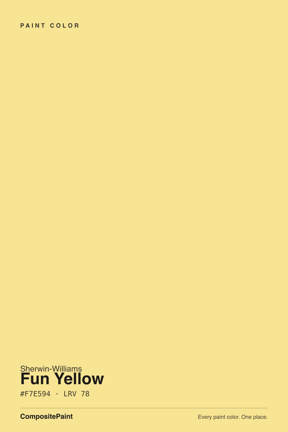
A clear, light golden yellow with real pigment in it. The mix is the giveaway: red and green sit near the top of the scale while blue drops to about 58 percent, and that gap is what makes the wall read as color instead of as a warm white. Sherwin-Williams filed it in the cheerful end of the deck and named it accordingly — this is a crayon-box yellow that has been lightened until an adult can live with it, not a cream that happens to lean warm. There is no mustard in it and no neon either; it lands almost exactly where most people picture the word yellow.
At LRV 78 it bounces about as much light as a warm off-white, and that number fools people. Lemon Chiffon (LRV 79) sits at essentially the same brightness with far less pigment, and Behr's Butter Yellow (LRV 86) is pale enough to pass for white on a wall. Fun Yellow is the same brightness class carrying two or three times the color. If you shop by LRV — and a lot of readers now do — this is the one that surprises you, because brightness and saturation are different things and only one of them is printed on the chip.
Undertone in one line: golden yellow first, a faint green under-cast second, no red in it at all. It never goes peach or apricot the way a warm cream does. When it misbehaves it goes one of two directions — sour and slightly olive in cool, dim light, or straight to banana under a direct sunbeam.
Where It Shines
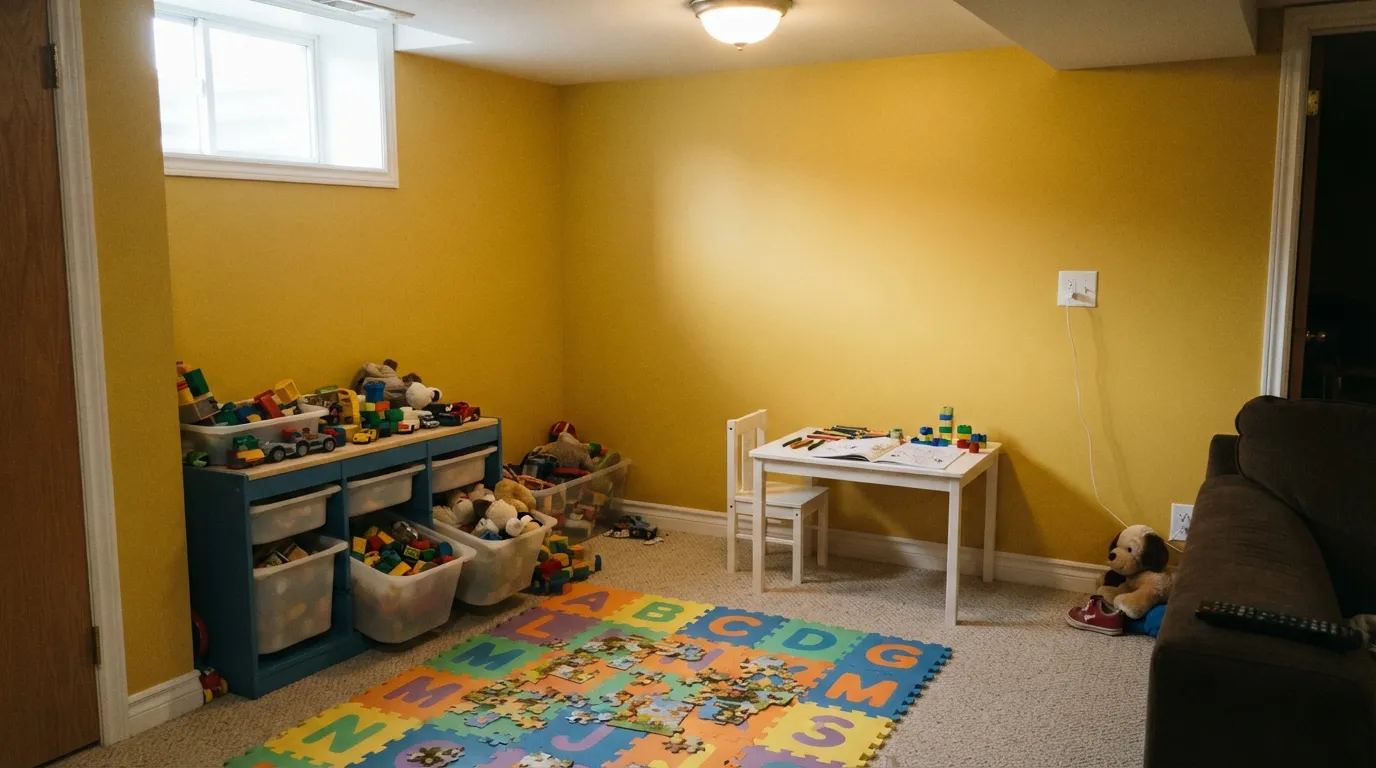
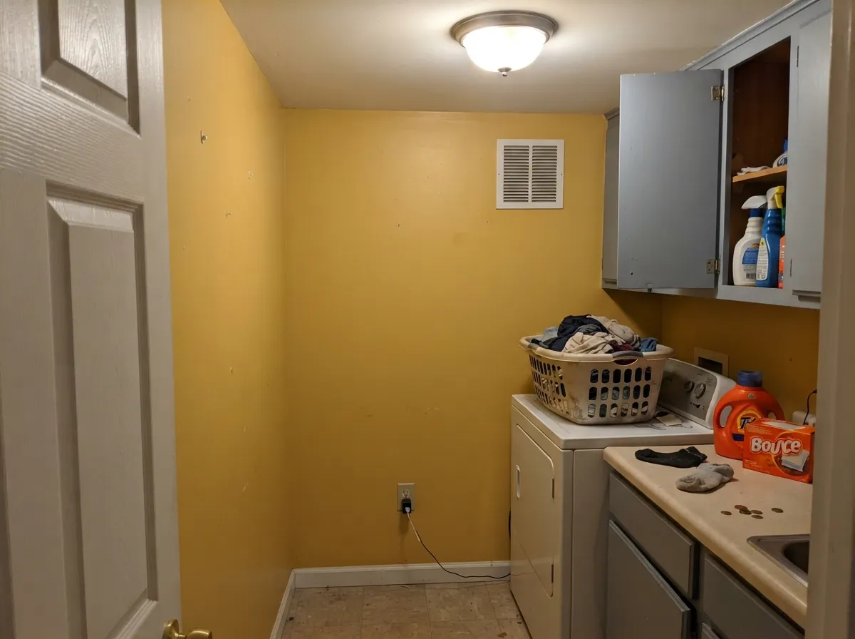
This color belongs in rooms you move through or play in, not rooms you sit still in for eight hours. A playroom is its best argument: it is one of the very few colors a five-year-old and a parent will both agree to, and at LRV 78 it keeps a basement-adjacent bonus room from feeling like a bunker. Its quiet second life is the small utilitarian room — a windowless laundry, a mudroom, a back entry — where warm bulbs and a coat of this make a room with no window read as if it had one.
Where It Fails
Nearly every regret story about a yellow this saturated follows one of three scripts, and all three are visible before you open the can. None of them are the paint's fault — but if your room matches one, sampling a bigger square will only confirm it faster.
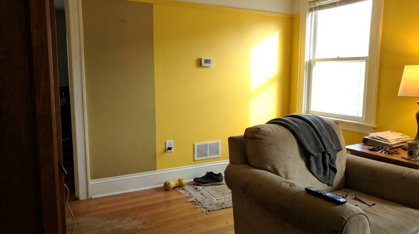
This is the warning that shows up in every honest write-up of the color: put it where the sun actually lands and it goes WAY more yellow — banana, highlighter, the shade nobody sampled for. Saturated yellow has nowhere to go but up when light multiplies it, and it bounces onto the trim and ceiling too, so the whole room tints. Sample on the wall that gets the beam, at the hour it gets it, and judge it then.
The current trend color is a pale, milky yellow that reads as a warm white with an idea. Fun Yellow is not that — it is a full step past it, and the store chip understates it because a two-inch square always does. If your reference photos are all soft cream kitchens, you want Behr Butter Yellow (LRV 86) or SW Lemon Chiffon (LRV 79) and you will be unhappy here by the second wall.
Yellow pigment is among the weakest-hiding in any deck, and this one is no exception: over a white wall expect three coats, and over anything dark expect more. The classic mistake is a gray-tinted primer, which is right for red and wrong for yellow — it kills the pigment and you keep rolling. Prime with a white or yellow-tinted primer instead, and buy more paint than the calculator says.
Room by Room
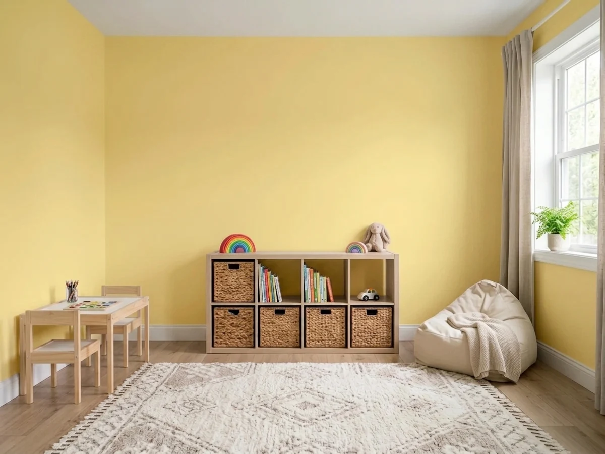
This is the room the color was named for and the one it genuinely wins. Designers who work in kids' spaces make the same point about saturation: pick one energetic color and keep the rest of the room calm. Fun Yellow is a good candidate for that one color, especially on the lower two-thirds of the wall with white above, so the energy sits at kid height instead of overhead. Scrubbable matte or eggshell — playroom walls get touched.
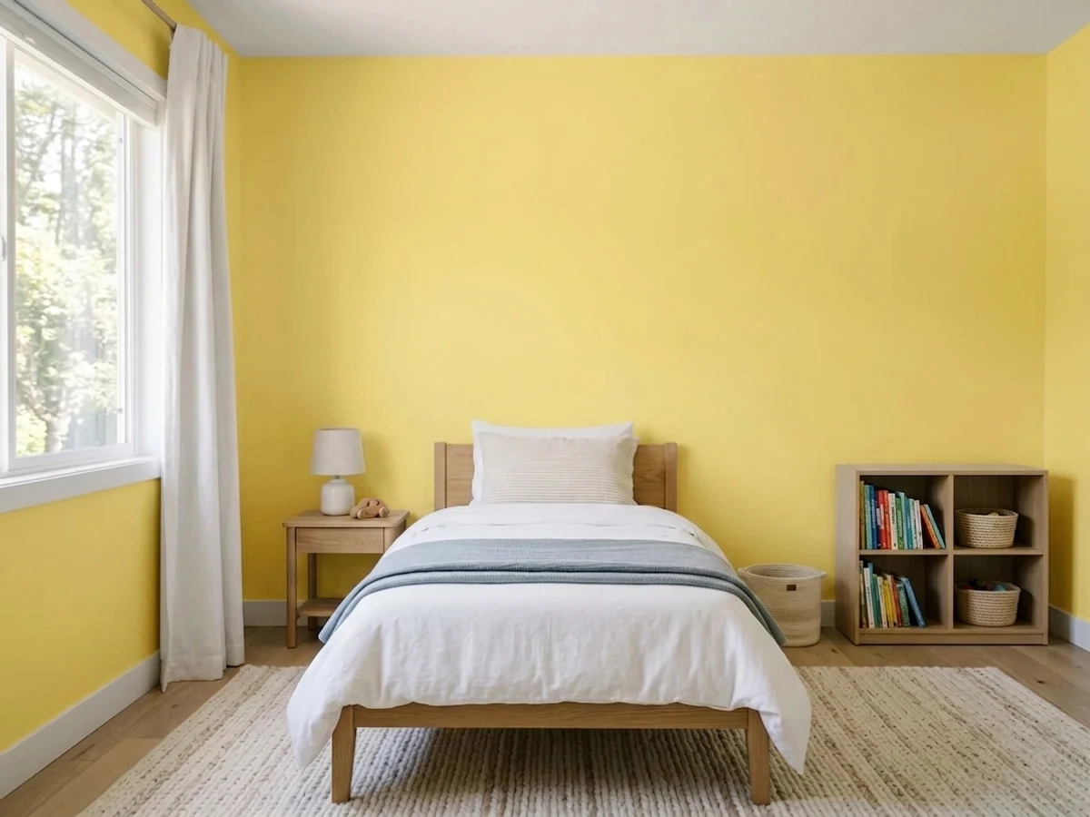
It works, but a bedroom is a sleep room first. One wall behind the bed, or a wall of yellow built-ins against white walls, gets the cheerfulness without a room that hums at 8pm. Four walls plus a north window is the combination that goes sour — the light drops and the green under-cast surfaces. Keep the bulbs at 2700K.
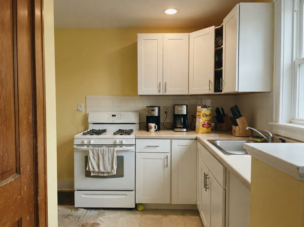
Yellow kitchen walls above plain white shaker cabinets is an old idea that keeps working, and Alabaster (LRV 82) is the cabinet white that fits it best — soft enough not to cut a hard edge against the color. Skip it if your cabinets are honey oak; a golden wall over a golden cabinet leaves the room with no separation anywhere.
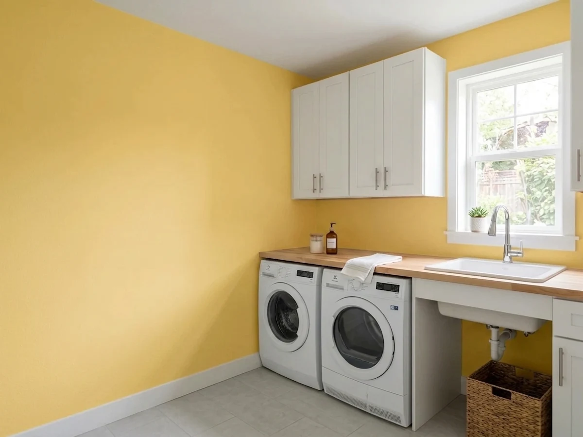
The best low-risk use of the color. These rooms are small, usually windowless, and nobody lingers in them, so the saturation reads as a lift rather than a shout. Under warm bulbs it fakes daylight convincingly. Pair with a cool light gray on the cabinets so the yellow has something to push against.
In a big daylit room a full drench of this is a commitment most people regret by year two, and in an open plan it has to negotiate with every adjacent room. One wall, a built-in bookcase back, or a sunny breakfast corner keeps the good part. A whole living room in it is a decision, not a default.
Outside, full sun washes a light yellow toward faded cream from the street, so it reads as a house that needs repainting rather than a house that chose a color. A yellow front door is a genuinely good move, but not at LRV 78 — go down to Lemon Twist (LRV 65), which still reads yellow from the curb.
Your Light Is the Risk
A big window with no direct beam. It holds the exact yellow you sampled all day — clean, not hot.
Cool, weak light drains the gold and lets the green under-cast surface — a sour, olive-tinged yellow.
East: radiant at breakfast, calm by noon. West: quiet until about 4pm, then a gold-to-banana hour.
2700K lamps push it toward butterscotch. Cool 4000K LEDs flatten it and pull the green forward — change the bulbs.
Most complaints about Fun Yellow are a light mismatch. Upload a photo of your actual room and see it on your walls — then ask for the same wall in north light or evening lamps before you buy a single sample.
Need It From Another Brand?
Any paint counter can custom-tint Sherwin-Williams SW 6908 directly. If you would rather stay in one brand's own deck, these are the closest stock matches, measured as ΔE2000. Under 2 is a difference you will not see on the wall.
| Brand | Closest color | ΔE | LRV | |
|---|---|---|---|---|
| Behr | Storm LightningP310-4 · Behr | 1.4 | 79 | Color page → |
| Benjamin Moore | San Fernando Sunshine360 · Benjamin Moore | 1.4 | 79 | Color page → |
| Valspar | Chickery Chick3008-2A · Valspar | 2.0 | 80.2 | Color page → |
| PPG / Glidden | Twinkle Little StarPPG1211-4 · PPG / Glidden | 1.3 | 80 | Color page → |
| Glidden | Harvest Moon60YY 74/371 · Glidden | 1.8 | 74 | Color page → |
| Dutch Boy | Rachel's Smile118-4DB · Dutch Boy | 0.0 | 78 | Color page → |
Similar Sherwin-Williams Colors
The nearest shades to Fun Yellow within Sherwin-Williams's own range, ranked by perceptual color distance — useful when you want the same look a touch lighter, darker, or warmer.
WCAG 2.1: AA is 4.5 : 1 for normal text, 3 : 1 for large text, AAA is 7 : 1.
Fun Yellow vs the Colors You're Also Considering
Every Fun Yellow sample board has the same rivals on it. The numbers show the real lightness gap — then it comes down to which risk you would rather live with.
Pick this when you want the wall to be unmistakably yellow instead of a warm cream that catches the light.
Sherwin-Williams SW 6686 · LRV 79Lemon ChiffonPick this for the creamier, softer take — nearly the same brightness with far less pigment, so it reads buttery rather than golden.
Pick this when you want the room to be yellow, not merely warm.
Behr ICC-90 · LRV 86Butter YellowPick this for the current butter-yellow look — it is pale enough to work as a whole-house warm white.
Fun Yellow Coordinating Colors
The rule with a saturated yellow is the opposite of the rule with a warm neutral: it needs something cool in the room, or it has no edges. Plain whites and cool light grays give it a boundary, muted greens meet its faint green lean halfway, and one deep note keeps the scheme from floating. These are the partners that keep showing up in rooms that actually work:
How Much Yellow a Kids' Room Can Take
The color-psychology literature on children's spaces is unusually consistent on one point, and it is not about hue — it is about saturation. Muted yellows read as cheerful and welcoming; vivid, high-chroma yellows are stimulating, which is useful in a room built for building and drawing and wrestling, and counterproductive in a room built for sleeping. The standard designer prescription for a playroom is one saturated color plus a calm supporting cast, not a room where every surface competes.
That translates into a practical rule for this specific color. A playroom or bonus room: yes, and you can be generous — all four walls works if the room has bright indirect light and white trim. A shared kids' bedroom: one wall, or the lower two-thirds with white above, so the color lives at floor-play height and the sleeping half of the room stays quiet. A nursery: use it on furniture, not walls. And in every one of these rooms, put a cool color somewhere — blue storage bins, a gray rug, gray cabinet fronts — because a room that is yellow and warm-wood and cream has nothing to rest your eye on.
Fun Yellow With Wood Tones, Floors and Trim
This is where most yellow rooms are won or lost, and the answer is counterintuitive: the safest floors under a strong yellow are the cool ones. Gray-washed wood, pale white oak, gray LVP, a plain gray carpet, even sealed concrete in a basement playroom — all of them give the yellow a boundary and let it read as a deliberate color rather than as a general golden haze.
Honey oak is the one honest no. Golden floors, orange-stained trim and a golden wall put three warm yellows in the same room with nothing between them, and the result is a room with no depth — everything is the same temperature and nothing separates. A large cool rug helps in a small room; in a big one, pick a different wall color or refinish the floor. Cream carpet has a milder version of the same problem: it goes dingy next to a wall this clean.
Trim follows the same logic. Fun Yellow is one of very few wall colors that prefers a plain neutral white over a warm one — a cream trim next to it disappears into the wall and the room loses its lines. Metals are easy: black, chrome and brushed nickel all give the cool counterweight, while unlacquered brass is the one finish that pushes an already-golden room further into golden.
Three Ready Palettes Built on Fun Yellow
A color is never alone on the wall. These are complete combinations in the 60-30-10 pattern, with the reason each one holds together. Every one opens in the visualizer.
The color-psychology advice for kids' rooms is consistent: one energetic color, everything else calm. Keeping Fun Yellow below a chair-rail line puts the energy at kid height and leaves the top half of the room quiet, and Pure White is neutral enough that the yellow doesn't tint it. Honolulu Blue on the storage adds a second playful note without a second loud wall.
Try this palette in your roomAlabaster is the soft cabinet white that sits against yellow without cutting a hard line — a bright, cold trim white would make the walls look like a mistake. Evergreen Fog on the island grounds the room and shares the yellow's faint green lean, so the two read as one family instead of two decisions.
Try this palette in your roomSherwin-Williams pairs this yellow with Gray Screen in its own coordinating list, and the reason holds up: a cool, plain gray gives the yellow something to push against so it reads crisp instead of syrupy. In a small utility room the crisp edge of Extra White is an asset rather than the liability it would be in a living room.
Try this palette in your roomFun Yellow FAQ
Is Fun Yellow too bright for a playroom?
On four walls in a small room with afternoon sun, probably yes. On one wall, on the lower two-thirds of the room, or on built-ins and a toy wall, it is close to ideal — designers who specialize in kids' spaces give the same advice: one saturated color, the rest of the palette calm. The problem is never the color, it is the dose.
What white trim goes with Fun Yellow?
A plain, neutral white — Pure White (LRV 84) is the default and Extra White (LRV 86) if you want the edge crisper. Avoid a warm cream trim: cream next to yellow blurs the line and the whole room reads like one big golden smudge. This is the rare wall color that actually prefers the cooler white.
How many coats does Fun Yellow need?
Plan on three over a white or light wall, more over anything dark. Yellow pigment hides poorly by nature. Do not let anyone hand you a gray-tinted primer — gray is the right base under red, and it swallows yellow. A white or yellow-tinted primer saves you a coat and a Saturday.
Is Fun Yellow good for a nursery?
It would not be our first pick. A nursery is a sleep room, and a saturated yellow at close range is stimulating in exactly the way you don't want at 2am — the same advice that makes it a good playroom color makes it a questionable crib-side one. If you want yellow in a nursery, drop to Butter Yellow (LRV 86) or use this on a dresser and keep the walls quiet.
What colors go with Fun Yellow?
Cool light grays and plain whites give it something to push against; a soft sage or muted green shares its faint green lean; a deep navy is the classic anchor when the room needs one dark note. What to avoid is another warm golden thing — honey oak floors, cream trim, brass everywhere — because with nothing cool in the room the yellow has no edges.
Will Fun Yellow look green on my wall?
In dim, cool, north-facing light, a little — the gold drains out and what's left leans slightly olive. In good daylight or under warm bulbs it never does. If your sample looks green, that is your light telling you the truth about the room, and no second coat will change it.
Have you painted with Fun Yellow?
Rate it — one tap helps the next reader decide.
Ask a Question