Statuary
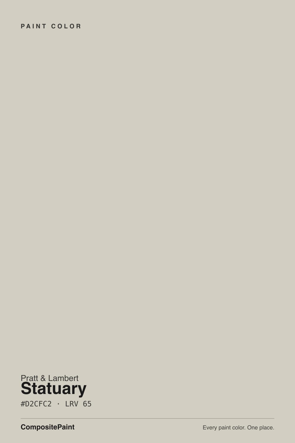
The pale stone greige Pratt & Lambert kept for Williamsburg trim, reviewed honestly: where it reads like marble, the rooms where it goes dingy, and what to pick instead.

Jessica has spec'd whites and neutrals for more than 300 rooms and keeps a sample wall of painted drawdowns in her studio. Every color review is checked against real reader rooms in the comments and re-tested when a formula changes. About the testing process →
- 1Revere Pewter55
- 2Agreeable Gray60
- 3Statuary65
- 4Shoji White74
- 5Dover White83
The Fast Verdict
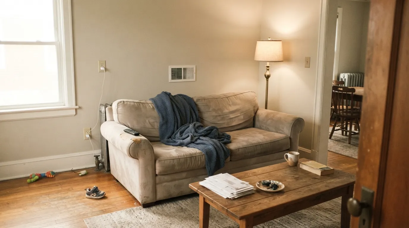
Statuary is a pale warm-gray that wants to be stone, not paint: low-chroma, yellow-beige at the base, grayed just enough to pass for marble plaster instead of beige. Pratt & Lambert filed it next to the 32-series grays and used it as Williamsburg trim — a quieter frame than any true white. On four walls in real daylight it is a very good light greige. In a dim north room, or next to a bright spec white, it looks dirty. That is the whole review.
Williamsburg-style and traditional interiors · trim against deeper historic walls · whole-house light greige in real daylight · oak floors and brass
The room faces north and stays dim · you want a crisp cool gray · your floors or counters are cool grey · you need a color every store stocks
- Reads as pale stone, not beige and not builder gray
- LRV 65 is light enough for whole-house walls in real daylight
- Genuinely excellent as trim against deeper historic colors
- Flatters oak, walnut, brass, and cream stone
- Quieter and less trendy than the big-box greiges it sits next to
- Goes dingy and dirty-beige in dim north rooms
- Looks unwashed next to a bright spec white
- Yellow-beige flash against cool grey floors and marble
- Pratt & Lambert is harder to buy than Sherwin or Benjamin Moore
What Color Is Statuary, Really?
A pale warm-gray built on a yellow-beige base, then grayed down until the beige almost disappears. That is why it is named Statuary: it is trying to look like unpolished marble plaster — the color of a cast, not a cream wall. Saturation is low, so it never reads as a true beige or a true gray. On a chip it looks almost like a warm off-white. On four walls the stone shows up.
At LRV 65 it sits in a useful gap. It is a step lighter than Edgecomb Gray (LRV 63) and Agreeable Gray (LRV 60), and a step deeper than Pale Oak (LRV 69). Light enough to keep a room open; deep enough to look like a color, not a dirty white. Pratt & Lambert parked it at 32-14, between Sterling (32-13, a heavier warm gray) and Iceland (32-15, a cooler blue-gray). The number is the hint: this is a gray-family color that kept its warmth. In the brand's Williamsburg lineup it has long been the trim spec — pale stone woodwork against deeper historic walls — which is still the job it does best.
Undertone in one line: warm yellow-beige, grayed out — never pink, never green, never a cool gray. If your sample looks yellow, you put it next to a brighter white or a cool grey floor. If it looks drab, the room does not have enough light. Both versions are the same paint reporting the room.
Where It Shines
Give it daylight and warm wood and it looks expensive in a quiet way — the color of limestone, not of a trend deck. Its real home is still trim: semi-gloss Statuary on casings, doors and built-ins against a deeper wall (Williamsburg Stone, Sterling, a muted olive) is the historic move, and it still looks right. On four walls in a south- or west-facing room it behaves like a lighter Edgecomb Gray — calm, warm, and finished — especially with oak floors and brass.
Where It Fails
Almost every bad Statuary room follows one of three scripts, and you can predict all three before the first coat. None of them are a formula problem. If your room matches one, this is not your greige.
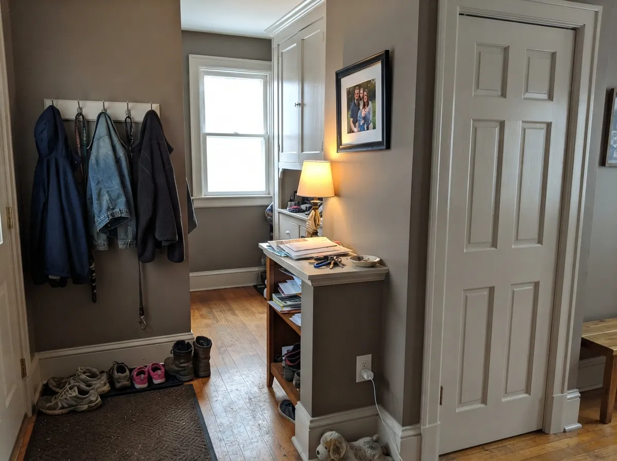
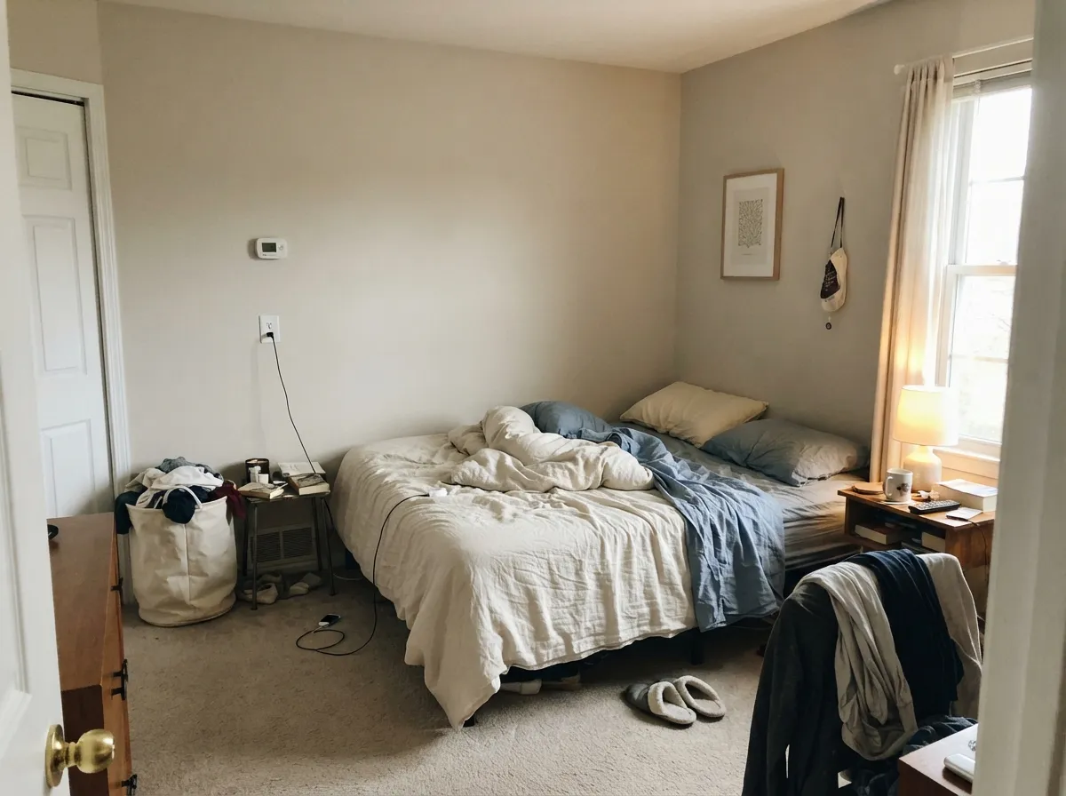
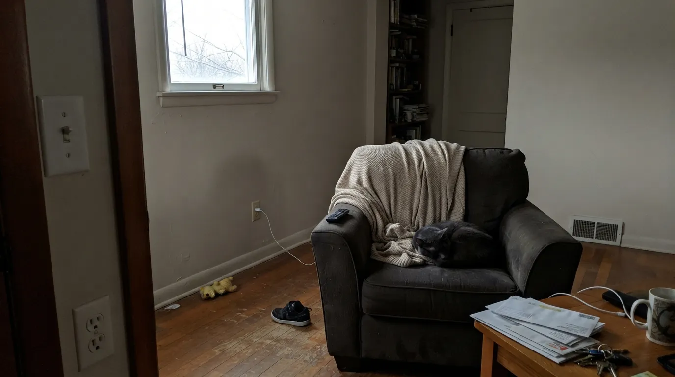
North light is cool and grey. It strips the yellow-beige warmth and leaves a dingy, slightly dirty plaster. Readers who wanted a pale gray get beige-gray sludge. The color did not fail; the light did. Pick Pale Oak if you need this family in a brighter version, or commit to warm lamps and a bigger sample on the actual wall.
Designer White sits at LRV 89. Put that on trim and Statuary walls immediately look unwashed — yellowed, dusty, like you missed a coat. Extra White does the same thing, colder. The fix is the one-color rule (Statuary walls and trim, sheen change only) or a warm white that is not that much lighter: White Dove or Alabaster, sampled on the wall, not the chip.
Grey LVP, grey-washed oak, and Carrara-type stone sit on the opposite side of the temperature line. They pull the yellow-beige forward until Statuary reads as beige, not stone. Warm oak, walnut, cream stone, and brass are its company. If the floor is already cool grey, this is not the wall color.
Room by Room
This is why the color exists. Semi-gloss Statuary on casings, six-panel doors and built-ins against a deeper historic wall looks like carved stone, not painted wood. Williamsburg Stone or Sterling on the walls, Statuary on the woodwork, and the house reads finished instead of contrasty.
South or west light keeps it in the pale-stone range all afternoon. Eggshell on the walls, the same color or White Dove on trim. Oak floors and a cream sofa are the easy furniture; cool grey sectionals fight it.
Warm evening lamps and a walnut or oak table bring the beige whisper forward in a good way. It is a dining-room greige, not a gallery greige. Brass chandelier, linen, wood — keep the company warm.
At LRV 65 it carries from room to room without the hallway going cave-dark, which is why it works as a whole-house light greige in a house that actually has windows. Long windowless halls still flatten it. Sample the darkest stretch of hall, not the living room.
Soft in morning light, creamier under 2700K bulbs at night. A north bedroom without lamps is the dingy version from the fails list — skip it or add light. White Dove or Alabaster on trim keeps the edges quiet.
Satin Statuary on cabinets next to warm wood or cream stone is a sleeper: it hides knuckle marks better than Designer White and does not go yellow the way a cream cabinet color can. Full kitchen walls only if the counters are warm. Cool grey quartz is a no.
Your Light Is the Risk
The stone stays pale and warm without tipping yellow. This is the light that makes Statuary look like marble plaster instead of greige.
Cool grey daylight strips the warmth and leaves dingy plaster. A north room without lamps is the version people regret.
Creamier at the sun hours, quieter gray-stone the rest of the day. The shift is a half-step, not a new color — still sample both ends of the day.
2700K lamps pull a soft beige-stone glow. Cool white LEDs flatten it toward dirty gray — swap the bulbs before you blame the paint.
Most complaints about Statuary are a light mismatch. Upload a photo of your actual room and see it on your walls — then ask for the same wall in north light or evening lamps before you buy a single sample.
Need It From Another Brand?
Any paint counter can custom-tint Pratt & Lambert 32-14 directly. If you would rather stay in one brand's own deck, these are the closest stock matches, measured as ΔE2000. Under 2 is a difference you will not see on the wall.
| Brand | Closest color | ΔE | LRV | |
|---|---|---|---|---|
| Sherwin-Williams | Gossamer VeilSW 9165 · Sherwin-Williams | 1.9 | 62 | Color page → |
| Behr | SawgrassN350-2 · Behr | 1.1 | 62 | Color page → |
| Benjamin Moore | Sea SaltCSP-95 · Benjamin Moore | 1.2 | 63 | Color page → |
| Valspar | Secluded BeachV146-1 · Valspar | 0.5 | 62.4 | Color page → |
| PPG / Glidden | Frivolous FollyPPG1128-2 · PPG / Glidden | 2.8 | 63 | Color page → |
| Glidden | WhiskersPPG1025-3 · Glidden | 2.0 | 61 | Color page → |
Contrast and Legibility
WCAG 2.1: AA is 4.5 : 1 for normal text, 3 : 1 for large text, AAA is 7 : 1.
Statuary vs the Colors You're Also Considering
Every Statuary sample board has the same rivals on it. The numbers show the real lightness gap — then it comes down to which risk you would rather live with.
Pick this if you want the paler, more stone-like version, or you are already in Pratt & Lambert and want it as trim.
Benjamin Moore HC-173 · LRV 63Edgecomb GrayPick this if you want the same easy warm greige in a brand every painter already stocks — it is a hair deeper and slightly more beige.
Pick this when you want lighter stone, not the default greige, and you are painting trim as much as walls.
Sherwin-Williams SW 7029 · LRV 60Agreeable GrayPick this for the famous whole-house greige that every Sherwin store can tint — deeper, a bit more taupe, easier to live with in mixed light.
Statuary sits among several Pratt & Lambert warm neutrals, and the differences come down to depth and how much color shows.
Light Grey 32-12, at LRV 58, is a step darker and reads cooler and grayer, with less of the beige warmth. Choose it when Statuary feels a touch too soft or when you want the walls to sit down a little. Tundra 32-6, at LRV 56, is also deeper but leans the other way, showing more gold and khaki, so it feels earthier and less crisp.
Ancestral 32-29, at LRV 73, goes the opposite direction: lighter and creamier, closer to a warm off-white. Pick it if you want more brightness and a clearer cream tone. In short, Statuary is the balanced middle, warm but restrained, when Light Grey feels too gray and Ancestral feels too creamy.
Statuary Coordinating Colors
Stay on the warm-stone side of the fence. Statuary likes deeper historic neutrals, muted olives, navy, and warm whites that are not too bright. It argues with icy whites, cool greys, and blue-grey stone. These are the partners that actually sit next to it:
Why It Was a Trim Color
Statuary is not a Color of the Year and it was never a viral wall color. Pratt & Lambert's Williamsburg lineup treated pale stone as woodwork: a quieter frame than the bright whites later houses used, closer to limestone casings and plaster casts than to gallery trim. The name is the brief — statuary marble, not cream.
That is still the most reliable way to use it. Semi-gloss on doors, casings, window frames and built-ins against Williamsburg Stone, Sterling, or a muted olive wall gives you the historic contrast without the plastic-bright trim line a Designer White (LRV 89) would cut. On four walls it can work, but you are asking a trim color to do a greige's job — sample bigger, and only in rooms with real daylight.
Statuary With Wood Tones and Floors
Warm wood is the easy pairing. Red oak, white oak, walnut, and butcher block all sit comfortably against the yellow-beige base because Statuary meets them halfway and the gray in it keeps the floor from looking orange. Honey-oak builder floors are not a dealbreaker here the way they are with a violet greige — the stone stays stone.
Cool grey LVP, grey-washed oak, and blue-grey stone are the test you should not skip. Those surfaces pull the yellow forward until the wall reads beige, not marble. A large sample on the actual floor, viewed morning and late afternoon, is cheaper than a repaint. If the floor is staying grey, look at Repose Gray or Light Grey instead and let this one go.
Three Ready Palettes Built on Statuary
A color is never alone on the wall. These are complete combinations in the 60-30-10 pattern, with the reason each one holds together. Every one opens in the visualizer.
This is the historic job: deeper stone walls, Statuary woodwork reading as pale marble, and one Colonial blue on the door. The LRV gap from 33 to 65 is the contrast traditional houses actually used — not bright white trim.
Try this palette in your roomWhite Dove is warm enough that Statuary walls do not go dirty beside it — Designer White would. The navy door is the one dark note an open main floor needs, and it loves brass.
Try this palette in your roomAlabaster is a cabinet-and-trim white with enough warmth to sit next to Statuary without making it look dusty. Evergreen Fog adds one muted green note that stays restful instead of decorated.
Try this palette in your roomStatuary FAQ
Is Statuary gray or beige?
Neither, which is the point. It is a pale warm-gray on a yellow-beige base, grayed until it reads as stone. In good daylight it looks like marble plaster. Next to a bright white or a cool grey floor, the beige shows. It will never be a crisp cool gray.
Can I use Statuary on walls, or is it only for trim?
Both, if the light is decent. Pratt & Lambert used it as Williamsburg trim, and that is still its best job. At LRV 65 it also runs whole-house walls in south- and west-facing rooms. Skip four walls in a dim north room — that is the dingy version.
What trim white goes with Statuary walls?
Statuary itself in semi-gloss is the safest. If you want contrast, White Dove or Alabaster — sampled on the wall, not the chip. Do not use Designer White, Extra White, or any gallery white; the LRV jump makes Statuary look dirty.
How does it compare to Agreeable Gray?
Same family, different job. Agreeable Gray is deeper (LRV 60), a bit more taupe, and the default whole-house greige. Statuary is lighter, more stone than taupe, and better as woodwork. If your painter is already at Sherwin-Williams, Agreeable Gray is the easier buy. If you want pale marble trim, stay here.
Will it work with oak floors?
Yes — warm oak, walnut, and butcher block are its natural company. Honey oak is tolerable because the gray in Statuary takes some of the orange out. Cool grey LVP and grey-washed oak are the mismatch; they push it yellow.
Is Pratt & Lambert hard to buy?
Harder than Sherwin-Williams or Benjamin Moore. It is a specifier brand, often tinted at independent dealers in Accolade, and stock is thinner. If you love the color and cannot find a dealer, Edgecomb Gray is the closest widely stocked stand-in.
Have you painted with Statuary?
Rate it — one tap helps the next reader decide.
Ask a Question