
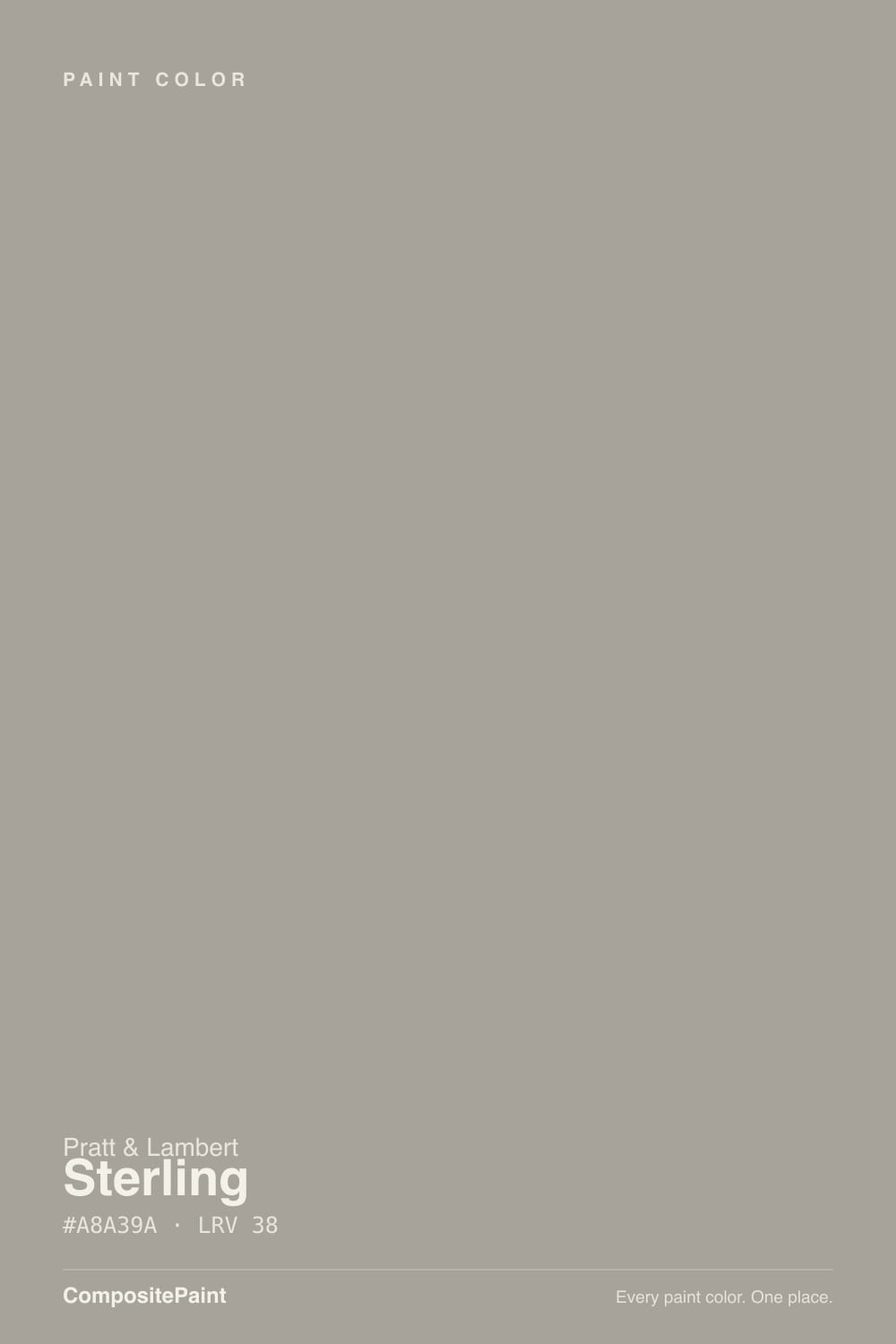
Color spec
| Brand | Pratt & Lambert |
| Name | Sterling |
| SKU | 32-13 |
| Hex | #A8A39A |
| RGB | 168, 163, 154 |
| HSL | 39°, 7%, 63% |
| LRV | 38 |
| Undertone | warm red-orange tone |
| Sheens | walls eggshell · trim semi-gloss · cabinets satin |
| Family | Neutral |
Sterling is not silver. It is a mid warm-gray with a taupe, red-orange lean — greige with a backbone — and at LRV 38 it sits a full step darker than the Revere Pewters and Agreeable Grays people actually shop. In a traditional living room with daylight and cream trim it looks finished and expensive. In a dim north room, or if you bought it hoping for a cool metallic gray, it looks like beige that never decided to be gray.
What Color Is Sterling, Really?
A mid warm-gray with a taupe, slightly red-orange base — greige, not silver, and not a cool charcoal. The name is the first problem: Sterling sounds like a coin, a cool metallic, something that would sit next to chrome. The paint is the opposite. Pratt & Lambert filed 32-13 in the gray range of its Calibrated deck, but the mix carries enough warmth that on a wall it reads as a dusty taupe-gray, closer to a worn linen than to steel. That warmth is why independent dealers keep putting it on traditional houses: it meets oak, brass, and cream trim halfway instead of fighting them.
At LRV 38 it is a genuine mid-tone, not a light whole-house gray. Revere Pewter (LRV 56) and Agreeable Gray (LRV 60) bounce a lot more light; Sterling sits next to Sherwin-Williams Dorian Gray (LRV 39) and will look a full value darker on four walls than the chip suggests. That depth is the point in a room with woodwork and real furniture — the wall has body, shadows don't go chalky — and it is the surprise if you sampled it thinking 'gray' meant pale. Plan for it to read deeper and tanner than the fan deck.
Undertone in one line: warm taupe first, gray second — never blue, never green. If your sample looks tan, that is the color being honest. If it looks drab and lifeless, the light is cool and dim. Both versions are the same paint; only one of them is a reason to buy it.
Where It Shines
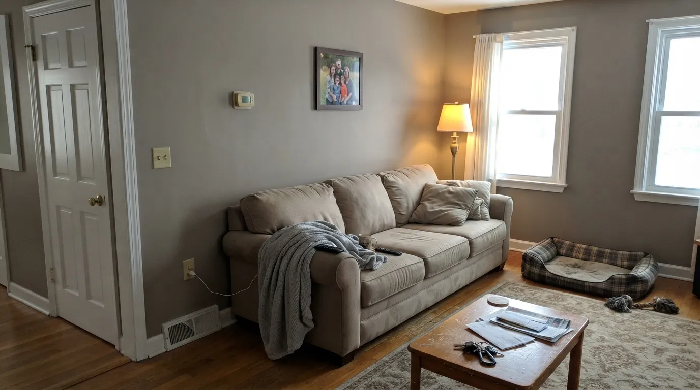
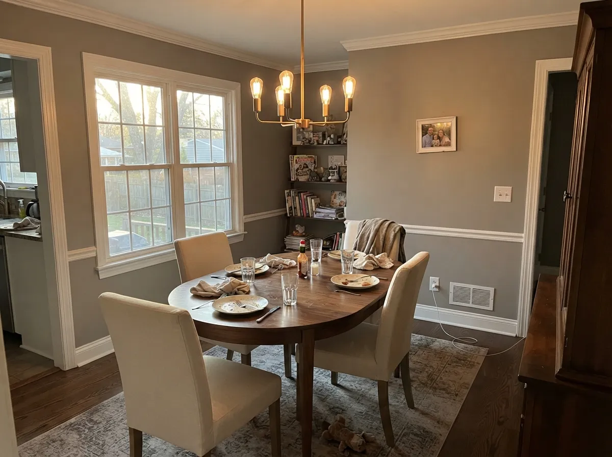
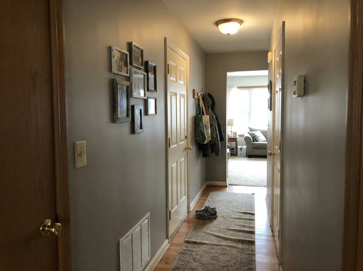
Give it daylight and traditional company and Sterling earns the whole-house reputation P&L dealers give it. South or east light keeps it a calm warm gray with just enough taupe to look expensive instead of builder-beige; cream or White Dove trim (LRV 85) makes the depth look intentional. Living rooms, dining rooms, and long hallways are its home — rooms that can take a mid-tone and still feel finished at night under 2700K lamps. Next to walnut, aged oak, brass, and cream linen it looks like it has been on the house for twenty years, which is the whole appeal.
Where It Fails — the Honest Part
Almost every regret story about a mid warm-gray follows one of three scripts, and Sterling is not exempt. None of them are the paint's fault — but if your room or your expectation matches one, this is not your gray, and a bigger sample will only confirm it.
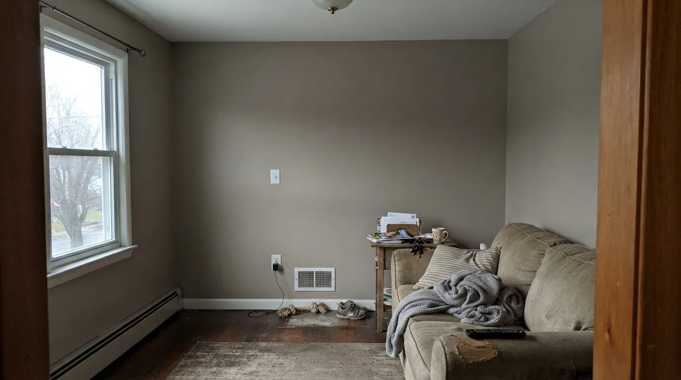
You wanted a light gray. LRV 38 is Dorian Gray territory, not Revere Pewter. On the chip it looks like a polite greige; on four walls it is a mid-tone with real weight, and small rooms without strong daylight will feel smaller. If 'whole-house gray' in your head means pale and airy, pick Revere Pewter (LRV 56) or Agreeable Gray (LRV 60) and leave Sterling for the room that can take the depth.
The name promised silver. Sterling sounds cool and metallic. The paint is a warm taupe-gray with a red-orange lean, and next to any true cool gray it looks tan. If you wanted steel, pewter, or a modern greige that stays gray, this is the wrong card. Sample it against Repose Gray if you need to see the temperature gap in one afternoon.
A dim north room, no lamps. Cool, weak light strips the warmth and leaves a drab, slightly muddy taupe — the color of a room that needs a wash. Mid-value greiges do this when they cannot bounce light. Warm 2700K bulbs are part of this paint job; if the room stays dim and you refuse lamps, pick a lighter greige that does not depend on bounce.
Room by Room
Living room — its best room
This is the room the color was mixed for: a traditional living room with daylight, wood floors, and cream trim. Eggshell on the walls; White Dove or Alabaster in semi-gloss on the trim. The mid-tone makes sofas and art look placed, not floating, and evening lamps pull the taupe forward so the room feels settled instead of gray-modern.
Dining room — yes
Dining rooms often lack the wall of windows a living room has, and Sterling's depth is an asset there — it holds through dinner under a chandelier. Pair it with cream linen, walnut, and brass. If the dining room is a cave with one north window, skip it or commit to lamps; the mud risk is real.
Hallways and entry — the whole-house test
A mid-tone is what makes a hallway look finished instead of like leftover builder white. Sterling carries from a living room into an entry without a temperature jump, which is why P&L dealers use it as a whole-house gray on traditional plans. Keep the trim the same warm white in every room or the hall will show the mismatch.
Bedroom — yes, with lamps
Restful as a mid greige, and it does not go lavender the way some cooler grays do at night. Matte or eggshell; warm bulbs on the nightstands. A north-facing bedroom with one window is the wrong bet — the walls will look tired by morning. South or west bedrooms are the easy yes.
Kitchen — islands and walls, with eyes open
On an island or a hutch under a lighter greige it looks custom. On every kitchen wall it is a commitment: LRV 38 next to white cabinets can feel heavy, and next to cool gray quartz it will read tan. Warm stone, wood cabinets, and brass are the company it wants. Satin on cabinets if you go there.
Exterior — traditional body, not a gray modern
Full sun will wash it a step lighter and a touch more taupe. On a traditional house with white trim and a dark door it can work as a body color; on a contemporary gray-and-black scheme it will look beige from the street. Shaded north elevations will read muddier than the sunny side — walk the sample around the house before you order Accolade by the gallon.
The Scorecard
What it gets right
- +Warm taupe-gray that flatters oak, walnut, brass, and cream trim
- +LRV 38 has real body — rooms look finished, not pale
- +Does not flash violet or blue the way cooler greiges can
- +Carries living room to hallway without a temperature jump
- +The un-famous P&L alternative when Revere Pewter feels too light
Where it struggles
- −Not light — shoppers expecting Revere Pewter depth get a mid-tone
- −The name Sterling is cool; the paint is tan-warm
- −Dim north light turns it drab and muddy
- −Pratt & Lambert is dealer-only — not a same-day big-box color
Light by Light
Most complaints about Sterling are a light mismatch. Upload a photo of your actual room and see it on your walls — then ask for the same wall in north light or evening lamps before you buy a single sample.
TEST IT IN YOUR LIGHT →Sterling vs the Colors You're Also Considering
Every Sterling sample board has the same rivals on it. The numbers show the real lightness gap — then it comes down to which risk you would rather live with.
Because Sterling is a whole-house neutral, the useful comparisons are the grays and greiges around it in the same line. Against Light Grey (32-12), which sits much lighter at LRV 58, Sterling is clearly deeper and more grounded. Choose Light Grey when you want an airy room that still avoids stark white; choose Sterling when you want the walls to hold some weight.
Granite (32-19) is the darker option at LRV 21. It is a truer, cooler gray with far less warmth, better for a moody accent wall, a door, or lower cabinets. Sterling is the softer, more livable everyday color, while Granite is the statement.
Williamsburg Stone (CW-25) is close to Sterling in depth at LRV 33 but leans warmer and browner, a real greige. If your fixed finishes are cool, pick Sterling; if they are warm or cream, Williamsburg Stone may blend better.
Need It From Another Brand?
Any paint counter can custom-tint Pratt & Lambert 32-13 directly — but if you would rather stay in one brand's own deck, these are the closest stock matches:
Sterling Coordinating Colors
Stay on the warm side of the fence. Sterling wants cream whites, other warm greiges, muted sage, and a single dark navy or charcoal — and it argues with icy whites, cool blue-grays, and anything that tries to make it look like silver. These are the partners that keep the taupe in check:
Sterling Versus the Famous Greiges
Sterling is not a famous color. There is no Color of the Year plaque, no viral kitchen, no HGTV house attached to 32-13. It lives in Pratt & Lambert's Calibrated deck, and the people who know it are independent dealers who still sell Accolade and keep a mid warm-gray on the traditional-house shortlist. That obscurity is useful: you are not walking into a color every neighbor already used in 2016. It is also a hassle: you cannot grab a gallon at the big box on a Saturday.
The shopping mistake is treating it like Revere Pewter or Agreeable Gray. Those are light greiges (LRV 56 and 60). Sterling is the next family down, with Dorian Gray (LRV 39) and a step below Mindful Gray (LRV 48). If your sample of Revere Pewter looked washed-out on the wall, Sterling is the direction to go, not a cooler gray. If Revere Pewter looked right, Sterling will look like you skipped a value on purpose.
Sterling With Wood Tones and Floors
Warm wood is the pairing this color was mixed for. Honey oak, red oak, walnut, and cherry all sit comfortably against the taupe — the wall's red-orange lean meets the floor instead of complement-clashing the way a cool gray would. If your house still has original oak trim, Sterling is one of the few mid-grays that will not make that trim look orange and dated.
The floors that need a sample first are grey LVP, ashy white oak, and blue-gray stone. Cool floors pull Sterling's warmth into relief, and the wall can read brown. A large rug in a cream or muted rust between the floor and the baseboard often fixes it; a whole main floor of cool gray plank usually does not. Test a 9-inch or larger sample on the actual floor in afternoon light before you paint the hall.
Three Ready Palettes Built on Sterling
A color is never alone on the wall — these are complete combinations in the 60-30-10 pattern, with the reason each one holds together.
Cream-warm White Dove keeps Sterling looking like a finished gray instead of a tan box; the navy door is the one dark note a traditional entry needs. Same wall color living-room-to-hall so the house reads as one decision.
TRY THIS PALETTE →Swiss Coffee is a touch creamier than White Dove, which is what a chandelier-lit dining room wants next to a mid taupe-gray. Kendall Charcoal on a buffet or chairs grounds the table without going black.
TRY THIS PALETTE →Alabaster keeps the cabinetry soft and warm so Sterling walls do not turn tan against a cooler white. Evergreen Fog on the island is the muted sage that sits at a similar depth and does not yank the greige toward beige.
TRY THIS PALETTE →Accessibility (WCAG contrast)
WCAG 2.1: AA = 4.5:1 normal text · AA Large = 3:1 large text · AAA = 7:1 normal text.
The Questions Everyone Asks
Is Sterling gray or beige?
Both, which is the definition of greige. It is a warm taupe-gray with a red-orange lean — gray enough to calm a traditional room, beige enough that a cool-gray fan will make it look tan. If you need a gray that refuses the beige, look at Collingwood (LRV 62) instead.
Is LRV 38 too dark for a whole house?
It depends on the daylight. In a traditional house with south or east windows, wood floors, and cream trim, 38 is the depth that looks finished. In a ranch with small north windows it will feel heavy and smaller. Sample a full wall in the darkest room you plan to paint before you commit the hall.
What trim white goes with Sterling?
A warm white in the same temperature family: White Dove (LRV 85) or Alabaster (LRV 82) in semi-gloss. A cooler, brighter white will push Sterling toward dirty beige. Do not pair it with a stark gallery white.
How close is it to Dorian Gray?
Very. Dorian Gray is LRV 39 and the same mid-weight warm greige idea at Sherwin-Williams. Sterling reads a hair warmer and tanner. If your painter is already in Accolade, stay; if you need a gallon tomorrow, Dorian Gray is the practical twin.
Does Sterling work with oak floors?
Yes — that is one of its jobs. The warm taupe meets honey and red oak halfway instead of turning the floor orange the way a cool gray would. Grey-washed or ashy oak is the pairing to sample: it can make the walls look brown.
Why can't I find this at Home Depot?
Pratt & Lambert is a dealer brand — independent paint stores, not the big-box aisles. The Accolade line is the reason painters still specify it. If you love the color and cannot get P&L, Dorian Gray is the closest widely stocked stand-in; do not assume a name match at another brand is the same paint.
Will It Work in YOUR Room?
No page can promise how Sterling behaves in your light. Upload a photo and see it on your own walls in seconds — before you spend a cent on samples.
TRY STERLING ON YOUR ROOM →
Ask a Question