Slip
A quiet lilac-gray from Benjamin Moore's Affinity Collection, reviewed honestly: the light that turns it blush, the light that flattens it, and why almost nobody has heard of it.

Jessica has spec'd whites and neutrals for more than 300 rooms and keeps a sample wall of painted drawdowns in her studio. Every color review is checked against real reader rooms in the comments and re-tested when a formula changes. About the testing process →
- 1Stardew43
- 2Palladian Blue60
- 3Slip65
- 4Glass Slipper70
- 5Spring Thaw83
The Fast Verdict
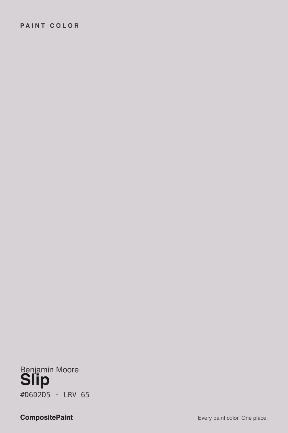
Slip is a pale gray with a secret: Benjamin Moore's own color library files it under Purple, describing it as "a delicate lilac that sits just left of blush." On the wall it rarely reads that loud — mostly it sits as a soft, quiet neutral, until warm evening light or a lamp catches it and the lilac steps forward. It has none of the fame of Agreeable Gray or the trend cycle of a mauve revival color. It is simply a well-made, slightly warm-blooded light gray that designers pull from a 144-color harmony collection most homeowners never browse.
Primary bedrooms and reading nooks · powder rooms and vanities · warm bathrooms with marble and brass · anyone bored of plain gray but not ready to commit to purple
You want a true, zero-drift gray · your room runs on cool LEDs all day with no lamps · your floors are honey oak or golden builder beige · you want a color your painter and your friends already recognize by name
- A genuinely quiet lilac-gray — softer than a true gray, far more restrained than any purple
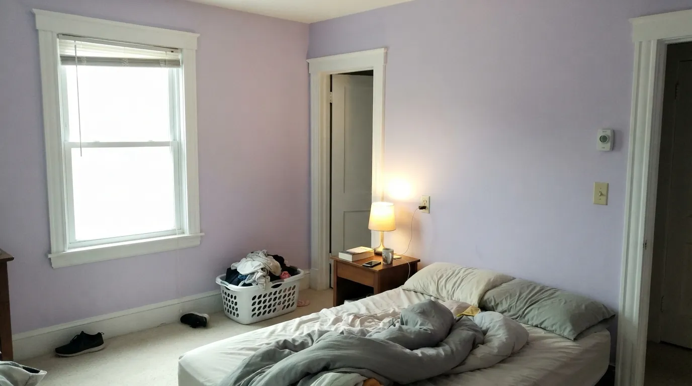
- Turns blush-warm and calm under evening lamps and west light
- Built for a 144-color harmony collection, so most Affinity colors pair with it automatically
- Flatters warm marble, brass and white oak in bathrooms and vanities
- LRV 65 keeps a room bright without the flat, stark feel of a near-white
- Not a true gray — Benjamin Moore itself files it under Purple, and gray-shoppers are often surprised
- Goes flat and slightly cold under north light or cool LEDs, losing the blush entirely
- Fights honey oak floors and golden-beige carpet the way most lilac-leaning neutrals do
- Almost no name recognition, so there is little crowd-tested room photography to check against
What Color Is Slip, Really?
A very pale, very grayed-down lilac. Benjamin Moore itself classifies Slip under the Purple family and describes it, in the company's own poetic house style, as "a delicate lilac that sits just left of blush." That is not marketing exaggeration so much as an honest label for a real if faint undertone — the chroma is pushed so low that our own color deck buckets Slip under plain gray. Both descriptions are true at once: it is technically a lilac, and it behaves, in most rooms, like a quiet neutral.
It belongs to Benjamin Moore's Affinity Collection, a 144-color set built around light-reflectance progression and cross-color harmony rather than around a single hero shade — the collection's whole pitch is that any two Affinity colors will sit together without a fight. That is a very different origin story from a Color-of-the-Year pick or a Classics-collection bestseller, and it explains why Slip has no viral room, no famous before-and-after, no Reddit thread with five hundred replies. At LRV 65 it sits mid-pack for a light neutral — brighter than a true greige like Revere Pewter (LRV 56), noticeably deeper than a bright white like Simply White (LRV 91).
Undertone in one line: lilac first, blush-pink second, never blue and never true gray. If your sample looks flat and slightly cool, that is north light or a cool LED bulb doing the talking, not a different paint. If it looks faintly rosy in the evening, that is the color doing exactly what Benjamin Moore's own description says it will.
Where It Shines
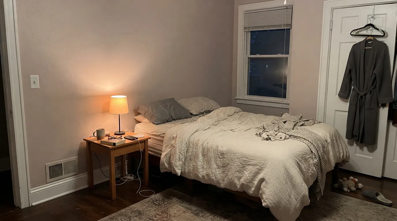
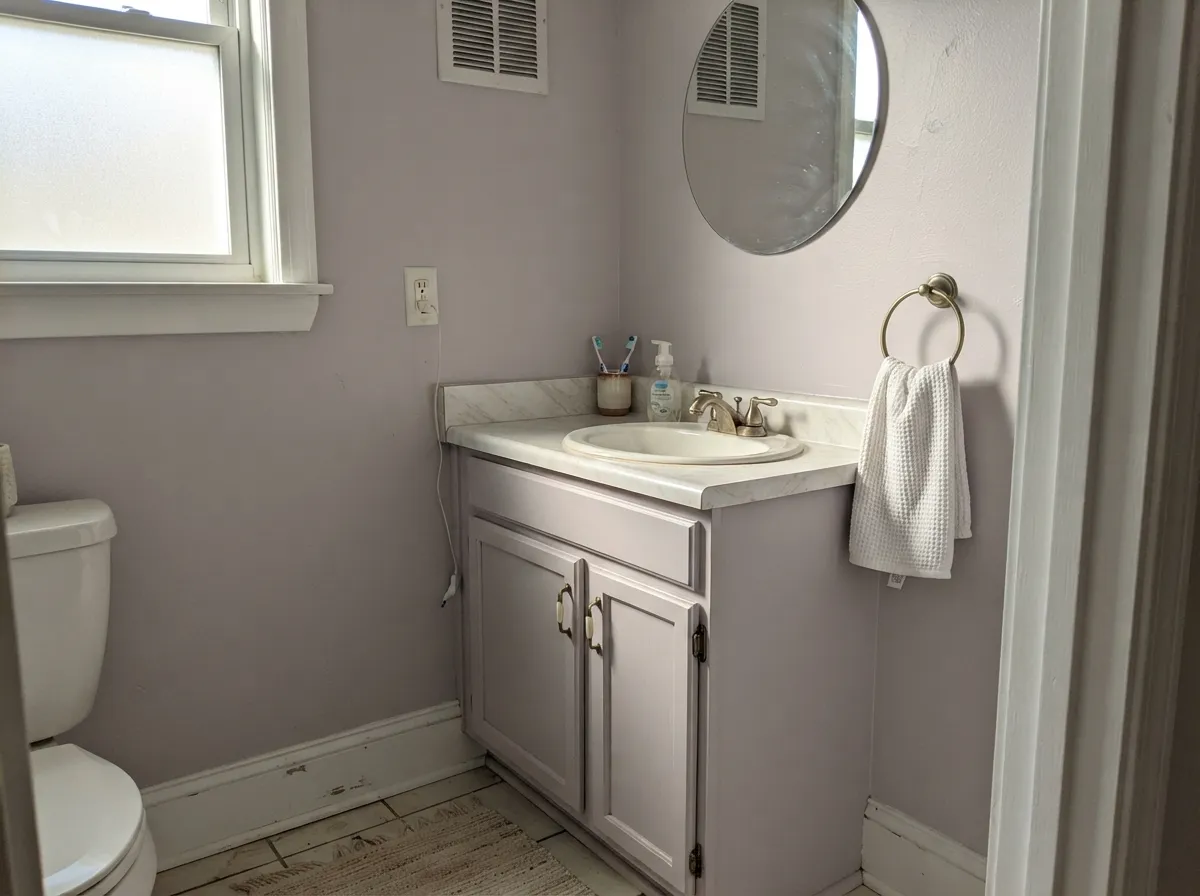
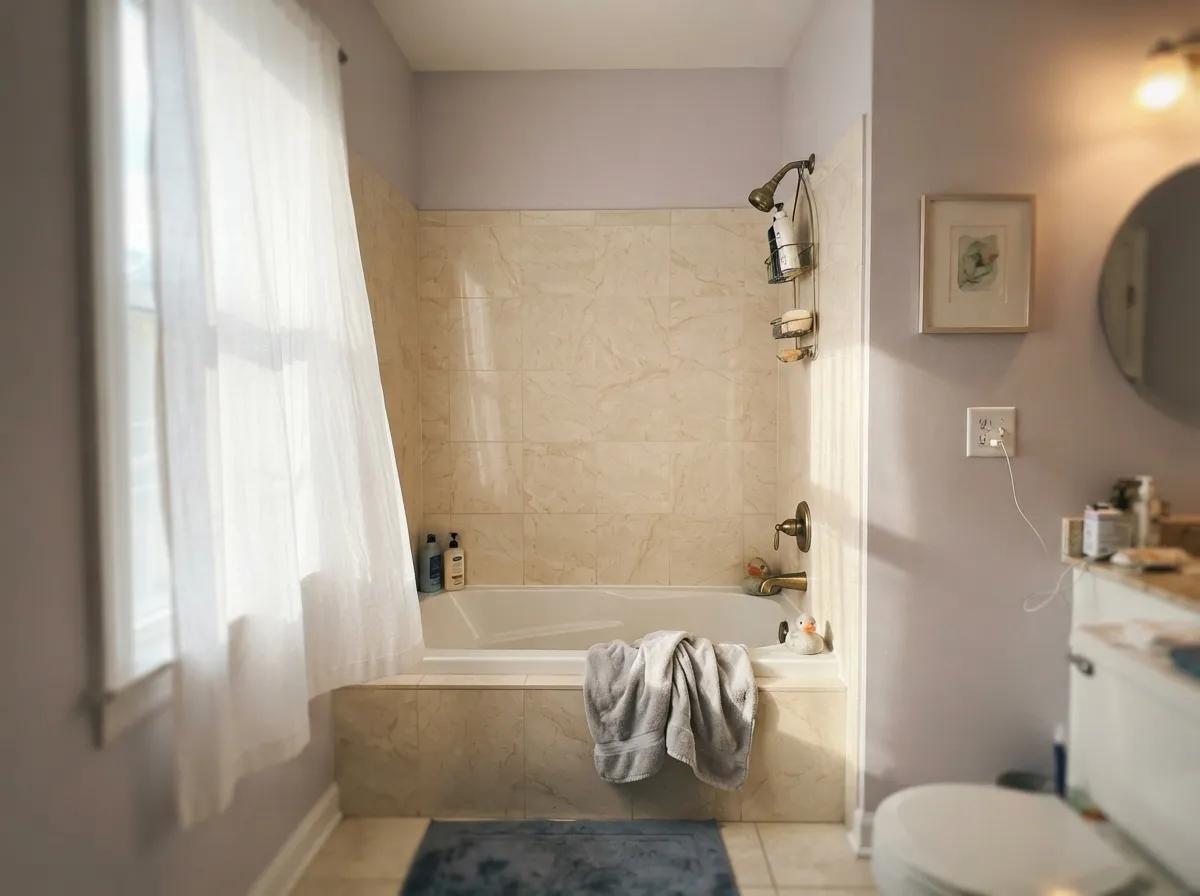
Give it warm light and it earns its "delicate lilac" description without ever feeling like a purple room. Primary bedrooms are its natural home — under a 2700K lamp at night the blush comes forward and the effect is genuinely restful, closer to dusk than to paint. Its second life is the small commitment: a powder room or a bathroom vanity, where warm marble and brass hardware pick up the same undertone and the whole room reads considered rather than accidental.
Where It Fails
Almost every disappointed review of Slip comes from one of three predictable mismatches, and none of them are really the paint's fault — they are a shopper who expected a different color than the one Benjamin Moore actually sells.
BM files this color under Purple for a reason. In good daylight the lilac is unmistakable on four walls, even though the paint chip in a dim showroom can look like plain gray. If "gray with zero personality" is the goal, this is the wrong can — look at Stonington Gray instead, which stays gray at every hour.
Warm gold and lilac sit almost opposite each other on the color wheel, so honey oak floors or builder-beige carpet pull the walls further toward purple while the walls push the floor toward orange. Neither side wins. White oak, walnut, or espresso floors are the safer match.
Cold artificial light and north daylight both drain the warmth out and leave a flat, slightly chalky pale gray with none of the blush that makes Slip interesting. The fix is cheap: swap to 2700K bulbs before you decide the color doesn't work.
Room by Room
Under evening lamplight it turns gently blush and calm, the exact quiet-luxury feel the color was built for. Eggshell on the walls; keep bedding in cream or white rather than beige, which reads yellow against it.
Satin Slip on a vanity, under a marble top with brass pulls, looks like a paid design decision for the cost of a quart. Small rooms carry the lilac confidently without it taking over a whole house.
With warm white or cream marble and brass fixtures, it is a genuinely pretty spa color. Against cool blue-gray tile or chrome, the two undertones argue — sample first if your tile is already installed.
Beautiful in a closed room with warm lamps and wood furniture. In a bright open-plan main floor it can read closer to plain pale gray most of the day, which is fine if that is what you actually want.
Soft enough to avoid looking like a themed "girl's room" pink, quiet enough to still work as the family grows out of it. Matte finish hides texture and keeps the color soft.
Full outdoor sun grays it toward a flat, slightly dingy pale gray, and the subtlety that makes it work indoors just reads as faded or discolored from the street. Save it for interior walls.
Your Light Is the Risk
Warm late-day sun and a 2700K lamp bring the blush forward — this is the light the color was made for.
Cool, flat daylight drains the lilac and leaves a plain pale gray with a faint cold edge. Test before committing.
Cool and quiet in the morning, warmer and faintly rosy by evening. The shift is gentle, not dramatic.
Cool white LEDs wash it chalky and flat. Warm 2700K bulbs pull the blush forward at night — swap bulbs before repainting.
Most complaints about Slip are a light mismatch. Upload a photo of your actual room and see it on your walls — then ask for the same wall in north light or evening lamps before you buy a single sample.
Need It From Another Brand?
Any paint counter can custom-tint Benjamin Moore AF-605 directly. If you would rather stay in one brand's own deck, these are the closest stock matches, measured as ΔE2000. Under 2 is a difference you will not see on the wall.
| Brand | Closest color | ΔE | LRV | |
|---|---|---|---|---|
| Sherwin-Williams | WallflowerSW 6281 · Sherwin-Williams | 3.8 | 64 | Color page → |
| Behr | So ShyMQ3-29 · Behr | 1.1 | 66 | Color page → |
| Valspar | London Calling8004-48A · Valspar | 1.7 | 66 | Color page → |
| PPG / Glidden | BalancedPPG1003-2 · PPG / Glidden | 1.6 | 65 | Color page → |
| Glidden | BalancedPPG1003-2 · Glidden | 2.1 | 65 | Color page → |
| Dutch Boy | Milky Quartz346-2DB · Dutch Boy | 3.8 | 64 | Color page → |
Similar Benjamin Moore Colors
The nearest shades to Slip within Benjamin Moore's own range, ranked by perceptual color distance — useful when you want the same look a touch lighter, darker, or warmer.
WCAG 2.1: AA is 4.5 : 1 for normal text, 3 : 1 for large text, AAA is 7 : 1.
Slip vs the Colors You're Also Considering
Every Slip sample board has the same rivals on it. The numbers show the real lightness gap — then it comes down to which risk you would rather live with.
Pick this if a hint of warmth and softness sounds better than flat gray — Slip has more personality once the light moves.
Benjamin Moore HC-170 · LRV 59Stonington GrayPick this if you actually want gray with no drift and no surprises — Stonington Gray stays gray at every hour.
Pick this for the cooler, quieter lilac-gray that stays closer to neutral in good daylight.
Sherwin-Williams SW 7014 · LRV 67Eider WhitePick this for the beige-leaning version of the same drift — Eider White starts warm and only goes mauve in bad light.
Slip Coordinating Colors
The rule for coordinating with Slip: stay warm, stay soft, and let the lilac be the quietest thing in the room. It pairs naturally with warm whites, deeper warm greiges, and one grounding near-black — the same logic behind Benjamin Moore's own suggested pairings for the color, which lean on charcoal and warm neutrals rather than anything cool or bright-white.
The Affinity Collection: A Color Benjamin Moore Never Hyped
Slip's story is really the story of the collection it lives in. The Affinity Collection is 144 colors organized by light reflectance value rather than by mood or trend, built so that any two colors in the set can sit next to each other without a designer needing to think twice. That is a genuinely useful tool for professionals — and it is also exactly why a color like Slip never gets its own moment. There was no Color of the Year press release, no celebrity kitchen, no viral before-and-after photo.
What that means for a shopper is simple: you are not buying a trend, and you are not buying hype. You are buying a well-considered, quietly lilac light neutral that Benjamin Moore built to behave — the same engineering logic behind the collection's better-known cousins, just without the marketing budget.
Slip With Wood Tones and Floors
White oak, walnut and espresso are the safe, flattering choices — their cool-to-neutral undertone leaves room for the lilac to read as intentional rather than accidental. Cream or light gray carpet is fine underfoot; true gray carpet is fine too.
The one honest no is golden: honey oak floors, orange-toned trim, or yellow-beige carpet. Warm gold and lilac are close to opposite on the color wheel, so each side pushes the other in a direction nobody wanted — the floor reads more orange, the wall reads more purple. A large rug helps if the floor is staying; otherwise, a truer greige like Revere Pewter is the safer bet over honey wood.
Metals follow the same warm logic: unlacquered brass, aged bronze and brushed nickel all read well against it, while polished chrome is the one finish that leans distinctly cold in the pairing.
Three Ready Palettes Built on Slip
A color is never alone on the wall. These are complete combinations in the 60-30-10 pattern, with the reason each one holds together. Every one opens in the visualizer.
Kendall Charcoal is one of Benjamin Moore's own suggested pairings for Slip, and it earns the spot: the near-black grounds the lilac so the room reads sophisticated rather than pastel, while White Dove's warm trim keeps the edges soft instead of stark.
Try this palette in your roomRevere Pewter's warm greige vanity keeps the room from tipping too pastel, and Wrought Iron on the mirror and hardware supplies the one near-black note a small room needs to read finished rather than accidental. Brass hardware ties both undertones together.
Try this palette in your roomUnlike a color built for the one-color-house trick, Slip actually wants a brighter trim than itself — the extra contrast from Simply White keeps the lilac reading crisp instead of dingy. Chelsea Gray on the door adds the one dark, grounding note.
Try this palette in your roomSlip FAQ
Is Slip gray or purple?
Officially purple — Benjamin Moore classifies it under the Purple family and describes it as "a delicate lilac that sits just left of blush." In practice it is so grayed down that it reads as a quiet neutral most of the day, and our own color library buckets it under gray. Warm evening light is when the lilac shows itself most clearly.
What trim color goes with Slip walls?
A brighter white than the walls, not a matching one. Simply White or White Dove in semi-gloss gives enough contrast to keep the lilac reading crisp; matching the trim to the walls the way you would with White Dove tends to make Slip look dingy instead.
Does it work with honey oak floors?
Not well. Golden, honey-toned wood sits nearly opposite lilac on the color wheel, so the floor and the walls each push the other toward a color you didn't want. White oak, walnut and espresso floors are the safer pairing.
Is it good for a bedroom?
Yes — it is arguably its best room. Under warm lamplight the color turns calm and faintly blush, which is exactly what most people want from a primary bedroom. Keep bulbs at 2700K and bedding in cream or white rather than beige.
Does it work in bathrooms with marble and brass?
Very well, if the stone is warm-toned. Cream or warm-white marble and unlacquered brass pick up the same undertone as the paint. Cool blue-gray marble or polished chrome will fight it — sample first if either is already installed.
Why haven't I heard of this color before?
Because it was never built to be famous. Slip comes from Benjamin Moore's Affinity Collection, a 144-color set designed around light-reflectance progression and cross-color harmony for design professionals, not around a single marketed hero shade. It has no Color-of-the-Year run and no viral room — it is simply a well-made, quietly good color that most homeowners never scroll past on a fan deck.
Have you painted with Slip?
Rate it — one tap helps the next reader decide.
Ask a Question