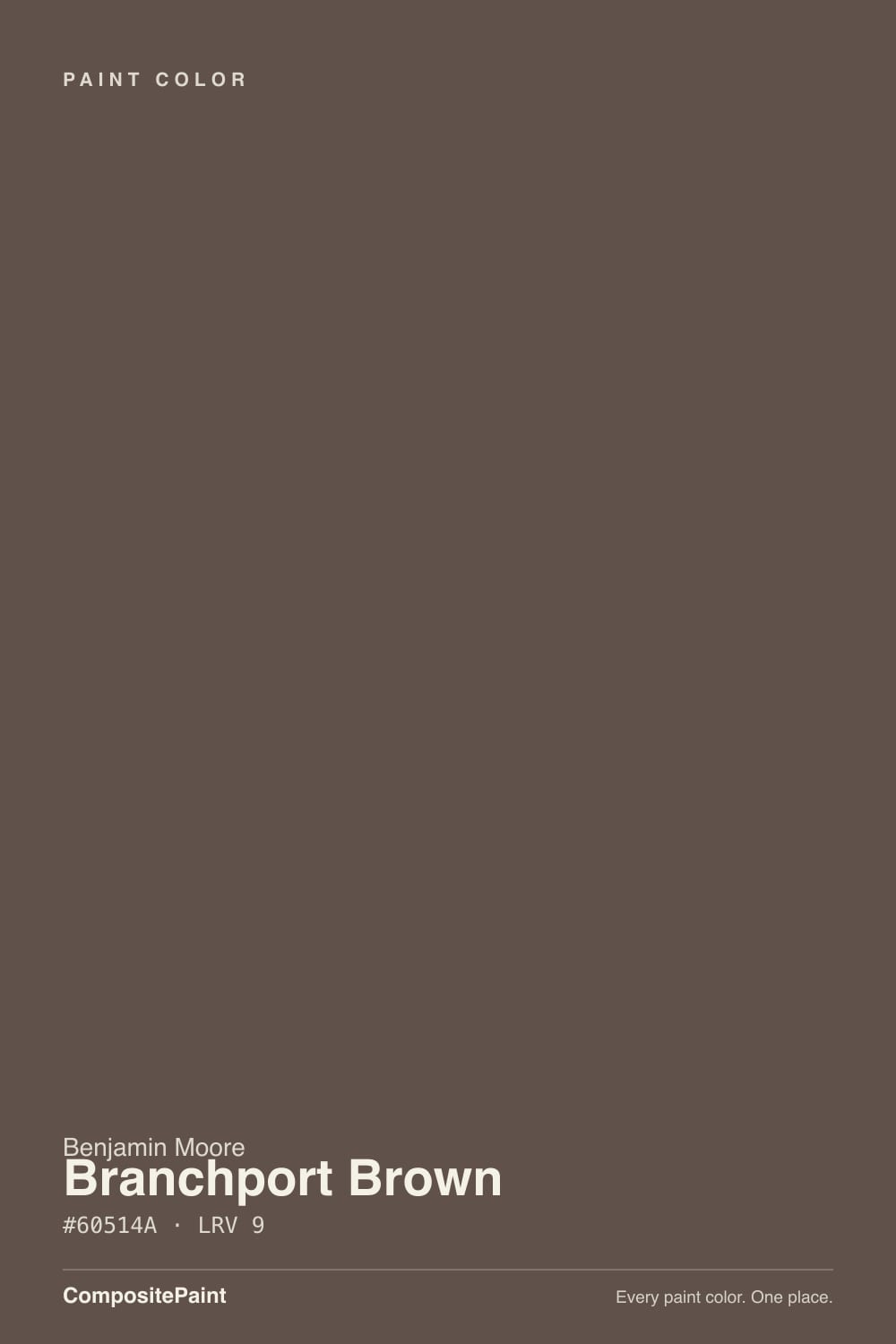
Branchport Brown
The Historical Collection chocolate-brown reviewed honestly: the light that lets it read brown, the light that flattens it to black, and what to pick instead.

Jessica has spec'd whites and neutrals for more than 300 rooms and keeps a sample wall of painted drawdowns in her studio. Every color review is checked against real reader rooms in the comments and re-tested when a formula changes. About the testing process →
- 1Black Bean4
- 2Branchport Brown9
- 3Cavern Clay20
- 4Redend Point30
The Fast Verdict
Branchport Brown is a Historical Collection chocolate that gives up its warmth reluctantly: at LRV 9 it sits one notch above true black, and only steady daylight or a warm lamp coaxes out the muted red-violet under the brown. On a front door or a kitchen island it reads rich and deliberate. Painted across a whole sunny room, the grey cast reads muddy instead of moody — this is a color for one surface, not four walls.
Front doors and shutters · a kitchen island against white perimeter cabinets · den or library built-ins · a small powder room drenched floor to ceiling
You want it to read brown in a dim room — it reads black · you're painting a whole sunny living room · your floors are honey-orange oak · you want warmth without needing a lamp
- A genuine Historical Collection chocolate-brown for doors, shutters and built-ins
- Reads like a furniture piece on a kitchen island against white cabinets
- Small, low-daylight rooms (powder rooms, dens) take the depth without losing warmth
- Pairs cleanly with warm whites and brass without tipping orange
- Dark enough to hide scuffs and fingerprints on a heavily touched front door
- At LRV 9, dim or shaded light reads it as black, not brown
- Too dark and grey-cast for a full sunny wall — goes muddy instead of rich
- Almost no real-room photos or owner reviews online to check against
- Clashes with honey-orange oak floors and trim
What Color Is Branchport Brown, Really?
Branchport Brown comes out of Benjamin Moore's Historical Collection, the roughly 190-color deck built around America's landmark buildings — which tells you the intent before you open the can: this is a color meant for doors, shutters and trim, the way a real historic house would have used it, not a trend-chasing wall color. It reads as a deep, muted chocolate brown with the orange dialed almost all the way out and a whisper of grey-violet laid over the top, so it never quite reaches the warm, honeyed brown of a stained oak door. It is closer to old ironwork or a well-worn leather ledger than to caramel.
At LRV 9 it sits one step above true black — practically indistinguishable from a near-black in anything but strong, direct light. That is the single fact that decides whether this color works for you: in bright daylight or under a warm bulb, the brown asserts itself and the grey-violet cast gives it a slightly cooler, more historical read than a straightforward chocolate. In shade, at dusk, or under a cool bulb, the brown disappears and what is left reads simply as black. Plan the room's light before you plan the color.
Undertone in one line: a grayed, slightly red-violet brown — warm enough to still register as brown, cool enough to never look orange. If your sample looks purely black, that is the light, not the paint; if it looks warm and reddish like saddle leather, that is strong afternoon sun or a 2700K bulb doing the work the paint alone can't do in flat light.
Where It Shines
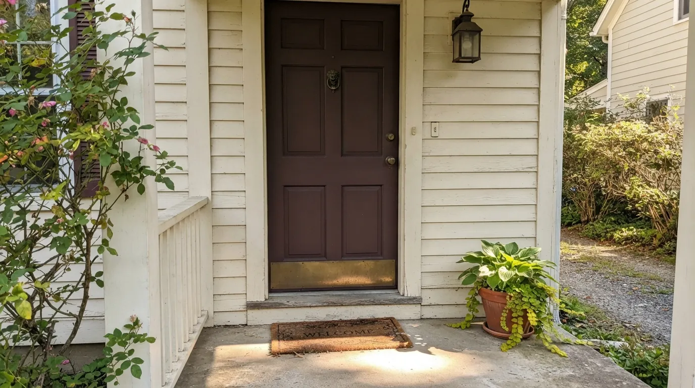
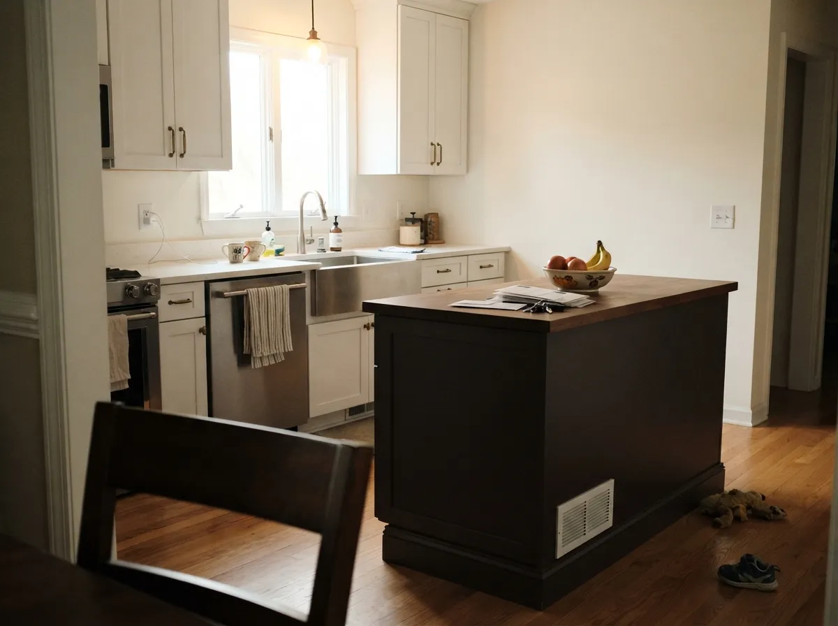
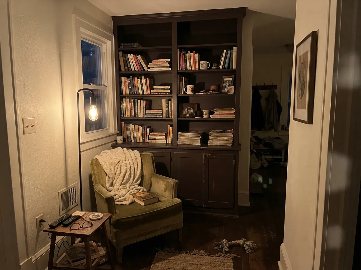
Give it one deliberate surface and real light and it looks expensive: a front door under a porch light, a kitchen island next to white cabinets, built-in bookshelves in a lamplit den. Because so few homeowners have actually painted a whole room in it — this is a color with almost no online track record — the reviews that do exist agree on one thing: it belongs in doses, on furniture-scale surfaces, not spread across four walls.
Where It Fails
The complaint pattern here is short and predictable, because a color this dark only has a few ways to go wrong. None of them are the paint's fault — but if your surface or your light matches one of these, this is not your brown.
At LRV 9 the difference between "brown" and "black" is entirely the light. In a shaded entry, a north-facing den, or after the sun goes down with no warm bulb nearby, Branchport Brown simply reads as a near-black — the same complaint every color this deep gets, and the reason it is sold for doors and built-ins, not open floor plans.
Painted across four walls in a bright room, the grey-violet cast that makes it look historical on a door reads muddy and flat at wall scale — readers expecting a rich cinematic dark instead describe it as "dirty." Keep it to one surface: a door, an island, a single built-in wall.
The red-violet undertone sits close to yellow-orange oak's opposite on the color wheel, so a honey-toned floor pulls the brown toward muddy and the floor toward more orange. Walnut, espresso stain, or a pale white oak floor sit next to it without the fight.

Room by Room
Deep enough to read as a real design decision, not just "brown door," and forgiving of fingerprints and weather grime that a lighter color would show. Semi-gloss, with brass or matte-black hardware — both metals sit well against the grey-violet cast.
The pairing that turns up in real kitchen photos is white shaker perimeter cabinets with a Branchport Brown island: the island reads like a piece of furniture, not a cabinet decision. A full kitchen of it is too heavy — reserve the color for the one piece that should stand out.
Built-in bookshelves, a fireplace surround, or wainscoting under warm lamp light is the color's natural home. Satin on millwork; keep at least one wall lighter (cream or warm white) so the room does not go cave-dark.
Small windowless rooms take LRV 9 well because there is no daylight to lose — drench all four walls and let a sconce do the work. Brass fixtures and a marble or butcher-block vanity top finish it.
A full room in this color is a real commitment and, per the fails above, risks reading black rather than brown once the sun moves. Use it on one accent wall behind a bed or sofa, with the rest of the room in a warm white or cream.
Against white, cream or pale-gray siding, Branchport Brown shutters and a Branchport Brown door read as a deliberate, historic pairing. It is too dark to be the body color of the house itself — reserve it for shutters, the door, and porch-ceiling boards.
Your Light Is the Risk
Full sun is the only light that reliably shows the red-violet under the brown — on a south-facing front door this is the color at its richest.
Without direct light the grey cast takes over and the color reads flat, near-black. A shaded north entry needs a porch light left on to keep the door reading brown after midday.
Morning and evening it leans darker and cooler; midday sun is when the chocolate-brown identity is clearest. Test a sample at both ends of the day before committing a door.
Warm 2700K bulbs pull the red forward and it looks like worn leather. Cool white LEDs flatten it to charcoal-black — the wrong bulb over a Branchport Brown door undoes the whole color.
Most complaints about Branchport Brown are a light mismatch. Upload a photo of your actual room and see it on your walls — then ask for the same wall in north light or evening lamps before you buy a single sample.
Need It From Another Brand?
Any paint counter can custom-tint Benjamin Moore HC-72 directly. If you would rather stay in one brand's own deck, these are the closest stock matches, measured as ΔE2000. Under 2 is a difference you will not see on the wall.
| Brand | Closest color | ΔE | LRV | |
|---|---|---|---|---|
| Sherwin-Williams | Tea LeafSW 9604 · Sherwin-Williams | 3.3 | 9 | Color page → |
| Behr | Scented CloveUL130-1 · Behr | 0.7 | 9 | Color page → |
| Valspar | Hunting Boots1001-9A · Valspar | 0.9 | 9.4 | Color page → |
| PPG / Glidden | Chocolate PretzelPPG1017-7 · PPG / Glidden | 0.9 | 9 | Color page → |
| Glidden | Authentic Brown60YR 09/086 · Glidden | 0.5 | 9 | Color page → |
| Dutch Boy | Heritage Brown411-7DB · Dutch Boy | 2.0 | 8 | Color page → |
Similar Benjamin Moore Colors
The nearest shades to Branchport Brown within Benjamin Moore's own range, ranked by perceptual color distance — useful when you want the same look a touch lighter, darker, or warmer.
WCAG 2.1: AA is 4.5 : 1 for normal text, 3 : 1 for large text, AAA is 7 : 1.
Branchport Brown vs the Colors You're Also Considering
Every Branchport Brown sample board has the same rivals on it. The numbers show the real lightness gap — then it comes down to which risk you would rather live with.
Pick this for the more muted, historical-grey version that reads like old ironwork rather than straight chocolate.
Benjamin Moore 2110-10 · LRV 8TaupePick this if you want the truer, warmer chocolate — Taupe skips the grey-violet cast entirely and reads pure brown.
Pick this when you want it read unmistakably as paint, not a wood stain — the grey cast keeps it from looking like a stain job.
Sherwin-Williams SW 2806 · LRV 14Rookwood BrownPick this if you want it lighter and more orange — close enough to stained oak trim that it can pass for woodwork, not paint.
Branchport Brown Coordinating Colors
The rule for coordinating with Branchport Brown is simple: keep the rest of the palette light and warm, and save the dark for one surface. It pairs cleanly with warm whites, historical greiges, and brass — and it needs contrast, not competition, from anything else deep.
Branchport Brown's Historical Collection Story
Branchport Brown belongs to Benjamin Moore's Historical Collection, roughly 190 colors researched and matched to restorations of landmark American buildings rather than picked for a seasonal trend. That pedigree explains its whole personality: it was built to sit on a door, a shutter, or a piece of trim on an old house, the way deep browns were actually used before "accent wall" was a phrase.
It also explains why there is almost no real-room track record to check it against online — unlike a bestseller like White Dove, Branchport Brown has no wall of Houzz photos or Reddit threads to draw on. The handful of real projects that do turn up follow the collection's own logic: a front door, a kitchen island, a small powder room — never a whole open floor plan.
Branchport Brown With Wood Tones and Floors
Walnut, espresso stain, and pale or gray-washed white oak all sit comfortably next to Branchport Brown — the wood reads as a complementary dark tone rather than competition, and none of them push the paint's grey-violet cast toward mud.
Honey oak is the one real clash. Its yellow-orange base sits close to the opposite side of the wheel from Branchport Brown's red-violet undertone, so each pulls the other the wrong direction — the floor looks more orange, the paint looks muddier. If the honey oak is staying, keep Branchport Brown to a door or an island well away from the floor, not a wall directly above it.
Three Ready Palettes Built on Branchport Brown
A color is never alone on the wall. These are complete combinations in the 60-30-10 pattern, with the reason each one holds together. Every one opens in the visualizer.
A warm white body keeps the house from going heavy while the door and shutters carry two depths of near-black brown — the exact restrained, historic contrast the Historical Collection was built for.
Try this palette in your roomCream walls keep the room lit while the built-ins do the color work; White Dove trim frames the dark shelving so it reads as furniture, not a cave. Add a warm lamp and this is the color's best night light.
Try this palette in your roomCrisp white perimeter cabinets keep the kitchen bright, Revere Pewter walls bridge warm and cool, and the Branchport Brown island reads as one deliberate piece of furniture rather than a whole kitchen going dark.
Try this palette in your roomBranchport Brown FAQ
Is Branchport Brown warm or cool?
Warm at its base but grayed down with a whisper of red-violet, which is what keeps it from looking like straightforward chocolate or stained wood. In flat or shaded light the grey reads cooler; in direct sun or warm lamplight the red comes forward.
Will it look black on my door?
At LRV 9, yes, in weak light — that is the single most common thing people notice. A shaded, north-facing entry or a dim porch light will read it as essentially black. Full sun, or a warm bulb left on, is what keeps it reading brown.
Does it work on kitchen cabinets?
Best in doses — a single island against white perimeter cabinets is the pairing that shows up in real kitchens, not a full kitchen of it. Use a satin urethane-fortified cabinet enamel, and keep the walls light.
What trim or wall white goes with it?
Any warm white — White Dove or Swiss Coffee — keeps the pairing from feeling stark. A crisp cool white will make the grey in Branchport Brown look muddier by contrast.
Is it good for exterior shutters and a front door?
Yes — this is arguably its best use. Against white, cream or pale-gray siding it reads as a deliberate historic color choice. It is too dark to be the main body color of a house.
How many coats does it need?
Two coats over most existing colors, but Branchport Brown is dark enough that a gray- or brown-tinted primer underneath will save a coat when covering a light color or bare wood — especially on a front door that needs even coverage in full sun.
Have you painted with Branchport Brown?
Rate it — one tap helps the next reader decide.
Ask a Question