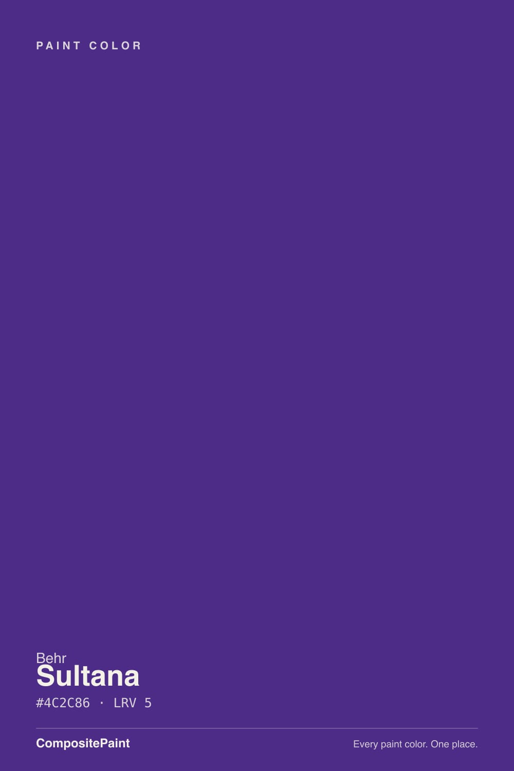
Sultana
The deep, balanced plum-purple Behr barely markets, reviewed honestly: the light that turns it into a jewel tone, the light that turns it black, and where to actually use it.

Jessica has spec'd whites and neutrals for more than 300 rooms and keeps a sample wall of painted drawdowns in her studio. Every color review is checked against real reader rooms in the comments and re-tested when a formula changes. About the testing process →
- 1Liberty Blue1
- 2Sultana8
- 3Blue Nova17
- 4Gothic Purple24
The Fast Verdict
Sultana is a genuinely dark purple — LRV 8, nearly as deep as a true black — built on a rare, almost perfectly balanced red-and-blue undertone. That balance is the whole trick: it never tips fully warm like a merlot or fully cool like an eggplant, so in weak light it reads as a soft charcoal-plum, and in good light it opens up into an honest, jewel-toned violet. It is not a whole-house color and it doesn't pretend to be — it is a one-room, one-surface commitment for people who want drama that reads expensive, not loud.
Powder rooms and small dining rooms with real daylight or good lamps · kitchen islands and cabinetry · front doors with contrast trim · dens and libraries built around evening light · anyone who wants a jewel tone that reads sophisticated, not sweet
Your only light is a small, north-facing window and you skip lamps · you want the purple to actually stay hidden and pass for gray · you're painting an entire large room floor-to-ceiling with no light anchor · you need a color with a long public track record before you commit
- A genuinely balanced purple — never tips fully warm or fully cool
- Reads as a sophisticated jewel tone in good light, not a pastel or a costume purple
- Deep enough (LRV 8) to anchor a small room in one coat of drama
- A real cabinet and island color, not just a wall color
- Pairs cleanly with brass, natural oak and warm creams per Behr's own guidance
- In weak or cool light it reads as plain near-black, not purple
- Almost no public owner reviews exist yet to confirm real-room behavior
- Too dark and too committed for a large room with only overhead light
- Needs a white or cream boundary (trim, ceiling, walls) or it can feel heavy
What Color Is Sultana, Really?
Sultana is Behr's dark, muted purple with, by Behr's own description, nearly equal red and blue influence — a "grounded plum" rather than a color that tips clearly warm or clearly cool. That balance is unusual: most dark purples in a paint deck lean hard one way, toward wine-red (Medieval Wine, Deep Merlot) or toward blue-violet amethyst (BM Shadow). Sultana sits closer to the middle, which is exactly why it can pass for a near-black charcoal in flat light and only reveal itself as purple when the light is doing real work.
At LRV 8 this is a genuinely dark color — nearly as low as a true black on the deck. That depth is the whole story: it is what lets Sultana carry a small jewel-box room without washing out, and it is also what makes it disappear into flat charcoal the moment the light goes weak. There is very little public track record on this specific color — it has almost no Reddit or Houzz threads of its own — so treat every claim here as grounded in the color's own physics (undertone, LRV, complement) plus Behr's official listing, not a pile of owner testimonials.
Behr itself pairs Sultana with soft creams, earthy browns, sage greens and dusky blues, and flags brushed brass and natural oak as its best metal and wood partners. Undertone in one line: balanced red-violet, never fully warm, never fully cool. If your sample reads bluer or browner than expected, that is your light and your neighboring surfaces talking, not a different can of paint.
Where It Shines
Give it warm daylight or a lamp and Sultana stops being a near-black and starts being a purple — a proper jewel tone, not a pastel one. Small, contained rooms are its best home: a powder room or a single accent wall lets the color do its job without asking a whole household to live inside a dark room all day. It is also a genuine cabinet and island color — Behr sells it for exactly that — where brass hardware and natural oak counters bring out the warmth Behr describes, and a crisp white perimeter keeps the kitchen from feeling like a cave.
Where It Fails
The regret stories that would come with Sultana are predictable from the color's own numbers — LRV 8 and a balanced, not-loudly-warm undertone — even before a single owner writes about them. All three are avoidable if you know them going in.
In anything less than good, warm light, Sultana reads as a soft charcoal-plum — closer to a dark neutral than an obvious purple. If your goal was a wall people immediately clock as "purple," sample it in your actual room first; in overcast or north light it can look like a plain dark gray with a name.
At LRV 8 the color is already absorbing most of the light that hits it. A windowless powder room or a north-facing den with the lamps off goes flat and cave-dark instead of moody — the difference between the two is entirely whether you turned a light on.
This is a color built for a contained space or a single surface — an island, a door, one wall. Painted wall-to-wall-to-ceiling in a big room with no crisp white trim or ceiling to break it up, it can feel oppressive rather than rich. Give it a white or cream boundary to work against.
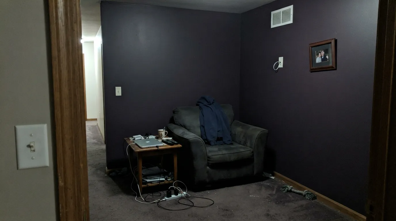
Room by Room
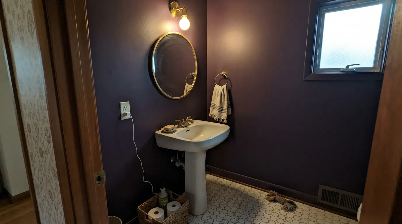
Small, enclosed, and usually lit by a vanity light you control — exactly the conditions Sultana wants. Drenching all four walls works here in a way it doesn't in a living room; the depth reads intentional and expensive at this scale.
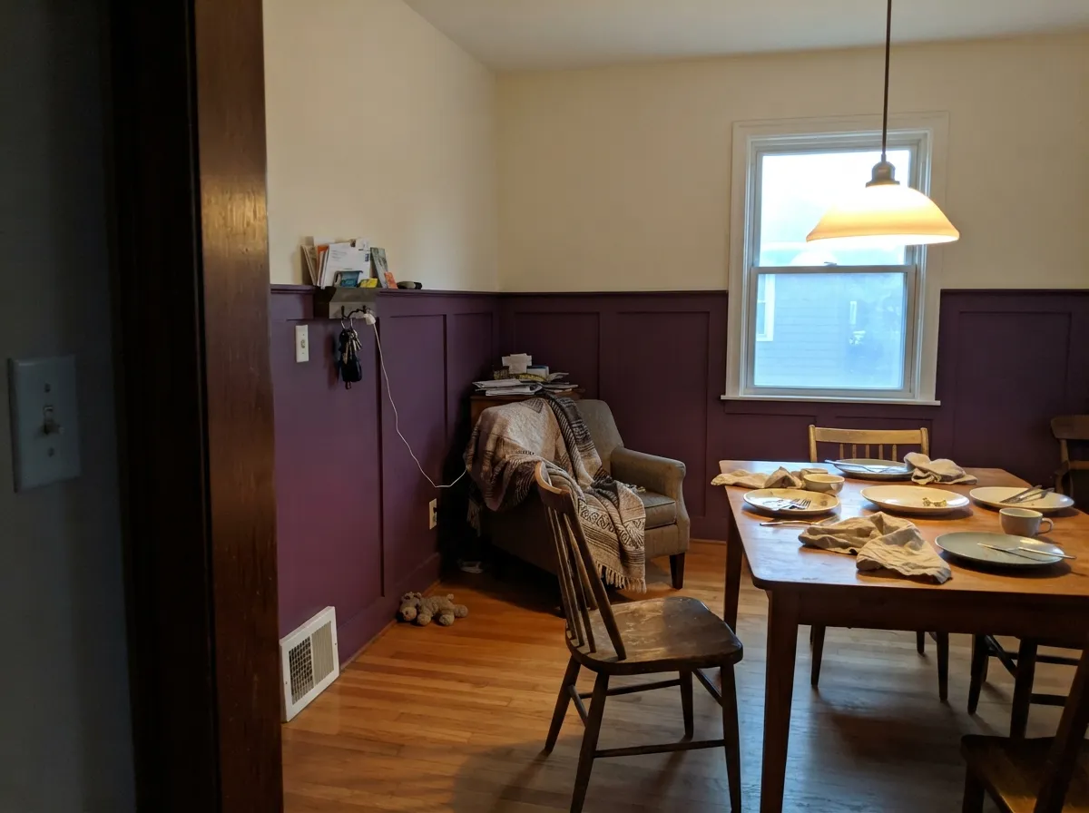
A candlelit or lamplit dining room is Sultana's second home; the balanced undertone keeps it from tipping too red or too blue as the light dims after dark. Pair it with a warm white or cream on trim so the room has a clear edge.
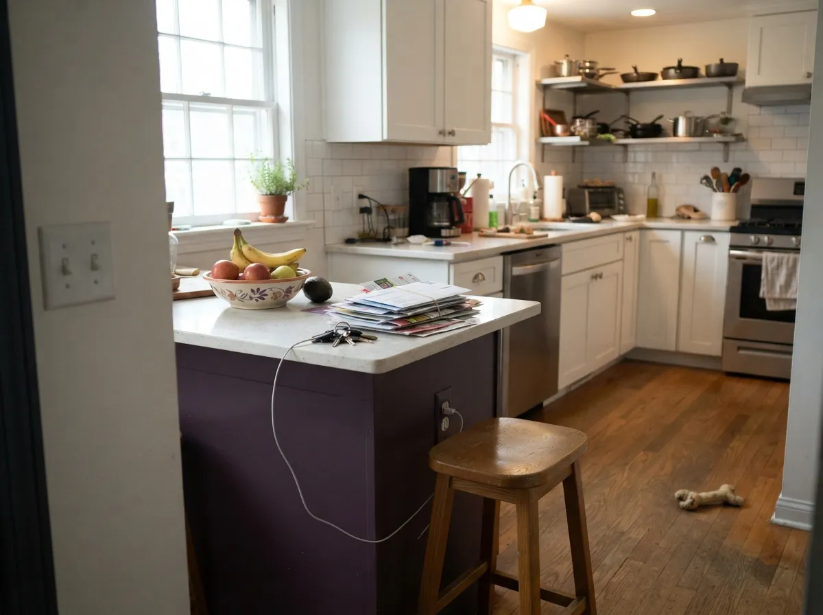
Behr lists it for cabinetry, and it earns the listing on an island or a run of lower cabinets under white walls, with brass pulls and butcher block or oak nearby. A full kitchen of Sultana cabinets is a much bigger, riskier bet.
Leather, walnut and brass lamp light are the color's natural company. It rewards a room that is used mostly in the evening; a den that only gets weak north daylight during the day will read flat until the lamps go on.
One wall behind the headboard, paired with a warm white on the rest, gives the drama without asking the whole room to go this dark. Four walls of Sultana in a bedroom with only overhead lighting is the color's hardest test.
Full sun reads it as a true dark plum rather than black, and against white or light-gray siding with black or brass hardware it makes a genuinely distinctive front door. Shaded, north-facing entries will read closer to near-black — which some buyers want anyway.
Your Light Is the Risk
Direct warm light — afternoon sun or a 2700K lamp — pulls the red forward and the color opens into a true, glowing plum-violet.
Cool, flat daylight reads Sultana as a dark charcoal with barely a hint of purple. If you wanted the color, not the shadow, this is the light to avoid painting blind in.
Brighter, cooler at midday with a bit more visible violet-blue; warmer and more wine-plum as the light lowers toward evening. The shift is real but gentle at this depth.
2700K warm bulbs bring the plum forward and make the color feel rich. Cool white LEDs flatten it toward gray-black — swap the bulbs before you swap the paint.
Most complaints about Sultana are a light mismatch. Upload a photo of your actual room and see it on your walls — then ask for the same wall in north light or evening lamps before you buy a single sample.
Need It From Another Brand?
Any paint counter can custom-tint Behr P100-7 directly. If you would rather stay in one brand's own deck, these are the closest stock matches, measured as ΔE2000. Under 2 is a difference you will not see on the wall.
| Brand | Closest color | ΔE | LRV | |
|---|---|---|---|---|
| Benjamin Moore | Eggplant1379 · Benjamin Moore | 4.2 | 11 | Color page → |
| Valspar | Magician's Cloak1009-8 · Valspar | 4.4 | 8 | Color page → |
| PPG / Glidden | Royal PlumPPG1178-7 · PPG / Glidden | 2.1 | 7 | Color page → |
| Glidden | Royal PlumPPG1178-7 · Glidden | 1.9 | 7 | Color page → |
| Dunn-Edwards | Your MajestyDE5986 · Dunn-Edwards | 3.1 | 8 | Color page → |
| Diamond Vogel | Joyous Song1187 · Diamond Vogel | 0.7 | 8 | Color page → |
Similar Behr Colors
The nearest shades to Sultana within Behr's own range, ranked by perceptual color distance — useful when you want the same look a touch lighter, darker, or warmer.
WCAG 2.1: AA is 4.5 : 1 for normal text, 3 : 1 for large text, AAA is 7 : 1.
Sultana vs the Colors You're Also Considering
Every Sultana sample board has the same rivals on it. The numbers show the real lightness gap — then it comes down to which risk you would rather live with.
Pick this if you want the purple to read recognizably violet-plum even in average light, not just in a spotlight.
Benjamin Moore 2117-30 · LRV 9ShadowPick this if you want it darker and more amethyst-black — Shadow barely admits it's purple except in direct light.
Pick this for the truer, more even purple — Medieval Wine can read plain brown in weak light where Sultana still shows violet.
Behr S100-7 · LRV 9Medieval WinePick this for the same Behr-deep commitment with a wine-red lean instead of a balanced plum.
Sultana Coordinating Colors
Behr's own guidance for Sultana is simple: soft creams and warm whites for the boundary, earthy browns and brass for warmth, and a touch of sage green or dusky blue where you want a second color in the room. These are the partners that follow that logic without fighting the balanced red-blue undertone:
Why Sultana Reads So Differently From Room to Room
The short explanation is arithmetic: at LRV 8, Sultana is already reflecting very little of whatever light hits it, so small changes in that light produce large changes in how the color looks. Behr's own description — nearly equal red and blue influence — means the color has no strong lean to fall back on the way a clearly warm plum or a clearly cool amethyst would. It reads as whichever half of its undertone the available light favors, which is exactly why the same can of paint can look near-black in an overcast kitchen and jewel-toned violet under a lamp that evening.
This is also a color with very little public history yet — it hasn't had a Color of the Year moment, a viral Houzz thread, or years of Reddit "is this too dark" posts the way Sherwin-Williams' Peppercorn or Behr's own Cracked Pepper have. That's not a mark against it; it just means the honest advice here leans on the color's physics and Behr's official pairing guidance rather than a pile of owner testimonials that don't yet exist.
Sultana With Wood Tones and Metals
Brass and natural oak are the pairing Behr itself recommends, and it holds up: unlacquered or antique brass hardware picks up the warm half of Sultana's undertone, and honey-to-medium oak reads rich rather than orange next to it, because the purple is dark enough not to fight the wood for attention. Walnut and espresso tones work the same way, just quieter — two dark, warm materials in the same room read as intentional layering, not competition.
Cool metals are the one thing to test first. Polished chrome and cool brushed nickel can make Sultana's blue half more noticeable, pushing it toward slate rather than plum — not a failure, but a different mood than the warm, jewel-toned version most people picture. Matte black is neutral either way and is the safest metal choice if you haven't decided which direction you want the room to lean.
Three Ready Palettes Built on Sultana
A color is never alone on the wall. These are complete combinations in the 60-30-10 pattern, with the reason each one holds together. Every one opens in the visualizer.
A small room is exactly where a color this deep earns its keep — the warm white trim gives the plum a clean edge instead of letting it bleed into the ceiling, and the near-black vanity frame reads as one deliberate dark note, not two competing ones.
Try this palette in your roomA warm cream on the main walls keeps the room from going cave-dark while the wainscoting or single accent wall carries all the drama. The near-black door is the one extra dark note that makes the scheme look planned instead of accidental.
Try this palette in your roomWhite walls do the heavy lifting so the island can be the one piece of real color in the room — the classic "one deep surface" kitchen formula. The warm beige on an adjoining wall keeps the transition from white to near-black from feeling abrupt.
Try this palette in your roomSultana FAQ
Is Sultana actually purple, or is it basically black?
It is a genuine purple, but a very dark one — LRV 8, close to a true black on the deck. In weak or cool light it can read as plain charcoal; in warm daylight or lamplight the violet comes forward clearly. Sample it in the room and the light you'll actually use before committing.
Is Sultana warm or cool?
Neither, by design — Behr describes it as having nearly equal red and blue influence, a balanced "grounded plum" rather than a color that leans hard warm (like a merlot) or hard cool (like a blue-violet amethyst). That balance is why it can look brownish in one light and bluish in another without actually being a different paint.
What trim color goes with Sultana walls?
A warm white or soft cream — Behr Whisper White or Blank Canvas — gives the plum a clean, finished edge. A stark, cool-toned white can make the wall look muddy by contrast; a near-black like Wrought Iron works as a single extra accent (door, mirror frame), not as the main trim.
Can I use Sultana on kitchen cabinets or an island?
Yes — Behr sells it as a cabinet, door and trim color, and it works especially well on a single island or a run of lower cabinets under white walls, with brass hardware and natural oak nearby. A full kitchen of Sultana cabinets is a much bigger commitment; test it on one piece first.
How many coats does Sultana need over a lighter color?
Behr's Dynasty and Marquee lines are formulated for one-coat hide when tinted into Sultana, but that assumes a compatible existing color. Going over a bright white or pastel, plan on a gray- or purple-tinted primer first, then two finish coats for even coverage.
Does Sultana work on an exterior or front door?
Yes, and it's one of the more distinctive front-door choices in this depth range. Full sun reads it as a true dark plum rather than black; a shaded, north-facing entry will read closer to near-black, which some buyers actually prefer. Pair it with white or light-gray siding and black or brass hardware.
Have you painted with Sultana?
Rate it — one tap helps the next reader decide.
Ask a Question