Medieval Wine
Behr's darkest wine-plum, reviewed honestly: the light that makes it glow red, the light that turns it black, and what to pick if you actually wanted purple.

Jessica has spec'd whites and neutrals for more than 300 rooms and keeps a sample wall of painted drawdowns in her studio. Every color review is checked against real reader rooms in the comments and re-tested when a formula changes. About the testing process →
- 1Liberty Blue1
- 2Medieval Wine9
- 3Blue Nova17
- 4Gothic Purple24
The Fast Verdict
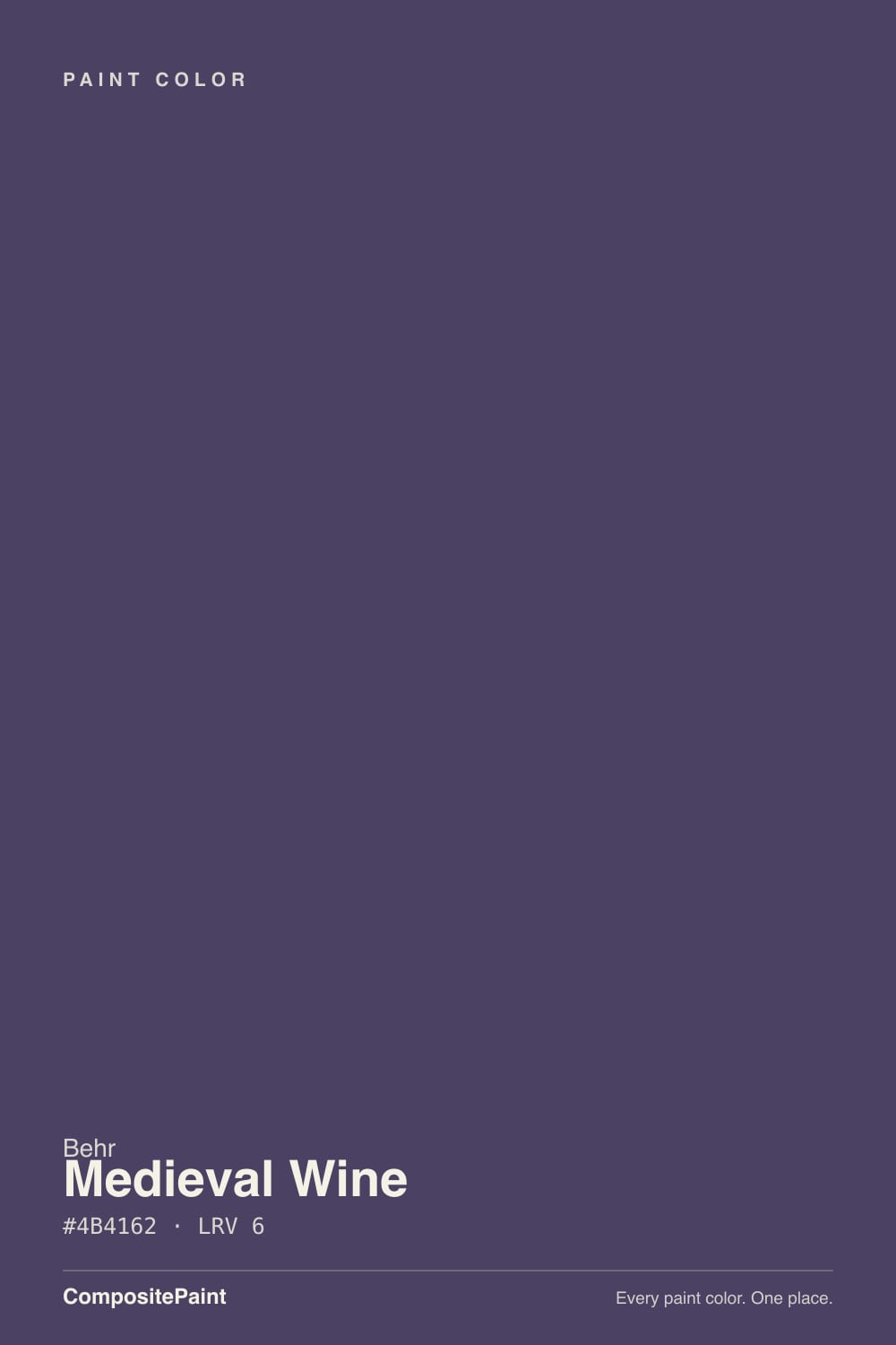
Medieval Wine is what a burgundy bottle looks like on a wall: a deep, brown-grayed red-violet with almost no shine to it, dark enough to pass for black across a room and honest enough to show its wine the moment real light or a warm lamp hits it. It is not a purple in the lavender sense — the grey keeps it grounded, closer to aged leather than to grape. Give it a lamp, a doorway, or direct sun and it is one of the moodiest, most grown-up colors Behr sells; leave it in a dim corner with cool bulbs and it just reads as a dark, slightly muddy wall.
Dining rooms and accent walls that get evening light or lamps · front doors and small exterior accents · powder rooms and vanities · kitchen islands and built-ins · anyone who wants "purple" without it reading purple
You actually want a true violet or lavender · the room has no window and no lamp plan · you're painting a large room with only cool white LEDs · your floor is honey-gold oak with no rug or contrast planned
- Genuine wine-plum depth that reads as sophisticated, not "purple bedroom"
- Brown-grayed undertone keeps it dignified in both daylight and lamplight
- Sold in interior and exterior formulas — rare for a color this dark
- Small-room jewel-box color: powder rooms, front doors, cabinetry, islands
- Comes forward and glows under warm 2700K light instead of going muddy
- LRV 9 is genuinely dark — no window or lamp plan means it reads almost black
- Cool white LEDs flatten the red into a bruised, muddy gray-plum
- Not an actual purple — buyers hoping for violet or lavender will be let down
- A full room without white trim contrast can feel cave-like fast
What Color Is Medieval Wine, Really?
A deep red-violet with most of the saturation drained out and a brown-gray cast poured back in — that trade is the entire personality of Medieval Wine. Measured, its hue sits around magenta-red on the wheel, the same family as a true violet, but the saturation is so low (under 10%) that almost nobody who sees it on a wall calls it purple. They call it wine, plum, aubergine, oxblood — burgundy-bottle words, not grape words. That distinction matters: buyers who want a lavender or violet mood color will find this one too brown and too dark; buyers who want a dramatic, grown-up dark color without the room reading "purple bedroom" have found their answer.
At LRV 9 this is a genuinely dark color — deeper than most "dark accent wall" paints and only a couple of points off true black (Behr's own near-black purples like Aubergine sit at LRV 5). That depth is the whole trade-off. In good light — direct sun, a warm lamp glowing against it in the evening — the wine-red comes forward and the wall looks rich and specific. In a dim room with no supplemental light, LRV 9 simply does not have enough reflectance to show its color; it reads as a dark, slightly warm black. This is not a flaw unique to Medieval Wine — every color this deep behaves the same way — but it is the single fact that decides whether you will love or regret this paint.
Undertone in one line: red-violet with brown mixed in, warm rather than cool. If your sample looks flatly gray-brown with no wine in it at all, the room is too dim or the bulbs are too cool; if it looks pink or bruised, that is cool light doing the same thing from a different angle. Neither means the paint is wrong — it means the light is.
Where It Shines
This color needs a job with real light behind it, and in that job it is genuinely striking. A dining room with an evening pendant, a front door that catches afternoon sun, a powder room with a sconce over the mirror, a kitchen island under can lights — small, lit, and specific is where Medieval Wine earns its keep. It is also sold across Behr's Marquee, Dynasty, Premium Plus and Pro lines in both interior and exterior formulas, which is unusual for a color this dark and opens up front doors, shutters and exterior accents as real options, not just interior accent walls.
Where It Fails
Nearly every disappointed review of a color this dark traces back to one of the same three situations, and all three are predictable before the first coat goes on. None of them are the paint's fault — but if your room matches one, this is not your color, and a bigger sample will only confirm it.
LRV 9 is close to black. Without a window that gets real light or a lamp aimed at the wall, Medieval Wine does not glow wine-red — it just sits there as a dark, flat wall with barely any visible color. This is the single most common regret with a color this deep: buyers picture the rich chip and forget the room has one small north window.
The name and the swatch both suggest grape, but the saturation is low and the base is brown, not blue. On the wall it reads wine, oxblood, aged leather — never lavender, never violet. If a true purple is the goal, look at Mystical Grape instead; Medieval Wine will feel like the wrong color even applied perfectly.
Cold light strips the red out of a warm dark color faster than almost anything else. Under 4000K-plus LEDs, Medieval Wine goes flat and slightly bruised-looking instead of rich. Warm 2700K bulbs are not optional with this paint — they are the difference between wine and mud.
Room by Room
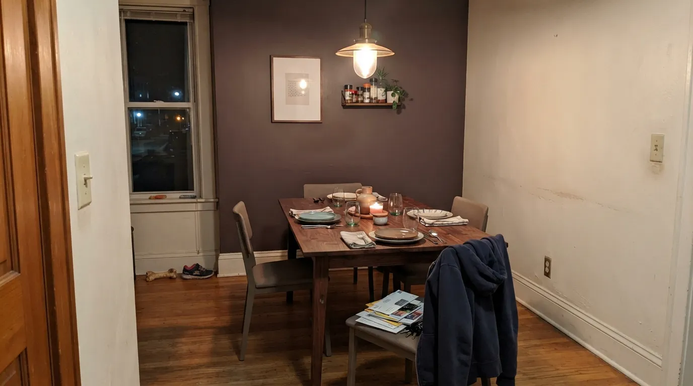
Evening use plus a pendant or wall sconces is exactly the light this color wants. Eggshell holds up to chair-back scuffs; White Dove trim keeps the room from feeling like a cave. Walnut table, brass fixtures, cream linens — the classic dark-dining-room recipe.
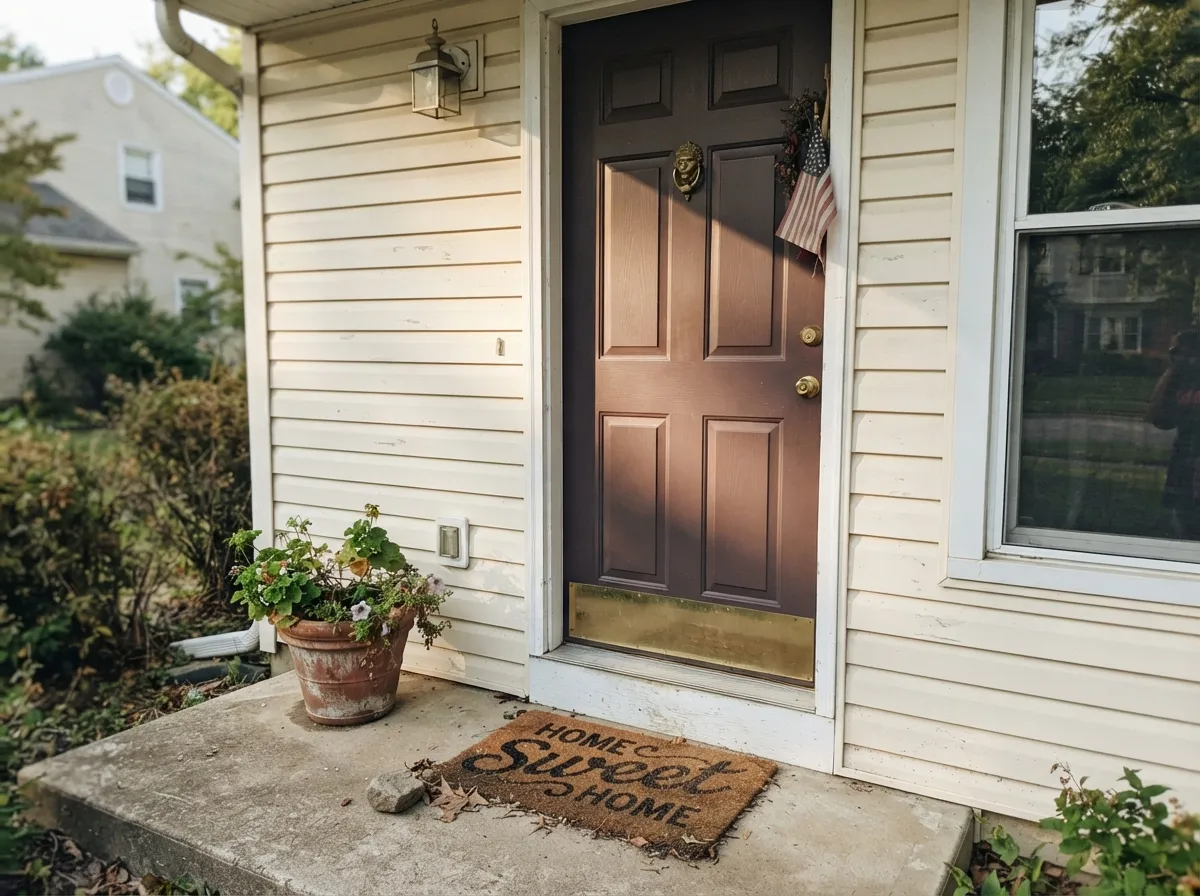
Behr sells Medieval Wine in an interior/exterior formula, which most colors this dark do not get. Full sun reads it as a rich burgundy door; shade reads it nearly black — sample it on the actual door before committing. Pairs well with a white or warm-neutral house body and black or bronze hardware.
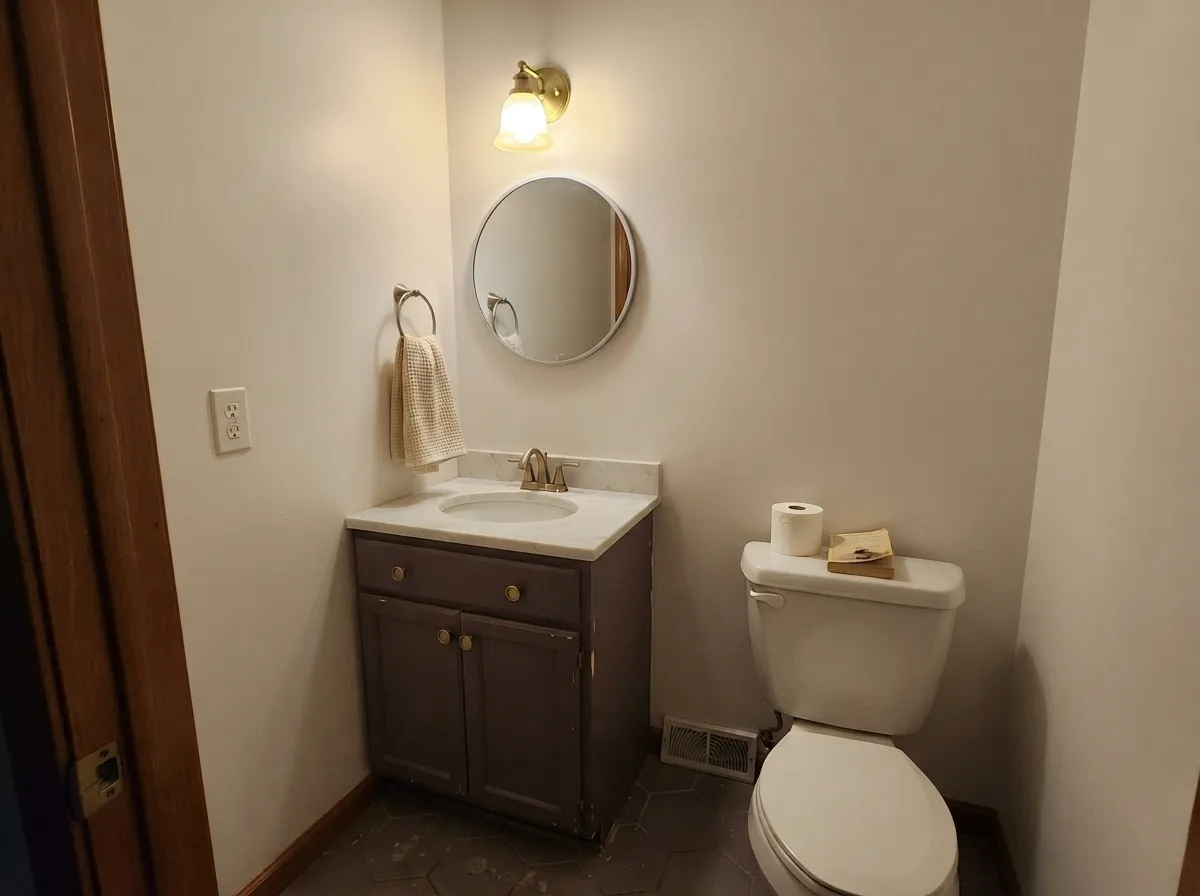
A windowless powder room with one good sconce is a perfect match: the room is small enough that "dark" reads as intentional rather than gloomy, and the color does not have to carry daylight duty. Satin on a vanity under a marble or butcher-block top with brass pulls looks custom for a weekend's work.
On an island or a single run of cabinets under a lighter wall color, it reads as a deliberate, expensive accent. A full kitchen of Medieval Wine cabinetry needs strong task lighting or the color disappears into shadow under the uppers. Satin or semi-gloss cabinet enamel either way.
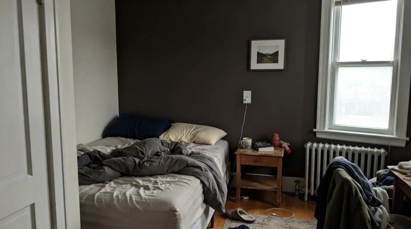
Behind a headboard with a bedside lamp on each side, it is genuinely romantic and cocooning. A full four-wall bedroom needs a real light plan — a window that gets afternoon sun, or lamps that stay on in the evening — or the room reads dark rather than moody.
Works as a single accent wall or a reading-nook wall with a floor lamp; a whole open-plan living room in this LRV is a bold, high-maintenance bet that depends entirely on the room's daylight. Pale Oak or Edgecomb Gray in the adjoining space keeps the handoff calm.
Your Light Is the Risk
2700K bulbs pull the red forward and the wall turns velvety wine instead of flat dark. This is the light the color depends on.
Without direct light or a lamp aimed at the wall, LRV 9 just reads as a dark, nearly black surface — the color disappears.
Full sun on a door or accent wall shows a genuine burgundy-wine color; step into shade and the same wall reads almost black.
Warm 2700K keeps the wine-red alive at night. Cool LEDs (4000K+) drain it toward a flat, bruised gray-plum — buy warm bulbs with this paint.
Most complaints about Medieval Wine are a light mismatch. Upload a photo of your actual room and see it on your walls — then ask for the same wall in north light or evening lamps before you buy a single sample.
Need It From Another Brand?
Any paint counter can custom-tint Behr S100-7 directly. If you would rather stay in one brand's own deck, these are the closest stock matches, measured as ΔE2000. Under 2 is a difference you will not see on the wall.
| Brand | Closest color | ΔE | LRV | |
|---|---|---|---|---|
| Benjamin Moore | CamelotCC-4 · Benjamin Moore | 2.0 | 10 | Color page → |
| PPG / Glidden | Pinot NoirPPG13-18 · PPG / Glidden | 2.1 | 9 | Color page → |
| Glidden | Pinot NoirPPG13-18 · Glidden | 2.4 | 9 | Color page → |
| Dunn-Edwards | Purple TrinketDE5979 · Dunn-Edwards | 2.6 | 9 | Color page → |
| Diamond Vogel | Crowd Pleaser1208 · Diamond Vogel | 3.8 | 9 | Color page → |
| C2 Paint | TamarindC2-505 · C2 Paint | 4.8 | 9 | Color page → |
Similar Behr Colors
The nearest shades to Medieval Wine within Behr's own range, ranked by perceptual color distance — useful when you want the same look a touch lighter, darker, or warmer.
WCAG 2.1: AA is 4.5 : 1 for normal text, 3 : 1 for large text, AAA is 7 : 1.
Medieval Wine vs the Colors You're Also Considering
Every Medieval Wine sample board has the same rivals on it. The numbers show the real lightness gap — then it comes down to which risk you would rather live with.
Pick this for the redder, winier version that reads closer to burgundy than to eggplant.
Benjamin Moore 1379 · LRV 11EggplantPick this if you want the red pulled toward true aubergine-purple instead of wine, and your room is small and warm.
Pick this for a couple more points of LRV and more red, so it still shows some color outside direct lamplight.
Sherwin-Williams SW 6286 · LRV 7Mature GrapePick this for an even darker, more purple-leaning plum — strictly for small, lamplit rooms.
Medieval Wine Coordinating Colors
The rule for coordinating with Medieval Wine is simple: warm whites and warm greiges soften it, and near-blacks give it exactly one dark partner instead of competing with it. Keep it away from cool blue-grays, which fight its brown-red base. These are the partners that keep it reading rich instead of murky:
Medieval Wine on Exteriors
Most colors this dark are interior-only, but Behr sells Medieval Wine in a Premium Plus interior/exterior formula, which opens up front doors, shutters and small exterior accents. Outside, the same light rule applies double: a door that gets real afternoon sun reads as a genuine wine-burgundy, while a shaded, north-facing door reads nearly black. Neither is wrong — walk the actual door location at the time of day you'll see it most before ordering paint.
For pairing, a warm-white or cream body color lets the door carry the color without a fight, and charcoal or black shutters give the facade one more dark note so the door doesn't stand alone as the only deep color on the house. Avoid pairing it with cool blue-gray siding, which pulls the door's warm base toward looking dingy rather than rich.
Medieval Wine With Wood Tones and Floors
Dark, red-brown woods are this color's best friends: walnut, espresso and aged leather all deepen it and make the wine read deliberate rather than accidental. Pale white oak and cool gray-washed floors are safe too, giving it a quieter, more contemporary backdrop.
The floor that needs a real sample first is golden honey oak. Yellow-green sits close to the opposite side of the wheel from this color's red-violet base, so a golden floor and a Medieval Wine wall can each push the other slightly off — the floor reading more orange, the wall reading slightly duller. It's rarely a hard no; a large rug or a run of darker furniture between the two usually resolves it, but test a big sample against the actual floor before committing a whole room.
Three Ready Palettes Built on Medieval Wine
A color is never alone on the wall. These are complete combinations in the 60-30-10 pattern, with the reason each one holds together. Every one opens in the visualizer.
White Dove trim keeps a wine-dark dining room from feeling like a cave, and Pale Oak next door softens the handoff instead of slamming the eye from near-black to bright white the moment you leave the room.
Try this palette in your roomA warm cream body lets the door read as a genuine wine color instead of just another dark door, and charcoal shutters keep the near-black depth of the door from being the only dark note on the facade.
Try this palette in your roomA small windowless powder room is where the darkest colors read as intentional rather than gloomy. Cream walls keep the room feeling airy, the vanity carries the color, and Wrought Iron on the mirror frame gives one crisp near-black accent so the palette reads deliberate.
Try this palette in your roomMedieval Wine FAQ
Is Medieval Wine purple or red?
Technically a red-violet, but the saturation is so low and the base so brown that almost nobody calls it purple on the wall. It reads as wine, burgundy or oxblood — a deep, grounded color, not a grape or lavender one. If you want an actual violet, this is the wrong color.
Is it too dark for a whole room?
At LRV 9, yes for most rooms without a real light plan. It works best as an accent wall, a door, a vanity or cabinetry — places where the color's depth is a feature, not something you have to fight for eight hours of daylight.
What trim white goes with Medieval Wine?
A warm white — White Dove or Swiss Coffee — in semi-gloss. A stark bright white makes the sense of contrast feel harsh rather than rich; a soft warm white lets the wine read as intentional and expensive instead of just dark.
Can I use it on a front door?
Yes — Behr sells it in an interior/exterior formula, which most colors this dark do not get. It reads as a rich burgundy in direct sun and nearly black in shade, so sample it on the actual door orientation before ordering paint.
Is it good for kitchen cabinets or an island?
Very good on an island or a single run of lower cabinets under a lighter wall color, less good across a whole kitchen where upper cabinets and shadow can swallow the color entirely. Satin or semi-gloss cabinet enamel either way, and plan for real task lighting.
Does it clash with honey oak floors?
It can. Red-violet sits opposite yellow-green on the wheel, and golden honey-oak floors push toward that clash more than walnut or espresso does. It is not an automatic no — a large rug or dark furniture between the wall and the floor usually settles it — but sample big before committing over golden wood.
Have you painted with Medieval Wine?
Rate it — one tap helps the next reader decide.
Ask a Question