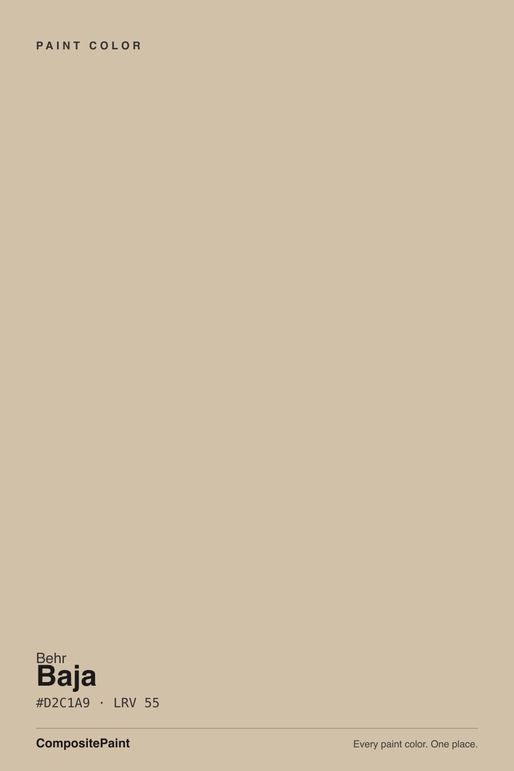
Baja
Behr's golden sandy tan, reviewed honestly: the stucco rooms where the gold is the point, the green-yellow that shows at night, and why it is not a quiet beige.

Jessica has spec'd whites and neutrals for more than 300 rooms and keeps a sample wall of painted drawdowns in her studio. Every color review is checked against real reader rooms in the comments and re-tested when a formula changes. About the testing process →
- 1Dorian Gray39
- 2Mindful Gray48
- 3Baja55
- 4Agreeable Gray60
- 5Pale Oak69
The Fast Verdict
Baja is a mid-tone sandy tan with a golden sepia base and a small green wink — richer and darker than the chip suggests, and not the grayed beige people grab when they type beige into search. In south or west daylight, against terracotta, walnut, and cream millwork, it reads like sun-baked stucco. Next to Polar Bear trim, under cool LEDs, or on four walls of an open plan, the gold is the whole story. Sample it at night.
Southwestern living rooms and stucco exteriors · daylit rooms that actually want gold sand · walnut, terracotta, and brass houses · satin cabinets in a warm kitchen
You wanted a grayed modern beige · trim stays Polar Bear or Ultra Pure White · cool gray floors or Carrara · a dim north room · you need one quiet color for the whole house
- Unapologetic sandy gold — the sepia is the point, not a surprise
- LRV 55 has enough body for stucco, cabinets, and daylit main rooms
- Flatters terracotta, walnut, brass, and Southwestern rooms
- Stocked at Home Depot, so touch-ups actually match
- Sun that yellows a cream just makes this one look like masonry
- Reads as a richer golden tan the moment you thought you bought beige
- Looks dingy-yellow next to Polar Bear or Ultra Pure White trim
- Yellow-green at night and under cool LEDs — the Houzz complaint
- A bit much for a whole house; fights orange oak and gray floors
What Color Is Baja, Really?
A warm sandy tan with real gold in it — not a greige, not a cream, and not a white, even though Behr files PPU7-08 in the White family. The gold is sepia, not butter: it sits in the sand, then a small green bias shows when the light goes cool or the bulbs go blue. Color consultant Kylie M put it on a Behr beige shortlist as the one that leans a wink more golden, richer than a modern muted beige, and a bit much for a whole house. That is the honest chip. On four walls it is a color, not a backdrop.
At LRV 55 it sits in the mid-neutral band with Revere Pewter (LRV 56) and a hair deeper than Accessible Beige (LRV 58) and Kilim Beige (LRV 57). Those three are the useful comparisons and the wrong ones. Accessible Beige grayed the yellow out; Kilim Beige went orange to save honey oak; Revere Pewter is a greige. Baja kept the gold. It will not wash out in a bright south room the way a cream does, and it will close a north hallway the way a mid-50s tan can. Plan for the wall to read a step deeper and noticeably more golden than the card.
Undertone in one line: gold first, sandy tan second, a wink of green third — never pink, never gray in the can. If your sample looks khaki-green, that is cool north light, a lawn bounce, or 4000K LEDs doing it. If it looks yellow, that is south sun or a brighter white parked next to it. Both versions are the same gallon being honest about the room.
Where It Shines
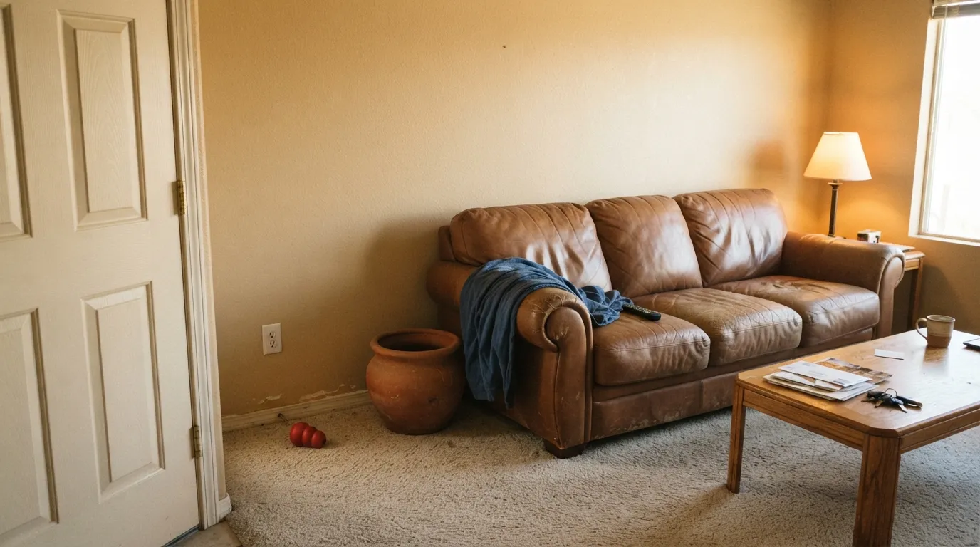
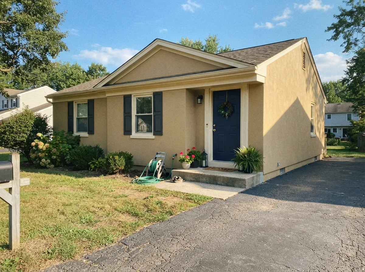
Give it real warm daylight, earthy materials, and a cream — not bright — white, and Baja does the job a sandy tan is supposed to do: the walls look like stone, the wood looks chosen, and the gold reads as climate instead of a 1990s leftover. Southwestern living rooms, stucco bodies, and satin cabinets in a kitchen that already has brass and warm stone are its home turf. The depth at LRV 55 is the asset outdoors; full sun that would yellow a cream just makes this one look like the desert it was named for.
Where It Fails
Almost every regret about Baja follows one of three scripts, and all three are visible on a large sample before the first gallon. None of them are a bad batch — but if your room matches one, this is not your tan, and a second coat will not gray the gold out.
On the chip it can pass as sand. On four walls the golden sepia is unmistakable — depth multiplies undertone. Kylie flagged it as richer than a modern muted beige and a bit much for a whole home; Houzz owners already living with it in open plans were shopping for something lighter. If your goal was Accessible Beige's grayed tan, this is the wrong can. Stay here only if gold is the point.
Polar Bear (LRV 94) or Ultra Pure White (LRV 97) on trim, ceiling, or a door is the classic pairing mistake. The bright white wins and Baja looks dingy, yellowed, and slightly dirty — the same trap creamy tans always hit. The fix is the trim, not a second coat: Alabaster or White Dove in semi-gloss. If the builder white has to stay, do not use this color.
A Houzz owner watching Baja through the day said it had a lot of yellow and a green undertone, mostly visible at night. Cool 4000K bulbs flatten the gold into khaki; 2700K lamps push it creamier and more sepia. Orange-leaning honey oak is the other tell: the green wink Kylie called a natural bias looks off-kilter against orange-beige finishes. Kilim Beige is the beige built for that floor. Walnut, terracotta, and pale oak are the easy yes.
Room by Room
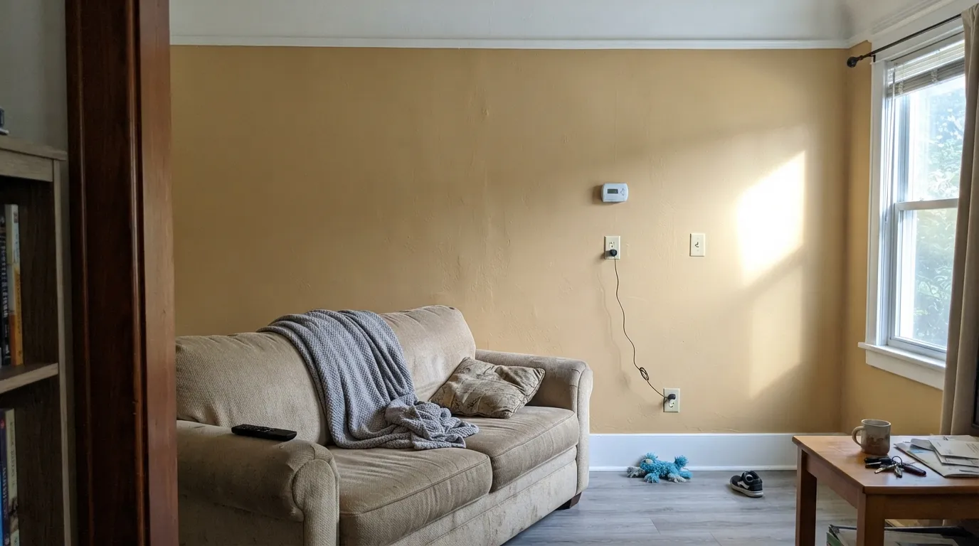
South or west daylight, terracotta or walnut, and cream millwork are where the sandy gold looks decided. Eggshell on the walls; Alabaster or White Dove on trim in semi-gloss. A new build with gray LVP and Polar Bear casing is the wrong living room — sample at 4 p.m. and again after dark.
Full sun that makes it too gold indoors just makes it read like warm masonry outdoors. Spanish, ranch, and Southwestern bodies take it; pair with Iron Ore or Kendall Charcoal on shutters and a Hale Navy door. Walk the north elevation with a board — shade will pull it a step more khaki and green than the sunny side.
At LRV 55 it wraps instead of bouncing, and under 2700K bulbs the gold goes quietly creamy. Keep the bedding on the warm side; gray linens will make the walls look more yellow than they are. A north cave with cool LEDs is where the green-khaki reviews would come from — step to Accessible Beige or skip tan.
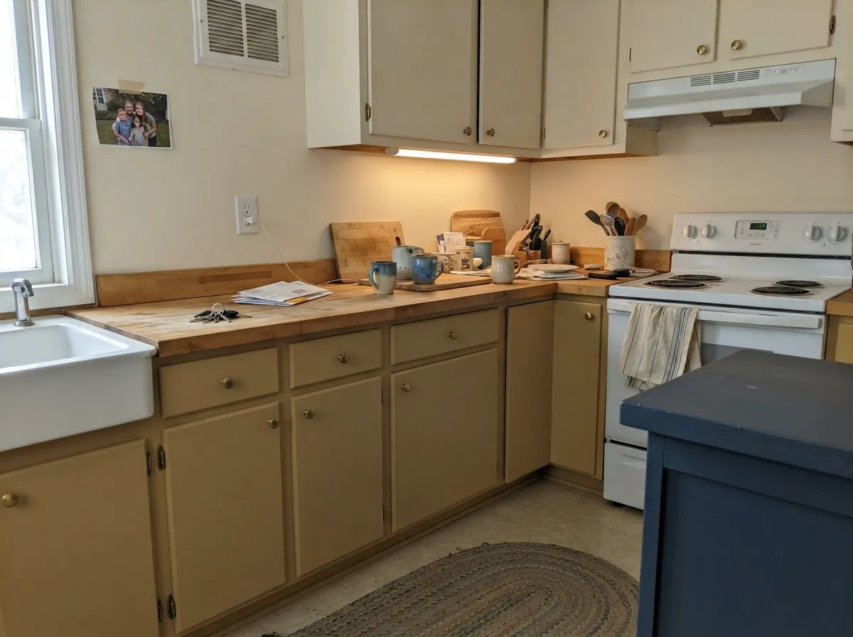
Behr's own pro desk has pointed people at Baja for cabinets: satin on lowers or an island under Alabaster walls reads custom without a saturated color. Travertine, butcher block, and brass love it. Cool white quartz, gray tile, and chrome argue, and the gold reads sour. Test it at night under the actual under-cabinet lights.
An open dining room that borrows west light from the living room is a natural fit, and the mid-tone hides chair-rail scuffs better than a pale beige. A closed, lamp-only dining room needs the bulbs at 2700K or it goes khaki at dinner. Entries with a real window carry; windowless foyers do not.
Kylie would not toss it wall-to-wall, and Houzz threads of people already living in Baja open plans were looking for something lighter. Run it in the rooms with sun and step to Accessible Beige (LRV 58) or Natural Tan (LRV 65) in the connectors. A whole house of this gold is a climate, not a neutral.
Your Light Is the Risk
Warm sun is where the sandy gold looks like stucco, not leftover beige. This is the light the color was named for.
Cool grey daylight strips the gold and leaves khaki with the green wink showing. Dim north rooms go dingy. Test first.
Quieter sand in morning east light; west and golden hour amp the sepia until it glows. Sample at 4 p.m. before you commit.
2700K lamps: creamier, cozier gold. Cool 4000K LEDs: yellow-green khaki — the night shift owners actually notice. Swap bulbs, not paint.
Most complaints about Baja are a light mismatch. Upload a photo of your actual room and see it on your walls — then ask for the same wall in north light or evening lamps before you buy a single sample.
Need It From Another Brand?
Any paint counter can custom-tint Behr PPU7-08 directly. If you would rather stay in one brand's own deck, these are the closest stock matches, measured as ΔE2000. Under 2 is a difference you will not see on the wall.
| Brand | Closest color | ΔE | LRV | |
|---|---|---|---|---|
| Sherwin-Williams | BeachcomberSW 9617 · Sherwin-Williams | 1.1 | 55 | Color page → |
| Benjamin Moore | Shaker BeigeHC-45 · Benjamin Moore | 1.8 | 54 | Color page → |
| Valspar | Elk AntlerT567 · Valspar | 1.6 | 54.8 | Color page → |
| PPG / Glidden | StylishPPG1101-3 · PPG / Glidden | 2.8 | 54 | Color page → |
| Glidden | Sudan Sand Beige30YY 53/125 · Glidden | 1.4 | 53 | Color page → |
| Dutch Boy | Beachwalk416-1DB · Dutch Boy | 2.4 | 54 | Color page → |
Similar Behr Colors
The nearest shades to Baja within Behr's own range, ranked by perceptual color distance — useful when you want the same look a touch lighter, darker, or warmer.
WCAG 2.1: AA is 4.5 : 1 for normal text, 3 : 1 for large text, AAA is 7 : 1.
Baja vs the Colors You're Also Considering
Every Baja sample board has the same rivals on it. The numbers show the real lightness gap — then it comes down to which risk you would rather live with.
Pick this when the gold is the point and a quiet beige would look washed out against terracotta or stucco.
Sherwin-Williams SW 7036 · LRV 58Accessible BeigePick this if you want the grayed-out beige — the yellow is muted, so it stays a safe warm neutral until the light goes cool.
Pick this when the oak is walnut or pale and you want sand-gold instead of a true beige.
Sherwin-Williams SW 6106 · LRV 57Kilim BeigePick this if the floors are honey oak — it is the beige that saves orange wood, with none of Baja's green wink.
Across brands the field is crowded. Rodda Quilt (CA098, LRV 54) at 0.91 is a true match you would not distinguish on a wall. Sherwin-Williams Beachcomber (SW 9617, #D0C1AC, LRV 55) at 1.13, C2 Monaco (C2-800, LRV 54) at 1.34, and Glidden Sudan Sand Beige (30YY 53/125, LRV 53) at 1.38 are all visually identical in normal room light. Farrow and Ball Oxford Stone (No. 264, LRV 54) at 1.59, Valspar Elk Antler (T567, LRV 54.8) at 1.6, and Benjamin Moore Shaker Beige (HC-45, #D1C2A7, LRV 54) at 1.75 sit in the same group, close enough to swap in most rooms. Dunn-Edwards Apache Tan (DEC746) at 2.02 is very close in hue but drops to LRV 50, so it will look a step darker. Inside Behr, Tiramisu Cream (HDC-MD-12, LRV 54) is the creamier option and Classic Taupe (290E-3, LRV 55) the more restrained one.
Baja Coordinating Colors
The rule for coordinating with Baja: stay on the warm side and keep the whites creamy, not bright. It wants terracotta, walnut, muted sage, and a near-black — and it argues with icy whites, cool greys, and orange-forward honey oak. These are the partners that keep showing up in rooms that work:
No Viral Kitchen, Plenty of Stucco
There is no Color of the Year plaque and no designer who built a career on PPU7-08. What exists is quieter: Behr's own page calling it a tan with a golden sepia undertone (and then filing it in the White family, which tells you nothing useful), the pro desk suggesting it for cabinets, Kylie M putting it on a Behr beige shortlist as the golden one with a green wink, and Houzz owners already living in it who wanted something lighter. That is not fame. It is a usable sandy tan sitting in the Designer Collection while Accessible Beige and Kilim Beige get the blog ink.
Here is why the obscurity is useful. Baja is gold enough to behave like a climate on stucco and Southwestern interiors, and deep enough at LRV 55 that it still looks like a color on the wall. The catch the pretty name does not advertise is the one owners actually report: it shifts — sand by day, yellow-green at night — and it is a bit much if you wanted a quiet beige for the whole house. Sample big, at 4 p.m. and after dark. If your room is warm and daylit, you get the desert tan. If it is not, you get khaki.
Baja With Wood Tones and Floors
Walnut, espresso, pale unstained white oak, and terracotta are the easy yes — the dark or quiet wood lets the gold read as sand instead of stacking more yellow on top. Saltillo, travertine, and sisal all sit in the same climate. Brass and matte black are the metals; polished chrome is the one that leans cold against it.
The sample-first pairing is orange-leaning honey oak and golden builder beige carpet. Kylie's green wink is a wallflower until it meets orange-beige finishes, and then the walls look slightly off-kilter while the floor looks more orange. Kilim Beige is the beige that was built for that oak. If the golden floor is staying and you still want Baja, put a large rug between them and live with a big sample on the wall for a few days before you buy gallons.
Cool gray LVP and gray-washed wood are the honest no. They sit at the opposite temperature, shove the gold forward, and make the floor look colder. Warm rugs will not rescue a whole-room clash. With cool floors, pick a greige such as Agreeable Gray (LRV 60) and let the warmth come from wood and textiles, not the wall.
Three Ready Palettes Built on Baja
A color is never alone on the wall. These are complete combinations in the 60-30-10 pattern, with the reason each one holds together. Every one opens in the visualizer.
This is the facade the color was built for: sandy body, cream — not bright — millwork, and a near-black that respects LRV 6 on shutters. Alabaster keeps the gold looking intentional; a Polar Bear trim line would make the stucco look yellowed from the street.
Try this palette in your roomWhite Dove is the safest warm white for this gold — it cuts the tan without going gallery-bright. Evergreen Fog is the muted sage that sits next to sandy walls without turning the room into a desert theme; one color note, not a second personality.
Try this palette in your roomAlabaster on the walls keeps the kitchen airy while Baja cabinets carry the sand. Hale Navy is the safest navy for the island as long as the room has light; brass hardware and a warm stone top finish the argument. Cool gray backsplash is the one pairing that sours it.
Try this palette in your roomBaja FAQ
Is Behr Baja beige, tan, or gold?
Tan with gold in it — a sandy mid-tone, not a grayed beige. Behr's own line is a golden sepia undertone; Kylie M called out a wee green wink as its natural bias. In south sun it reads sun-baked sand. In north light or under cool LEDs it reads khaki-green. If you actually want beige, pick Accessible Beige (LRV 58) or Kilim Beige (LRV 57).
What trim white goes with Baja?
A warm, slightly creamy white — Alabaster or White Dove in semi-gloss. Behr Swiss Coffee works if you want the whole room warmer, knowing it is the warmest of the safe off-whites and it shows. Polar Bear (LRV 94) and Ultra Pure White (LRV 97) make the walls look dingy-yellow. Never park a gallery white next to this tan.
Does Baja work on a whole house?
Only if you actually want gold in every room. Kylie flagged it as a bit much for a whole home; Houzz owners already living with it in open plans were hunting for something lighter. Run it in the sunlit rooms and step to Accessible Beige or Natural Tan (LRV 65) in halls and north bedrooms. A whole house of this is a climate.
Does Baja work with honey oak floors?
Sample first. The green wink looks off-kilter against orange-beige finishes, which is exactly the oak that makes people reach for tan. Kilim Beige is the beige that was built for honey oak. Walnut, espresso, pale white oak, and terracotta are the easy yes with Baja. A large board over the actual floor at 4 p.m. and again after dark is cheaper than a repaint.
Is Baja good for kitchen cabinets?
Yes, in doses — satin on lowers or an island under a cream wall is the custom look Behr's pro desk has pointed people toward. A full kitchen of these walls can feel heavy next to white quartz. Keep the counters warm (butcher block, travertine, cream stone) and the bulbs at 2700K–3000K. Cool LEDs will pull the yellow-green.
Does Baja work on exteriors and stucco?
This is its strongest use. Sun lifts it toward warm masonry instead of washing it out, and a flat or matte sheen on stucco looks like the material, not like paint. Pair with Alabaster or White Dove trim, Iron Ore or Kendall Charcoal shutters, and a Hale Navy door. Walk around the house with a board — the north elevation will read a full step more khaki than the south.
Have you painted with Baja?
Rate it — one tap helps the next reader decide.
Ask a Question