Palette · Study

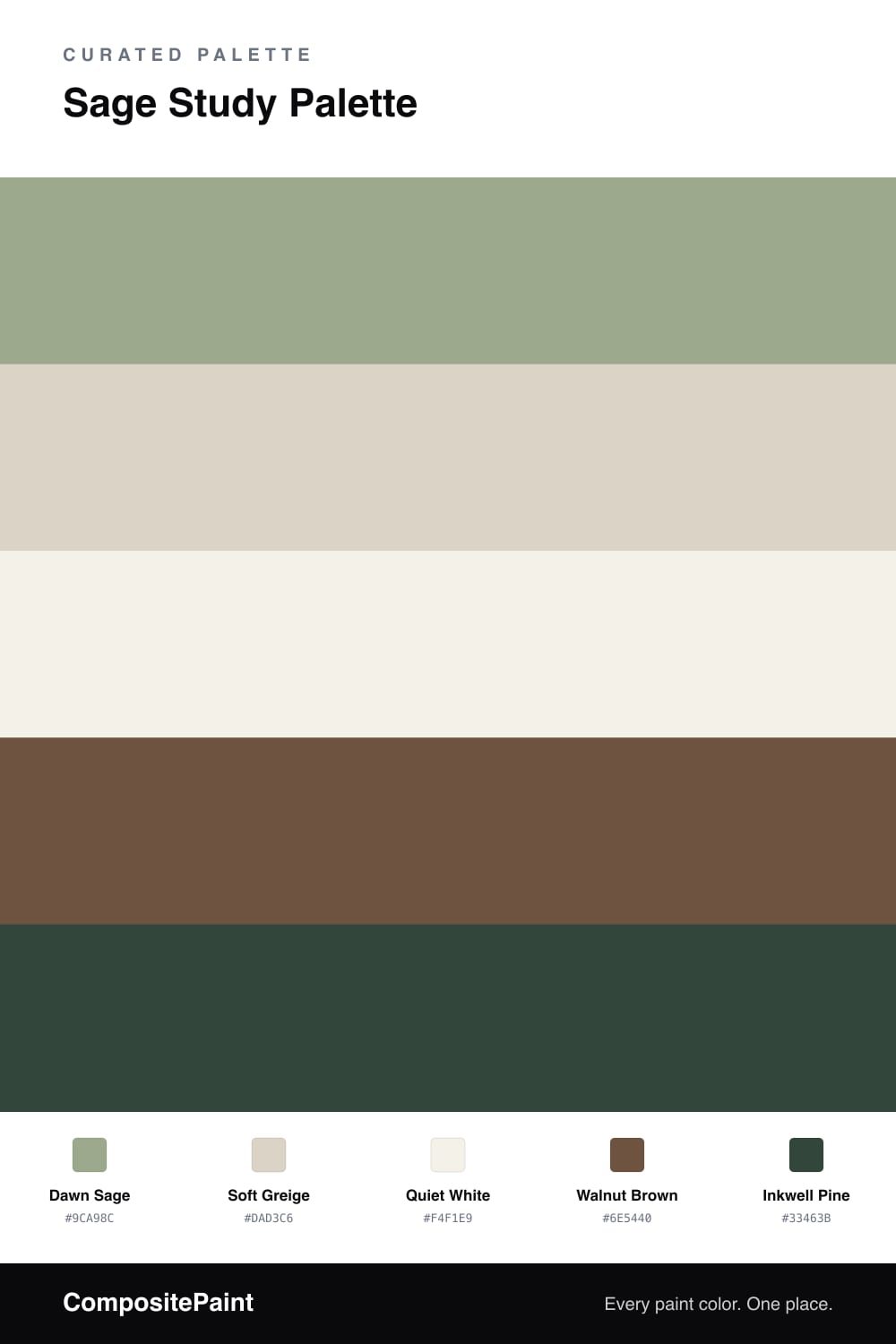
Sage Study PaletteDawn Sage & Inkwell Pine

A calm five-color study scheme led by soft sage, balanced with a warm greige backdrop, crisp white trim, walnut wood, and a deep pine accent — every color matched to real paint you can buy.

By Emily Roberts · DIY Editor & First-Timer's Guide
View palette in

A study should feel quiet, and this scheme is built around that idea. Dawn Sage leads on the walls — a soft, dusty green that reads almost neutral in daylight and warms up beautifully under a desk lamp at night. It is the kind of color that helps your shoulders drop the moment you sit down.

Around it, Soft Greige carries any built-ins or a cabinet, and Quiet White keeps the trim and ceiling fresh without going stark. Walnut Brown brings in the grounded, woody warmth of a floor or a good desk, which stops the green from feeling cool or clinical.

For the spark, lean on Inkwell Pine in small doses — the back of a bookshelf, a single painted door, or a window frame. It is a deep, modern green that ties the whole room together and gives the calm a little backbone. That mix of soft sage and one richer green feels very much of the moment heading into 2026.

Buy these colors

Every Color, Matched to Real Paint

Each color matched to the closest paint in every brand we track, by ΔE2000. Tap a swatch for its full guide. Take any code to the store, they mix on demand.

Questions people actually ask

Questions

Why does sage work so well in a study?

Sage is a muted green, which means it has a lot of gray mixed in. That softness keeps it from grabbing your attention, so it helps a room feel calm and focused — exactly what you want where you read or work.

How much of each color should I use?

Let the sage lead on the walls and the white handle trim and ceiling. Use the greige on built-ins or a cabinet, walnut on the floor or a desk, and save the deep pine for one small moment like a shelf back or a door.