Sage Study Palette — Quiet Sage & Inkwell Green
A grounded five-color study scheme led by soft sage, layered with warm greige, crisp white, walnut wood, and a deep ink-green accent — every color matched to real paint you can buy.
By Jessica Williams · Color Stylist & Interior Editor
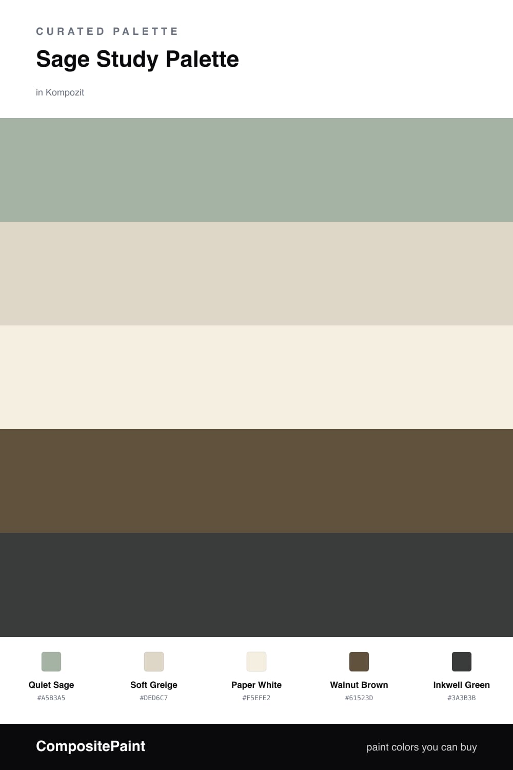
A study should feel like a deep breath. This scheme starts there, with Quiet Sage washing the walls in a soft, grounded green that takes the edge off a long afternoon at the desk. It is gentle but never sleepy, the kind of color that holds steady while you think.
Soft Greige warms the cabinets and built-ins so the green has something to lean on, and Paper White keeps the trim and ceiling clean and quiet overhead. Underfoot, Walnut Brown floors bring the whole room down to earth and stop the sage from drifting too cool.
The spark is Inkwell Green, a near-black forest tone for a bookshelf back, a door, or one moody accent wall. It pulls the palette toward something a little more contemporary and gives the room real depth. Lead with the sage, let the neutrals do the quiet work, and save the ink-green for one confident move.
Buy These Colors
Each color matched to the closest real paint in every brand, by ΔE2000. Kompozit first; take any SKU to the store — these mix on demand.
Questions
Sage is a soft, restful green that quiets the eye without putting you to sleep. In a study that calm reads as focus — your attention settles on the work in front of you instead of the walls.
Let the deep Inkwell Green do the lifting. A painted shelf, a door, or a single dark wall gives the eye somewhere to land, and the walnut floors and tones add warmth so the sage never turns flat.
Similar Palettes
Closest schemes by color — not by label.