CP

Red Color Palette — Red Frost

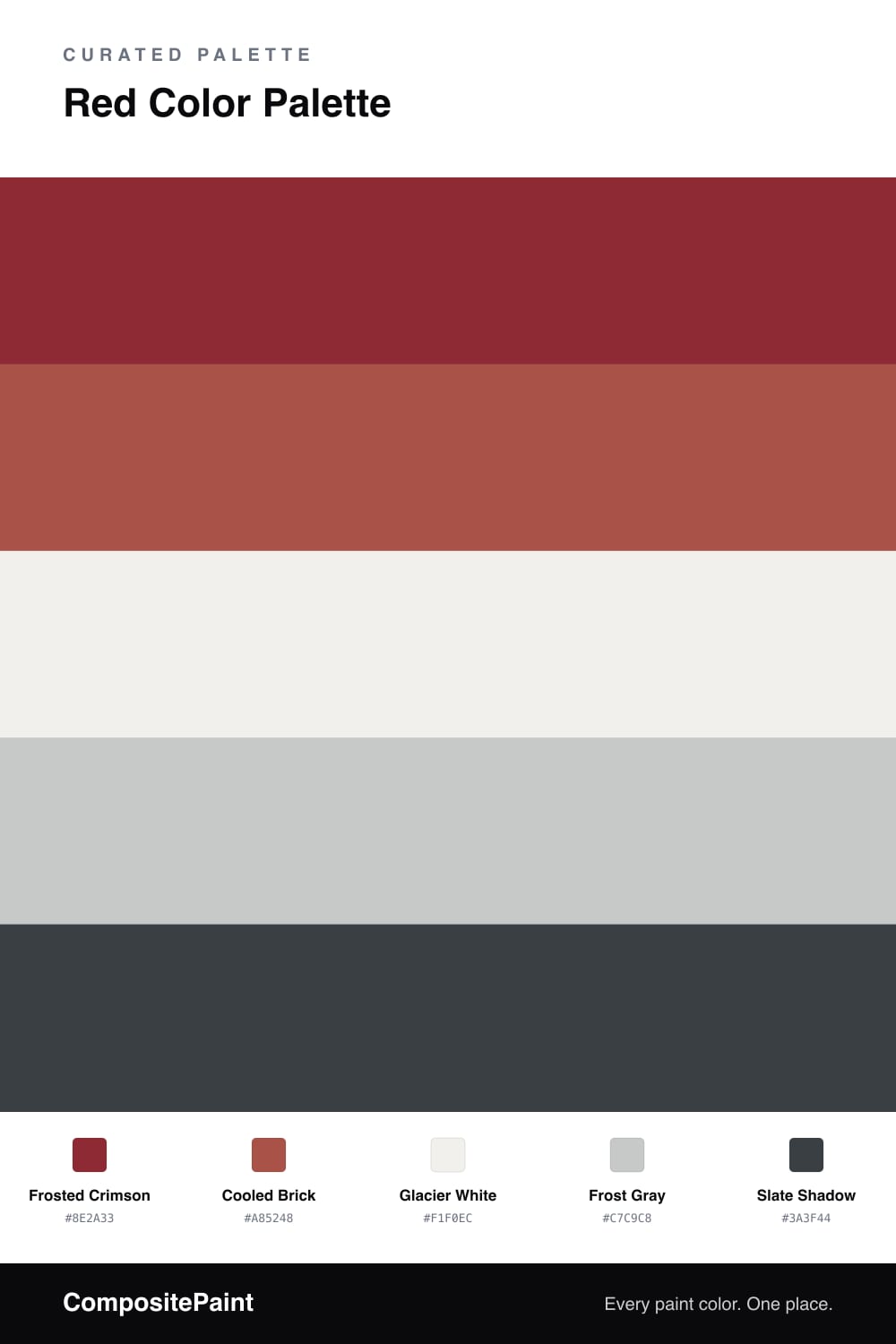
A cool-leaning five-color scheme led by a deep crimson red and balanced with icy grays, soft white, and a slate accent — every color matched to real paint you can buy.

By Maya Patel · Reviews Editor & Product Tester

Most red schemes go straight for heat. This one does the opposite. Frosted Crimson is a deep red with a cool blue undertone, so it feels sharp and modern instead of warm and traditional — exactly the direction red is moving in 2026.

Cooled Brick softens the jump between the crimson and the neutrals, giving you a muted mid-tone to lean on. Glacier White and Frost Gray keep everything bright and airy, which is what makes the red look intentional rather than loud.

The Slate Shadow accent is the trick that holds it all together — a near-charcoal with a faint cool cast that echoes the gray and grounds the red. Use it sparingly on trim, hardware, or a single fixture and the whole palette snaps into focus.

View palette in
Frosted Crimson
Dominant
Valspar Pomegranate Seeds · V043-6
#8D2E32
LRV 8
Cooled Brick
Secondary
C2 Paint Firefly · C2-567
#A55147
LRV 14
Glacier White
Base
Kompozit White Shoulders · 1265
#F1F0EC
LRV 87
Frost Gray
Support
Behr Burnished Metal · UL260-17
#C7CAC9
LRV 59
Slate Shadow
Accent
Valspar Chimney Smoke · 4010-1
#3A4044
LRV 5

Buy These Colors

Each color matched to the closest real paint in every brand, by ΔE2000. Tap a swatch for its full guide or + to save it — take any SKU to the store, they mix on demand.

Frosted Crimson
#8E2A33 · LRV 8 · Dominant
Sherwin-Williams · SW 2903 · ΔE 2.39
Behr · S-H-190 · ΔE 1.52
Benjamin Moore · AF-290 · ΔE 3.28
Valspar · V043-6 · ΔE 1.35
PPG / Glidden · PPG1052-7 · ΔE 6.4
Glidden · 00YR 08/409 · ΔE 2.65
Dutch Boy · 205-7DB · ΔE 4.04
HGTV Home by Sherwin-Williams · HGSW 2051 · ΔE 2.9
Dunn-Edwards · DEFD08 · ΔE 5.73
Magnolia Home · JG-28 · ΔE 3.69
Farrow & Ball · NO. 217 · ΔE 6.67
Diamond Vogel · H008 · ΔE 4.81
Hirshfield's · 0066 · ΔE 2.12
Rodda · R124 · ΔE 7.79
C2 Paint · C2-519 · ΔE 4.69
Clare · PNT100-DP-67 · ΔE 10.67
Portola Paints · POE · ΔE 15.24
Annie Sloan · BURGUNDY · ΔE 8.2
Backdrop · BD-SB · ΔE 5.08
Rust-Oleum · 329211 · ΔE 11.44
Kompozit · 0066 · ΔE 2.12
Cooled Brick
#A85248 · LRV 15 · Secondary
Sherwin-Williams · SW 6320 · ΔE 3
Behr · 220D-7 · ΔE 1.5
Benjamin Moore · 2089-10 · ΔE 1.82
Valspar · M104 · ΔE 2.34
PPG / Glidden · PPG13-15 · ΔE 2.85
Glidden · 10YR 14/348 · ΔE 3.31
Dutch Boy · 205-6DB · ΔE 1.78
HGTV Home by Sherwin-Williams · HGSW 2062 · ΔE 2.66
Dunn-Edwards · DE5118 · ΔE 1.22
Magnolia Home · JG-36 · ΔE 7.01
Farrow & Ball · NO. 304 · ΔE 1.09
Diamond Vogel · H013 · ΔE 3.18
Hirshfield's · H0013 · ΔE 1.89
Rodda · CA225 · ΔE 4.7
C2 Paint · C2-567 · ΔE 0.71
Clare · PNT100-DP-30 · ΔE 6.09
Portola Paints · ZION · ΔE 9.84
Annie Sloan · EMPERORS SILK · ΔE 7.86
Backdrop · BD-BH · ΔE 7.87
Rust-Oleum · 329211 · ΔE 8.47
Kompozit · 1075 · ΔE 2.1
Glacier White
#F1F0EC · LRV 87 · Base
Sherwin-Williams · SW 9623 · ΔE 2.11
Behr · 700C-1 · ΔE 0.82
Benjamin Moore · 880 · ΔE 1.91
Valspar · 7002-6 · ΔE 0.99
PPG / Glidden · PPG1001-1 · ΔE 1
Glidden · 30GY 88/014 · ΔE 1.57
Dutch Boy · 003W · ΔE 1.25
HGTV Home by Sherwin-Williams · HGSW 4026 · ΔE 1.04
Dunn-Edwards · DET648 · ΔE 0.21
Magnolia Home · JG-107 · ΔE 1.42
Farrow & Ball · NO. 239 · ΔE 3.18
Diamond Vogel · 1265 · ΔE 0.51
Hirshfield's · 1265 · ΔE 0
Rodda · R003 · ΔE 0.66
C2 Paint · C2-804 · ΔE 2.12
Clare · PNT100-LT-24 · ΔE 3.29
Portola Paints · ORIGAMI · ΔE 1.05
Annie Sloan · OLD OCHRE · ΔE 14.4
Backdrop · BD-TR · ΔE 3.18
Rust-Oleum · 285140 · ΔE 3.41
Kompozit · 1265 · ΔE 0
Frost Gray
#C7C9C8 · LRV 58 · Support
Sherwin-Williams · SW 7071 · ΔE 1.01
Behr · UL260-17 · ΔE 0.53
Benjamin Moore · 1459 · ΔE 1.09
Valspar · 8006-11B · ΔE 1.34
PPG / Glidden · PPG0994-2 · ΔE 1.33
Glidden · PPG0994-2 · ΔE 1.33
Dutch Boy · 437-2DB · ΔE 0.6
HGTV Home by Sherwin-Williams · HGSW 1467 · ΔE 1.01
Dunn-Edwards · DEGR65 · ΔE 1.3
Magnolia Home · JG-12 · ΔE 3.39
Farrow & Ball · NO. 270 · ΔE 4.66
Diamond Vogel · 0546 · ΔE 1.56
Hirshfield's · 0546 · ΔE 1.1
Rodda · R013 · ΔE 3
C2 Paint · C2-992 · ΔE 1.44
Clare · PNT100-LT-08 · ΔE 2.59
Portola Paints · LUMIERE · ΔE 4.04
Annie Sloan · PARIS GREY · ΔE 6.28
Backdrop · BD-RR · ΔE 7.71
Rust-Oleum · 285139 · ΔE 11.44
Kompozit · 0546 · ΔE 1.1
Slate Shadow
#3A3F44 · LRV 5 · Accent
Sherwin-Williams · SW 9690 · ΔE 5.07
Behr · ECC-25-3 · ΔE 2.47
Benjamin Moore · 2125-10 · ΔE 2.6
Valspar · 4010-1 · ΔE 1.02
PPG / Glidden · PPG0995-7 · ΔE 3.4
Glidden · PPG0995-7 · ΔE 3.4
Dutch Boy · 437-7DB · ΔE 5.02
HGTV Home by Sherwin-Williams · HGSW 3381 · ΔE 6.53
Dunn-Edwards · DE6350 · ΔE 2.48
Magnolia Home · JG-97 · ΔE 2.32
Farrow & Ball · NO. 95 · ΔE 1.58
Diamond Vogel · 0515 · ΔE 3.28
Hirshfield's · 0529 · ΔE 3.55
Rodda · CA210 · ΔE 3.75
C2 Paint · C2-757 · ΔE 3.08
Clare · PNT100-DP-54 · ΔE 5.75
Portola Paints · NOMAD · ΔE 7.55
Annie Sloan · AUBUSSON BLUE · ΔE 7.31
Backdrop · BD-AH · ΔE 5.95
Rust-Oleum · 285144 · ΔE 1.87
Kompozit · 0529 · ΔE 3.55

Questions

Why does this red feel cool instead of warm?

The crimson here carries a touch of blue under it, and the grays around it are cool too. Set against icy white and slate, the red reads crisp and a little wintry rather than cozy and fiery.

How much red should I actually use?

Let the crimson lead but keep it to one big move — one wall, cabinetry, or a large piece. The white and grays should fill most of the space, with slate as the quiet finishing line.

KEEP EXPLORING

Similar Palettes

Closest schemes by color — not by label.