CP

Plum Dining Room Palette — Rich Plum & Warm Gold

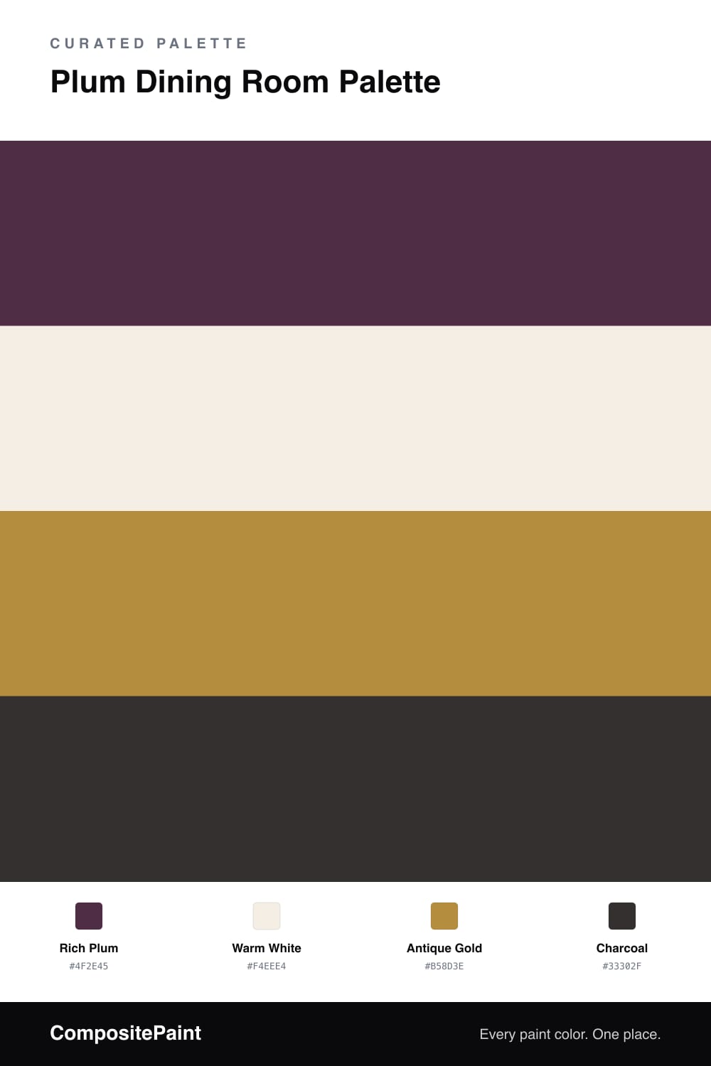
A jewel-toned 4-color scheme for a dramatic dining room: deep plum walls, crisp warm white trim, a gold accent, and grounding charcoal for contrast. Every color matched to real paint you can buy.

By Jessica Williams · Color Stylist & Interior Editor

A dining room is the one place where a deep, jewel-toned wall pays off, because most of the time you are in it after dark. This scheme leans into that with a rich plum on the walls — saturated, warm, and dramatic by candlelight.

A warm white on the trim and ceiling gives the plum a crisp frame and keeps the room from feeling like a cave. Antique gold is the magic touch, appearing on a light fixture, picture frames, or hardware, where it catches the light and warms the whole scheme.

Charcoal grounds it all through a dining table, chairs, or a sideboard, adding weight without competing with the plum. The effect is moody and grown-up: plum sets the drama, white keeps it sharp, gold glints, and charcoal anchors the room.

View palette in
Rich Plum
Walls
Behr Plum Raisin · 120F-7
#4F2F3D
LRV 4
Warm White
Trim & Ceiling
Behr Stonewashed Pink · ECC-61-2
#F4EEE4
LRV 86
Antique Gold
Accent
Rodda Bronzite · R053
#B89040
LRV 31
Charcoal
Furniture & Anchor
Sherwin-Williams Caviar · SW 6990
#313031
LRV 3

Buy These Colors

Each color matched to the closest real paint in every brand, by ΔE2000. Tap a swatch for its full guide or + to save it — take any SKU to the store, they mix on demand.

Rich Plum
#4F2E45 · LRV 4 · Walls
Sherwin-Williams · SW 2704 · ΔE 5.71
Behr · 120F-7 · ΔE 3.53
Benjamin Moore · 2073-10 · ΔE 5.75
Valspar · M215 · ΔE 7.08
PPG / Glidden · PPG1013-7 · ΔE 15.04
Glidden · 85RR 05/082 · ΔE 9.87
Dutch Boy · 302-7DB · ΔE 8.8
HGTV Home by Sherwin-Williams · HGSW 3411 · ΔE 9.45
Dunn-Edwards · DEA193 · ΔE 7.26
Magnolia Home · JG-102 · ΔE 7.75
Farrow & Ball · NO. W24 · ΔE 13.35
Diamond Vogel · H065 · ΔE 7.3
Hirshfield's · 1215 · ΔE 7.21
Rodda · CA210 · ΔE 16.35
C2 Paint · BD42 · ΔE 6.84
Clare · PNT100-DP-54 · ΔE 19.22
Portola Paints · DANCING SHOES · ΔE 4.78
Annie Sloan · BURGUNDY · ΔE 12.5
Backdrop · BD-LC · ΔE 15.89
Rust-Oleum · 285144 · ΔE 19.38
Kompozit · 1215 · ΔE 7.21
Warm White
#F4EEE4 · LRV 86 · Trim & Ceiling
Sherwin-Williams · SW 7566 · ΔE 0.78
Behr · ECC-61-2 · ΔE 0
Benjamin Moore · 876 · ΔE 1.68
Valspar · V153 · ΔE 1.17
PPG / Glidden · PPG18-01 · ΔE 2.65
Glidden · 61YY 85/050 · ΔE 0.58
Dutch Boy · 020W · ΔE 1.47
HGTV Home by Sherwin-Williams · HGSW 4003 · ΔE 0.78
Dunn-Edwards · DEW315 · ΔE 1.82
Magnolia Home · JG-107 · ΔE 2.03
Farrow & Ball · NO. 2003 · ΔE 1.54
Diamond Vogel · 0012 · ΔE 1.17
Hirshfield's · 0012 · ΔE 1.34
Rodda · CA013 · ΔE 0.79
C2 Paint · C2-708 · ΔE 1.49
Clare · PNT100-LT-24 · ΔE 2.1
Portola Paints · ORIGAMI · ΔE 2.35
Annie Sloan · OLD OCHRE · ΔE 11.83
Backdrop · BD-JA · ΔE 2.03
Rust-Oleum · 329598 · ΔE 5.21
Kompozit · 0012 · ΔE 1.34
Antique Gold
#B58D3E · LRV 29 · Accent
Sherwin-Williams · SW 6396 · ΔE 2.72
Behr · 320D-6 · ΔE 2.2
Benjamin Moore · 2152-20 · ΔE 1.22
Valspar · 3007-5A · ΔE 1.82
PPG / Glidden · PPG1106-7 · ΔE 2.04
Glidden · PPG1106-7 · ΔE 2.42
Dutch Boy · 319-6DB · ΔE 2.72
HGTV Home by Sherwin-Williams · HGSW 1201 · ΔE 5.54
Dunn-Edwards · DEA168 · ΔE 2.14
Magnolia Home · JG-152 · ΔE 8.52
Farrow & Ball · NO. 46 · ΔE 9.09
Diamond Vogel · 0907 · ΔE 3.19
Hirshfield's · 0899 · ΔE 3.67
Rodda · R053 · ΔE 0.98
C2 Paint · C2-648 · ΔE 5.75
Clare · PNT100-DP-59 · ΔE 7.2
Portola Paints · BANDELIER · ΔE 10.33
Annie Sloan · FIRLE · ΔE 14.73
Backdrop · BD-AN · ΔE 15.43
Rust-Oleum · 398640 · ΔE 12.77
Kompozit · 0899 · ΔE 3.67
Charcoal
#33302F · LRV 3 · Furniture & Anchor
Sherwin-Williams · SW 6990 · ΔE 1.66
Behr · N510-7 · ΔE 5.98
Benjamin Moore · 2132-10 · ΔE 2.11
Valspar · 8006-12G · ΔE 1.99
PPG / Glidden · PPG0995-7 · ΔE 4.7
Glidden · 00NN 05/000 · ΔE 3.84
Dutch Boy · 438-7DB · ΔE 2.16
HGTV Home by Sherwin-Williams · HGSW 6990 · ΔE 1.66
Dunn-Edwards · DEA002 · ΔE 3.38
Magnolia Home · JG-05 · ΔE 5.22
Farrow & Ball · NO. G18 · ΔE 4.16
Diamond Vogel · H101 · ΔE 3.99
Hirshfield's · 0515 · ΔE 3.24
Rodda · CA210 · ΔE 7.74
C2 Paint · BD49 · ΔE 6.89
Clare · PNT100-DP-54 · ΔE 7.54
Portola Paints · STORY TELLER · ΔE 3.95
Annie Sloan · AUBUSSON BLUE · ΔE 13.87
Backdrop · BD-AH · ΔE 7.85
Rust-Oleum · 285144 · ΔE 5.94
Kompozit · 0515 · ΔE 3.24

Questions

do plum walls make a dining room feel too dark?

Dining rooms are one of the best places for a deep color because they are often used at night. The warm white trim and a little gold keep the plum from feeling heavy, and candlelight makes the whole room glow.

how much gold is too much?

Gold works best as a glint, not a finish. Keep it to a light fixture, frames, hardware, or a few accents. Too much and it tips toward flashy; in small doses it reads warm and elegant against the plum.

KEEP EXPLORING

Similar Palettes

Closest schemes by color — not by label.