CP

Pink, Blue & Purple Color Palette — Cosmic Drift

A dreamy four-color scheme blending soft rose pink, deep midnight blue, and a muted plum purple with a cool gray base — every color matched to real paint you can buy.

By Emily Roberts · DIY Editor & First-Timer's Guide

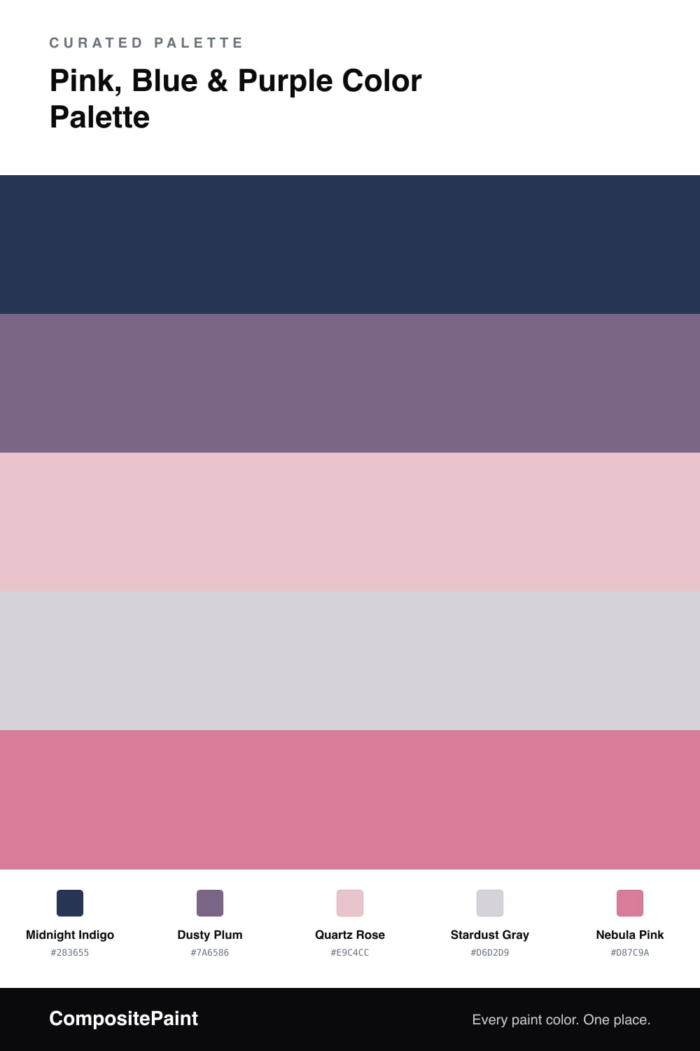
This is the night sky turned into a paint scheme, and it is gentler than you might expect. Midnight Indigo is your deep, grounding anchor, a blue with just enough gray in it to feel modern instead of bold. It sets the mood for everything else.

From there, Dusty Plum brings in a soft, smoky purple, and Stardust Gray keeps things light and airy so the room can breathe. These two are the quiet middle layer, the part that makes the palette feel finished rather than themed.

The two pinks are the fun part. Quartz Rose is the whisper-soft one for larger calm touches, while Nebula Pink is a touch deeper and brighter for the little moments that make you smile. Use them sparingly and this whole scheme stays dreamy, soft, and very 2026.

View palette in
Midnight Indigo
Dominant
Benjamin Moore Bold Blue · 2064-10
#2B3558
LRV 6
Dusty Plum
Secondary
Benjamin Moore Cupid's Dart · 1385
#7D6685
LRV 17
Quartz Rose
Support
Glidden Sweetheart Rose · 70RR 61/136
#ECC4CB
LRV 61
Stardust Gray
Base
Behr So Shy · MQ3-29
#D8D2D6
LRV 66
Nebula Pink
Accent
Sherwin-Williams Impatient Pink · SW 6854
#DB7B97
LRV 32

Buy These Colors

Each color matched to the closest real paint in every brand, by ΔE2000. Tap a swatch for its full guide or + to save it — take any SKU to the store, they mix on demand.

Midnight Indigo
#283655 · LRV 4 · Dominant
Sherwin-Williams · SW 9178 · ΔE 6.81
Behr · 570F-7 · ΔE 4.48
Benjamin Moore · 2064-10 · ΔE 2.05
Valspar · 8003-46G · ΔE 2.51
PPG / Glidden · PPG1165-7 · ΔE 4.54
Glidden · PPG1165-7 · ΔE 4.61
Dutch Boy · 338-7DB · ΔE 5.65
HGTV Home by Sherwin-Williams · HGSW 9177 · ΔE 7.5
Dunn-Edwards · DEA185 · ΔE 4.97
Magnolia Home · JG-05 · ΔE 10.96
Farrow & Ball · NO. W24 · ΔE 8.64
Diamond Vogel · H101 · ΔE 13.89
Hirshfield's · 0620 · ΔE 5.05
Rodda · CA210 · ΔE 9.13
C2 Paint · C2-773 · ΔE 4.84
Clare · PNT100-DP-54 · ΔE 16.91
Portola Paints · GHOST TREE · ΔE 12.43
Annie Sloan · NAPOLEONIC BLUE · ΔE 2.32
Backdrop · BD-LC · ΔE 6.69
Rust-Oleum · 285144 · ΔE 13.06
Kompozit · 0620 · ΔE 5.05
Dusty Plum
#7A6586 · LRV 15 · Secondary
Sherwin-Williams · SW 6557 · ΔE 3.33
Behr · MQ5-41 · ΔE 4.33
Benjamin Moore · 1385 · ΔE 1.12
Valspar · V038-5 · ΔE 2.89
PPG / Glidden · PPG1177-6 · ΔE 3
Glidden · PPG1177-6 · ΔE 3.07
Dutch Boy · 245-6DB · ΔE 3.11
HGTV Home by Sherwin-Williams · HGSW 2423 · ΔE 3.33
Dunn-Edwards · DE5985 · ΔE 4.57
Magnolia Home · JG-86 · ΔE 19.96
Farrow & Ball · NO. 220 · ΔE 12.58
Diamond Vogel · 1284 · ΔE 6.64
Hirshfield's · 1207 · ΔE 4.87
Rodda · CA208 · ΔE 13.2
C2 Paint · C2-776 · ΔE 10.68
Clare · PNT100-DP-33 · ΔE 7.31
Portola Paints · CARMINE · ΔE 9.02
Annie Sloan · RODMELL · ΔE 10.87
Backdrop · BD-MJ · ΔE 19.18
Rust-Oleum · 329207 · ΔE 19.97
Kompozit · 1207 · ΔE 4.87
Quartz Rose
#E9C4CC · LRV 61 · Support
Sherwin-Williams · SW 6852 · ΔE 2.14
Behr · S160-1 · ΔE 1.61
Benjamin Moore · 1276 · ΔE 2.46
Valspar · 1006-6B · ΔE 2.73
PPG / Glidden · PPG1183-3 · ΔE 2.08
Glidden · 70RR 61/136 · ΔE 0.93
Dutch Boy · 201-2DB · ΔE 3.45
HGTV Home by Sherwin-Williams · HGSW 1036 · ΔE 2.82
Dunn-Edwards · DE5093 · ΔE 3.96
Magnolia Home · JG-26 · ΔE 8
Farrow & Ball · NO. 230 · ΔE 9.54
Diamond Vogel · 0097 · ΔE 3.2
Hirshfield's · 0076 · ΔE 3.62
Rodda · R109 · ΔE 12.29
C2 Paint · BD50 · ΔE 1.93
Clare · PNT100-LT-60 · ΔE 10.07
Portola Paints · GYPSY · ΔE 10.81
Annie Sloan · OLD OCHRE · ΔE 19.9
Backdrop · BD-AU · ΔE 11.8
Rust-Oleum · 285142 · ΔE 6.7
Kompozit · 0076 · ΔE 3.62
Stardust Gray
#D6D2D9 · LRV 65 · Base
Sherwin-Williams · SW 6281 · ΔE 3.45
Behr · MQ3-29 · ΔE 1.57
Benjamin Moore · AF-605 · ΔE 1.96
Valspar · 8004-48A · ΔE 3.15
PPG / Glidden · PPG1173-3 · ΔE 1.82
Glidden · PPG1173-3 · ΔE 1.92
Dutch Boy · 345-2DB · ΔE 1.84
HGTV Home by Sherwin-Williams · HGSW 2437 · ΔE 3.45
Dunn-Edwards · DE6345 · ΔE 3.89
Magnolia Home · JG-98 · ΔE 2.43
Farrow & Ball · NO. 277 · ΔE 5.59
Diamond Vogel · 1308 · ΔE 3.03
Hirshfield's · 1308 · ΔE 3.07
Rodda · R091 · ΔE 6.03
C2 Paint · C2-786 · ΔE 5.74
Clare · PNT100-LT-31 · ΔE 4.08
Portola Paints · GYPSY · ΔE 4.77
Annie Sloan · OLD OCHRE · ΔE 16.88
Backdrop · BD-RR · ΔE 11.88
Rust-Oleum · 285142 · ΔE 7.29
Kompozit · 1308 · ΔE 3.07
Nebula Pink
#D87C9A · LRV 31 · Accent
Sherwin-Williams · SW 6854 · ΔE 1.14
Behr · M170-5 · ΔE 3.67
Benjamin Moore · 2084-40 · ΔE 3.06
Valspar · 1007-3B · ΔE 3.41
PPG / Glidden · PPG1182-5 · ΔE 2.7
Glidden · PPG1182-5 · ΔE 2.37
Dutch Boy · 146-5DB · ΔE 6.07
HGTV Home by Sherwin-Williams · HGSW 1034 · ΔE 4.22
Dunn-Edwards · DE5032 · ΔE 2.46
Magnolia Home · JG-136 · ΔE 21.61
Farrow & Ball · NO. 9911 · ΔE 11.91
Diamond Vogel · 1128 · ΔE 1.8
Hirshfield's · 1128 · ΔE 2.08
Rodda · CA223 · ΔE 22.8
C2 Paint · BD59 · ΔE 3.79
Clare · PNT100-MD-28 · ΔE 11.53
Portola Paints · TIERRE · ΔE 20.92
Annie Sloan · SCANDINAVIAN PINK · ΔE 16.02
Backdrop · BD-RO · ΔE 15.86
Rust-Oleum · 398640 · ΔE 28.72
Kompozit · 1128 · ΔE 2.08

Questions

How do I keep pink, blue, and purple from looking like a kids room?

Keep the blue deep and a little gray, like Midnight Indigo, and choose dusty, grown-up versions of pink and purple instead of bright candy tones. The muted gray base does the rest, so the whole thing reads calm and current rather than cartoonish.

Which color should I use the most?

Lead with the deep blue and let it cover the biggest area, then bring in plum and gray for the middle, and save the two pinks for small touches like a chair, a pillow, or one painted shelf. Roughly a 60/30/10 split keeps it soft instead of busy.

KEEP EXPLORING

Similar Palettes

Closest schemes by color — not by label.