Pastel Blue Color Palette — Quiet Slate Morning
A calm five-color scheme built around a soft pastel blue and a grounded slate, balanced by warm white and gentle greige — every color matched to real paint you can buy.
By David Chen · Formulation Lead & Resident Chemist
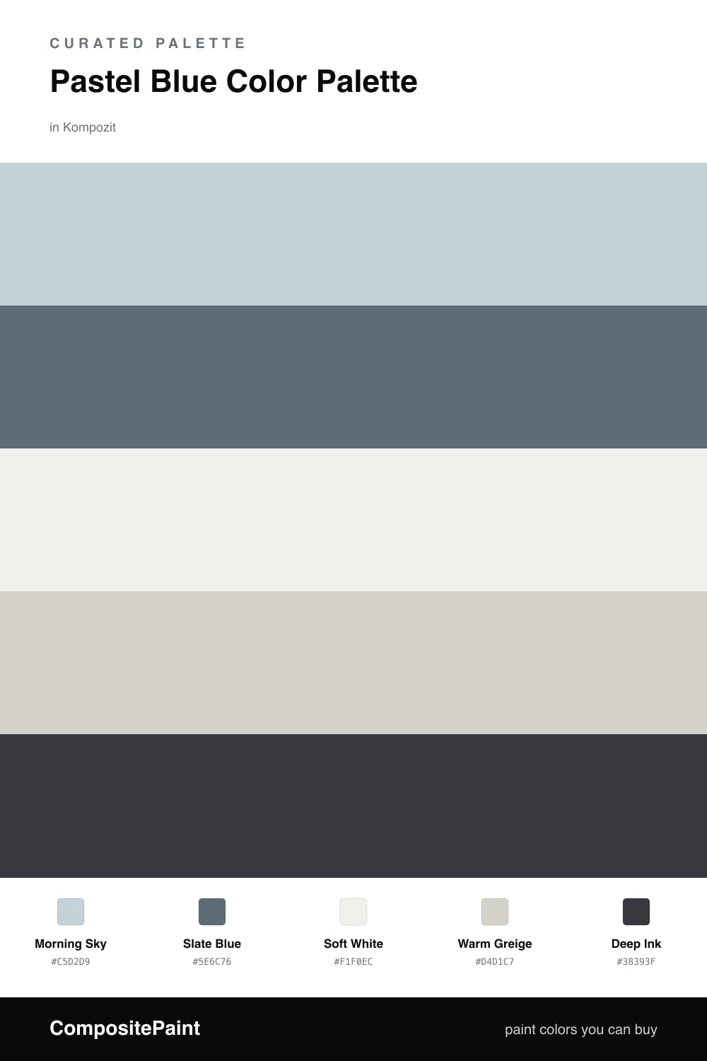
Think of pastel blue like a held breath — it works best when something steadier sits underneath it. Here Morning Sky leads as the soft, airy pastel, the kind of blue that catches daylight and quiets a wall. On its own it can feel thin, so I anchor it with Slate Blue, a deeper, slightly grayed cousin that gives the scheme weight.
Soft White and Warm Greige do the steady work in between. They carry just enough warmth to keep all that cool blue from tipping into cold, and they let the two blues read as a deliberate family rather than a single fuzzy tone. A small dose of Deep Ink at the edges — a frame, a fixture, a piece of trim — sharpens everything around it.
For a 2026 read, keep the pastel broad and the ink narrow. Let Morning Sky cover the big planes, let Slate Blue show up on a single grounding surface, and save the darkest note for the smallest moments. That restraint is what makes a soft palette feel current instead of sweet.
Buy These Colors
Each color matched to the closest real paint in every brand, by ΔE2000. Kompozit first; take any SKU to the store — these mix on demand.
Questions
A pale blue on its own can drift and feel washed out. Pairing it with a deeper slate gives the eye somewhere to land, so the soft color reads as a choice rather than an accident.
Lean on the warm white and greige. Those two carry a touch of warmth that offsets the cool blues, so the whole room stays calm instead of chilly.
Similar Palettes
Closest schemes by color — not by label.