Pastel Blue Color Palette — Pearl Morning
A soft five-color scheme built around airy pastel blue, pearl whites, and a gentle slate accent, with every color matched to real paint you can buy.
By Jessica Williams · Color Stylist & Interior Editor
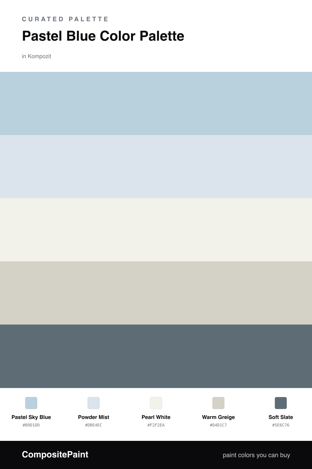
There is a quiet kind of luxury in a pale blue room first thing in the morning, when the light is still soft. This scheme leans into that feeling. Pastel Sky Blue leads, with Powder Mist floating just behind it as a barely-there second blue that keeps the walls from looking flat.
Pearl White is the base that lets everything breathe, and Warm Greige slips in to add a little warmth so the cool tones never tip into chilly. I love this combination on trim and built-ins where it softens hard edges.
For 2026 the move is to skip the all-pastel sweetness and ground it. Soft Slate does exactly that — used sparingly on a single door or shelf, it gives the palette a calm, modern spine and makes the pale blues feel deliberate.
Buy These Colors
Each color matched to the closest real paint in every brand, by ΔE2000. Kompozit first; take any SKU to the store — these mix on demand.
Questions
They share a cool, low-key softness, so nothing fights for attention. The pearl and greige warm up the blues just enough to keep the scheme from feeling cold.
Add the soft slate in small doses — a door, a frame, or a single piece of furniture. That bit of depth makes the pale blues read as intentional rather than faded.
Similar Palettes
Closest schemes by color — not by label.