CP

Sky Color Palette — Sky Cove

A soft five-color sky scheme pairing pale blue and cloud white with a hint of dawn pink and dusk lavender, every color matched to real paint you can buy.

By Emily Roberts · DIY Editor & First-Timer's Guide

Pale Sky Blue
Dominant
Kompozit Abstract Idea · 0643
#B9D1DD
LRV 61
Soft Dusk Lavender
Secondary
Kompozit Orchid Fragrance · 1287
#C9C1D0
LRV 55
Cloud White
Base
Kompozit Cyprus Spring · 0411
#F2F2EA
LRV 88
Dawn Pink
Support
Kompozit Velvet Blush · 1217
#E3D5D8
LRV 69
Slate Blue
Accent
Kompozit Blue Depths · 0626
#5A7187
LRV 16
View palette in

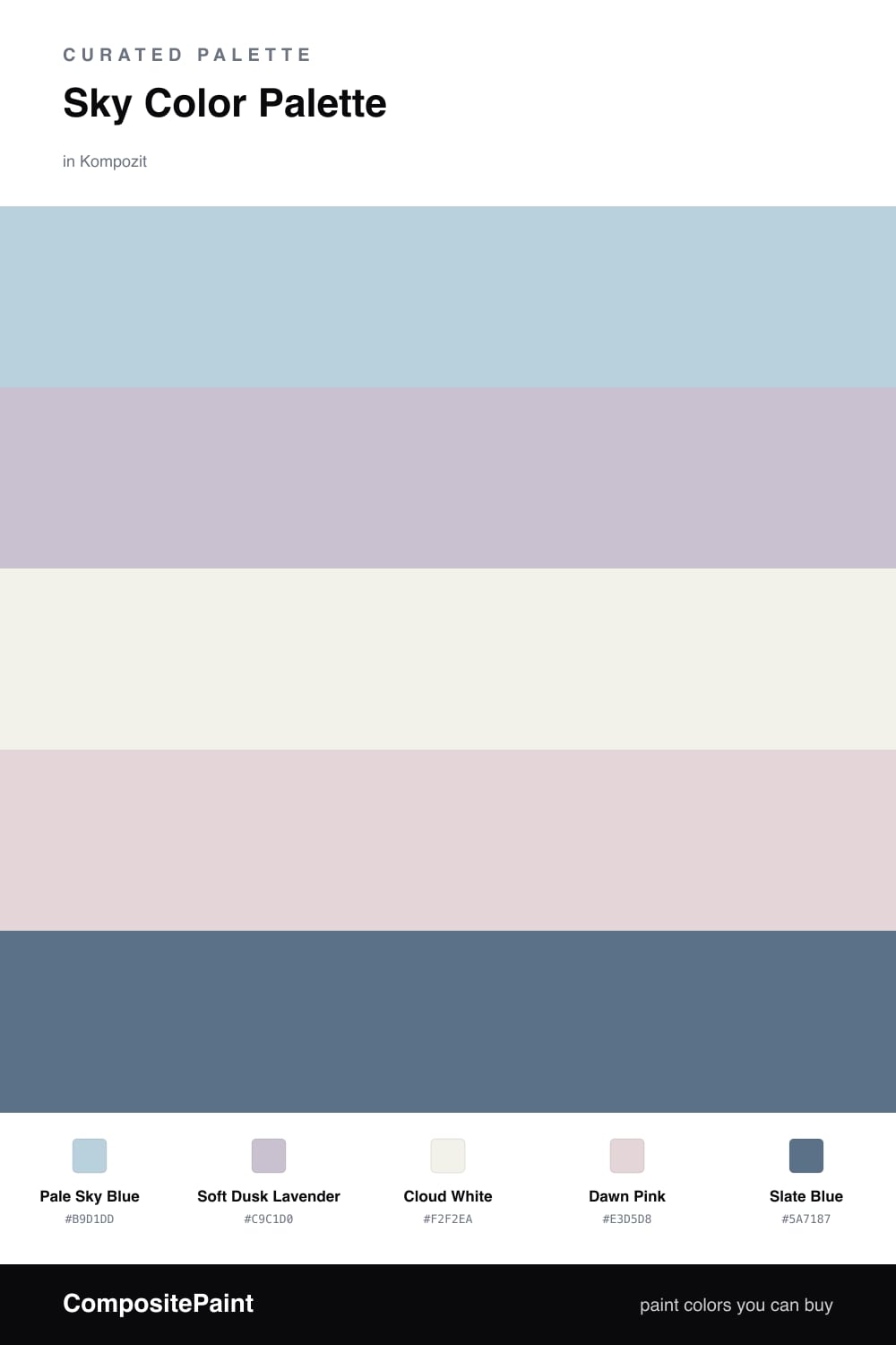
This is the palette I reach for when someone wants a room that feels like a deep breath. Pale Sky Blue leads the way, soft and a little hazy, like the sky right after the clouds clear. It is doing most of the work here, so let it cover your biggest walls.

From there, Soft Dusk Lavender and Dawn Pink are the quiet magic. They are barely there, just a whisper of color you catch out of the corner of your eye, and that is exactly the point — they read as light, not as bold paint choices. Cloud White keeps everything fresh and open, especially on trim and ceilings.

The one thing that makes it all click is Slate Blue. Without a deeper note, soft palettes can drift into feeling faded, so use this one sparingly on a door, a console, or window frames. It is very 2026 — airy and calming, but grounded enough to feel intentional.

Buy These Colors

Each color matched to the closest real paint in every brand, by ΔE2000. Kompozit first; take any SKU to the store — these mix on demand.

Pale Sky Blue
#B8D2E0 · LRV 62 · Dominant
Kompozit Abstract Idea · 0643 ΔE 0.84
Backdrop Lost in the 80s · BD-LO ΔE 4.32
Behr Millstream · PPU14-16 ΔE 1.35
Benjamin Moore Mediterranean Breeze · 799 ΔE 1
Clare Nairobi Blue · PNT100-LT-36 ΔE 5.19
Dunn-Edwards Two Harbors · DE5813 ΔE 1.74
Farrow & Ball Skylight · No. 205 ΔE 9.7
Magnolia Home Dark Moon · JG-74 ΔE 9.32
PPG / Glidden Sleep Baby Sleep · 1161-2 ΔE 2.91
Sherwin-Williams Wondrous Blue · SW 6807 ΔE 2.42
Valspar Sailing on the Bay · V106-2 ΔE 1.76
Soft Dusk Lavender
#C7C2D8 · LRV 56 · Secondary
Kompozit Orchid Fragrance · 1287 ΔE 2.88
Backdrop Lost in the 80s · BD-LO ΔE 15.97
Behr Mulberry Stain · N110-2 ΔE 0.85
Benjamin Moore French Lilac · 1403 ΔE 0.47
Clare Motor City · PNT100-LT-09 ΔE 12.49
Dunn-Edwards Prim Blue · DE5898 ΔE 6.89
Farrow & Ball Calluna · No. 270 ΔE 6.85
Magnolia Home Cement Pots · JG-93 ΔE 8.42
PPG / Glidden Purple Dragon · 1247-4 ΔE 3.39
Sherwin-Williams Agapanthus · SW 9066 ΔE 6.5
Valspar Playful Petal · 1001-4B ΔE 3.62
Cloud White
#F4F3EE · LRV 90 · Base
Kompozit Cyprus Spring · 0411 ΔE 1.64
Backdrop Tabula Rasa · BD-TR ΔE 2.69
Behr Whisper White · HDC-MD-08 ΔE 0.59
Benjamin Moore Opulence · 879 ΔE 1.01
Clare Timeless · PNT100-LT-04 ΔE 1.46
Dunn-Edwards Droplets · DEW381 ΔE 0.56
Farrow & Ball Wimborne White · No. 239 ΔE 2.74
Magnolia Home True White · JG-21 ΔE 1.12
PPG / Glidden Delicate White · 1001-1 ΔE 1.03
Sherwin-Williams High Reflective White · SW 7757 ΔE 1.08
Valspar Santa's Beard · 8007-6E ΔE 0.21
Dawn Pink
#E8D4D2 · LRV 69 · Support
Kompozit Velvet Blush · 1217 ΔE 2.99
Backdrop Cookies & Cream · BD-CC ΔE 13.01
Behr Conch Shell · S200-1 ΔE 2.45
Benjamin Moore Paisley Pink · 1261 ΔE 1.27
Clare Neutral Territory · PNT100-LT-20 ΔE 7.67
Dunn-Edwards Whirlwind · DE6030 ΔE 2.74
Farrow & Ball Calamine · No. 230 ΔE 2
Magnolia Home Yarn · JG-132 ΔE 9.32
PPG / Glidden Shangri La · 1053-2 ΔE 1.44
Sherwin-Williams Demure · SW 6295 ΔE 1.41
Valspar Barely Pink · 1006-8C ΔE 0.72
Slate Blue
#5F7387 · LRV 16 · Accent
Kompozit Blue Depths · 0626 ΔE 1.32
Backdrop Mom Jeans · BD-MJ ΔE 2.79
Behr Arrowhead Lake · PPU14-01 ΔE 2.25
Benjamin Moore Thousand Oceans · 1645 ΔE 4.32
Clare Hyperlink · PNT100-MD-41 ΔE 6.56
Dunn-Edwards Wharf View · DEC799 ΔE 3.81
Farrow & Ball Pitch Blue · No. 220 ΔE 7.45
Magnolia Home Blue Skies · JG-85 ΔE 7.02
PPG / Glidden Blue Cloud · 1164-6 ΔE 2.97
Sherwin-Williams Distance · SW 6243 ΔE 2.23
Valspar Providence · 8003-44F ΔE 2.42

Questions

Why does this palette feel so calm?

It stays in one soft family of light blues, lavenders, and warm whites, so nothing fights for attention. The single deeper slate is the only contrast, and that little bit of weight is what keeps the room from looking washed out.

Where should I use the pink and lavender?

Keep them gentle and in small doses — a bedroom accent wall, the back of a bookshelf, or trim. They are meant to be felt more than seen, like the first and last light of the day.

Similar Palettes

Closest schemes by color — not by label.