Pastel Blue Color Palette — Powder Room Calm
A soft four-color scheme led by airy powder blue and gentled by misty greens and warm white, with every color matched to real paint you can buy.
By Emily Roberts · DIY Editor & First-Timer's Guide
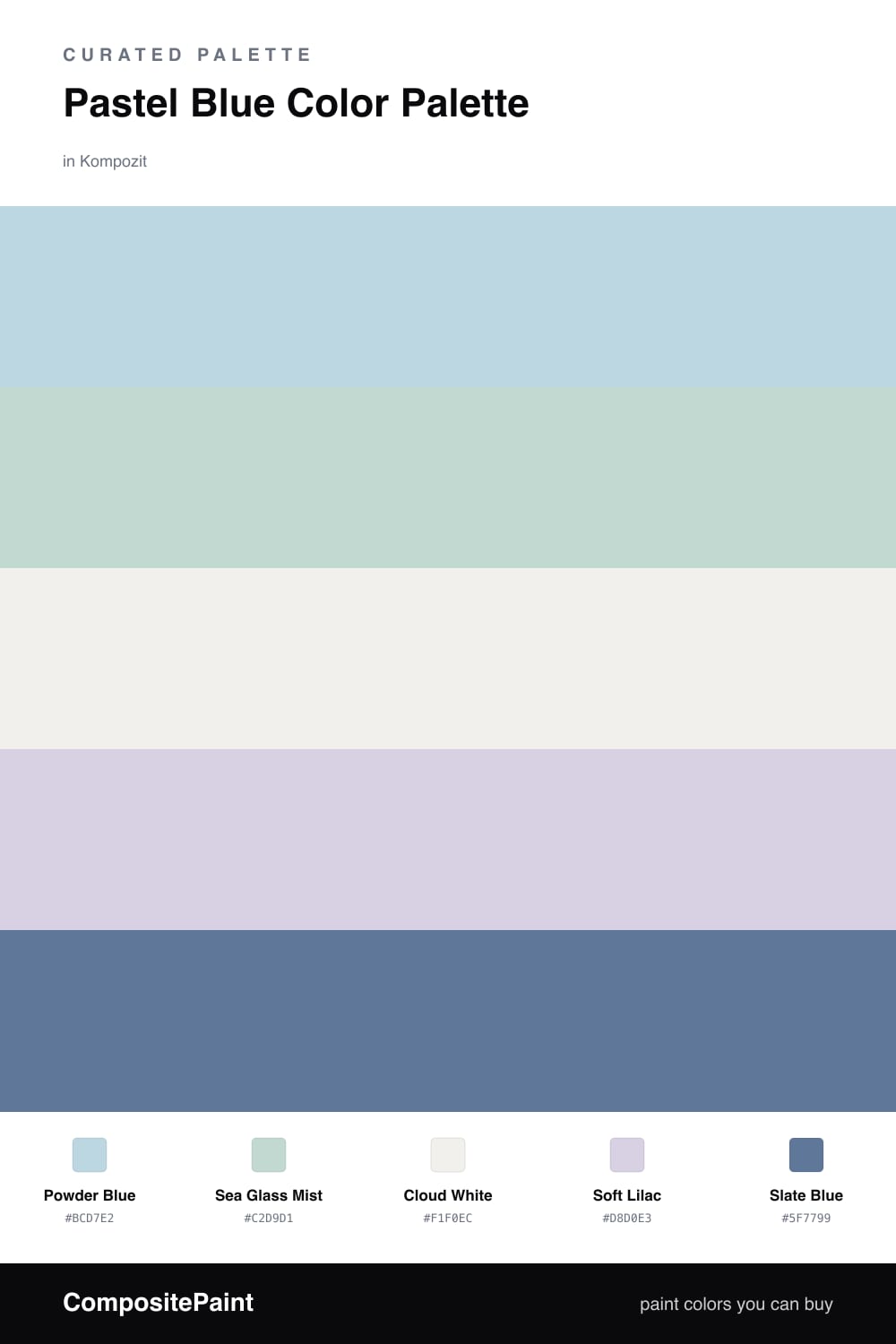
Pastel blue is having a real moment in 2026, and the trick to keeping it modern instead of nursery-sweet is mixing it with other soft tones instead of bright white alone. This scheme puts a gentle Powder Blue in the lead, the kind of barely-there blue that feels like a clear morning sky.
Around it sit two quiet companions. Sea Glass Mist is a hushed blue-green that keeps things fresh, and Soft Lilac adds the faintest warm-cool tension so the palette does not feel flat. Cloud White is your calm base, a creamy off-white that warms the whole group up and stops the blues from reading cold.
When you want a little weight, reach for Slate Blue. It is the one deeper note here, perfect for a single cabinet, a door, or a bit of furniture so the soft colors have something to lean against. Keep the pastels doing most of the talking and let that slate just whisper underneath.
Buy These Colors
Each color matched to the closest real paint in every brand, by ΔE2000. Kompozit first; take any SKU to the store — these mix on demand.
Questions
It can if it leans gray, so this scheme warms it up with Cloud White, a creamy off-white that takes the chill off. Paint a sample swatch and check it at night under your bulbs, since cool blues read bluer in low light.
Start with Powder Blue as your wall color since it is the soft, airy lead. Use Sea Glass Mist and Soft Lilac on smaller things like a cabinet or trim, and save Slate Blue for one grounding moment so the room does not float away.
Similar Palettes
Closest schemes by color — not by label.