CP

Sky Color Palette — Sky Horizon

A soft five-color scheme layering pale sky blue with cloud white, dawn pink, and dusk lavender, grounded by a quiet slate — every color matched to real paint you can buy.

By Emily Roberts · DIY Editor & First-Timer's Guide

Pale Sky Blue
Dominant
Kompozit Simple Serenity · 0614
#C8D9E5
LRV 68
Cloud White
Base
Kompozit Cyprus Spring · 0411
#F2F2EA
LRV 88
Dawn Pink
Secondary
Kompozit Truffles · 0146
#EAD7CD
LRV 71
Dusk Lavender
Support
Kompozit Lavender Bliss · 1252
#CEC3DD
LRV 57
Soft Slate
Accent
Kompozit Deep Lagoon · 0507
#5E6C76
LRV 14
View palette in

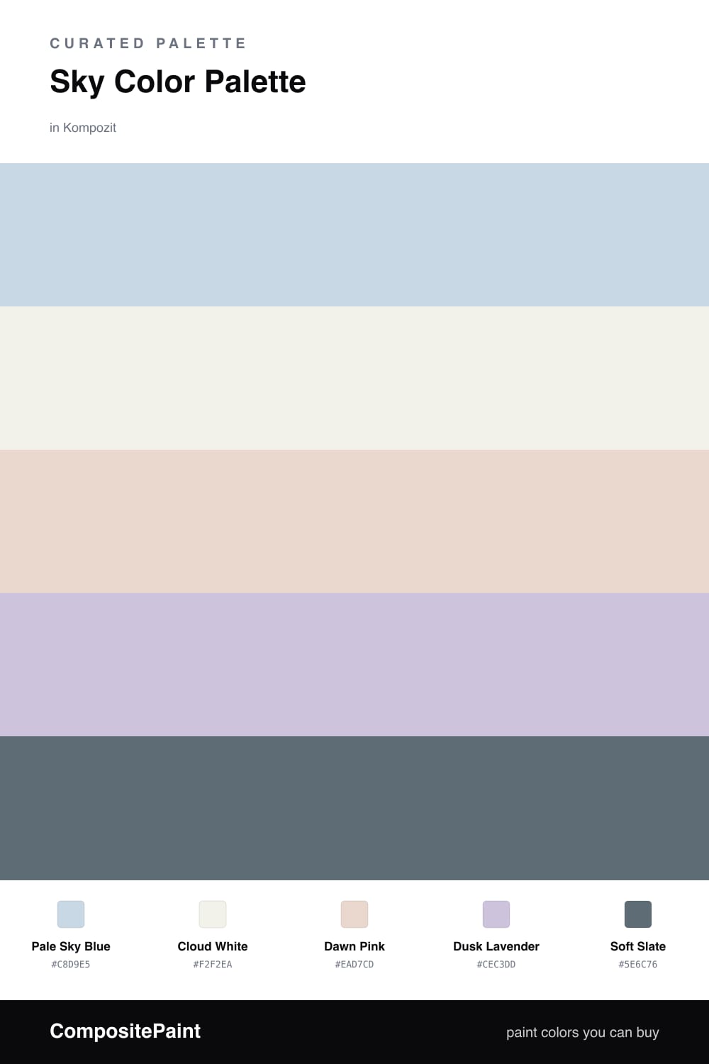
This is the color version of a slow morning sky. Pale Sky Blue leads the way, soft and a little hazy, the kind of blue that feels like early light through a window. Cloud White sits underneath it as the base, warm enough to stay easy on the eyes instead of going stark.

Then come the pretty surprises. Dawn Pink adds that first blush of sunrise, and Dusk Lavender brings the cooler hush of evening, so the palette quietly carries both ends of the day. They keep the blue from ever feeling cold.

To tie it all together, lean on Soft Slate in small doses, a doorframe, a piece of trim, a single accent. It is just deep enough to give the airy colors something to stand against, which is exactly what keeps a soft scheme like this one feeling grounded and current.

Buy These Colors

Each color matched to the closest real paint in every brand, by ΔE2000. Kompozit first; take any SKU to the store — these mix on demand.

Pale Sky Blue
#C6D9E6 · LRV 67 · Dominant
Kompozit Simple Serenity · 0614 ΔE 0.67
Backdrop Real Real · BD-RR ΔE 15.84
Behr Celestial Light · MQ3-24 ΔE 1.35
Benjamin Moore Bright and Early · 834 ΔE 2.27
Clare Nairobi Blue · PNT100-LT-36 ΔE 5.58
Dunn-Edwards Snow Lodge · DE5799 ΔE 1.73
Farrow & Ball Borrowed Light · No. 235 ΔE 6.65
Magnolia Home Dark Moon · JG-74 ΔE 8.06
PPG / Glidden Blue Pearl · 1157-2 ΔE 1.56
Sherwin-Williams Icelandic · SW 6526 ΔE 2.23
Valspar Easy on the Eyes · 8003-45A ΔE 0
Cloud White
#F4F1EA · LRV 88 · Base
Kompozit Cyprus Spring · 0411 ΔE 1.67
Backdrop Tabula Rasa · BD-TR ΔE 2.02
Behr Nano White · HDC-MD-06 ΔE 1.4
Benjamin Moore Gardenia · AF-10 ΔE 0.21
Clare Wing It · PNT100-LT-24 ΔE 2.46
Dunn-Edwards Fossil · DE6225 ΔE 0.48
Farrow & Ball Wimborne White · No. 239 ΔE 1.78
Magnolia Home Silos White · JG-107 ΔE 0.68
PPG / Glidden Delicate White · 1001-1 ΔE 2.13
Sherwin-Williams White Flour · SW 7102 ΔE 1.48
Valspar Santa's Beard · 8007-6E ΔE 1.18
Dawn Pink
#EAD3CE · LRV 69 · Secondary
Kompozit Truffles · 0146 ΔE 3.35
Backdrop Cookies & Cream · BD-CC ΔE 12.62
Behr Conch Shell · S200-1 ΔE 0.95
Benjamin Moore Pleasant Pink · 2094-60 ΔE 1.09
Clare Neutral Territory · PNT100-LT-20 ΔE 7.18
Dunn-Edwards Short and Sweet · DE6023 ΔE 3.88
Farrow & Ball Calamine · No. 230 ΔE 1.14
Magnolia Home Ella Rose · JG-24 ΔE 4.12
PPG / Glidden Birthday Cake · 1059-2 ΔE 0.54
Sherwin-Williams Innocence · SW 6302 ΔE 1.96
Valspar Charmed · 8003-9A ΔE 1.21
Dusk Lavender
#CBC2DA · LRV 56 · Support
Kompozit Lavender Bliss · 1252 ΔE 1.08
Backdrop Lost in the 80s · BD-LO ΔE 18.05
Behr Mulberry Stain · N110-2 ΔE 1.97
Benjamin Moore French Lilac · 1403 ΔE 2.18
Clare Motor City · PNT100-LT-09 ΔE 13.71
Dunn-Edwards Plum Point · DE5982 ΔE 5.49
Farrow & Ball Calluna · No. 270 ΔE 7.87
Magnolia Home Cement Pots · JG-93 ΔE 10.05
PPG / Glidden Purple Dragon · 1247-4 ΔE 2.56
Sherwin-Williams Rhapsody Lilac · SW 6828 ΔE 1.88
Valspar Playful Petal · 1001-4B ΔE 1.91
Soft Slate
#5C6B78 · LRV 14 · Accent
Kompozit Deep Lagoon · 0507 ΔE 1.48
Backdrop Mom Jeans · BD-MJ ΔE 1.94
Behr Nostalgic · UL240-2 ΔE 5.75
Benjamin Moore Blue Spruce · 1637 ΔE 3.8
Clare Nearly Navy · PNT100-DP-65 ΔE 7.47
Dunn-Edwards Turbulent Sea · DE5803 ΔE 2.75
Farrow & Ball Inchyra Blue · No. 289 ΔE 6.84
Magnolia Home Storm Chaser · JG-86 ΔE 4.37
PPG / Glidden Superstition · 1035-6 ΔE 4.7
Sherwin-Williams Granite Peak · SW 6250 ΔE 1.7
Valspar In the Deep Blue Sea · 8004-40F ΔE 1.83

Questions

How do I keep a sky palette from feeling cold?

The trick is the warm pieces. Dawn Pink and Dusk Lavender both carry a soft warmth, so they take the chill off the blue. Use Cloud White as your base instead of a stark bright white, and the whole scheme reads calm and airy rather than icy.

Which color should I use the most?

Lead with Pale Sky Blue as the dominant color, then let Cloud White do the quiet background work. Keep Dawn Pink and Dusk Lavender as gentle accents, and save Soft Slate for the smallest touches so it grounds the palette without weighing it down.

Similar Palettes

Closest schemes by color — not by label.