Sky Color Palette — Storm Light
A soft five-color sky scheme of pale blue and cloud white warmed by dawn pink and dusk lavender, with a slate anchor — every color matched to real paint you can buy.
By Jessica Williams · Color Stylist & Interior Editor
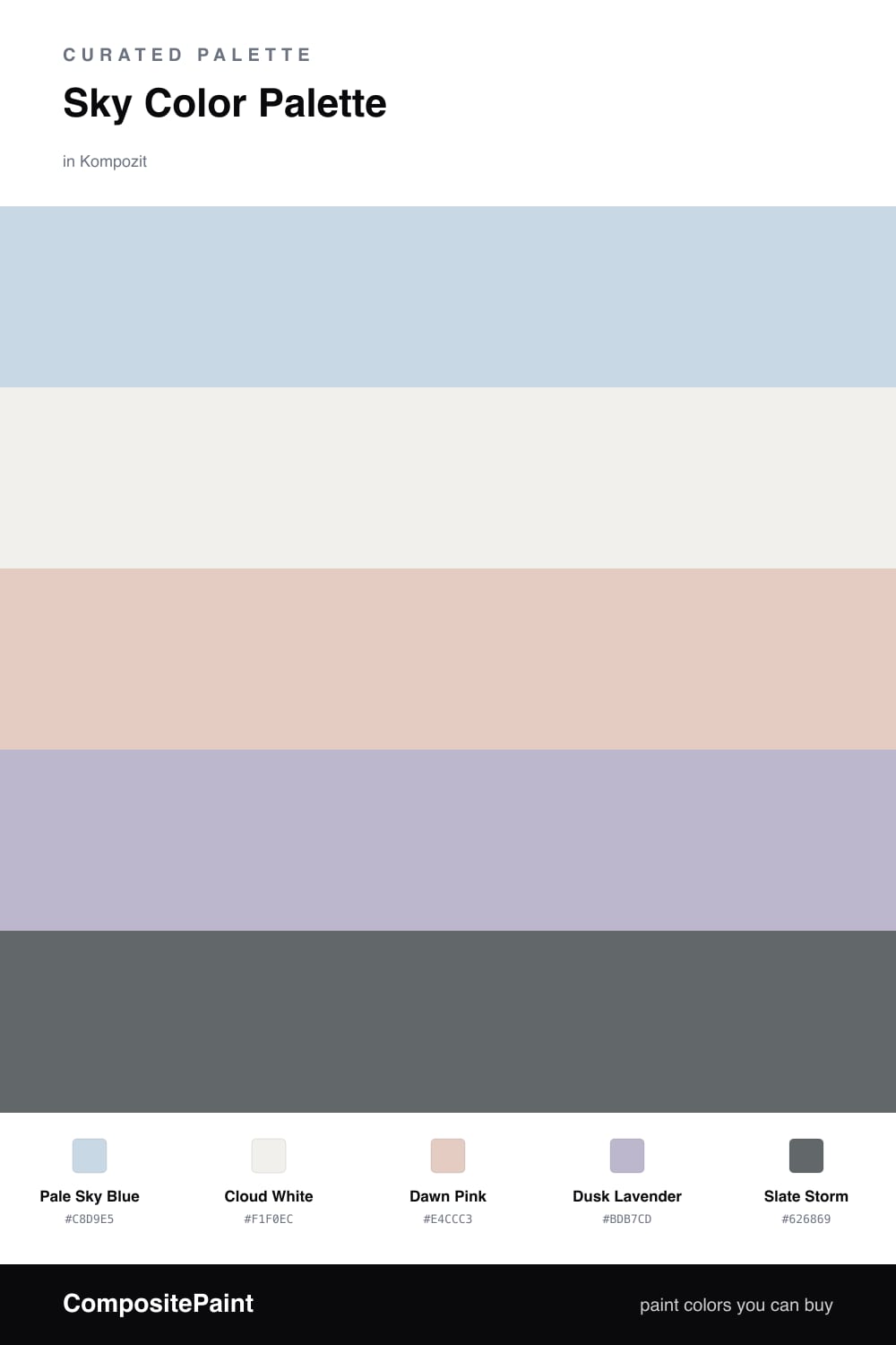
There is a moment just before a storm clears when the sky goes soft and silvered, and that is the feeling I built this scheme around. Pale Sky Blue leads, light and a little hazy, the kind of blue that shifts with the weather outside your window.
Cloud White keeps everything open and breathing, while Dawn Pink and Dusk Lavender warm the cool from the inside out. These two are the quiet heroes of 2026 palettes, the gentle muted tones that make a cool color feel tender instead of chilly.
Then Slate Storm steps in to ground it all. Used in small doses on a door, a window frame, a single piece of furniture, it gives this airy sky scheme weight and keeps it from drifting away.
Buy These Colors
Each color matched to the closest real paint in every brand, by ΔE2000. Kompozit first; take any SKU to the store — these mix on demand.
Questions
The warm tones do that work. Dawn Pink and a touch of Dusk Lavender thread real warmth through the cool blue, so the room reads soft and lived-in rather than clinical. Save Cloud White for trim and ceilings to hold the light open.
Lead with Pale Sky Blue on the main walls and let Cloud White carry the rest of the surfaces. Bring in Dawn Pink and Dusk Lavender through textiles and smaller moments, then use Slate Storm sparingly on a door or frame to give the eye somewhere to land.
Similar Palettes
Closest schemes by color — not by label.