Pastel Blue Color Palette — Periwinkle Hush
A soft four-color scheme leading with airy periwinkle blue and gentle pastel companions in lilac, mint, and warm white — every color matched to real paint you can buy.
By Jessica Williams · Color Stylist & Interior Editor
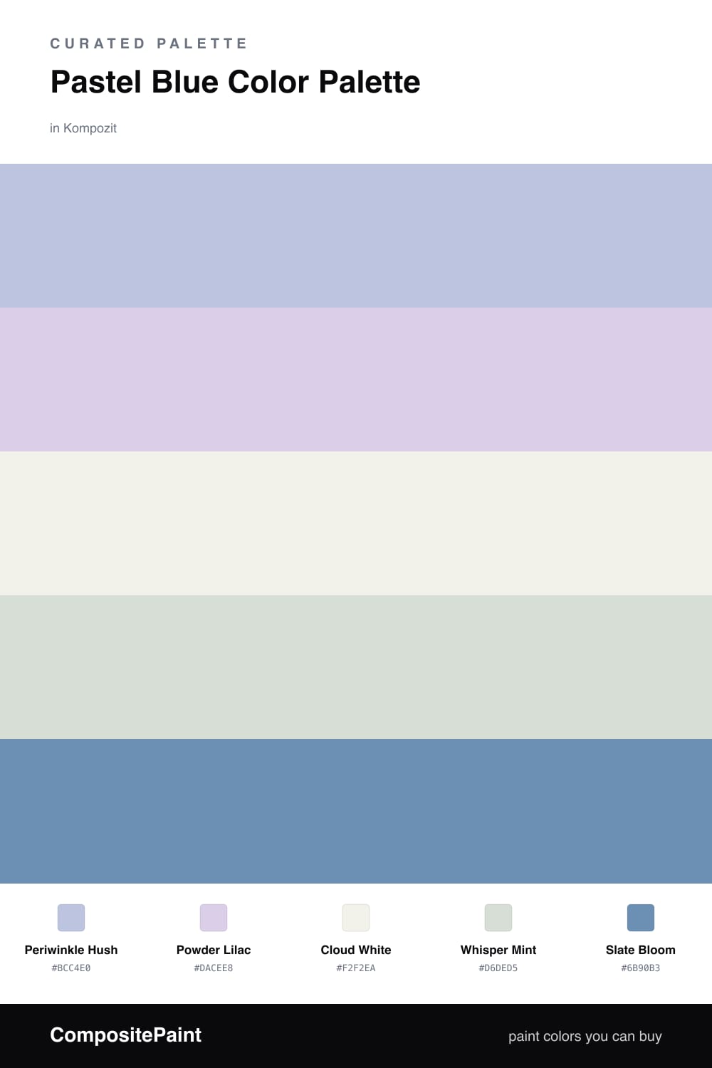
Some blues shout and some blues sigh. Periwinkle Hush is firmly in the sighing camp, a powdery blue with the faintest violet lean that feels like the light just after dawn. It leads this scheme as the dominant color, soft enough to wrap a whole space in calm yet clearly blue.
Around it, Powder Lilac and Whisper Mint drift in as the gentlest companions, one warming the palette toward lavender, the other cooling it with a breath of green. Cloud White keeps everything light and lets the pastels float instead of pooling into one hazy wash.
The one note of weight is Slate Bloom, a muted blue-gray that grounds the softness so the whole thing feels considered. This is a quietly contemporary mix for 2026, where pastels are coming back without the sugar, and a single deeper tone is all it takes to make them feel grown-up.
Buy These Colors
Each color matched to the closest real paint in every brand, by ΔE2000. Kompozit first; take any SKU to the store — these mix on demand.
Questions
Periwinkle leans a touch violet, so it loves a soft lilac next to it and a clean warm white to keep it from going cold. Adding a whisper of mint brings in just enough freshness without breaking the dreamy mood.
Anchor it with one deeper tone. Slate Bloom is the quiet weight here, used on a single piece or a band of trim, so the pastels read intentional and calm rather than faded.
Similar Palettes
Closest schemes by color — not by label.