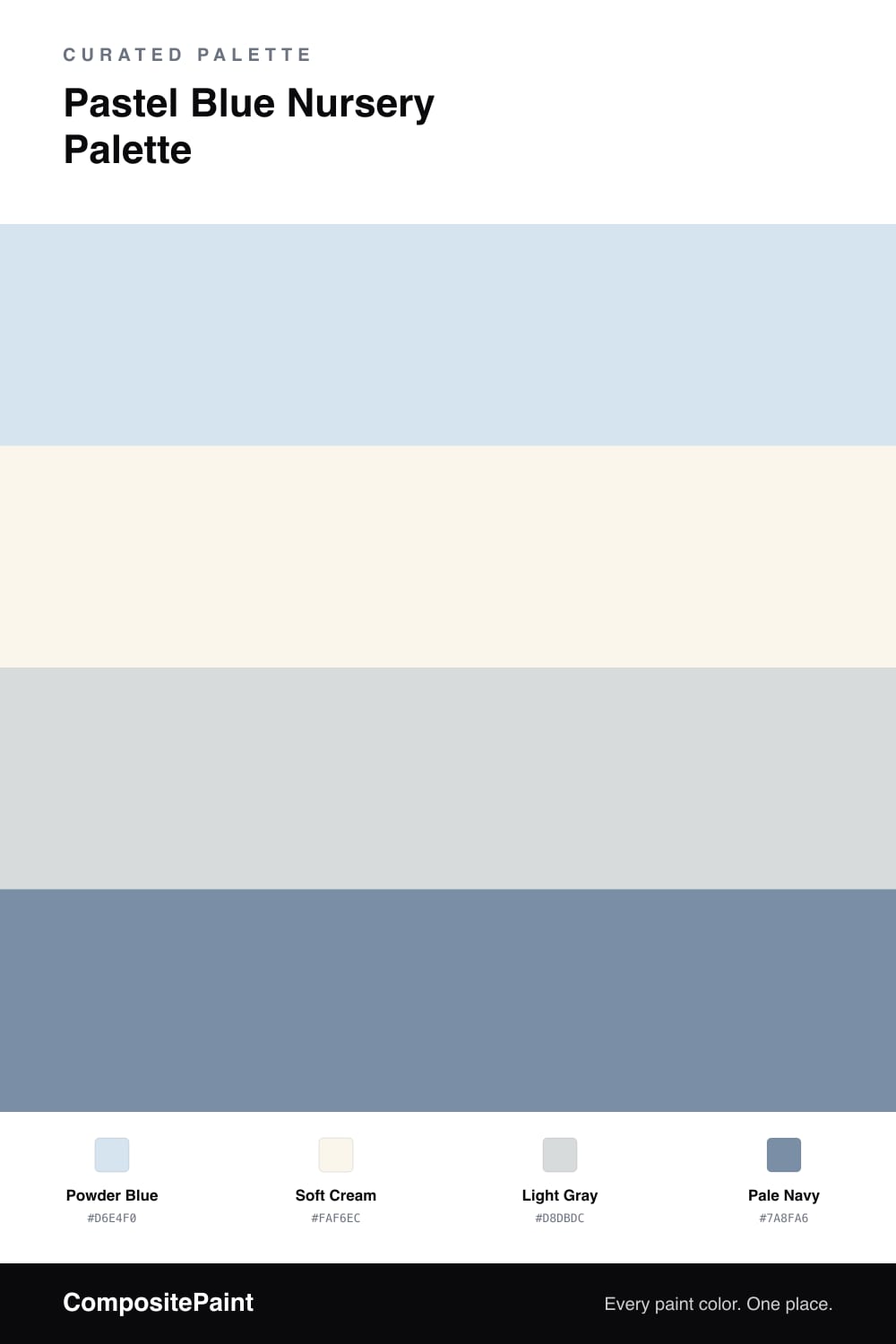
Pastel Blue Nursery Palette — Powder Blue & Soft Cream
A gentle, soothing pastel blue nursery scheme: powder blue walls, soft cream trim, a calming light gray, and a pale navy accent for contrast. Every color matched to real paint you can buy.
By Jessica Williams · Color Stylist & Interior Editor
A nursery should feel calm the moment you walk in, and a soft powder blue does exactly that. This shade is light and gentle, never icy, so it soothes rather than chills. It is the kind of blue that looks lovely in both morning sun and the dim glow of a night feed.
A soft cream on the trim and ceiling keeps the room warm and welcoming, far cozier than a bright white would feel against the blue. A light gray on the crib, dresser, or rocker adds a quiet middle tone that keeps the scheme grounded and grown-up.
For a touch of definition, a pale navy accent works beautifully in art, a rug, or curtains. It gives the eye somewhere to rest and makes the whole palette feel considered, classic, and built to grow with the child.
Buy These Colors
Each color matched to the closest real paint in every brand, by ΔE2000. Tap a swatch for its full guide or + to save it — take any SKU to the store, they mix on demand.
Questions
A true powder blue can feel cool, so this one carries a little warmth and softness. Pairing it with a soft cream rather than a stark white instantly warms the room, and natural wood furniture or warm textiles do the rest.
This palette is built to last. The powder blue and pale navy read as classic, gender-neutral neutrals that carry easily from baby into the toddler and big-kid years. Swapping art and bedding refreshes the room without repainting.
Similar Palettes
Closest schemes by color — not by label.