CP

Sky Color Palette — Morning Drift

A soft five-color scheme blending pale sky blue with cloud white, a whisper of dawn pink, and a calm flax base — every color matched to real paint you can buy.

By Emily Roberts · DIY Editor & First-Timer's Guide

Pale Sky Blue
Dominant
Kompozit Simple Serenity · 0614
#C8D9E5
LRV 68
Cloud White
Base
Kompozit Cyprus Spring · 0411
#F2F2EA
LRV 88
Soft Flax
Secondary
Kompozit Mission Hills · 0363
#E2DAC3
LRV 70
Dawn Pink
Support
Kompozit Velvet Blush · 1217
#E3D5D8
LRV 69
Dusk Lavender
Accent
Kompozit Lilac Blossom · 1289
#9A93A9
LRV 31
View palette in

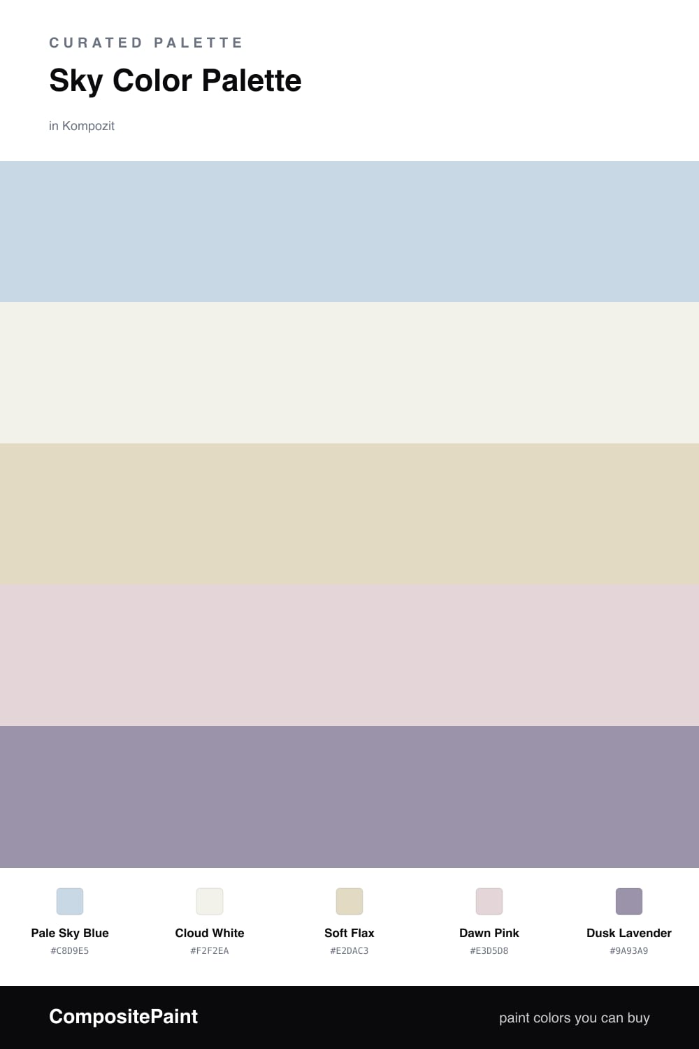
This is the palette I reach for when someone wants a room that feels like a slow morning. Pale Sky Blue leads the way — light, airy, and easy to live with — while Cloud White keeps everything bright and open. Together they read like early daylight before the day really starts.

Soft Flax is the quiet warm note that stops the cool blues from feeling chilly. Think of it as the linen in the room — a gentle oatmeal tone that grounds the lighter colors without darkening the mood. It is the kind of neutral that looks expensive without trying.

For a little life, Dawn Pink adds a barely-there blush, and Dusk Lavender brings just enough shadow to feel current in 2026. Use the blue and white across your big surfaces, let flax carry the mid-tones, and save the pink and lavender for small, deliberate touches.

Buy These Colors

Each color matched to the closest real paint in every brand, by ΔE2000. Kompozit first; take any SKU to the store — these mix on demand.

Pale Sky Blue
#C5D8E4 · LRV 67 · Dominant
Kompozit Simple Serenity · 0614 ΔE 0.81
Backdrop Real Real · BD-RR ΔE 15.48
Behr Celestial Light · MQ3-24 ΔE 1.79
Benjamin Moore Bright and Early · 834 ΔE 1.81
Clare Nairobi Blue · PNT100-LT-36 ΔE 5.15
Dunn-Edwards Snow Lodge · DE5799 ΔE 1.36
Farrow & Ball Borrowed Light · No. 235 ΔE 6.42
Magnolia Home Dark Moon · JG-74 ΔE 7.74
PPG / Glidden Blue Pearl · 1157-2 ΔE 1.13
Sherwin-Williams Icelandic · SW 6526 ΔE 2.12
Valspar Soft Blue · V107-1 ΔE 0.9
Cloud White
#F4F1EA · LRV 88 · Base
Kompozit Cyprus Spring · 0411 ΔE 1.67
Backdrop Tabula Rasa · BD-TR ΔE 2.02
Behr Nano White · HDC-MD-06 ΔE 1.4
Benjamin Moore Gardenia · AF-10 ΔE 0.21
Clare Wing It · PNT100-LT-24 ΔE 2.46
Dunn-Edwards Fossil · DE6225 ΔE 0.48
Farrow & Ball Wimborne White · No. 239 ΔE 1.78
Magnolia Home Silos White · JG-107 ΔE 0.68
PPG / Glidden Delicate White · 1001-1 ΔE 2.13
Sherwin-Williams White Flour · SW 7102 ΔE 1.48
Valspar Santa's Beard · 8007-6E ΔE 1.18
Soft Flax
#E3D9C2 · LRV 70 · Secondary
Kompozit Mission Hills · 0363 ΔE 0.96
Backdrop Cookies & Cream · BD-CC ΔE 0.93
Behr Chartreuse Frost · MQ3-17 ΔE 0.76
Benjamin Moore Seaspray · 941 ΔE 1.81
Clare Neutral Territory · PNT100-LT-20 ΔE 4.46
Dunn-Edwards Exclusive Ivory · DE6191 ΔE 0.78
Farrow & Ball Shadow White · No. 282 ΔE 2.22
Magnolia Home Morning Snow · JG-167 ΔE 0.76
PPG / Glidden Bone White · 1085-2 ΔE 1.41
Sherwin-Williams Echelon Ecru · SW 7574 ΔE 2.15
Valspar Unforgettable · 7003-2 ΔE 1.16
Dawn Pink
#EAD3D1 · LRV 69 · Support
Kompozit Velvet Blush · 1217 ΔE 3.75
Backdrop Cookies & Cream · BD-CC ΔE 13.87
Behr Conch Shell · S200-1 ΔE 2.31
Benjamin Moore Pleasant Pink · 2094-60 ΔE 1.93
Clare Neutral Territory · PNT100-LT-20 ΔE 8.41
Dunn-Edwards Short and Sweet · DE6023 ΔE 2.65
Farrow & Ball Calamine · No. 230 ΔE 2.3
Magnolia Home Yarn · JG-132 ΔE 10.4
PPG / Glidden Shangri La · 1053-2 ΔE 0.44
Sherwin-Williams Charming Pink · SW 6309 ΔE 1.21
Valspar Barely Pink · 1006-8C ΔE 0.87
Dusk Lavender
#9A93AE · LRV 31 · Accent
Kompozit Lilac Blossom · 1289 ΔE 1.8
Backdrop Polly Wants · BD-PW ΔE 15.98
Behr Uptown Girl · MQ5-33 ΔE 5.54
Benjamin Moore Snugglepuss · 1405 ΔE 3.86
Clare Cosmic Vibes · PNT100-LT-32 ΔE 7.72
Dunn-Edwards Charcoal Dust · DE5927 ΔE 4.2
Farrow & Ball Oval Room Blue · No. 85 ΔE 18.75
Magnolia Home Times Past · JG-94 ΔE 14.53
PPG / Glidden Purple Surf · 1173-5 ΔE 2.65
Sherwin-Williams Berry Cream · SW 9075 ΔE 3.77
Valspar Iris Blossom · 1001-5C ΔE 3.57

Questions

Why does this palette feel so calm?

Every shade is muted and low in contrast, so nothing fights for attention. The pale blue and soft cream do most of the work, while the pink and lavender add just enough warmth and depth to keep it from feeling flat.

Where should I use the lavender accent?

Keep it small and intentional — think a single piece of trim, a chair, or a vase. It is the deepest color here, so a little goes a long way and ties the softer shades together.

Similar Palettes

Closest schemes by color — not by label.