CP

Sky Color Palette — Sky Opal

A soft five-color scheme layering pale sky blue and cloud white with a whisper of dawn pink and dusk lavender — every color matched to real paint you can buy.

By Maya Patel · Reviews Editor & Product Tester

Pale Sky Blue
Dominant
Kompozit Bridgewater Bay · 0650
#BCD7E2
LRV 65
Cloud White
Secondary
Kompozit Sugar Dust · 0011
#F8F6ED
LRV 92
Soft Mist Gray
Base
Kompozit Ocean Crest · 0502
#D6DDDD
LRV 71
Dawn Blush
Support
Kompozit Velvet Blush · 1217
#E3D5D8
LRV 69
Dusk Lavender
Accent
Kompozit Lilac Blossom · 1289
#9A93A9
LRV 31
View palette in

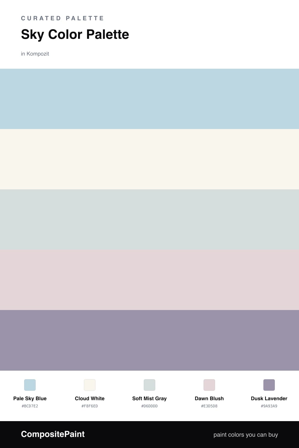
Sky Opal is the kind of scheme I reach for when a space needs to breathe. Pale Sky Blue leads, soft and a little hazy, the exact blue you see in a sky right before the color fully wakes up. Pair it with Cloud White on trim and ceilings and the room feels like it has more air in it than it actually does.

The quiet work happens in the middle. Soft Mist Gray keeps the blue from reading too sweet, while Dawn Blush slips in a barely-there warmth so the whole thing stays gentle instead of cold. This is the move that makes the palette feel current — soft does not have to mean chilly.

Then comes the part that earns the name. Dusk Lavender is your accent, and you want it in small doses — a single chair, a throw, a painted alcove. It is the one deeper note here, and without it the rest goes flat. With it, the palette holds together and feels like an opal, pale on the surface with one cool flash of color underneath.

Buy These Colors

Each color matched to the closest real paint in every brand, by ΔE2000. Kompozit first; take any SKU to the store — these mix on demand.

Pale Sky Blue
#BFD4E0 · LRV 64 · Dominant
Kompozit Bridgewater Bay · 0650 ΔE 2.26
Backdrop Real Real · BD-RR ΔE 15.71
Behr Millstream · PPU14-16 ΔE 2.33
Benjamin Moore Under the Big Top · 1675 ΔE 2.05
Clare Nairobi Blue · PNT100-LT-36 ΔE 4.85
Dunn-Edwards Two Harbors · DE5813 ΔE 0.92
Farrow & Ball Skylight · No. 205 ΔE 8.38
Magnolia Home Dark Moon · JG-74 ΔE 7.98
PPG / Glidden Sentimental Lady · 1159-2 ΔE 2.04
Sherwin-Williams Breathtaking · SW 6814 ΔE 5.66
Valspar Pale Flowers · 4008-5A ΔE 1.79
Cloud White
#F4F6F5 · LRV 92 · Secondary
Kompozit Sugar Dust · 0011 ΔE 3.89
Backdrop Tabula Rasa · BD-TR ΔE 4.76
Behr Luster White · W-B-600 ΔE 1
Benjamin Moore Chantilly Lace · 2121-70 ΔE 2.02
Clare Fresh Kicks · PNT100-LT-03 ΔE 1.35
Dunn-Edwards Cascading White · DEW394 ΔE 2.54
Farrow & Ball All White · No. 2005 ΔE 2.62
Magnolia Home True White · JG-21 ΔE 1.97
PPG / Glidden Delicate White · 1001-1 ΔE 1.71
Sherwin-Williams High Reflective White · SW 7757 ΔE 2.47
Valspar New Ream · V148 ΔE 2.03
Soft Mist Gray
#D7DCDC · LRV 71 · Base
Kompozit Ocean Crest · 0502 ΔE 0.91
Backdrop Cookies & Cream · BD-CC ΔE 10.73
Behr River Veil · MQ3-50 ΔE 0.49
Benjamin Moore Gray Cloud · 2126-60 ΔE 1.08
Clare Rain Check · PNT100-LT-69 ΔE 4.44
Dunn-Edwards Silver Setting · DE6359 ΔE 1.7
Farrow & Ball Borrowed Light · No. 235 ΔE 0.54
Magnolia Home Chime Gray · JG-119 ΔE 3.7
PPG / Glidden Sea Frost · 1037-1 ΔE 0.91
Sherwin-Williams Spatial White · SW 6259 ΔE 2.89
Valspar Tsunami Sky · 7004-4 ΔE 0.65
Dawn Blush
#E7D2D2 · LRV 68 · Support
Kompozit Velvet Blush · 1217 ΔE 2.82
Backdrop Cookies & Cream · BD-CC ΔE 14.21
Behr Malibu Coast · 230E-2 ΔE 2.36
Benjamin Moore Orleans Violet · 1374 ΔE 1.87
Clare Neutral Territory · PNT100-LT-20 ΔE 8.8
Dunn-Edwards Desert Mauve · DE6016 ΔE 1.88
Farrow & Ball Calamine · No. 230 ΔE 2.89
Magnolia Home Yarn · JG-132 ΔE 10.18
PPG / Glidden Cool Melon · 1057-2 ΔE 2.29
Sherwin-Williams Demure · SW 6295 ΔE 0.69
Valspar Barely Pink · 1006-8C ΔE 0.82
Dusk Lavender
#9A93B0 · LRV 31 · Accent
Kompozit Lilac Blossom · 1289 ΔE 2.48
Backdrop Polly Wants · BD-PW ΔE 16.27
Behr Uptown Girl · MQ5-33 ΔE 5.7
Benjamin Moore Snugglepuss · 1405 ΔE 3.18
Clare Cosmic Vibes · PNT100-LT-32 ΔE 8.27
Dunn-Edwards Charcoal Dust · DE5927 ΔE 4.2
Farrow & Ball Oval Room Blue · No. 85 ΔE 19.16
Magnolia Home Times Past · JG-94 ΔE 15.05
PPG / Glidden Purple Surf · 1173-5 ΔE 3.31
Sherwin-Williams Berry Cream · SW 9075 ΔE 4.15
Valspar Iris Blossom · 1001-5C ΔE 3.17

Questions

Why do these soft colors work together?

They all share the same low, hazy quality, so nothing fights for attention. The pale blue leads, the warm pink and cool lavender pull gently in opposite directions, and the white keeps the whole thing feeling like open air.

How do I keep this palette from looking washed out?

Lean on the lavender accent. A small dose of the deeper dusk tone gives your eye something to land on and stops the soft blues and whites from blurring into one flat wash.

Similar Palettes

Closest schemes by color — not by label.