CP

Pastel Grey Color Palette — Pastel Grey Mist

A soft, airy four-color scheme built around a gentle pastel grey, layered with cool dove and a quiet blush — every color matched to real paint you can buy.

By Maya Patel · Reviews Editor & Product Tester

Misty Grey
Dominant
Kompozit Metro · 0530
#D4D5D0
LRV 66
Dove Whisper
Secondary
Kompozit Sacred Spring · 0510
#C7CBCE
LRV 59
Cloud White
Base
Kompozit White Shoulders · 1265
#F1F0EC
LRV 87
Faded Blush
Support
Kompozit Velvet Blush · 1217
#E3D5D8
LRV 69
Slate Hush
Accent
Kompozit Metropolis Mood · 0526
#99A1A5
LRV 35
View palette in

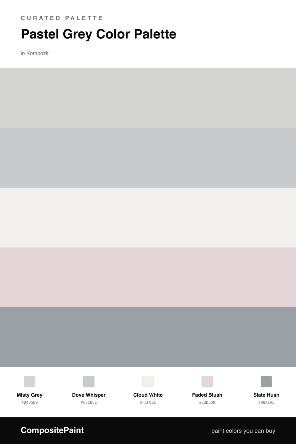
Pastel grey is having a real moment in 2026, and this is the quiet, dreamy version of it. Misty Grey leads the scheme with a soft greige base that feels calm rather than cold, and Dove Whisper sits just a half-step cooler to give it gentle depth without breaking the low-contrast mood.

Cloud White is the base that keeps everything light and breathable, while Faded Blush slips in the faintest warmth so the palette never tips into grey-on-grey monotony. The trick with a scheme this soft is restraint, and one well-placed darker note does the heavy lifting.

That note is Slate Hush. Use it sparingly, on trim, a single door, or a small accent, and it gives the whole airy palette a spine to hang on. Together these five tones read as a soft mist you can live inside, easy and modern and quietly polished.

Buy These Colors

Each color matched to the closest real paint in every brand, by ΔE2000. Kompozit first; take any SKU to the store — these mix on demand.

Misty Grey
#D4D6D5 · LRV 67 · Dominant
Kompozit Metro · 0530 ΔE 2.03
Backdrop Real Real · BD-RR ΔE 7.66
Behr Gray Shimmer · MQ3-25 ΔE 1.11
Benjamin Moore Alaskan Husky · 1479 ΔE 2.22
Clare Seize The Gray · PNT100-LT-07 ΔE 2.02
Dunn-Edwards December Sky · DE6352 ΔE 1.67
Farrow & Ball Dimpse · No. 277 ΔE 2.31
Magnolia Home Yarn · JG-132 ΔE 3.25
PPG / Glidden Fog · 1010-2 ΔE 2.02
Sherwin-Williams Reflection · SW 7661 ΔE 0.59
Valspar Polar Star · 4005-1A ΔE 0.64
Dove Whisper
#C6CBCE · LRV 59 · Secondary
Kompozit Sacred Spring · 0510 ΔE 0.48
Backdrop Real Real · BD-RR ΔE 9.96
Behr Chicago Fog · N140-2 ΔE 1.58
Benjamin Moore Silver Lining · 2119-60 ΔE 0.53
Clare Windy City · PNT100-LT-08 ΔE 4.84
Dunn-Edwards Bay of Hope · DE6331 ΔE 2.55
Farrow & Ball Calluna · No. 270 ΔE 5.25
Magnolia Home Cement Pots · JG-93 ΔE 2.83
PPG / Glidden Keepsakes · 1040-2 ΔE 3.79
Sherwin-Williams Gray Screen · SW 7071 ΔE 1.58
Valspar Misty Harbor · V137-2 ΔE 2.04
Cloud White
#EFEFEA · LRV 86 · Base
Kompozit White Shoulders · 1265 ΔE 0.84
Backdrop Jane · BD-JA ΔE 2.32
Behr Falling Snow · PPU18-07 ΔE 0.97
Benjamin Moore White · OC-151 ΔE 1.02
Clare Wing It · PNT100-LT-24 ΔE 3.81
Dunn-Edwards Shadow White · DE6281 ΔE 1.89
Farrow & Ball Cabbage White · No. 269 ΔE 2.78
Magnolia Home Silos White · JG-107 ΔE 1.19
PPG / Glidden Magical Moonlight · 1045-1 ΔE 1.61
Sherwin-Williams Extra White · SW 7006 ΔE 0.49
Valspar Tambourine · 8007-3B ΔE 0.99
Faded Blush
#E3D6D4 · LRV 69 · Support
Kompozit Velvet Blush · 1217 ΔE 2.56
Backdrop Cookies & Cream · BD-CC ΔE 11.06
Behr Moxie · MQ3-35 ΔE 0.72
Benjamin Moore Paisley Pink · 1261 ΔE 1.65
Clare Neutral Territory · PNT100-LT-20 ΔE 6.29
Dunn-Edwards Whirlwind · DE6030 ΔE 0.23
Farrow & Ball Ammonite · No. 274 ΔE 6.04
Magnolia Home Yarn · JG-132 ΔE 6.61
PPG / Glidden Lost Love · 1047-2 ΔE 0.62
Sherwin-Williams Dreamy White · SW 6021 ΔE 1.95
Valspar Napa Dawn · 1003-10C ΔE 1.28
Slate Hush
#9CA3A6 · LRV 36 · Accent
Kompozit Metropolis Mood · 0526 ΔE 0.88
Backdrop Nuevo · BD-NU ΔE 6.41
Behr Silent Film · MQ5-30 ΔE 0.82
Benjamin Moore Cobblestone Path · 1606 ΔE 1.76
Clare Set In Stone · PNT100-LT-15 ΔE 1.35
Dunn-Edwards Gray Wolf · DE6354 ΔE 2.62
Farrow & Ball Manor House Gray · No. 265 ΔE 4.93
Magnolia Home Display · JG-84 ΔE 3.99
PPG / Glidden Ufo · 1011-4 ΔE 1.32
Sherwin-Williams Network Gray · SW 7073 ΔE 1.17
Valspar Hazy Stratus · 4004-1C ΔE 5.22

Questions

Does pastel grey look cold or dull on a wall?

It can if the grey leans too blue, so this scheme warms it up. Misty Grey carries a soft greige base, and the Faded Blush nearby keeps the whole thing gentle and inviting instead of clinical.

How do I keep a low-contrast palette from feeling flat?

Lean on texture and the one darker tone. Let Slate Hush show up in small doses, on a door frame or a single piece, and use matte and satin finishes side by side so the soft greys read as layered, not washed out.

Similar Palettes

Closest schemes by color — not by label.