CP

Pastel Blue Color Palette — Sea Mist

A soft four-color scheme led by a pale sea-mist blue and rounded out by gentle pastel companions, with every color matched to real paint you can buy.

By David Chen · Formulation Lead & Resident Chemist

Sea Mist Blue
Dominant
Kompozit Sea Foam Mist · 0642
#CBDCE2
LRV 69
Pale Seafoam
Secondary
Kompozit Dream Catcher · 0481
#DAE4DC
LRV 76
Cloud White
Base
Kompozit Cyprus Spring · 0411
#F2F2EA
LRV 88
Soft Dove Gray
Support
Kompozit Santo · 0538
#D6D2CE
LRV 65
Faded Denim
Accent
Kompozit Chicago Skyline · 0631
#96ADBA
LRV 40
View palette in

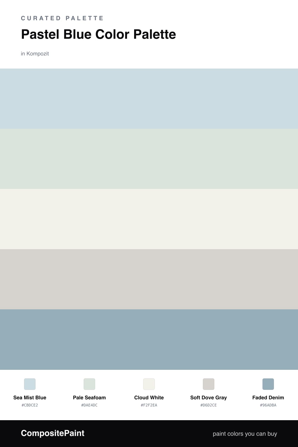
Pastel blue is having a quiet moment in 2026, and Sea Mist Blue is exactly the shade I keep reaching for. Think of the color the sky takes on just after fog burns off the water — pale, cool, barely there. It leads this scheme without ever raising its voice.

Around it I set Pale Seafoam and Cloud White to keep everything soft and breathing, with Soft Dove Gray smoothing the transitions so nothing feels stark. These three are the calm backdrop that lets the lead color glow.

The trick with any all-pastel scheme is one slightly deeper note, and that is Faded Denim. Use it in small doses — a single wall, a door, a piece of trim — and it acts like the bass line under a light melody, giving the whole palette a gentle anchor.

Buy These Colors

Each color matched to the closest real paint in every brand, by ΔE2000. Kompozit first; take any SKU to the store — these mix on demand.

Sea Mist Blue
#C5DCE3 · LRV 69 · Dominant
Kompozit Sea Foam Mist · 0642 ΔE 1.99
Backdrop Real Real · BD-RR ΔE 14.68
Behr Journeys End · S520-2 ΔE 2.42
Benjamin Moore Breath of Fresh Air · 806 ΔE 1.35
Clare Nairobi Blue · PNT100-LT-36 ΔE 2.14
Dunn-Edwards Shark · DE5771 ΔE 2.44
Farrow & Ball Borrowed Light · No. 235 ΔE 6.33
Magnolia Home Yarn · JG-132 ΔE 10.77
PPG / Glidden Galactica · 1235-3 ΔE 1.34
Sherwin-Williams Byte Blue · SW 6498 ΔE 1.43
Valspar Blue Bouquet · V069-1 ΔE 0.85
Pale Seafoam
#D4E6DC · LRV 76 · Secondary
Kompozit Dream Catcher · 0481 ΔE 3.19
Backdrop Cookies & Cream · BD-CC ΔE 11.63
Behr Pensive Sky · 710E-2 ΔE 0.78
Benjamin Moore Taffeta Green · 843 ΔE 0.53
Clare Headspace · PNT100-LT-34 ΔE 3.06
Dunn-Edwards Toadstool · DE5645 ΔE 1.4
Farrow & Ball Pavilion Blue · No. 252 ΔE 6.4
Magnolia Home Chime Gray · JG-119 ΔE 7.23
PPG / Glidden Summer Breeze · 1139-1 ΔE 0.22
Sherwin-Williams Green Trance · SW 6462 ΔE 1.91
Valspar Mint Whisper · 5008-7A ΔE 2.1
Cloud White
#F2F4F1 · LRV 90 · Base
Kompozit Cyprus Spring · 0411 ΔE 2.41
Backdrop Tabula Rasa · BD-TR ΔE 3.79
Behr White Fur · W-F-610 ΔE 0.99
Benjamin Moore Distant Gray · 2124-70 ΔE 0
Clare Timeless · PNT100-LT-04 ΔE 2.51
Dunn-Edwards Lighthouse · DEW385 ΔE 1.76
Farrow & Ball Wimborne White · No. 239 ΔE 4.12
Magnolia Home True White · JG-21 ΔE 1.08
PPG / Glidden Delicate White · 1001-1 ΔE 0.72
Sherwin-Williams High Reflective White · SW 7757 ΔE 1.69
Valspar Tell Me a Secret · 8007-2B ΔE 0.54
Soft Dove Gray
#D2D3CE · LRV 65 · Support
Kompozit Santo · 0538 ΔE 2.77
Backdrop Real Real · BD-RR ΔE 5.77
Behr Curio · MQ3-22 ΔE 1.46
Benjamin Moore Gray Owl · 2137-60 ΔE 1.45
Clare Beigeing · PNT100-LT-18 ΔE 2.99
Dunn-Edwards Silver Spoon · DE6366 ΔE 2.27
Farrow & Ball Worsted · No. 284 ΔE 3.46
Magnolia Home Dark Moon · JG-74 ΔE 2.04
PPG / Glidden Tornado · 1009-2 ΔE 0.62
Sherwin-Williams Silverpointe · SW 7653 ΔE 1.01
Valspar Morning Lake · 7004-21 ΔE 1.5
Faded Denim
#8FA9BC · LRV 38 · Accent
Kompozit Chicago Skyline · 0631 ΔE 2.67
Backdrop Underdog · BD-UD ΔE 6.54
Behr Windsurf · PPU14-09 ΔE 1.19
Benjamin Moore Harlequin Blue · 830 ΔE 4.02
Clare Good Jeans · PNT100-LT-38 ΔE 4.68
Dunn-Edwards Bachelor Blue · DE5878 ΔE 4.93
Farrow & Ball Dix Blue · No. 82 ΔE 11.29
Magnolia Home Winter Solstice · JG-89 ΔE 3.54
PPG / Glidden Kaleidoscope · 1160-4 ΔE 1.18
Sherwin-Williams Notable Hue · SW 6521 ΔE 0.88
Valspar Porcelain Vase · V109-4 ΔE 1.78

Questions

How do I keep a pastel blue scheme from looking washed out?

Add one color with a little more weight. Here the faded denim accent does that job, giving your eye a place to land so the soft sea-mist blue reads as calm and intentional rather than flat or faded.

Where should each pastel go in a real space?

Let the sea-mist blue lead on the largest surface, use cloud white on trim and ceilings to keep it light, and tuck the seafoam and dove gray into smaller areas. Save the denim for one accent so it stays a quiet anchor.

Similar Palettes

Closest schemes by color — not by label.