CP

Sky Color Palette — Morning Marsh

A soft five-color scheme drifting from pale sky blue through cloud white to a whisper of dawn pink and dusk lavender — every color matched to real paint you can buy.

By Jessica Williams · Color Stylist & Interior Editor

Pale Sky Blue
Dominant
Kompozit Simple Serenity · 0614
#C8D9E5
LRV 68
Cloud White
Secondary
Kompozit Cyprus Spring · 0411
#F2F2EA
LRV 88
Misty Grey
Base
Kompozit Diamond Stud · 0516
#DBDBDA
LRV 71
Dawn Pink
Support
Kompozit Velvet Blush · 1217
#E3D5D8
LRV 69
Dusk Lavender
Accent
Kompozit Violet Crush · 1288
#B4AEC1
LRV 44
View palette in

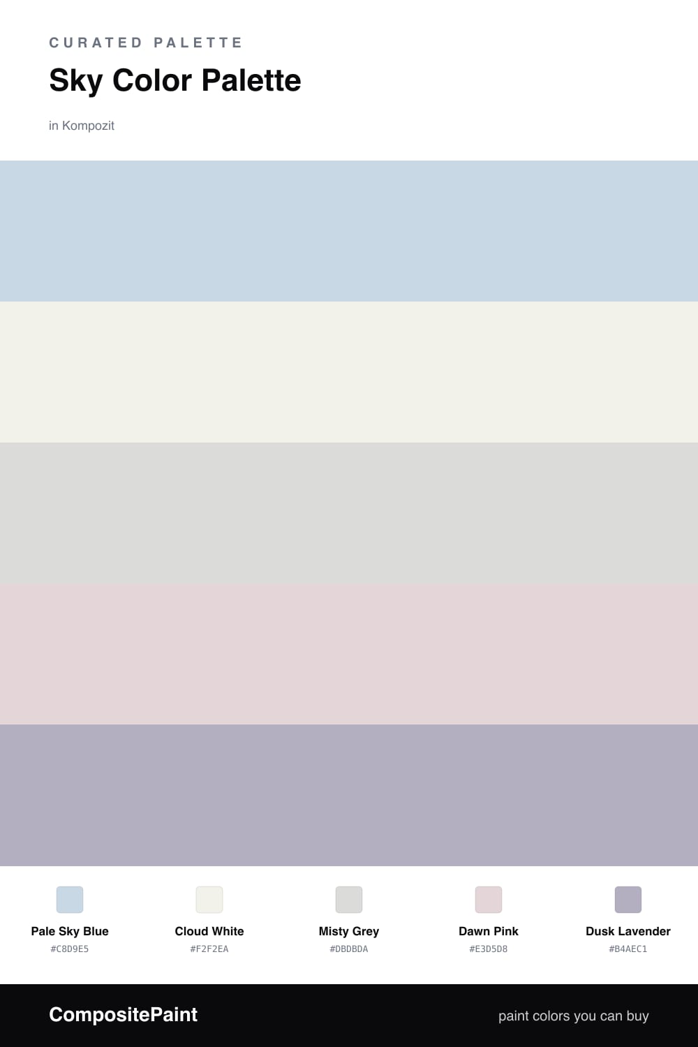
There is a moment just after dawn when the sky has not quite decided what color it is. This palette lives in that pause. Pale Sky Blue sets the mood, cool and open, the kind of blue that makes a wall feel like a held breath.

Around it, Cloud White and Misty Grey soften everything, so the room reads as light rather than as paint. A breath of Dawn Pink warms the whole thing from underneath, the way early sun catches the low clouds.

For 2026 I love letting Dusk Lavender do the talking in small doses — a reading nook, a band of trim, the inside of a cabinet. It keeps this gentle scheme from going sleepy and gives your eye somewhere soft to land.

Buy These Colors

Each color matched to the closest real paint in every brand, by ΔE2000. Kompozit first; take any SKU to the store — these mix on demand.

Pale Sky Blue
#C7DAE6 · LRV 68 · Dominant
Kompozit Simple Serenity · 0614 ΔE 0.75
Backdrop Real Real · BD-RR ΔE 15.52
Behr Summer Sky · HDC-CT-15 ΔE 1.98
Benjamin Moore Breath of Fresh Air · 806 ΔE 2.11
Clare Nairobi Blue · PNT100-LT-36 ΔE 5.16
Dunn-Edwards Snow Lodge · DE5799 ΔE 1.48
Farrow & Ball Borrowed Light · No. 235 ΔE 6.35
Magnolia Home Dark Moon · JG-74 ΔE 7.83
PPG / Glidden Blue Pearl · 1157-2 ΔE 1.16
Sherwin-Williams Rhythmic Blue · SW 6806 ΔE 1.43
Valspar Easy on the Eyes · 8003-45A ΔE 0.5
Cloud White
#F4F2ED · LRV 89 · Secondary
Kompozit Cyprus Spring · 0411 ΔE 1.94
Backdrop Tabula Rasa · BD-TR ΔE 2.77
Behr Whisper White · HDC-MD-08 ΔE 0.52
Benjamin Moore Opulence · 879 ΔE 0.51
Clare Wing It · PNT100-LT-24 ΔE 2.78
Dunn-Edwards Fossil · DE6225 ΔE 0.61
Farrow & Ball Wimborne White · No. 239 ΔE 2.67
Magnolia Home Silos White · JG-107 ΔE 1.17
PPG / Glidden Delicate White · 1001-1 ΔE 1.45
Sherwin-Williams White Flour · SW 7102 ΔE 2.44
Valspar Santa's Beard · 8007-6E ΔE 0.5
Misty Grey
#D7DBDA · LRV 70 · Base
Kompozit Diamond Stud · 0516 ΔE 1.99
Backdrop Cookies & Cream · BD-CC ΔE 10.15
Behr White City · N140-1 ΔE 2.19
Benjamin Moore Bunny Gray · 2124-50 ΔE 1.06
Clare Rain Check · PNT100-LT-69 ΔE 4.01
Dunn-Edwards Silver Setting · DE6359 ΔE 1.64
Farrow & Ball Borrowed Light · No. 235 ΔE 0.95
Magnolia Home Yarn · JG-132 ΔE 3.72
PPG / Glidden Sea Frost · 1037-1 ΔE 1.34
Sherwin-Williams First Star · SW 7646 ΔE 2.82
Valspar Tsunami Sky · 7004-4 ΔE 0
Dawn Pink
#E8D3D1 · LRV 68 · Support
Kompozit Velvet Blush · 1217 ΔE 3.24
Backdrop Cookies & Cream · BD-CC ΔE 13.31
Behr Conch Shell · S200-1 ΔE 2.36
Benjamin Moore Orleans Violet · 1374 ΔE 2.55
Clare Neutral Territory · PNT100-LT-20 ΔE 7.92
Dunn-Edwards Desert Mauve · DE6016 ΔE 2.81
Farrow & Ball Calamine · No. 230 ΔE 2
Magnolia Home Yarn · JG-132 ΔE 9.69
PPG / Glidden Birthday Cake · 1059-2 ΔE 1.87
Sherwin-Williams Demure · SW 6295 ΔE 1.4
Valspar Nana's Pearls · V128-1 ΔE 2.39
Dusk Lavender
#B7B0C4 · LRV 45 · Accent
Kompozit Violet Crush · 1288 ΔE 0.85
Backdrop Underdog · BD-UD ΔE 14.35
Behr Exclusive Violet · HDC-SP14-12 ΔE 2.43
Benjamin Moore Lavender Lipstick · 2072-50 ΔE 4.33
Clare Cloud Watching · PNT100-MD-73 ΔE 12.78
Dunn-Edwards Spacious Sky · DE5919 ΔE 6.74
Farrow & Ball Lulworth Blue · No. 89 ΔE 13.95
Magnolia Home Vintage Collection · JG-99 ΔE 8.78
PPG / Glidden Cloudberry · 1174-4 ΔE 2.17
Sherwin-Williams Swanky Gray · SW 6261 ΔE 7.27
Valspar Really Romantic · V075-3 ΔE 4.27

Questions

Why do these soft colors work together?

They all share a low, hazy intensity, like light just after sunrise. Because none of them shouts, the blue, pink, and lavender blend into one calm wash instead of competing.

How do I keep the palette from feeling washed out?

Lean on the pale blue and cloud white for most of the space, then let the dusk lavender land as a small accent — a single piece or trim line — to give the softness a quiet edge.

Similar Palettes

Closest schemes by color — not by label.