Sky Color Palette — Dusk Drift
A soft four-color scheme drifting from pale daylight blue into dawn pink and dusk lavender, grounded by cloud white — every color matched to real paint you can buy.
By Jessica Williams · Color Stylist & Interior Editor
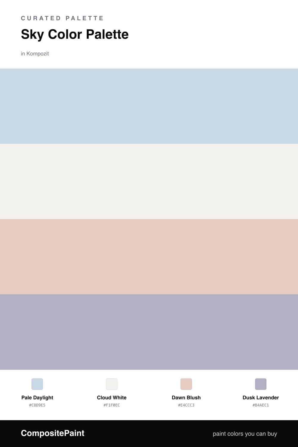
There is a moment right at dusk when the sky lets go of its daylight blue and a wash of pink and lavender moves in. This palette catches that drift. Pale Daylight is a clear, breathable blue, the kind of color that makes a room feel like the windows are always open, and it sets the whole mood.
Against it, Cloud White keeps everything bright and quiet, the soft layer that lets the blue read as calm instead of cold. Dawn Blush warms the edges with the faintest pink, the color of light just touching the horizon, so the scheme never tips chilly.
For 2026 the move is to add one tone with a little weight, and that is Dusk Lavender — gray enough to feel grown-up, violet enough to glow at the end of the day. Use it sparingly on a single surface and it pulls the pale blues and pinks together into something that feels intentional and serene.
Buy These Colors
Each color matched to the closest real paint in every brand, by ΔE2000. Kompozit first; take any SKU to the store — these mix on demand.
Questions
Let Dusk Lavender do the deepening. A pale palette reads flat without one slightly weighted tone, so use the lavender on a single wall, a door, or trim to give the lighter blues and pinks something to lean on.
Lead with Pale Daylight on the largest walls and let Cloud White carry ceilings and trim. Keep Dawn Blush and Dusk Lavender to about one-fifth of the space combined so the scheme stays airy rather than candy-colored.
Similar Palettes
Closest schemes by color — not by label.