Sky Color Palette — Twilight Drift
A soft four-color scheme blending pale sky blue and cloud white with a whisper of dawn pink and dusk lavender, every color matched to real paint you can buy.
By Maya Patel · Reviews Editor & Product Tester
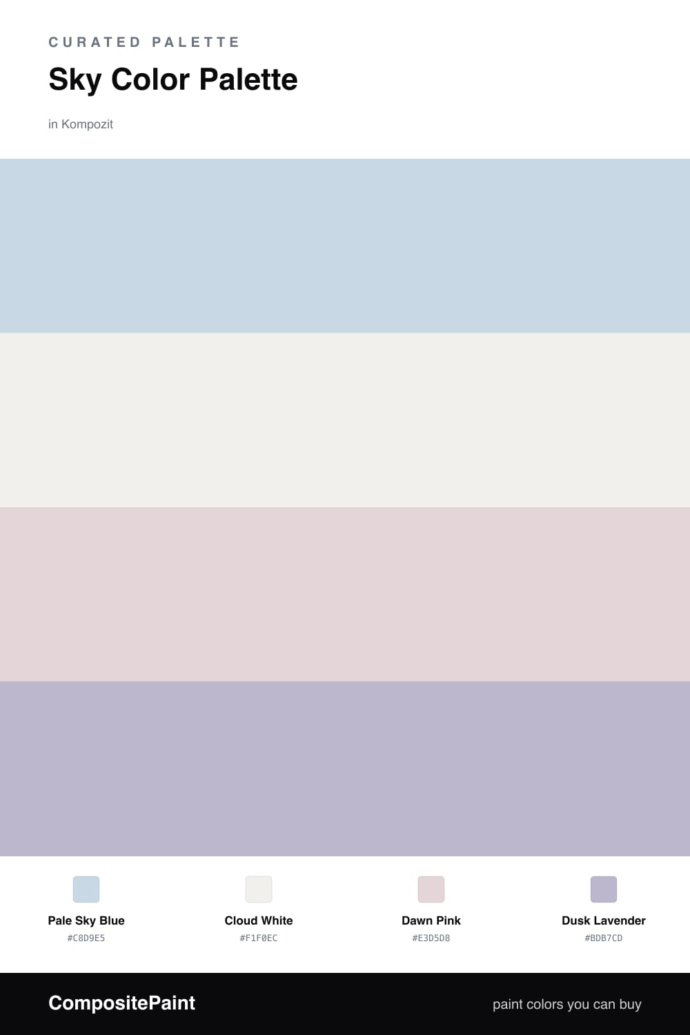
Twilight Drift is the palette I reach for when a space needs to feel calm without going cold. Pale Sky Blue leads the way as a soft, slightly grayed blue that mimics the sky just before the light shifts, and Cloud White keeps everything warm and open underneath it.
The magic is in the two quiet partners. Dawn Pink brings a flush of early morning, while Dusk Lavender pulls the scheme toward evening, and together they give the blue a gentle glow it would never have on its own. None of these shades shout, which is exactly the point.
For 2026 this kind of muted, atmospheric blue is doing the work that crisp navy used to. Let Pale Sky Blue and Cloud White carry the broad surfaces, then sprinkle the pink and lavender in small touches so the room feels like a sky changing color rather than a single flat wash.
Buy These Colors
Each color matched to the closest real paint in every brand, by ΔE2000. Kompozit first; take any SKU to the store — these mix on demand.
Questions
They read as gentle, not flat, because each one carries a little gray that keeps it grounded. Pale Sky Blue gives you the airy lead, Cloud White warms the light, and the pink and lavender add just enough color to stop the scheme from going chilly.
Use them in small, separated doses. Let Pale Sky Blue and Cloud White cover most surfaces, then drop the pink and lavender in as quiet accents on the opposite sides of a space so they echo each other instead of competing.
Similar Palettes
Closest schemes by color — not by label.