Sky Color Palette — Dawn Drift
A soft four-color sky scheme of pale blue and cloud white warmed by a hint of dawn pink and dusk lavender — every color matched to real paint you can buy.
By David Chen · Formulation Lead & Resident Chemist
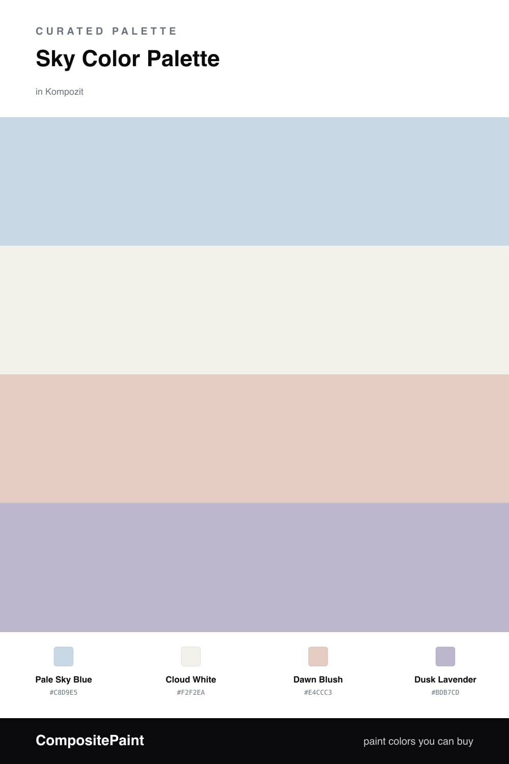
This is the color of the sky about twenty minutes before sunrise, when the night has thinned but the warm light has not fully arrived yet. Pale Sky Blue does the heavy lifting here as a quiet, slightly grayed wash that never tips into baby-blue, and Cloud White sits behind it as a soft off-white base so nothing reads stark.
Then come the two that make it feel like real dawn. Dawn Blush is the warm pink edge of the morning, and Dusk Lavender is the cool shadow that lingers on the other side of the sky. Used in small amounts, they keep the blue from feeling chilly and give the whole scheme a gentle glow.
The 2026 move is to keep it low-contrast and airy: blue and white across the big surfaces, then a careful touch of blush and lavender so the palette shifts a little as the daylight changes through the room.
Buy These Colors
Each color matched to the closest real paint in every brand, by ΔE2000. Kompozit first; take any SKU to the store — these mix on demand.
Questions
Keep them small. Dawn Blush and Dusk Lavender are meant to read as a warm tint in the light, not as full color blocks, so save them for a single wall, trim, or soft furnishings while the pale blue and cloud white carry most of the space.
It can, because cool light pulls the blue grayer. The Dawn Blush in this scheme is the fix; even a small dose of that warm pink near the blue tricks the eye into reading the whole room as softer and a touch warmer.
Similar Palettes
Closest schemes by color — not by label.