Pastel Blue Color Palette — Dawn Light
A soft four-color scheme led by a gentle pastel blue, warmed with pale petal and clay tones — every color matched to real paint you can buy.
By Emily Roberts · DIY Editor & First-Timer's Guide
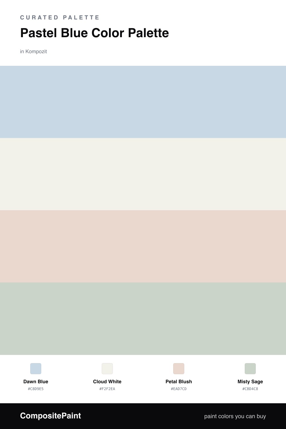
Pastel blue is having a real moment in 2026, and it is easy to see why — it feels like that quiet first hour of morning, soft and unhurried. This scheme starts with Dawn Blue, a light, slightly grayed pastel that never tips into baby-blue territory, so it stays grown-up and easy to live with.
Around it, Cloud White acts as the calm base, a warm off-white that keeps everything feeling airy instead of icy. Then come the gentle companions — Petal Blush adds the faintest hint of warmth, like sunrise on a wall, while Misty Sage brings in a whisper of green so the palette has something natural to ground it.
Use Dawn Blue as your main color, let Cloud White fill the space around it, and sprinkle the blush and sage in small doses. That balance is what keeps a soft palette like this feeling fresh and intentional rather than washed out.
Buy These Colors
Each color matched to the closest real paint in every brand, by ΔE2000. Kompozit first; take any SKU to the store — these mix on demand.
Questions
Not when you warm it up. Dawn Blue stays gentle and a little gray, and pairing it with Petal Blush and a soft Cloud White keeps the whole scheme feeling calm instead of chilly. The trick is leaning on warm-toned whites, not bright stark ones.
Let Dawn Blue lead and Cloud White do the quiet filling-in around it. Keep Petal Blush and Misty Sage as small touches, maybe one-fifth of the scheme between them, so the pastel blue still reads as the star.
Similar Palettes
Closest schemes by color — not by label.