Soft Pastel Nursery Palette — Gentle Blush & Sage
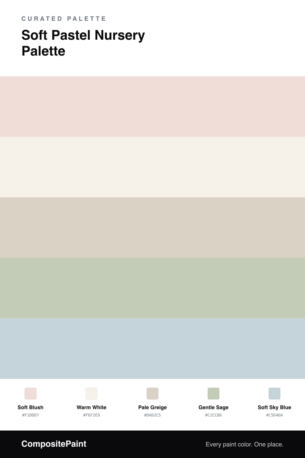
A tender 5-color scheme for nurseries: soft blush pink walls, warm white trim, pale greige for grounding, and gentle sage and sky-blue accents. Every color matched to real paint you can buy.
By Jessica Williams · Color Stylist & Interior Editor
A nursery should feel soft, safe, and easy to nap in, and that is exactly what this palette delivers. The soft blush on the walls is warm and barely-there, the kind of pink that glows rather than shouts, so the room stays soothing at every hour. Warm white on the trim and ceiling keeps everything clean and bright, giving the blush a crisp frame. Pale greige is the grounding tone — use it on the crib, dresser, or shelving so the pastels have a calm, natural base to sit against. From there, two gentle accents add character: a soft sage that brings a touch of nature and a soft sky blue for a fresh, airy lift. Sprinkle those last two through bedding, a rug, or wall art rather than big surfaces. The whole scheme feels tender without being too sweet, and it grows gracefully right alongside your little one.
Buy These Colors
Each color matched to the closest real paint in every brand, by ΔE2000. Tap a swatch for its full guide or + to save it — take any SKU to the store, they mix on demand.
Questions
A true soft blush like this is far gentler than a candy pink, so it stays calm rather than loud. It reads almost as a warm neutral in daylight and turns cozy under lamplight, which is exactly what you want in a room meant for naps. If you want it even quieter, use it on a single accent wall and keep the rest warm white.
Balance the blush with the muted, grown-up tones in this palette. The pale greige on furniture and the gentle sage accent add an earthy, natural feel that keeps things from tipping into too-cute territory. A little soft sky blue keeps the room feeling fresh and gender-flexible as the child grows.
Similar Palettes
Closest schemes by color — not by label.