CP

Pastel Grey Color Palette — Pebble Hush

A soft four-color scheme built around a gentle pastel grey, layered with airy white, blush, and a quiet sage — every color matched to real paint you can buy.

By Emily Roberts · DIY Editor & First-Timer's Guide

Pebble Grey
Dominant
Kompozit Power Lunch · 0572
#D4D1C7
LRV 64
Cloud White
Base
Kompozit White Shoulders · 1265
#F1F0EC
LRV 87
Faded Blush
Support
Kompozit Velvet Blush · 1217
#E3D5D8
LRV 69
Whisper Sage
Accent
Kompozit Pale Loden · 0440
#CCD2CA
LRV 63
View palette in

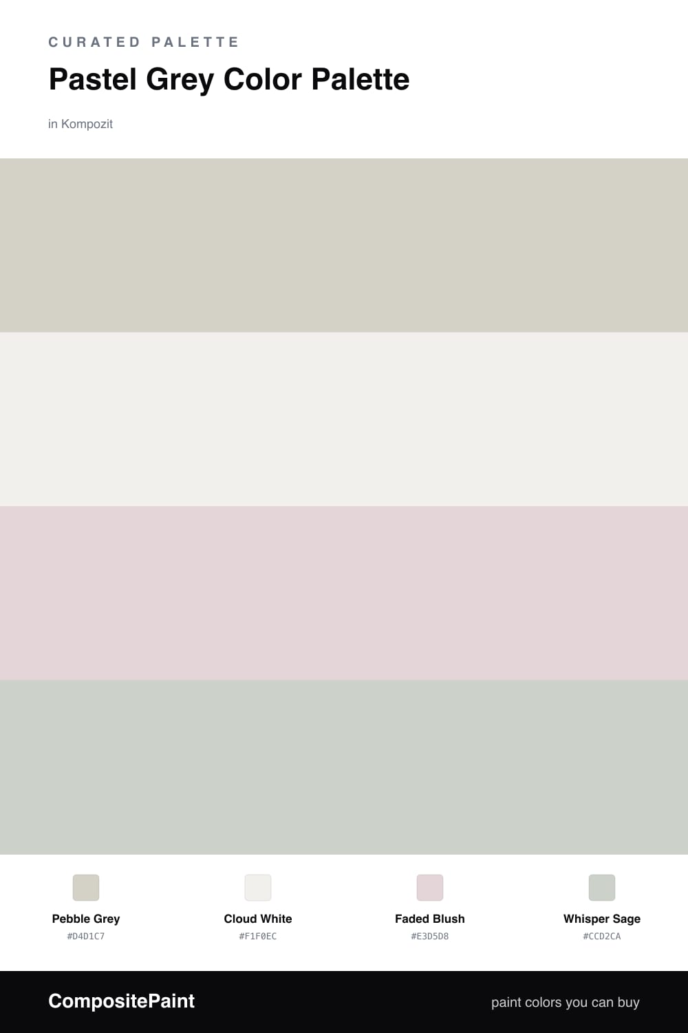
Pastel grey is having a real moment in 2026, and it is easy to see why — it is the calm, slightly warmer cousin of the cool greys we leaned on for years. This scheme is built around Pebble Grey, a gentle low-contrast shade that feels soft and grounded rather than cold.

To keep things airy, Cloud White does the lifting as your base, on trim, ceilings, and anywhere you want a little breathing room. Faded Blush warms the palette by just a degree, so the grey never tips into chilly, and it is lovely on a built-in or an accent wall where the light can catch it.

Then comes the quiet surprise — a touch of Whisper Sage. It is barely there, more of a suggestion of green than a color, but it gives this soft palette a fresh, contemporary edge. Use it in small doses on a door, a stool, or a frame, and let everything else stay hushed.

Buy These Colors

Each color matched to the closest real paint in every brand, by ΔE2000. Kompozit first; take any SKU to the store — these mix on demand.

Pebble Grey
#D2CFC9 · LRV 63 · Dominant
Kompozit Power Lunch · 0572 ΔE 1.95
Backdrop Real Real · BD-RR ΔE 4.68
Behr Cotton Grey · HDC-NT-20 ΔE 1.64
Benjamin Moore Abalone · 2108-60 ΔE 0.95
Clare Flatiron · PNT100-LT-17 ΔE 3.22
Dunn-Edwards Miner's Dust · DEC786 ΔE 1.5
Farrow & Ball Worsted · No. 284 ΔE 2.34
Magnolia Home Stoneware Pieces · JG-55 ΔE 3.49
PPG / Glidden Elusion · 1005-2 ΔE 1.56
Sherwin-Williams Big Chill · SW 7648 ΔE 0.66
Valspar Silver Thistle Down · 8006-4B ΔE 1.04
Cloud White
#F2F0EB · LRV 87 · Base
Kompozit White Shoulders · 1265 ΔE 0.6
Backdrop Tabula Rasa · BD-TR ΔE 2.79
Behr Pearl Drops · 700C-1 ΔE 1.02
Benjamin Moore Gardenia · AF-10 ΔE 0.95
Clare Wing It · PNT100-LT-24 ΔE 2.78
Dunn-Edwards Fossil · DE6225 ΔE 0.63
Farrow & Ball Wimborne White · No. 239 ΔE 2.73
Magnolia Home Silos White · JG-107 ΔE 1
PPG / Glidden Delicate White · 1001-1 ΔE 1.48
Sherwin-Williams Arcade White · SW 7100 ΔE 1.54
Valspar Du Jour · 7002-6 ΔE 0.54
Faded Blush
#E5D5D2 · LRV 69 · Support
Kompozit Velvet Blush · 1217 ΔE 2.87
Backdrop Cookies & Cream · BD-CC ΔE 11.38
Behr Moxie · MQ3-35 ΔE 1.78
Benjamin Moore Paisley Pink · 1261 ΔE 0.87
Clare Neutral Territory · PNT100-LT-20 ΔE 6.29
Dunn-Edwards Whirlwind · DE6030 ΔE 1.2
Farrow & Ball Calamine · No. 230 ΔE 2.21
Magnolia Home Yarn · JG-132 ΔE 7.54
PPG / Glidden Lost Love · 1047-2 ΔE 0.89
Sherwin-Williams Demure · SW 6295 ΔE 2.69
Valspar Nana's Pearls · V128-1 ΔE 0.96
Whisper Sage
#C9CFC2 · LRV 61 · Accent
Kompozit Pale Loden · 0440 ΔE 2.33
Backdrop Real Real · BD-RR ΔE 6.03
Behr Wheat Bread · 720C-3 ΔE 1.13
Benjamin Moore Tea Light · 471 ΔE 1.69
Clare Dirty Martini · PNT100-MD-47 ΔE 2.45
Dunn-Edwards Granite · DE6283 ΔE 1.29
Farrow & Ball Cromarty · No. 285 ΔE 3.15
Magnolia Home Emmie's Room · JG-13 ΔE 1.41
PPG / Glidden Frosty Pine · 1124-3 ΔE 1.88
Sherwin-Williams Frostwork · SW 59 ΔE 0.62
Valspar Sparkling Sage · 5005-3B ΔE 1.48

Questions

Will a pastel grey this soft just read as dirty white on my walls?

It can if the room gets a lot of warm afternoon light, which can wash out the grey. To keep Pebble Grey looking intentional, pair it with the cooler Cloud White as trim so there is a clear line between the two, and test a sample on the wall that gets the least direct sun.

How do I keep a low-contrast palette like this from feeling flat?

Lean on texture and finish instead of stronger color. A matte grey wall next to a soft-sheen white trim gives you contrast you can feel rather than see, and a small dose of Whisper Sage on a door or a chair pulls the whole scheme together without raising the volume.

Similar Palettes

Closest schemes by color — not by label.