CP

Pastel Grey Color Palette — Dove Whisper

A soft five-color scheme built around a gentle pastel dove grey, layered with cloud white, blush mist, and warm taupe for a low-contrast, airy feel — every color matched to real paint you can buy.

By Jessica Williams · Color Stylist & Interior Editor

Dove Grey
Dominant
Kompozit Cool Elegance · 0517
#CFCFD0
LRV 62
Cloud White
Base
Kompozit White Shoulders · 1265
#F1F0EC
LRV 87
Blush Mist
Secondary
Kompozit Venetian Wall · 0544
#E3DCD6
LRV 72
Soft Taupe
Support
Kompozit Power Lunch · 0572
#D4D1C7
LRV 64
Slate Whisper
Accent
Kompozit Tin Man · 0547
#AFADAD
LRV 42
View palette in

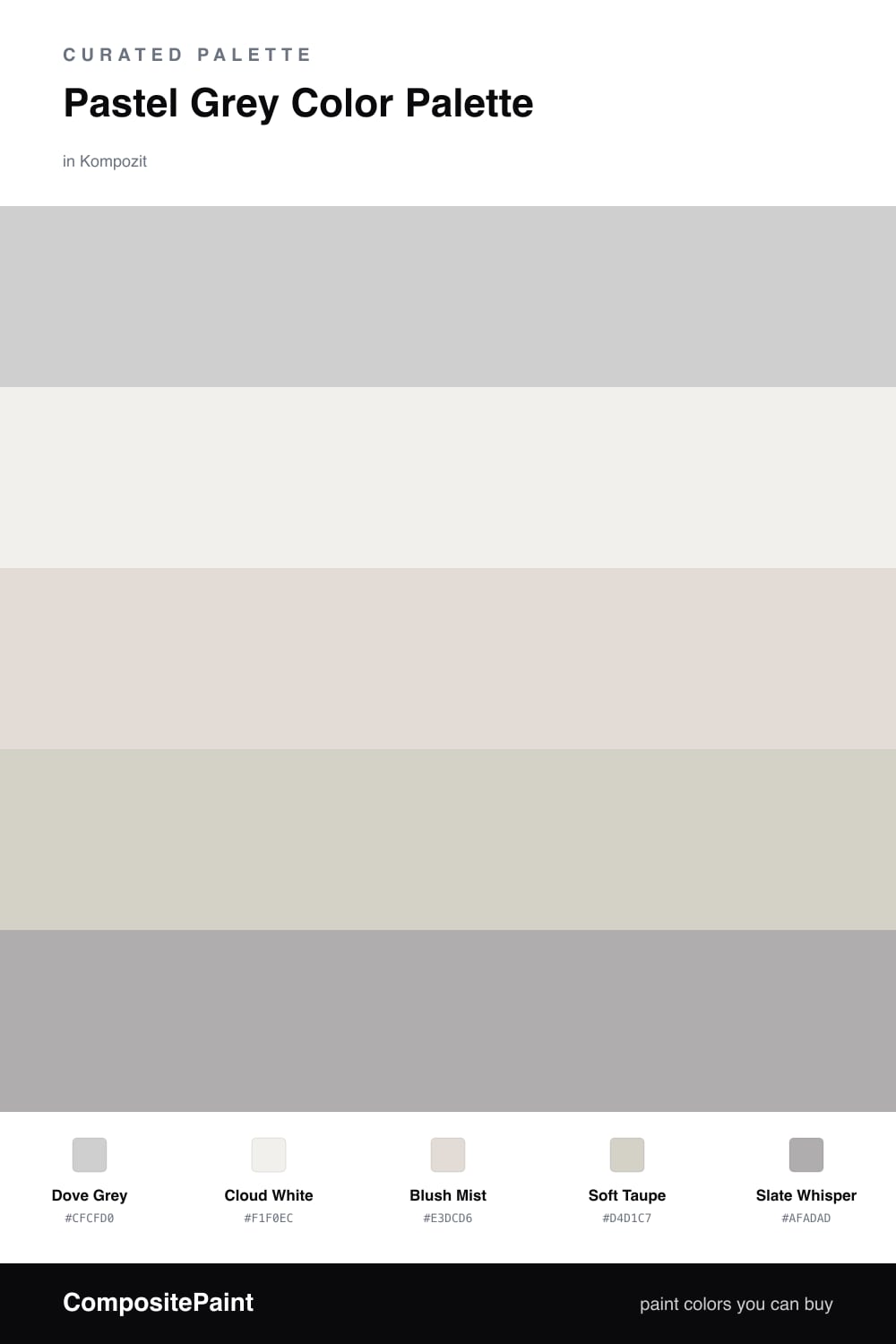
Pastel grey is having a quiet moment in 2026, and it is easy to see why. This scheme floats around a gentle Dove Grey that reads soft and a little warm, the kind of grey that changes with the light instead of sitting flat on the wall.

A warm Cloud White keeps everything light and open, while Blush Mist slips a whisper of pink-grey into the mix so the palette never feels cold. Soft Taupe adds a grounding warmth underneath it all, the bridge that makes the pastels feel intentional rather than washed out.

Then there is Slate Whisper, the deepest note here, and you only need a little of it. Tuck it into a trim, a door, or a single chair, and it gives this airy, low-contrast palette just enough quiet definition to feel finished.

Buy These Colors

Each color matched to the closest real paint in every brand, by ΔE2000. Kompozit first; take any SKU to the store — these mix on demand.

Dove Grey
#CFD0CC · LRV 63 · Dominant
Kompozit Cool Elegance · 0517 ΔE 2.88
Backdrop Real Real · BD-RR ΔE 6.09
Behr Road Runner · 790A-3 ΔE 0.96
Benjamin Moore Sterling · 1591 ΔE 1.49
Clare Wink · PNT100-LT-31 ΔE 3.73
Dunn-Edwards Clouded Vision · DE6380 ΔE 3.18
Farrow & Ball Skylight · No. 205 ΔE 1.44
Magnolia Home Dark Moon · JG-74 ΔE 1.6
PPG / Glidden Elusion · 1005-2 ΔE 2.28
Sherwin-Williams Big Chill · SW 7648 ΔE 1.53
Valspar Silver Thistle Down · 8006-4B ΔE 1.24
Cloud White
#F2F1EC · LRV 88 · Base
Kompozit White Shoulders · 1265 ΔE 0.53
Backdrop Tabula Rasa · BD-TR ΔE 2.68
Behr Nano White · HDC-MD-06 ΔE 0.81
Benjamin Moore Super White · OC-152 ΔE 1
Clare Wing It · PNT100-LT-24 ΔE 3.27
Dunn-Edwards Fossil · DE6225 ΔE 0.98
Farrow & Ball Wimborne White · No. 239 ΔE 2.78
Magnolia Home Silos White · JG-107 ΔE 1.04
PPG / Glidden Delicate White · 1001-1 ΔE 1
Sherwin-Williams Extra White · SW 7006 ΔE 1.11
Valspar Santa's Beard · 8007-6E ΔE 0.21
Blush Mist
#E6DCDA · LRV 73 · Secondary
Kompozit Venetian Wall · 0544 ΔE 2.87
Backdrop Cookies & Cream · BD-CC ΔE 10.28
Behr Crushed Peony · PPU17-06 ΔE 1.35
Benjamin Moore Pampas Grass · 2110-60 ΔE 1.5
Clare Baby Soft · PNT100-LT-25 ΔE 3.2
Dunn-Edwards Studio White · DE6065 ΔE 2.44
Farrow & Ball Great White · No. 2006 ΔE 0.87
Magnolia Home Soft Linen · JG-108 ΔE 5.72
PPG / Glidden Sea Anemone · 1056-1 ΔE 1.74
Sherwin-Williams Smart White · SW 6007 ΔE 0.83
Valspar Mind of Her Own · 8004-3A ΔE 1.78
Soft Taupe
#D6CFC4 · LRV 63 · Support
Kompozit Power Lunch · 0572 ΔE 1.96
Backdrop Real Real · BD-RR ΔE 2.61
Behr Clay Beige · UL190-10 ΔE 1.74
Benjamin Moore Sea Salt · CSP-95 ΔE 1.26
Clare Flatiron · PNT100-LT-17 ΔE 1.33
Dunn-Edwards Muslin · DE6227 ΔE 1.53
Farrow & Ball Shaded White · No. 201 ΔE 2.67
Magnolia Home Stoneware Pieces · JG-55 ΔE 3.69
PPG / Glidden River Rock · 18-02 ΔE 2.53
Sherwin-Williams Modern Gray · SW 7632 ΔE 0.54
Valspar Moon Shot · 8005-2B ΔE 1.42
Slate Whisper
#A9ABA7 · LRV 40 · Accent
Kompozit Tin Man · 0547 ΔE 3.61
Backdrop Nuevo · BD-NU ΔE 3.04
Behr Cathedral Gray · PPU18-14 ΔE 2.64
Benjamin Moore Platinum Gray · HC-179 ΔE 1.19
Clare Make Waves · PNT100-MD-43 ΔE 8.23
Dunn-Edwards Castlerock · DE6375 ΔE 2.98
Farrow & Ball Lamp Room Gray · No. 88 ΔE 2.86
Magnolia Home Refinished · JG-118 ΔE 2.6
PPG / Glidden Light Drizzle · 1033-4 ΔE 3.7
Sherwin-Williams Ellie Gray · SW 7650 ΔE 1.59
Valspar Metropolis · 4005-1C ΔE 2.73

Questions

Does pastel grey make a space feel cold?

Not when you warm it up. This dove grey has a touch of warmth in it, and pairing it with soft taupe and a blush mist keeps the whole scheme feeling gentle rather than chilly. The warm cloud white is what really stops it from going gray and flat.

How do I keep a low-contrast palette from looking washed out?

Let the slate whisper do the quiet lifting. It is the deepest tone here, so use it in small doses, on a trim line, a door, or one piece of furniture, to give your eye somewhere to land without breaking the soft, airy mood.

Similar Palettes

Closest schemes by color — not by label.